Before You Begin
This 10-minute tutorial shows you how to analyze data from a file source dataset and curated dataset.
In first section of this tutorial, you create analyses with the donations2024 dataset. In the second section, you create analyses with the Donations by School curated dataset.
Draw your own conclusions about the insights available with the analyses in both section.
Background
This is the second tutorial in the Prepare and Analyze Data in Oracle Analytics series. Read the tutorials in the order listed.
- Explore Data Flows
- Analyze Your Data
- Create Aggregated Datasets
What Do You Need?
- Access to Oracle Analytics Cloud
- Access to the donation and Donations by School Datasets
Create Analyses with the Donation Dataset
This section uses the donations2024 dataset that you added in the Explore Data Flows tutorial.
- Sign in to Oracle Analytics.
- On your home page, click Create, and then select Workbook.
- In Add Data, click donations2024, and then click Add to Workbook.
- In the Auto Insights panel, click X to close the panel.
- In the Data pane, expand DATE_COMPLETED, hold down the Ctrl key, select Year and TOTAL_DONATIONS, and then drag them to the canvas.
The line view shows that 2023 had the largest number of donations.

Description of the illustration total_donations_yr_completed.png - In the Data pane, hold down the Ctrl key, and then select SCH_CITY, TOTAL_DONATIONS, and NUM_DONORS. Right-click and select Create Best Visualization.
A scatter chart is added to the canvas that shows the total number of donors and total donations by city.
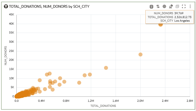
Description of the illustration num_donors_city.png - In the Data pane, select SCHOOL_ID and drag it to Category (Points) to replace SCH_CITY.
- Hover over the visualization and click menu
 , then select Zoom Chart.
The scatter view shows that 478 donors gave more than $26,000 in donations to the selected school.

Description of the illustration num_donors_school.png - Click Save
 . In Save Workbook, enter
 Donation Analyses, and then click Save. - Click Go Back
 to return to your home page.
Create Visualizations with the Curated Dataset
In this section, you use the curated Donations by School dataset to gain insights.
You can see the donations patterns related to grade-level and poverty in the grid heat map views.
- On your home page, click the Data search tag, enter
Donations by School, and then click Search. - On Donations by School, click Actions
 , and then select Create Workbook.
 - In the Data pane, hold down the Ctrl key, select POVERTY_LEVEL, GRADE_LEVEL, and Donation by Population, and then right-click and select Create Best Visualization.
The bar visualization shows the grades 3 through 5 levels as different colors.
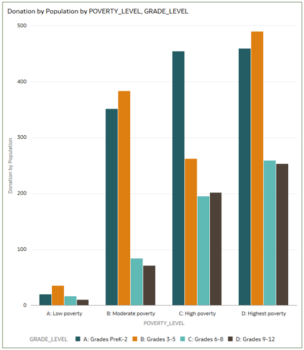
Description of the illustration poverty_grade_level.png - In the Data pane, hold down the Ctrl key, select POVERTY_LEVEL, GRADE_LEVEL, and then select Average School Donation by Income. Drag the data elements to the canvas.
Oracle Analytics creates the visualization next to the existing visualization.
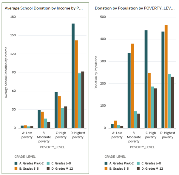
Description of the illustration school_income_donations.png - In the Data panel, select TOTAL_DONATIONS, and drag it to Values (Y-axis) to replace Average School Donation by Income.

Description of the illustration total_donations_poverty.png - Click Save . In Save Workbook, enter
Donations by School WBKin Name and click Save.
Next Steps
Learn More
Analyze Your Data in Oracle Analytics
F22680-08
July 2026
Learn how to gain insights into your Oracle Analytics curated dataset.
This software and related documentation are provided under a license agreement containing restrictions on use and disclosure and are protected by intellectual property laws. Except as expressly permitted in your license agreement or allowed by law, you may not use, copy, reproduce, translate, broadcast, modify, license, transmit, distribute, exhibit, perform, publish, or display any part, in any form, or by any means. Reverse engineering, disassembly, or decompilation of this software, unless required by law for interoperability, is prohibited.
If this is software or related documentation that is delivered to the U.S. Government or anyone licensing it on behalf of the U.S. Government, then the following notice is applicable:
U.S. GOVERNMENT END USERS: Oracle programs (including any operating system, integrated software, any programs embedded, installed or activated on delivered hardware, and modifications of such programs) and Oracle computer documentation or other Oracle data delivered to or accessed by U.S. Government end users are "commercial computer software" or "commercial computer software documentation" pursuant to the applicable Federal Acquisition Regulation and agency-specific supplemental regulations. As such, the use, reproduction, duplication, release, display, disclosure, modification, preparation of derivative works, and/or adaptation of i) Oracle programs (including any operating system, integrated software, any programs embedded, installed or activated on delivered hardware, and modifications of such programs), ii) Oracle computer documentation and/or iii) other Oracle data, is subject to the rights and limitations specified in the license contained in the applicable contract. The terms governing the U.S. Government's use of Oracle cloud services are defined by the applicable contract for such services. No other rights are granted to the U.S. Government.
This software or hardware is developed for general use in a variety of information management applications. It is not developed or intended for use in any inherently dangerous applications, including applications that may create a risk of personal injury. If you use this software or hardware in dangerous applications, then you shall be responsible to take all appropriate fail-safe, backup, redundancy, and other measures to ensure its safe use. Oracle Corporation and its affiliates disclaim any liability for any damages caused by use of this software or hardware in dangerous applications.
Oracle and Java are registered trademarks of Oracle and/or its affiliates. Other names may be trademarks of their respective owners.
Intel and Intel Inside are trademarks or registered trademarks of Intel Corporation. All SPARC trademarks are used under license and are trademarks or registered trademarks of SPARC International, Inc. AMD, Epyc, and the AMD logo are trademarks or registered trademarks of Advanced Micro Devices. UNIX is a registered trademark of The Open Group.
This software or hardware and documentation may provide access to or information about content, products, and services from third parties. Oracle Corporation and its affiliates are not responsible for and expressly disclaim all warranties of any kind with respect to third-party content, products, and services unless otherwise set forth in an applicable agreement between you and Oracle. Oracle Corporation and its affiliates will not be responsible for any loss, costs, or damages incurred due to your access to or use of third-party content, products, or services, except as set forth in an applicable agreement between you and Oracle.