Before You Begin
This 10-minute tutorial shows you how to add a map layer to the Console, and then assign a map layer to a data column in a dataset.
Background
You can add a custom map layer using a geographic data file with the .json extension that conforms to GeoJSON format. You use the custom map layer to view geometric map data in a map visualization. When adding the map layer, you select layer keys that correspond with your data. The layer keys are property attributes for map features in the original JSON file.
You can assign a map layer to a column containing text or numeric attributes. When you select a data column with a map layer assignment for a visualization, Oracle Analytics automatically creates a map visualization.
What Do You Need?
- Access to Oracle Analytics Cloud
- Download the following to your computer:
Add a Map Layer
- Sign in to Oracle Analytics.
- On your home page, click Navigator
 , and then click Console. In the Console, click Maps.
 - On the Data Layers page, click Add Custom Layer
 and click GeoJSON.
 - In File Upload, select the
world_airports.jsonfile, and then click Open. - In the Map Layer dialog, under the Layer Keys section, select name and click Save.
- On the Maps page, click Go back
 . In the Console page, click Navigator , and then click Home.
Assign a Map Layer to a Data Column
- On your home page, click Create, and then select Dataset.
- In Create Dataset, click Drop data file here or click to browse.
- In File Upload, select
airport_data.xlsx, and then click Open. - In Create Dataset Table from airport_data.xlsx, click OK.
- Click Save. In Save Dataset As, enter
airport_datain Name and click OK. - Click the airport_data tab.
- On the airport_data page, click the Airport Name column, select Options
 , and then select Location Details.

Description of the illustration location_details_airport_names.png - If not selected, from the Map Layer list, select world airports, and then click OK.
Visualize the Data
- Click Create Workbook. Close the Insights panel.
- In the Data
 pane under airport_data, select Airport Name, and drag it to the canvas.
Oracle Analytics automatically creates a map with the data points representing airports.
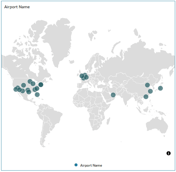
Description of the illustration wrld_airports_map.png - Click Properties
 . In Properties, click Map.
- In the Default Map Type row, click Default and select Bright.
- Click Grammar
 . In the Data pane, select Traffic Movement, and drag it to Color in the Grammar panel.
 - Hover over the map visualization and click Menu in the visualization toolbar.
- Select Color, and then select Manage Assignments. In Manage Color Assignments, click Presets
 , select Viridis, and then click Done.

Description of the illustration airport_traffic_map.png - In the Data pane, select Passengers, and drag it to the visualization.

Description of the illustration size_passengers.png
Learn More
- Data Profiles and Semantic Recommendations in Oracle Analytics Cloud
Assign a Map Layer to a Data Column in Oracle Analytics
F25147-07
July 2026
Learn how to add a custom map layer and assign a map layer to a data column.
This software and related documentation are provided under a license agreement containing restrictions on use and disclosure and are protected by intellectual property laws. Except as expressly permitted in your license agreement or allowed by law, you may not use, copy, reproduce, translate, broadcast, modify, license, transmit, distribute, exhibit, perform, publish, or display any part, in any form, or by any means. Reverse engineering, disassembly, or decompilation of this software, unless required by law for interoperability, is prohibited.
If this is software or related documentation that is delivered to the U.S. Government or anyone licensing it on behalf of the U.S. Government, then the following notice is applicable:
U.S. GOVERNMENT END USERS: Oracle programs (including any operating system, integrated software, any programs embedded, installed or activated on delivered hardware, and modifications of such programs) and Oracle computer documentation or other Oracle data delivered to or accessed by U.S. Government end users are "commercial computer software" or "commercial computer software documentation" pursuant to the applicable Federal Acquisition Regulation and agency-specific supplemental regulations. As such, the use, reproduction, duplication, release, display, disclosure, modification, preparation of derivative works, and/or adaptation of i) Oracle programs (including any operating system, integrated software, any programs embedded, installed or activated on delivered hardware, and modifications of such programs), ii) Oracle computer documentation and/or iii) other Oracle data, is subject to the rights and limitations specified in the license contained in the applicable contract. The terms governing the U.S. Government's use of Oracle cloud services are defined by the applicable contract for such services. No other rights are granted to the U.S. Government.
This software or hardware is developed for general use in a variety of information management applications. It is not developed or intended for use in any inherently dangerous applications, including applications that may create a risk of personal injury. If you use this software or hardware in dangerous applications, then you shall be responsible to take all appropriate fail-safe, backup, redundancy, and other measures to ensure its safe use. Oracle Corporation and its affiliates disclaim any liability for any damages caused by use of this software or hardware in dangerous applications.
Oracle and Java are registered trademarks of Oracle and/or its affiliates. Other names may be trademarks of their respective owners.
Intel and Intel Inside are trademarks or registered trademarks of Intel Corporation. All SPARC trademarks are used under license and are trademarks or registered trademarks of SPARC International, Inc. AMD, Epyc, and the AMD logo are trademarks or registered trademarks of Advanced Micro Devices. UNIX is a registered trademark of The Open Group.
This software or hardware and documentation may provide access to or information about content, products, and services from third parties. Oracle Corporation and its affiliates are not responsible for and expressly disclaim all warranties of any kind with respect to third-party content, products, and services unless otherwise set forth in an applicable agreement between you and Oracle. Oracle Corporation and its affiliates will not be responsible for any loss, costs, or damages incurred due to your access to or use of third-party content, products, or services, except as set forth in an applicable agreement between you and Oracle.