Before you Begin
This tutorial shows you how to create a bar visualization and add a category reference line using a date column.
Background
Oracle Analytics creates a vertical line or vertical band reference when you choose a category column. You can change the reference line's properties such as line pattern, color, and line type. You can change the properties for measure reference lines as well.
Oracle Analytics uses horizontal reference lines with measure columns.
What Do You Need?
- Access to Oracle Analytics
- Download sample_order_lines2023.xlsx to your computer
Create a Dataset
In this section, you add the sample_order_lines2023.xlsx file to Oracle Analytics to create a dataset table.
- Sign in to Oracle Analytics.
- On the Home page, click Create, and then click Dataset.
- In Create Dataset, click Drop data file here or click to browse, select the sample_order_lines2023.xlsx file, and then click Open.
- In Create Dataset Table from sample_order_lines2023.xlsx, click OK.
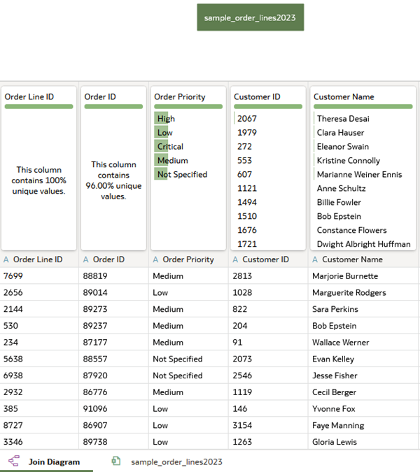
Description of the illustration sample_order_lines2023_ds.png - Click Save
 . In Save Dataset As, enter
 sample_order_lines2023, and then click OK.
Create a Bar Visualization
In this section, you create a workbook and add a visualization using a measure, Quantity Ordered, and Ship Date.
- Click Create Workbook.
- In the Data
 panel, drag Ship Date to the canvas.
Oracle Analytics creates a single column table visualization.
- In the Data panel, drag Quantity Ordered to the canvas.
Oracle Analytics adds a column to the table for the Quantity Ordered data.
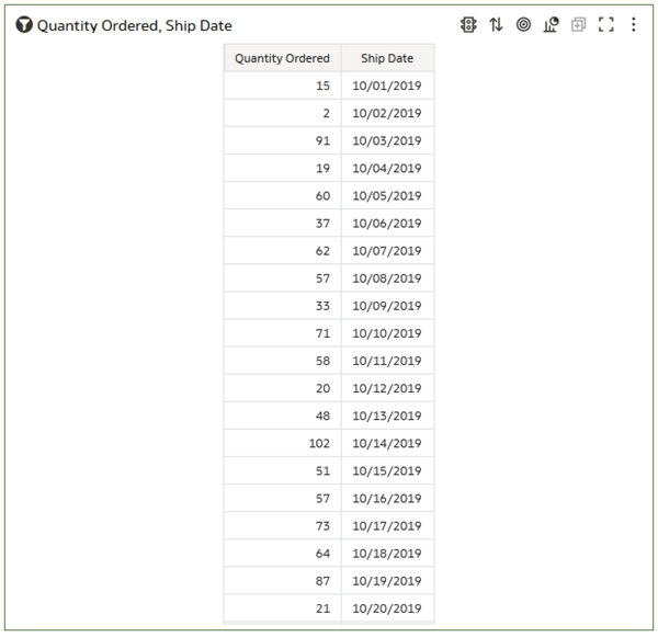
Description of the illustration qnty_ord_ship_date_table.png - Click Change Visualization Type
 and select Bar
  .
.The table visualization changes to a bar visualization.
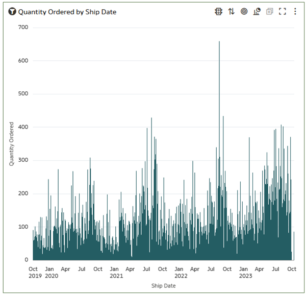
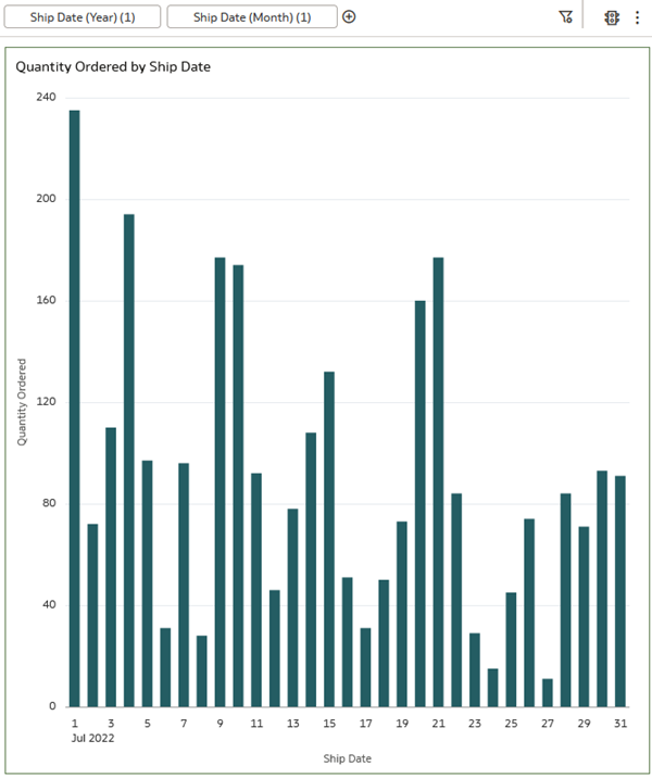
Description of the illustration bar_vis.png - Click Save . In Save Workbook, enter
qnty_ordered_ship_date_wbkin Name, and click Save.
Add Date Filters
In this section, you add filters to refine the visualization to a period of interest.
- In the Data panel, expand Ship Date, and drag Ship Date (Year) to the filter bar.
- In the Ship Date (Year) filter, click 2022 and then click outside the dialog.
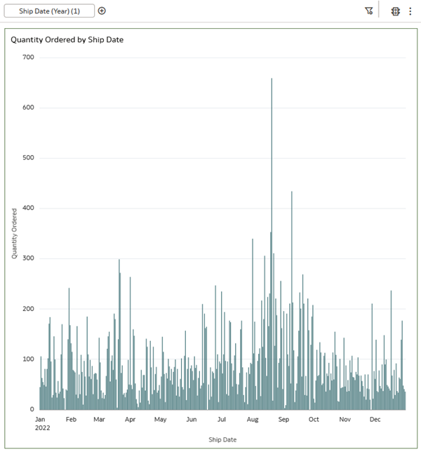
Description of the illustration year_filter.png - In the Data panel under Ship Date, drag Ship Date (Month) to the filter bar.
- In the Ship Date (Month) filter, click July and then click outside the dialog.
Description of the illustration month_filter.png
Add a Category Reference Line
In this section, you add a reference line to the visualization using the Ship Date column.
- Click Properties
 .
. - In Properties, click Analytics
 , click Add Statistics
  , and then select Reference Line.
Oracle Analytics creates a horizontal reference line using the Quantity Ordered measure in the visualization.
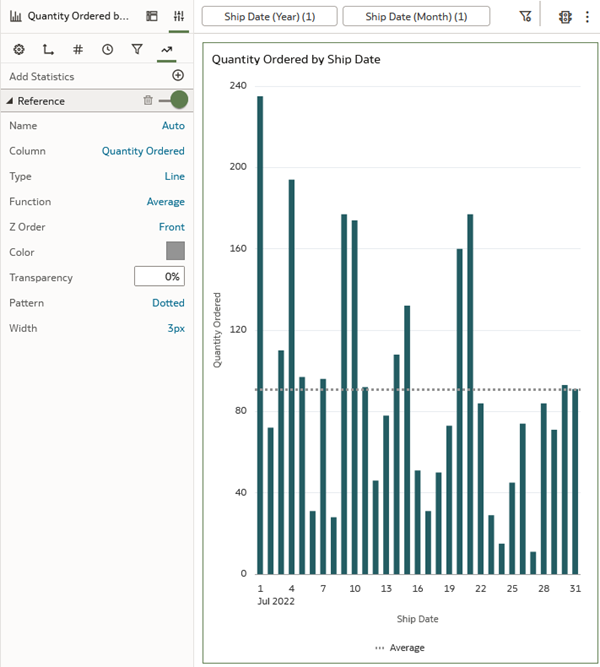
Description of the illustration default_measure_ref_line.png - In the Column row, click Quantity Ordered and select Ship Date.
- In the Value row, click the Calendar
 and click July 1.
 The reference line changes to a vertical line using the July 1, 2022 ship date.

Description of the illustration ship_date_ref_line.png
Change the Reference Line's Properties
In this section, you modify the reference line's color, pattern, and line type.
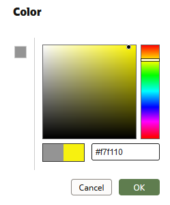
- In Reference properties, click the box
 in the Color row. Click a color in the scale, select a hue, and then click OK.
 The color yellow, #f7f110, provides a good contrast to the visualization's bar color. Your bar visualization might use a different color.
Description of the illustration color_picker.png - Click Dotted in the Pattern row and select Dashed.

Description of the illustration modified_ref_line.png - Click Line in the Type row and select Band.
- Click Calendar in the From field and click July 1. Click Calendar in the in the Until field and click July 16.
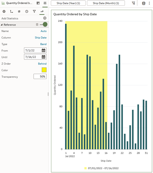
Description of the illustration band_line_type.png - Click Save .
Learn More
Add a Category Reference Line to a Bar Visualization in Oracle Analytics
F91579-01
March 2024
Copyright © 2024, Oracle and/or its affiliates.
Learn how to add a category reference line to a bar visualization.
This software and related documentation are provided under a license agreement containing restrictions on use and disclosure and are protected by intellectual property laws. Except as expressly permitted in your license agreement or allowed by law, you may not use, copy, reproduce, translate, broadcast, modify, license, transmit, distribute, exhibit, perform, publish, or display any part, in any form, or by any means. Reverse engineering, disassembly, or decompilation of this software, unless required by law for interoperability, is prohibited.
If this is software or related documentation that is delivered to the U.S. Government or anyone licensing it on behalf of the U.S. Government, then the following notice is applicable:
U.S. GOVERNMENT END USERS: Oracle programs (including any operating system, integrated software, any programs embedded, installed or activated on delivered hardware, and modifications of such programs) and Oracle computer documentation or other Oracle data delivered to or accessed by U.S. Government end users are "commercial computer software" or "commercial computer software documentation" pursuant to the applicable Federal Acquisition Regulation and agency-specific supplemental regulations. As such, the use, reproduction, duplication, release, display, disclosure, modification, preparation of derivative works, and/or adaptation of i) Oracle programs (including any operating system, integrated software, any programs embedded, installed or activated on delivered hardware, and modifications of such programs), ii) Oracle computer documentation and/or iii) other Oracle data, is subject to the rights and limitations specified in the license contained in the applicable contract. The terms governing the U.S. Government's use of Oracle cloud services are defined by the applicable contract for such services. No other rights are granted to the U.S. Government.
This software or hardware is developed for general use in a variety of information management applications. It is not developed or intended for use in any inherently dangerous applications, including applications that may create a risk of personal injury. If you use this software or hardware in dangerous applications, then you shall be responsible to take all appropriate fail-safe, backup, redundancy, and other measures to ensure its safe use. Oracle Corporation and its affiliates disclaim any liability for any damages caused by use of this software or hardware in dangerous applications.
Oracle and Java are registered trademarks of Oracle and/or its affiliates. Other names may be trademarks of their respective owners.
Intel and Intel Inside are trademarks or registered trademarks of Intel Corporation. All SPARC trademarks are used under license and are trademarks or registered trademarks of SPARC International, Inc. AMD, Epyc, and the AMD logo are trademarks or registered trademarks of Advanced Micro Devices. UNIX is a registered trademark of The Open Group.
This software or hardware and documentation may provide access to or information about content, products, and services from third parties. Oracle Corporation and its affiliates are not responsible for and expressly disclaim all warranties of any kind with respect to third-party content, products, and services unless otherwise set forth in an applicable agreement between you and Oracle. Oracle Corporation and its affiliates will not be responsible for any loss, costs, or damages incurred due to your access to or use of third-party content, products, or services, except as set forth in an applicable agreement between you and Oracle.