Before You Begin
This tutorial shows you how to enable contextual insights so that users can get more information about selected data points in an Oracle Analytics visualization.
Background
You can enable contextual insights for consumers on visualizations in workbooks based on subject areas and datasets. Contextual insights can uncover hidden trends and patterns and provide a textual description in the data and visualization. Contextual insights compare selected data in a visualization with the rest of the visualization's data.
If you use a subject area for your workbook's data source, you must add the columns to use for contextual insights to Related Columns in the Grammar pane.
In Oracle Analytics, the contextual insights generated by the underlying AI prioritize the most relevant insights. When a consumer makes a filter selection in a visualization, the underlying AI generates new insights based on the consumer’s interactions.
What Do You Need?
- Access to Oracle Analytics
- Download sample_order_lines2023.xlsx to your computer
Create a Dataset
In this section, you add the sample_order_lines2023.xlsx to Oracle Analytics to create a dataset table.
- Sign in to Oracle Analytics.
- On the Home page, click Create, and then click Dataset.
- In Create Dataset, click Drop data file here or click to browse, select the sample_order_lines2023.xlsx file, and then click Open.
- In Create Dataset Table from sample_order_lines2023.xlsx, click OK. Click Save
 .
. - In Save Dataset As, enter
sample_order_lines2023, and then click OK.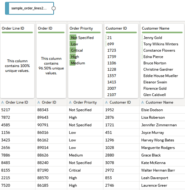
Description of the illustration sample_order_lines2023_ds.png
Create a Visualization
In this section, you create a visualization and enable the contextual insights property in the visualization.
If you duplicate a visualization with contextual insights enabled, the duplicated visualization also has the Explain Visualization for end user property enabled.
- Click Create Workbook. Close the Insights panel.
- In the Data
 pane, hold down the Ctrl key, select Sales, Gross Unit Price, Product Sub Category, and Customer Segment. Drag the data elements to the canvas.
 Oracle Analytics creates a scatter visualization of the data elements.
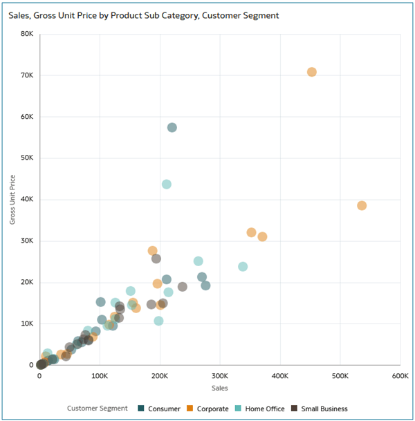
Description of the illustration scatter_vis.png - Click Properties
 . In Properties, click Advanced
  .
. - In Advanced, click Off in the Explain Visualization for end user row to enable (On) the property.
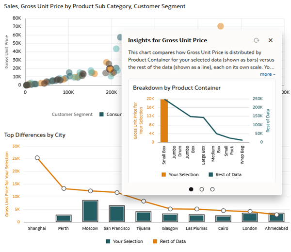
- In the scatter visualization, hover over a data point, right-click and select Explain Selected.
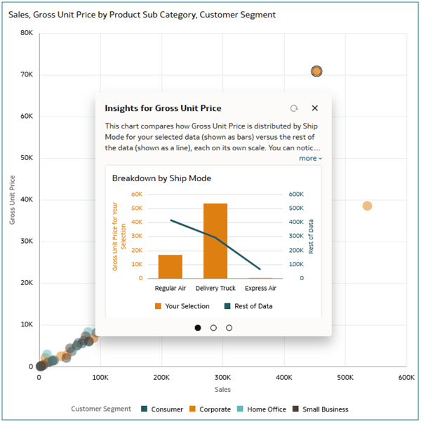
Description of the illustration explain_selected.png - In Insights for Gross Unit Price, click More to view the entire description.
- Click Go to Page 2
 to see the next generated visualization and then click Go to Page 3.
 - On Page 3, click Find New Insights.
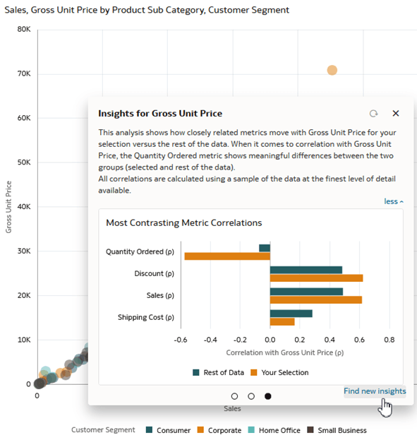
Description of the illustration new_insights.png
Add Insights to the Workbook
In this section, you add insights to the workbook and watchlists.
- Click Preview
 .
.
Description of the illustration preview_user_insights.png - Hover over the contextual insights visualization and click Add to Watchlist
 in the toolbar. Click New watchlist.
 - In Add to New Watchlist, enter
Sample Orders Insightsand click Add.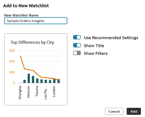
Description of the illustration watchlist.png - Click Save. In Save Watchlist, enter a Name and click Save.
- Click Go back
 to see the Sample Order Insights watchlist on your home page.
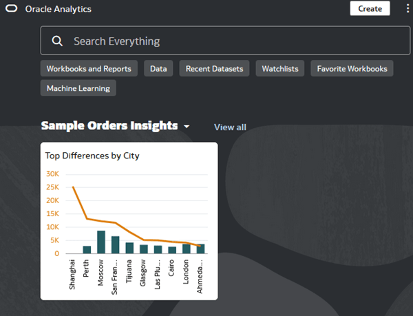
Description of the illustration home_page_watchlist.png
Add Filters to the Workbook
In this section, you add dashboard filters that let consumers filter the data in the workbook. When a user selects a filter value, the underlying AI generates updated contextual insights visualizations.
- On your home page, hover over your contextual insights workbook, click Actions, and select Open. Click Edit.
- Click Visualizations
 . In Visualizations, drag Dashboard Filters
  and release it on the canvas above the scatter visualization.

Description of the illustration db_filter_control.png - Click Data .
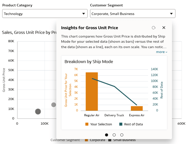
- In Data, select and drag Product Category to the dashboard filter. Select and drag Customer Segment to the dashboard filter.
- Click Preview .
- Select Technology from Product Category and select Corporate and Small Business from Customer Segment.
- In the scatter visualization, select a data point, right-click and select Explain Selected.

Description of the illustration preview_w_db_filters.png - While contextual insights are open, select a different data point. Click Refresh
 to generate updated insights.
Description of the illustration refreshed_insights.png
Learn More
Enable Contextual Insights in Oracle Analytics
G47495-01
January 2026
Learn how to enable contextual insights for users in your Oracle Analytics workbook.
This software and related documentation are provided under a license agreement containing restrictions on use and disclosure and are protected by intellectual property laws. Except as expressly permitted in your license agreement or allowed by law, you may not use, copy, reproduce, translate, broadcast, modify, license, transmit, distribute, exhibit, perform, publish, or display any part, in any form, or by any means. Reverse engineering, disassembly, or decompilation of this software, unless required by law for interoperability, is prohibited.
If this is software or related documentation that is delivered to the U.S. Government or anyone licensing it on behalf of the U.S. Government, then the following notice is applicable:
U.S. GOVERNMENT END USERS: Oracle programs (including any operating system, integrated software, any programs embedded, installed or activated on delivered hardware, and modifications of such programs) and Oracle computer documentation or other Oracle data delivered to or accessed by U.S. Government end users are "commercial computer software" or "commercial computer software documentation" pursuant to the applicable Federal Acquisition Regulation and agency-specific supplemental regulations. As such, the use, reproduction, duplication, release, display, disclosure, modification, preparation of derivative works, and/or adaptation of i) Oracle programs (including any operating system, integrated software, any programs embedded, installed or activated on delivered hardware, and modifications of such programs), ii) Oracle computer documentation and/or iii) other Oracle data, is subject to the rights and limitations specified in the license contained in the applicable contract. The terms governing the U.S. Government's use of Oracle cloud services are defined by the applicable contract for such services. No other rights are granted to the U.S. Government.
This software or hardware is developed for general use in a variety of information management applications. It is not developed or intended for use in any inherently dangerous applications, including applications that may create a risk of personal injury. If you use this software or hardware in dangerous applications, then you shall be responsible to take all appropriate fail-safe, backup, redundancy, and other measures to ensure its safe use. Oracle Corporation and its affiliates disclaim any liability for any damages caused by use of this software or hardware in dangerous applications.
Oracle and Java are registered trademarks of Oracle and/or its affiliates. Other names may be trademarks of their respective owners.
Intel and Intel Inside are trademarks or registered trademarks of Intel Corporation. All SPARC trademarks are used under license and are trademarks or registered trademarks of SPARC International, Inc. AMD, Epyc, and the AMD logo are trademarks or registered trademarks of Advanced Micro Devices. UNIX is a registered trademark of The Open Group.
This software or hardware and documentation may provide access to or information about content, products, and services from third parties. Oracle Corporation and its affiliates are not responsible for and expressly disclaim all warranties of any kind with respect to third-party content, products, and services unless otherwise set forth in an applicable agreement between you and Oracle. Oracle Corporation and its affiliates will not be responsible for any loss, costs, or damages incurred due to your access to or use of third-party content, products, or services, except as set forth in an applicable agreement between you and Oracle.