Before you Begin
This tutorial shows how to add a dashboard filter with a slider control to filter measures using a time dimension in your workbook.
Background
The dashboard filter is a visualization type that you add to the workbook Visualize canvas. You can filter measures such as revenue, profit, sales, and the number of units sold using a time dimension. This tutorial uses Year as the time dimension. You define the slider action to play or use the default manual interaction mode. Consumers viewing your workbook click a value on the slider to move between values or click Play. If play is enabled, consumers can speed up or slow down the animation, and repeat the animation.
What Do You Need?
- Access to Oracle Analytics
- Download sample_revenue.xlsx to your computer
Create a Dataset
In this section, you create a dataset to use in the visualizations.
- Sign in to Oracle Analytics as a content author.
- On the Home page, click Create, and then select Dataset.
- In Create Dataset, click Drop data file here or click to browse, select the sample_revenue.xlsx file, and then click Open.
- In Create Dataset Table From sample_revenue.xlsx, click OK.
- Click Save Dataset
 . In Save Dataset As, enter
 samp_revenuein Name, and then click OK.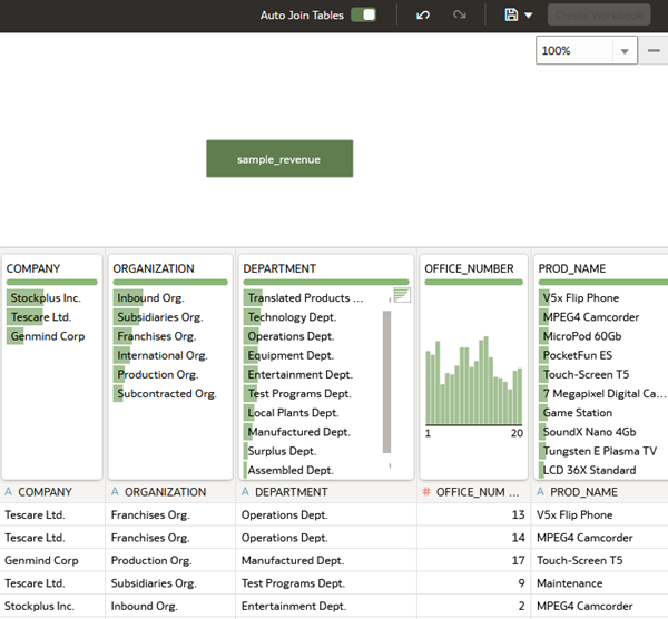
Description of the illustration sample_revenue_dataset.png
Create a Workbook and Visualization
In this section, you create a workbook that uses the samp_revenue dataset, and a bar visualization with product type and revenue data elements.
- Click Create Workbook. Close the Auto-Insights pane.
- Hold down the Ctrl key, click PROD_TYPE and REVENUE in the Data pane, and then drag them to the canvas.
Oracle Analytics automatically creates the best visualization type for the selected data elements.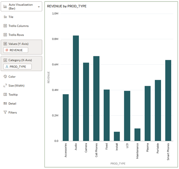
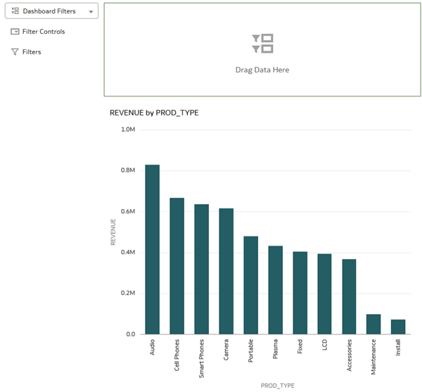
Description of the illustration revenue_by_prodtype.png - Click the visualization Menu
 , select Sort By, select Revenue, and then select High to Low.
 - Click Save . In Save Workbook, enter a Name, and then click Save.
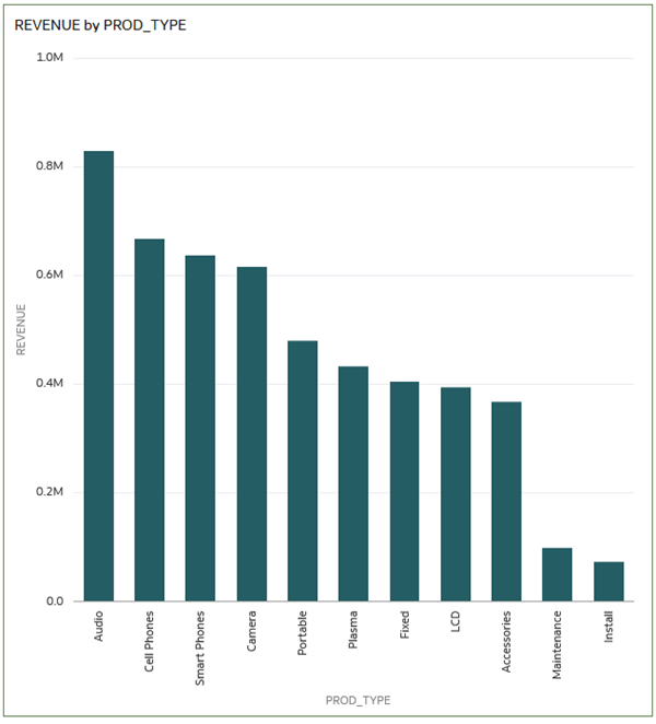
Description of the illustration revenue_high_to_low.png
Add a Dashboard Slider Filter
In this section, you add a dashboard filter visualization and configure the control as a slider. Consumers of the visualization manually interact with the slider by clicking on the values.
- Click Visualizations
 . Scroll to Dashboard Controls, select Dashboard Filters
  .
.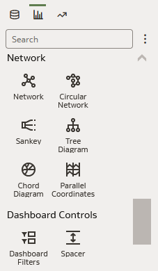
Description of the illustration viz_menu_dashboard_controls.png - Drag the Dashboard Filters visualization to the canvas, and then release it above the REVENUE by PROD_TYPE visualization.
Description of the illustration dashboard_filter_viz.png - Click Data
 . In the Data pane, expand BILL_DAY_DT (Year), click Year, and then drag it to the Dashboard Filter visualization.
 - Click Properties
 . In BILL_DAY_DT (Year) properties, click Filter Controls
  . In the Filter Type row, click List, and then select Slider.
 - In BILL_DAY_DT (Year) properties, click General
 . In the Title row, click None, and then select Custom. Enter
 Billing Date Yearas the title. - In the Title Font row, click Auto, and then select 16 from the font size list.
- In the Align row, click the alignment box
 . In the larger box click the top row center cell
  to move the slider to the center of the dashboard filter visualization.
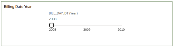
Description of the illustration slider_center_alignment.png - Click Save .
- Click Preview
 to see the consumer view of the visualizations.
 - In Preview, click 2009 on the Billing Date Year slider to see the Revenue by Product Type results.
The preview shows the dashboard slider filter set to use manual interaction. The consumer must click a value on the slider to view the data.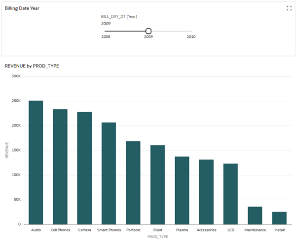
Description of the illustration slider_preview.png - Click Edit
 to return to the Visualize canvas.
Change the Slider Properties
In this section, you update the dashboard filter slider to automatically play through the values on the slider.
- Select the Billing Date Year visualization. In properties, click Filter Controls . Click Off in the Play row to enable the slider.
The slider is updated with the Play
 , Speed
  , and Repeat
  icons.
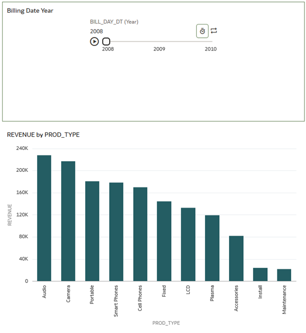
Description of the illustration animate_slider.png - Click Preview to see the consumer view of the visualizations.
- In Preview, click Play on the slider to see the revenue by product type results.
- Click Speed. Select Custom, enter
10for ten seconds, and then click Repeat. - Click Play to see the animation.
Add a Visualization
- Click Edit to return to the Visualize page.
- In the Data panel, hold down the Ctrl key, click UNITS and PROD_TYPE, and then drag them to the canvas and release above the REVENUE by PROD_TYPE visualization.
- Click the visualization menu, select Sort By, select UNITS, and then select High to Low.
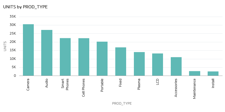
Description of the illustration units_by_prod_type.png - Click Save .
- Click Preview to see the consumer view of the visualizations.
- In Preview, click Play on the slider to see results in both visualizations.
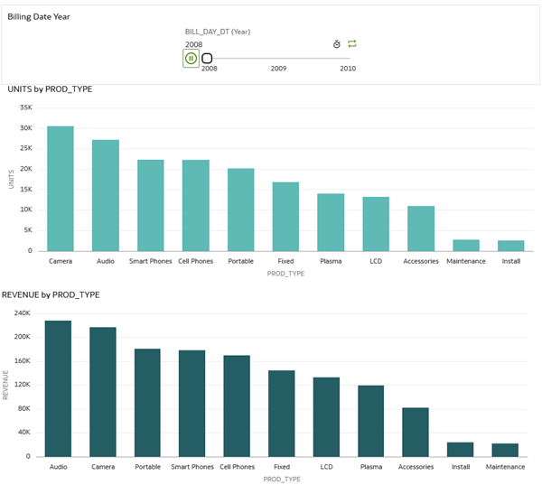
Description of the illustration slider_2_vizs.png
Learn More
Create a Slider Control to Filter Values in Oracle Analytics
F72231-02
March 2025
Learn how to create a dashboard filter that uses a slider control in Oracle Analytics.
This software and related documentation are provided under a license agreement containing restrictions on use and disclosure and are protected by intellectual property laws. Except as expressly permitted in your license agreement or allowed by law, you may not use, copy, reproduce, translate, broadcast, modify, license, transmit, distribute, exhibit, perform, publish, or display any part, in any form, or by any means. Reverse engineering, disassembly, or decompilation of this software, unless required by law for interoperability, is prohibited.
If this is software or related documentation that is delivered to the U.S. Government or anyone licensing it on behalf of the U.S. Government, then the following notice is applicable:
U.S. GOVERNMENT END USERS: Oracle programs (including any operating system, integrated software, any programs embedded, installed or activated on delivered hardware, and modifications of such programs) and Oracle computer documentation or other Oracle data delivered to or accessed by U.S. Government end users are "commercial computer software" or "commercial computer software documentation" pursuant to the applicable Federal Acquisition Regulation and agency-specific supplemental regulations. As such, the use, reproduction, duplication, release, display, disclosure, modification, preparation of derivative works, and/or adaptation of i) Oracle programs (including any operating system, integrated software, any programs embedded, installed or activated on delivered hardware, and modifications of such programs), ii) Oracle computer documentation and/or iii) other Oracle data, is subject to the rights and limitations specified in the license contained in the applicable contract. The terms governing the U.S. Government's use of Oracle cloud services are defined by the applicable contract for such services. No other rights are granted to the U.S. Government.
This software or hardware is developed for general use in a variety of information management applications. It is not developed or intended for use in any inherently dangerous applications, including applications that may create a risk of personal injury. If you use this software or hardware in dangerous applications, then you shall be responsible to take all appropriate fail-safe, backup, redundancy, and other measures to ensure its safe use. Oracle Corporation and its affiliates disclaim any liability for any damages caused by use of this software or hardware in dangerous applications.
Oracle and Java are registered trademarks of Oracle and/or its affiliates. Other names may be trademarks of their respective owners.
Intel and Intel Inside are trademarks or registered trademarks of Intel Corporation. All SPARC trademarks are used under license and are trademarks or registered trademarks of SPARC International, Inc. AMD, Epyc, and the AMD logo are trademarks or registered trademarks of Advanced Micro Devices. UNIX is a registered trademark of The Open Group.
This software or hardware and documentation may provide access to or information about content, products, and services from third parties. Oracle Corporation and its affiliates are not responsible for and expressly disclaim all warranties of any kind with respect to third-party content, products, and services unless otherwise set forth in an applicable agreement between you and Oracle. Oracle Corporation and its affiliates will not be responsible for any loss, costs, or damages incurred due to your access to or use of third-party content, products, or services, except as set forth in an applicable agreement between you and Oracle.