Before you Begin
This 10-minute tutorial shows you how to create a map, change the map's name, background color, and colors representing the sales data element. You also add zoom controls to the map view.
Background
You can create maps to visualize data such as sales by city and country, products purchased in a specific region, and determine where you might need to add sales resources.
What Do You Need?
- Access to Oracle Analytics
- Download world_cities_data.xlsx to your computer
Create a Dataset
In this section, you create a Dataset and workbook with a spreadsheet data source.
- Sign in to Oracle Analytics.
- On the Home page, click Create, and then click Dataset.
- In Create Dataset, click Drop data file here or click to browse. In Open File, select the
world_cities_data.xlsxfile, and then click Open. - In Create Dataset Table from world_cities_data.xlsx, click OK.
- Click Save. In Save Dataset As, enter
world_cities_datain Name, and click OK.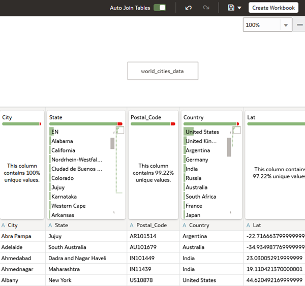
Description of the illustration world_cities_data_set.png - In world_cities_data, click Create Workbook.
Create a Map View
In this section, you select data elements and pick a map visualization to represent the data.
- Close the Auto Insights panel if it opens.
- In the Data panel, hold down the Ctrl key, and then select Country and Sales. Right-click, select Pick Visualization, and then select Map
 .
.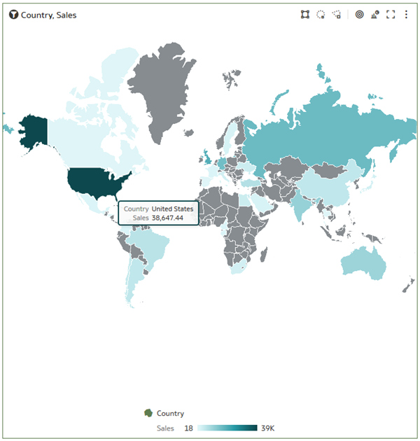
Description of the illustration default_map.png
Change the Map
In this section, you change the map background.
- Select the map visualization. In the visualization's properties, click Auto in the Title row, select Custom, and then enter
World Sales. - In Properties, click Map . Click Default (Thematic) in the Background Map row, and then select Oracle DataViz.
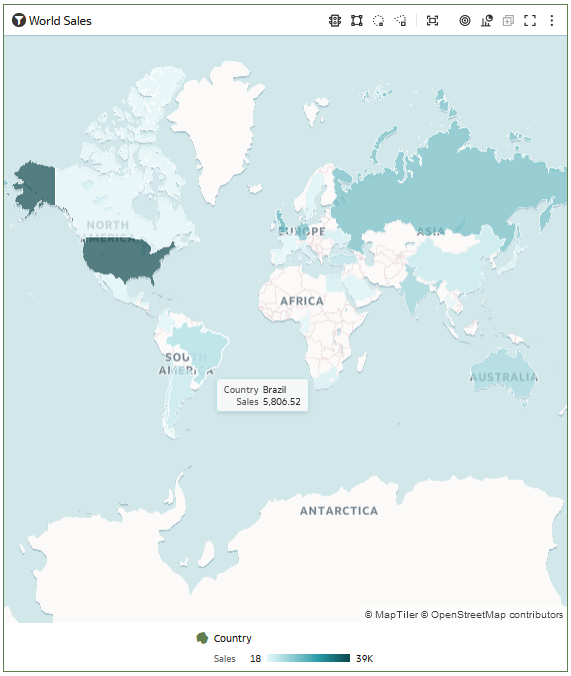
Description of the illustration oracle_dataviz_map.png
Add Zoom Controls
In this section, you add Zoom Controls to increase (+) or decrease (-) the size of the map.
- In Properties, click Map , and then click Off in the Zoom Control row to enable zoom controls in the map view.
- Click Zoom in
 until eastern Europe and Russia are in view. Hover over Russia to see the total sales.
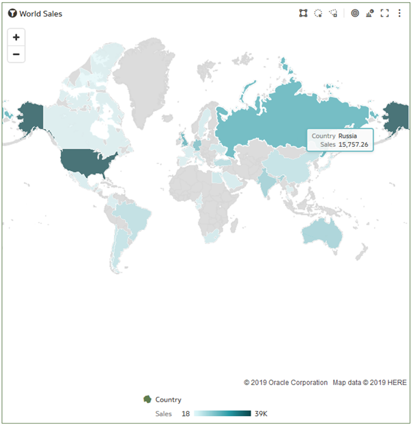
Description of the illustration zoom_control.png
Change Map Color
In this section, you change the default color used to represent sales data points. You can implement different color options by entering the web color number representing the color that you want to use, or by selecting Manage Assignments from the Color menu.
- In the map view, click Menu
 , select Color, and then select Manage Assignments. In Manage Color Assignments, click Default (Redwood), and then select a Series Color Palette such as Southwest.
 - Click Presets
 next to the Sales color scale, select Viridis, and then click Done.
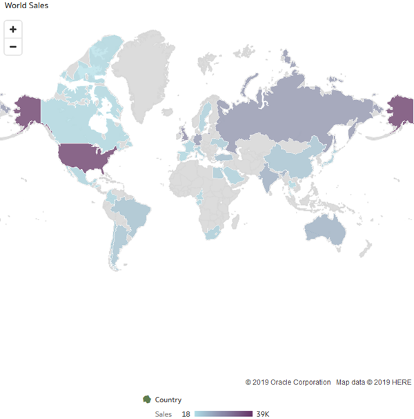
Description of the illustration new_sales_color.png
Learn More
Create a Map Visualizations of Your Data
E91853-06
July 2024
Learn how to customize your map visualizations.
This software and related documentation are provided under a license agreement containing restrictions on use and disclosure and are protected by intellectual property laws. Except as expressly permitted in your license agreement or allowed by law, you may not use, copy, reproduce, translate, broadcast, modify, license, transmit, distribute, exhibit, perform, publish, or display any part, in any form, or by any means. Reverse engineering, disassembly, or decompilation of this software, unless required by law for interoperability, is prohibited.
If this is software or related documentation that is delivered to the U.S. Government or anyone licensing it on behalf of the U.S. Government, then the following notice is applicable:
U.S. GOVERNMENT END USERS: Oracle programs (including any operating system, integrated software, any programs embedded, installed or activated on delivered hardware, and modifications of such programs) and Oracle computer documentation or other Oracle data delivered to or accessed by U.S. Government end users are "commercial computer software" or "commercial computer software documentation" pursuant to the applicable Federal Acquisition Regulation and agency-specific supplemental regulations. As such, the use, reproduction, duplication, release, display, disclosure, modification, preparation of derivative works, and/or adaptation of i) Oracle programs (including any operating system, integrated software, any programs embedded, installed or activated on delivered hardware, and modifications of such programs), ii) Oracle computer documentation and/or iii) other Oracle data, is subject to the rights and limitations specified in the license contained in the applicable contract. The terms governing the U.S. Government's use of Oracle cloud services are defined by the applicable contract for such services. No other rights are granted to the U.S. Government.
This software or hardware is developed for general use in a variety of information management applications. It is not developed or intended for use in any inherently dangerous applications, including applications that may create a risk of personal injury. If you use this software or hardware in dangerous applications, then you shall be responsible to take all appropriate fail-safe, backup, redundancy, and other measures to ensure its safe use. Oracle Corporation and its affiliates disclaim any liability for any damages caused by use of this software or hardware in dangerous applications.
Oracle and Java are registered trademarks of Oracle and/or its affiliates. Other names may be trademarks of their respective owners.
Intel and Intel Inside are trademarks or registered trademarks of Intel Corporation. All SPARC trademarks are used under license and are trademarks or registered trademarks of SPARC International, Inc. AMD, Epyc, and the AMD logo are trademarks or registered trademarks of Advanced Micro Devices. UNIX is a registered trademark of The Open Group.
This software or hardware and documentation may provide access to or information about content, products, and services from third parties. Oracle Corporation and its affiliates are not responsible for and expressly disclaim all warranties of any kind with respect to third-party content, products, and services unless otherwise set forth in an applicable agreement between you and Oracle. Oracle Corporation and its affiliates will not be responsible for any loss, costs, or damages incurred due to your access to or use of third-party content, products, or services, except as set forth in an applicable agreement between you and Oracle.