 Creating Your Map View
 Before You Begin
This 15-minute tutorial shows you how to create an analysis and display results in a map view.
Background
In an analysis, a map view is rendered by using the formatting that you added to the map layer. Formatting can be color fill, graph (bar, pie, bubble, or line), variable shape, or image.
What Do You Need?
- Access to Oracle Analytics Cloud
 Create an Analysis with a Map View
- Sign in to Oracle Analytics Cloud with your credentials.
- On the Home page, click Page Menu
 , and then select Open Classic Home.
 - On the Classic Home page, under Create, click Analysis.
- In the Select Subject Area dialog box, click revenue_by_brand.
- On the analysis page, click the Criteria tab, and expand revenue_by_brand. Drag the following columns to Selected Columns:
- Country Name
- City
- Brand
- Revenue
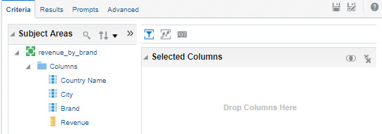
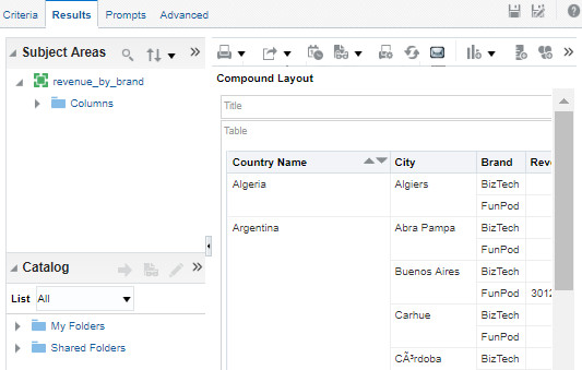
Description of the illustration oac_criteria_tab.jpg - On the Results tab, review the values for the business intelligence columns.
Description of the illustration oac_results_tab.jpg - Click New View
 , and select Map.
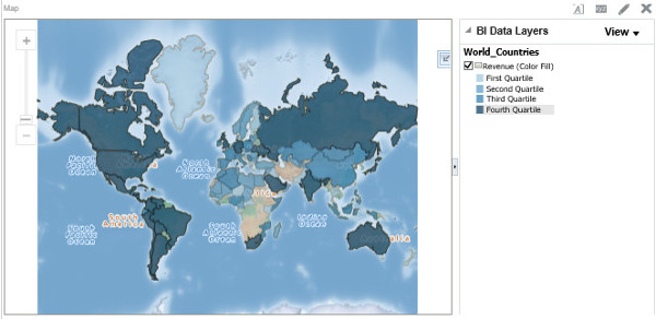
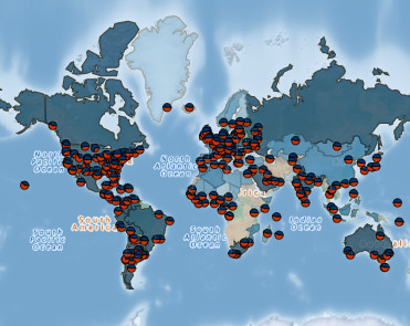
Description of the illustration oac_initial_map_view.jpg - In the Map view, click Zoom In
 to enlarge the map. Hover your cursor over Russia to view the total revenue amount by country.
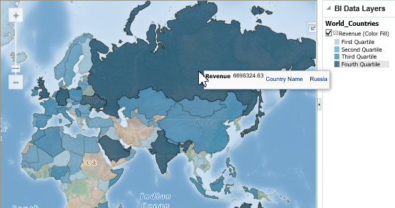
Description of the illustration oac_russia_revenue.jpg
 Edit Your Map View
- On the analysis page, click the Results tab. For the Map view, click Edit View
 to open the Edit Map page.
 - In BI Data Layers, click Add new map formats , select Pie Graph, and then select World_Cities. In Information, click OK.
- In the Pie Graph (World_Cities) dialog box, enter
5in the Graph Size field, select Brand from the Slices drop-down list, and click OK.The map view displays revenue by brand for all cities in the pie graph format and revenue by country in the color fill format.
Description of the illustration oac_world_cities_and_countries.jpg - In the Map view, click Zoom In . To view revenue by brand for Nairobi, hover your cursor over the pie graph
 in Kenya.
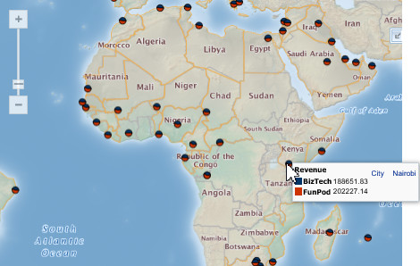
Description of the illustration oac_world_cities_brand_nairobi.jpg - For the World_Countries layer, click Edit .
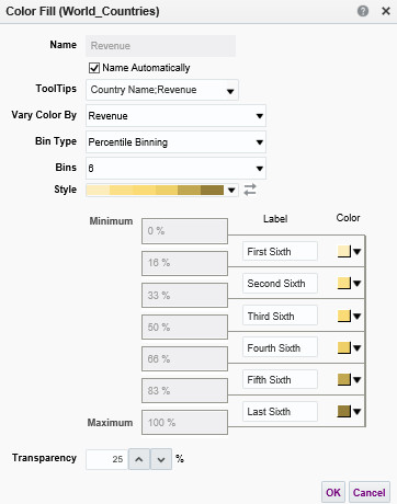
- In the Color Fill (World_Countries) dialog box, select 6 from the Bins drop-down list. From the Style drop-down list, select the shades of yellow with the FDEDBD, FCE087, FBDB76, EFCF67, C2A751, and 947E3A HEX color codes. Click OK, and then click Done.
Description of the illustration oac_color_fill_details.jpg The map is displayed with the modified settings.
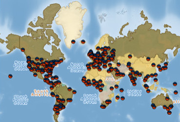
Description of the illustration oac_modified_map.jpg - Click Save Analysis
 . In the Save As dialog box, enter
 Revenue by Brand Across World Citiesfor the name, and click OK.