Before You Begin
This tutorial shows you how to create a 100% stacked bar chart and change it into a Mekko chart in Oracle Analytics.
Background
A Mekko chart, also known as a mosaic or Marimekko chart, represents multiple dimensions with a size value. To change a bar chart into a Mekko chart, you reduce the gap between bars to zero. The varied size of the segments in the Mekko chart enable evaluating the impactful segments from those with less impact.
A thin line separates the rectangular segments of the Mekko chart. You can add data labels that provide the percentage, value, and data element involved in each segment.
You can create a Mekko chart from the other bar visualization types available in Oracle Analytics.
Time dimensions aren't supported as the size dimension in Oracle Analytics.
What Do You Need?
- Access to Oracle Analytics
- Download sample_order_lines2023.xlsx to your computer
Create a Dataset
In this section, you create a dataset to use for creating visualizations.
- Sign in to Oracle Analytics.
- On your home page, click Create, and then select Dataset.
- In Create Dataset, click Drop data file here or click to browse, select the sample_order_lines2023.xlsx file, and then click Open.
- In Create Dataset Table from sample_order_lines2023.xlsx, click OK.
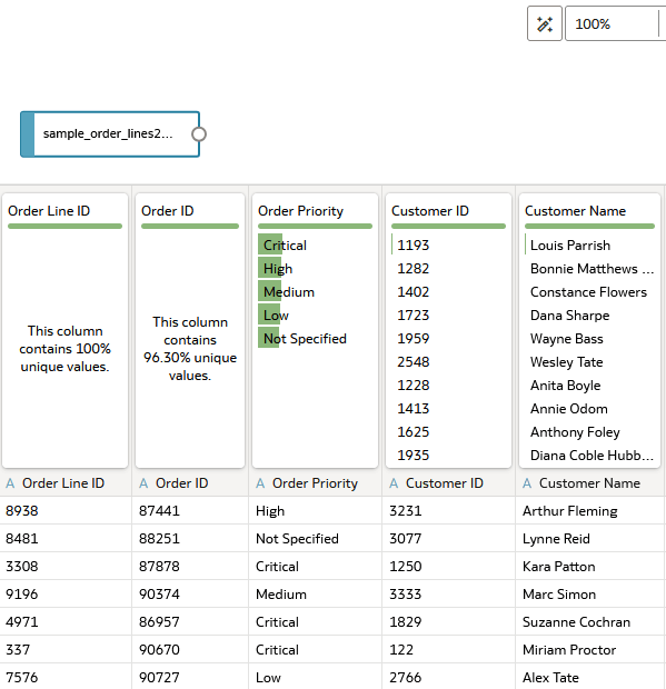
Description of the illustration sample_order_lines2023_jd.png - Click Save
 . In Save Dataset As, enter
 sample_order_lines2023, and then click OK.
Create a Stacked Bar
In this section, you create a stacked bar chart in preparation for creating a Mekko chart.
- Click Create Workbook.
- In the Data pane, hold down the Ctrl key, select Sales, Product Category, and Ship Mode.
- Right-click, select Pick Visualization, and then select 100% Stacked Bar
 .
. 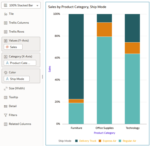
Description of the illustration 100percent_stacked_bar.png - In the Data pane, drag Shipping Cost to Size (Width) in the Grammar pane.
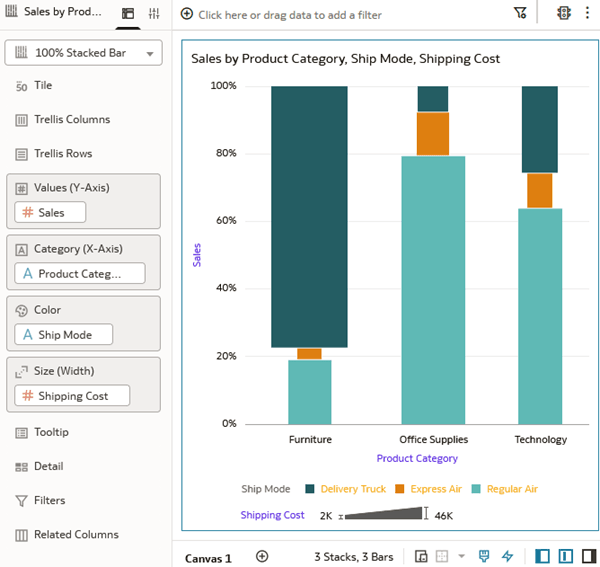
Description of the illustration shipping_cost.png - Click Save . In Save Workbook, enter
Mekko Chartin Name and click Save.
Update the Visualization's Properties
In this section, you update the visualization properties of the 100% stacked bar chart to change it into a Mekko chart.
- Click Properties
 . On the General
  tab, in the Bar Gap row, click 37 and move the slider to zero.
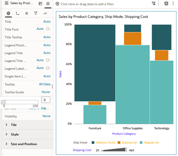
Description of the illustration bar_gap_zero.png - In the Bar Size row, click Apply to Segments and select Apply to Stack.
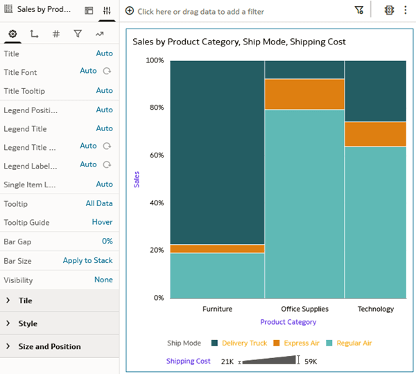
Description of the illustration mekko_chart.png - In Properties, click Values
 . Under Sales, click Off in the Data Labels Position and select Top.
 - In the Data Labels row, click Percent and click Value.
- In the Data Labels Font row, click Auto and click Data Label Font
 .
. - In Data Label Font, click #f4f3c5, the pale yellow color, and click OK.
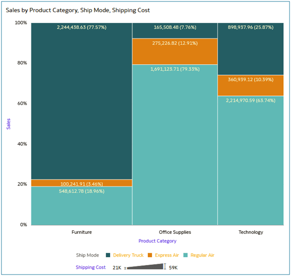
Description of the illustration mekko_data_labels.png - Click Save .
Change the Data Elements in the Mekko Chart
In this section, you change the data elements in the Mekko chart.
- In the Data pane, drag Customer Segment to Color in the Grammar panel to replace Ship Mode.
- In the Data pane, drag Quantity Order to Size (Width) in the Grammar panel to replace Shipping Cost.
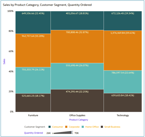
Description of the illustration cust_seg_sales.png
Learn More
Create a Mekko Chart in Oracle Analytics
G41270-01
September 2025
Learn how to create a Mekko chart in Oracle Analytics.
This software and related documentation are provided under a license agreement containing restrictions on use and disclosure and are protected by intellectual property laws. Except as expressly permitted in your license agreement or allowed by law, you may not use, copy, reproduce, translate, broadcast, modify, license, transmit, distribute, exhibit, perform, publish, or display any part, in any form, or by any means. Reverse engineering, disassembly, or decompilation of this software, unless required by law for interoperability, is prohibited.
If this is software or related documentation that is delivered to the U.S. Government or anyone licensing it on behalf of the U.S. Government, then the following notice is applicable:
U.S. GOVERNMENT END USERS: Oracle programs (including any operating system, integrated software, any programs embedded, installed or activated on delivered hardware, and modifications of such programs) and Oracle computer documentation or other Oracle data delivered to or accessed by U.S. Government end users are "commercial computer software" or "commercial computer software documentation" pursuant to the applicable Federal Acquisition Regulation and agency-specific supplemental regulations. As such, the use, reproduction, duplication, release, display, disclosure, modification, preparation of derivative works, and/or adaptation of i) Oracle programs (including any operating system, integrated software, any programs embedded, installed or activated on delivered hardware, and modifications of such programs), ii) Oracle computer documentation and/or iii) other Oracle data, is subject to the rights and limitations specified in the license contained in the applicable contract. The terms governing the U.S. Government's use of Oracle cloud services are defined by the applicable contract for such services. No other rights are granted to the U.S. Government.
This software or hardware is developed for general use in a variety of information management applications. It is not developed or intended for use in any inherently dangerous applications, including applications that may create a risk of personal injury. If you use this software or hardware in dangerous applications, then you shall be responsible to take all appropriate fail-safe, backup, redundancy, and other measures to ensure its safe use. Oracle Corporation and its affiliates disclaim any liability for any damages caused by use of this software or hardware in dangerous applications.
Oracle and Java are registered trademarks of Oracle and/or its affiliates. Other names may be trademarks of their respective owners.
Intel and Intel Inside are trademarks or registered trademarks of Intel Corporation. All SPARC trademarks are used under license and are trademarks or registered trademarks of SPARC International, Inc. AMD, Epyc, and the AMD logo are trademarks or registered trademarks of Advanced Micro Devices. UNIX is a registered trademark of The Open Group.
This software or hardware and documentation may provide access to or information about content, products, and services from third parties. Oracle Corporation and its affiliates are not responsible for and expressly disclaim all warranties of any kind with respect to third-party content, products, and services unless otherwise set forth in an applicable agreement between you and Oracle. Oracle Corporation and its affiliates will not be responsible for any loss, costs, or damages incurred due to your access to or use of third-party content, products, or services, except as set forth in an applicable agreement between you and Oracle.