Before You Begin
This tutorial shows you how to create a custom workbook theme and share your custom workbook theme with other workbooks in Oracle Analytics.
Background
When designing a color palette for your workbook theme, you might want to review the Web Content Accessibility Guidelines (WCAG) for contrast and color. You can add your company's color palette by entering the hexadecimal color codes instead of using the color picker in the Add Palette dialog.
You can change the fonts and apply a background color for the workbook theme. Custom background colors applied to visualizations override your workbook theme background color.
What Do You Need?
- Access to Oracle Analytics
- Download sample_dbf_wbk.dva to your computer
- Access as a Content Author with these permissions:
- Manage Themes and Layouts
- Create and Edit Shared Themes
- Create and Edit Shared Layouts
Import the Sample Workbook
In this section, you import the sample_dbf_wbk.dva file to use in this tutorial to create custom workbook themes.
- Sign in to Oracle Analytics.
- On the Home page, click Page Menu
 and select Import Workbook/Flow.
 - In Import Workbook/Flow, click Select File. In File Upload, select
sample_dbf_wbk.dvaand click Open. - In Import Workbook/Flow, click Import. When the message, Import successful displays, click OK.
- On the Home page, hover over sample_dbf_wbk, click Actions
 , and then select Open.
 - Click Edit
 .
.
Description of the illustration sample_wbk.png
Define the Theme's Color Palette
In this section, you customize the default Redwood theme by creating a color scheme to use for the workbook.
If you enter the Hex values for colors in this section, your colors should match the visualizations in this tutorial.
- In the workbook, click Menu and select Workbook Themes. Click the Redwood color scale in the Color series row and select Add Palette. In Name, enter
my_company_palette. - Click the gray box, click orange in the color scale, and then select a color or enter
#F4B315for the first color. - Click the empty box
 , click green in the color scale, and then select a color or enter
 #83F415for the second color. - Click the empty box , click turquoise the color scale, and then select a color or enter
#15F4ECfor the third color. - Click the empty box , click blue the color scale, and then select a color or enter
#1568F4for the fourth color. - Click the empty box , click pink the color scale, and then select a color or enter
#F415E0for the fifth color. - Click the empty box , click dark green the color scale, and then select a color or enter
#144309for the sixth color. - Click the empty box , click yellow the color scale, and then select a color or enter
#F4EFB7for the seventh color. Click OK.The color palette contains seven contrasting colors which haven't been tested for accessibility compliance.
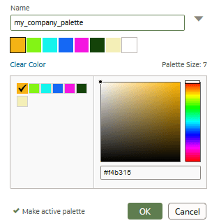
Description of the illustration custom_palette.png
Specify the Font Family
In this section, you specify the font family for the workbook and visualizations. The primary font color applies to the visualization titles, axis titles, and legend titles. The secondary font color applies to axis label values and legend label values.
- In Workbook Themes, click Auto in the Font family row under Workbook styles and click Verdana.
- In the Title font row under Visualization styles, click Auto.
- Click the Auto list, select Verdana.
- In the font size list, select 14, click B for bold, and then click OK.
You can see the font style changes in the Shipping Cost by Ship Mode, Product Category visualization.

Description of the illustration custom_colors_fonts.png
Share Your Workbook Theme
In this section, you name your workbook color palette and property changes as a theme to share with other workbooks. You use the Sample Order Lines dataset that was imported into Oracle Analytics with the sample_dbf_wbk.
- In Workbook Themes, click Menu
 the Theme row and click Save as new shared theme. In New Theme, enter
 My_co_themein Name and click Create. - Click Save
 and click Go back
  .
. - On the Home page, click Data. On the Data page, hover over Sample Order Lines, click Actions , and then select Create Workbook.
- Close the Insights panel.
- In the Data
 pane, hold down the Ctrl key, select Customer Segment, Product Sub Category, and Sales. Drag the data elements to the canvas.
Oracle Analytics creates a bar visualization using the Redwood workbook theme.

Description of the illustration new_wbk.png - Click the workbook Menu , select Workbook Themes. In the Theme row, click Redwood.
- In Shared Themes, click My_co_theme and click OK.
The visualization updates to use the My_co_theme colors and styles.

Description of the illustration shared_theme_wbk.png
Learn More
Create a Shared Custom Workbook Theme in Oracle Analytics
G17262-02
February 2026
Learn how to create and share custom themes for workbooks in Oracle Analytics.
This software and related documentation are provided under a license agreement containing restrictions on use and disclosure and are protected by intellectual property laws. Except as expressly permitted in your license agreement or allowed by law, you may not use, copy, reproduce, translate, broadcast, modify, license, transmit, distribute, exhibit, perform, publish, or display any part, in any form, or by any means. Reverse engineering, disassembly, or decompilation of this software, unless required by law for interoperability, is prohibited.
If this is software or related documentation that is delivered to the U.S. Government or anyone licensing it on behalf of the U.S. Government, then the following notice is applicable:
U.S. GOVERNMENT END USERS: Oracle programs (including any operating system, integrated software, any programs embedded, installed or activated on delivered hardware, and modifications of such programs) and Oracle computer documentation or other Oracle data delivered to or accessed by U.S. Government end users are "commercial computer software" or "commercial computer software documentation" pursuant to the applicable Federal Acquisition Regulation and agency-specific supplemental regulations. As such, the use, reproduction, duplication, release, display, disclosure, modification, preparation of derivative works, and/or adaptation of i) Oracle programs (including any operating system, integrated software, any programs embedded, installed or activated on delivered hardware, and modifications of such programs), ii) Oracle computer documentation and/or iii) other Oracle data, is subject to the rights and limitations specified in the license contained in the applicable contract. The terms governing the U.S. Government's use of Oracle cloud services are defined by the applicable contract for such services. No other rights are granted to the U.S. Government.
This software or hardware is developed for general use in a variety of information management applications. It is not developed or intended for use in any inherently dangerous applications, including applications that may create a risk of personal injury. If you use this software or hardware in dangerous applications, then you shall be responsible to take all appropriate fail-safe, backup, redundancy, and other measures to ensure its safe use. Oracle Corporation and its affiliates disclaim any liability for any damages caused by use of this software or hardware in dangerous applications.
Oracle and Java are registered trademarks of Oracle and/or its affiliates. Other names may be trademarks of their respective owners.
Intel and Intel Inside are trademarks or registered trademarks of Intel Corporation. All SPARC trademarks are used under license and are trademarks or registered trademarks of SPARC International, Inc. AMD, Epyc, and the AMD logo are trademarks or registered trademarks of Advanced Micro Devices. UNIX is a registered trademark of The Open Group.
This software or hardware and documentation may provide access to or information about content, products, and services from third parties. Oracle Corporation and its affiliates are not responsible for and expressly disclaim all warranties of any kind with respect to third-party content, products, and services unless otherwise set forth in an applicable agreement between you and Oracle. Oracle Corporation and its affiliates will not be responsible for any loss, costs, or damages incurred due to your access to or use of third-party content, products, or services, except as set forth in an applicable agreement between you and Oracle.