Before You Begin
This tutorial shows you how to add data bars to tables and pivot visualizations in Oracle Analytics.
Background
You can add data bars to a measure column in a table or pivot visualization. The data bars provide a visual representation of the size of the value in each row. You can change data bars' color, transparency, orientation from left to right or right to left, and whether the values in the row are visible. With data bars in measure columns, you can see the outliers in the records.
What Do You Need?
- Access to Oracle Analytics
- Download sample_order_lines2023.xlsx
Create a Dataset
In this section, you create a dataset using the sample_order_lines2023.xlsx file.
- Sign in to Oracle Analytics.
- On your home page, click Create and click Dataset.
- In Create Dataset, click Drop data file here or click to browse, select the sample_order_lines2023.xlsx file, and then click Open.
- In Create Dataset Table from sample_order_lines2023.xlsx, click OK. Click Save
 .
. - In Save Dataset As, enter sample_order_lines2023, and then click OK.
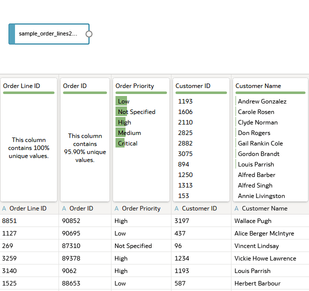
Description of the illustration sample_order_lines2023_ds.png
Create a Table
In this section, you create a table and add data bars to a measure column.
- Click Create Workbook.
- In the Data
 pane, select Product Sub Category and drag it to the canvas.
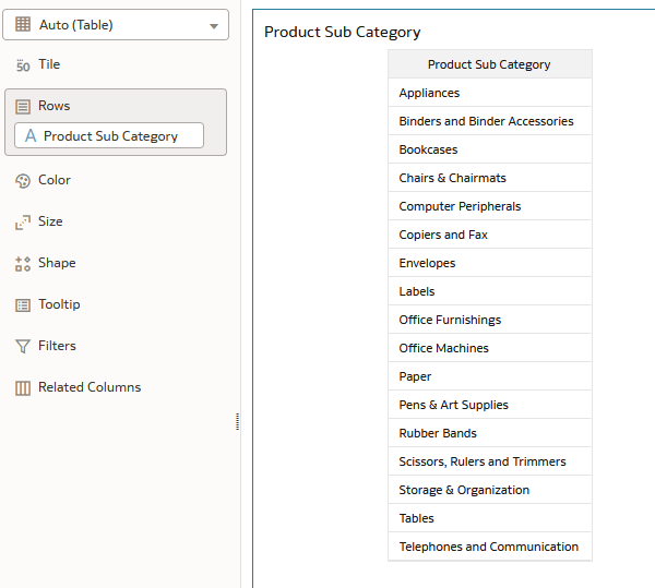
Description of the illustration prodsubcat_table.png - In the Data pane, select Sales and drag it to Rows in the Grammar pane under Product Sub Category.
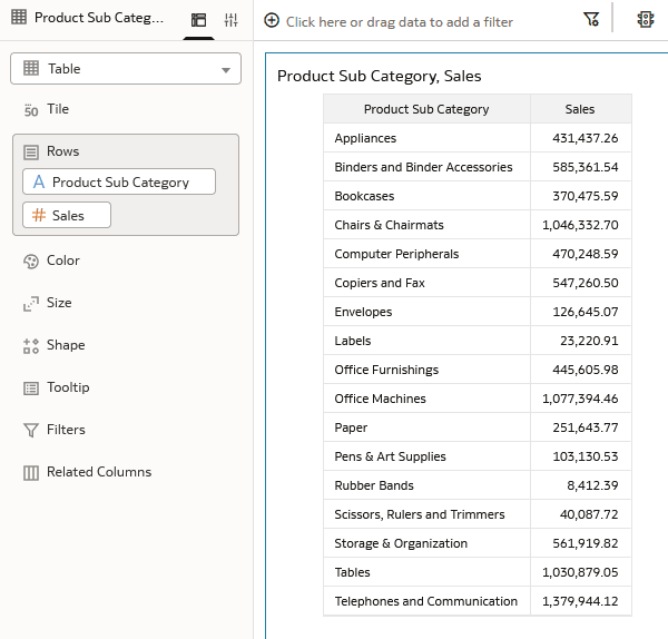
Description of the illustration prodsubcat_sales_table.png - Click Properties
 . In Properties, click Edge Labels
  .
. - Expand Sales. In the Chart row, click None and select Standard Bar.
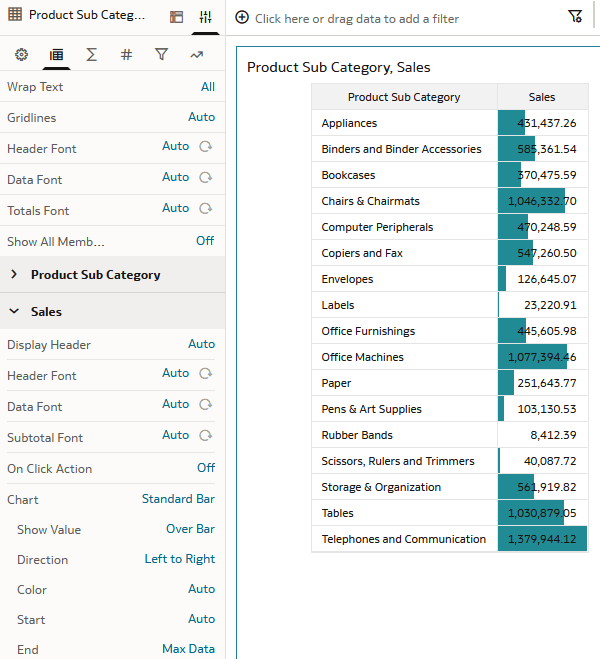
Description of the illustration sales_data_bars.png - Click Left to Right in the Direction row and select Right to Left.
- In the Color row, click Auto and select Custom. Click the box
 in the Fill Color row. Your instance might use a different default fill color.
 - In Fill Color, click a color in the palette and click OK.
This tutorial uses a light yellow, #eff0c2.
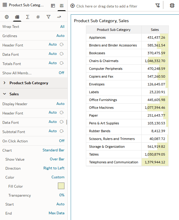
Description of the illustration table_data_bars.png
Create a Pivot
In this section, you change the table to a pivot visualization and add an attribute and two measures.
- In the Data pane, select Customer Segment and drag it to the table visualization, before the Product Sub Category column.
- In the Grammar pane, click Table
 and select Pivot
  .
.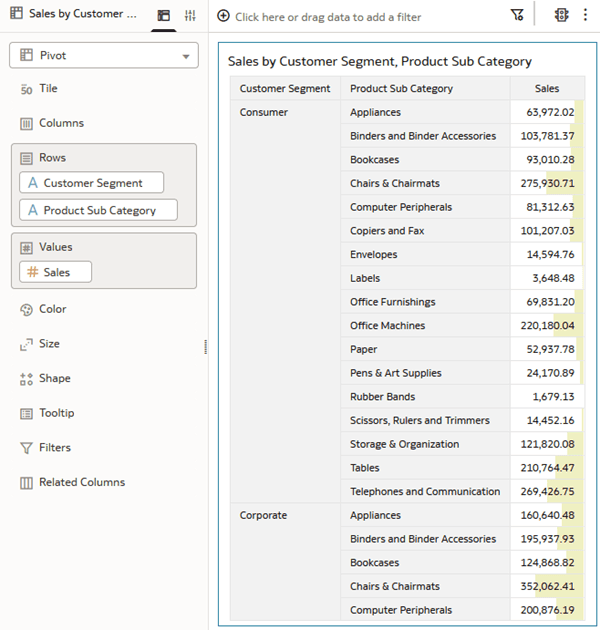
Description of the illustration custseg_in_table.png - In the Data pane, select Quantity Ordered and drag it to Values in the Grammar pane above Sales.
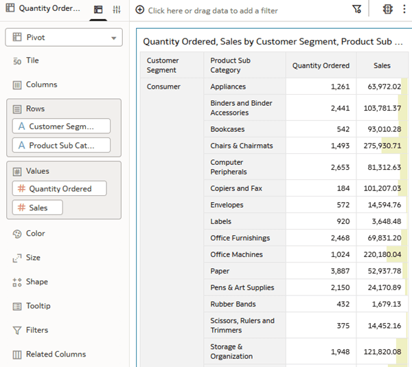
Description of the illustration qntyord_pivot.png - Click Properties . In Properties, click Edge Labels .
- In Edge Labels, expand Quantity Ordered, click None in the Chart row, and then select Standard Bar.
- Click Grammar.
- In the Data pane, select Profit and drag it to Values in the Grammar pane under Sales.
- Click Properties . In Properties, click Edge Labels .
- In Edge Labels, expand Profit, click None in the Chart row, and then select Standard Bar.
If a product sub category doesn't have a profit value, data bars point in the opposite direction for the positive value data bars.
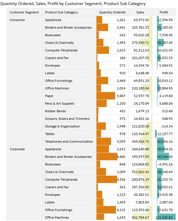
Description of the illustration profit_in_pivot.png
Learn More
Add Data Bars to Tables and Pivots in Oracle Analytics
G53274-01
May 2026
Learn how to add data bars to table and pivot visualizations in Oracle Analytics.
This software and related documentation are provided under a license agreement containing restrictions on use and disclosure and are protected by intellectual property laws. Except as expressly permitted in your license agreement or allowed by law, you may not use, copy, reproduce, translate, broadcast, modify, license, transmit, distribute, exhibit, perform, publish, or display any part, in any form, or by any means. Reverse engineering, disassembly, or decompilation of this software, unless required by law for interoperability, is prohibited.
If this is software or related documentation that is delivered to the U.S. Government or anyone licensing it on behalf of the U.S. Government, then the following notice is applicable:
U.S. GOVERNMENT END USERS: Oracle programs (including any operating system, integrated software, any programs embedded, installed or activated on delivered hardware, and modifications of such programs) and Oracle computer documentation or other Oracle data delivered to or accessed by U.S. Government end users are "commercial computer software" or "commercial computer software documentation" pursuant to the applicable Federal Acquisition Regulation and agency-specific supplemental regulations. As such, the use, reproduction, duplication, release, display, disclosure, modification, preparation of derivative works, and/or adaptation of i) Oracle programs (including any operating system, integrated software, any programs embedded, installed or activated on delivered hardware, and modifications of such programs), ii) Oracle computer documentation and/or iii) other Oracle data, is subject to the rights and limitations specified in the license contained in the applicable contract. The terms governing the U.S. Government's use of Oracle cloud services are defined by the applicable contract for such services. No other rights are granted to the U.S. Government.
This software or hardware is developed for general use in a variety of information management applications. It is not developed or intended for use in any inherently dangerous applications, including applications that may create a risk of personal injury. If you use this software or hardware in dangerous applications, then you shall be responsible to take all appropriate fail-safe, backup, redundancy, and other measures to ensure its safe use. Oracle Corporation and its affiliates disclaim any liability for any damages caused by use of this software or hardware in dangerous applications.
Oracle and Java are registered trademarks of Oracle and/or its affiliates. Other names may be trademarks of their respective owners.
Intel and Intel Inside are trademarks or registered trademarks of Intel Corporation. All SPARC trademarks are used under license and are trademarks or registered trademarks of SPARC International, Inc. AMD, Epyc, and the AMD logo are trademarks or registered trademarks of Advanced Micro Devices. UNIX is a registered trademark of The Open Group.
This software or hardware and documentation may provide access to or information about content, products, and services from third parties. Oracle Corporation and its affiliates are not responsible for and expressly disclaim all warranties of any kind with respect to third-party content, products, and services unless otherwise set forth in an applicable agreement between you and Oracle. Oracle Corporation and its affiliates will not be responsible for any loss, costs, or damages incurred due to your access to or use of third-party content, products, or services, except as set forth in an applicable agreement between you and Oracle.