Before You Begin
In this 15-minute tutorial, you learn how to create rules that apply conditional formatting to your data in Oracle Analytics visualizations.
Background
In Oracle Analytics, you can define rules on measures and attributes such as sales, profit, and product sub category. You can identify specific events with conditional formatting. You can create rules that format a measure compared to a specific target, a measure compared to a percentage of a value, a measure compared with the results of an expression, and a measure in a set of thresholds such as with a high, average, and low sales in a stoplight format.
Your rules define the visual formatting options such as bar, line, and cell colors, font and font styles, and background colors. When the condition exists that is defined in a rule, the visualization changes to show the formatting in your rule.
Your rules can apply to all visualizations in your workbook or to individual visualizations.
What Do You Need?
- Access to Oracle Analytics
- Download samples_orders_examples.xlsx to your computer
Create a Dataset and Workbook
In this section, you create a dataset from the spreadsheet file that you download to your computer.
- Sign in to Oracle Analytics.
- On the Home page, click Create, and then click Dataset.
- In Create Dataset, click Drop data file here or click to browse. In File Upload, select
sample_orders_examples.xlsx, and then click Open. - In Create Dataset Table from sample_orders_examples.xlsx, click OK.
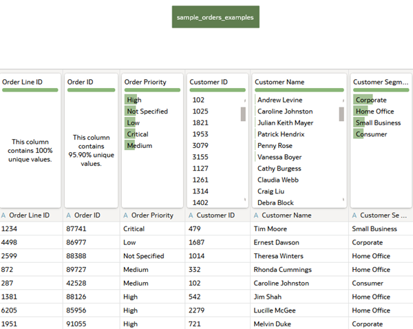
Description of the illustration dataset_table.png - Click Save. In Save Dataset As, enter
Sample Ordersin Name, and then click OK.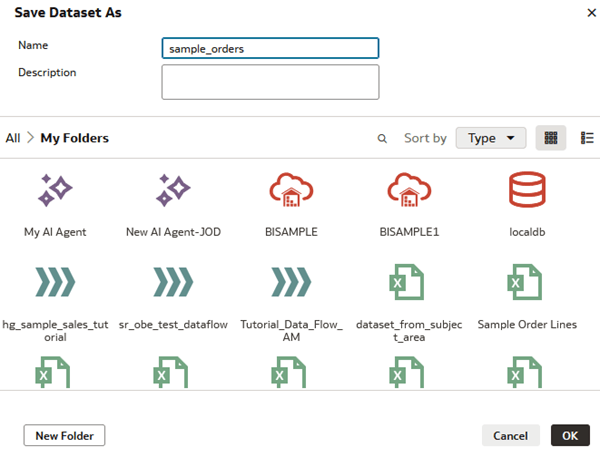
Description of the illustration saveas_select_folder.png
Create a Visualization
In this section, you create a visualization in the Sample Orders dataset.
- Click Create Workbook. Close the Insights panel.
- In the Data panel under Sample Orders, hold down the Ctrl key, select Sales, Profit, and Product Sub Category, and then drag them to the canvas.
Oracle Analytics automatically selects a scatter visualization.
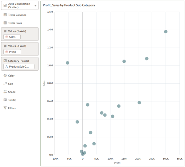
Description of the illustration sales_profit_scatter_viz.png - Select Product Sub Category in Category (Points) and drag it to Color.
- Select Profit in Values (X-axis) and drag it to Values (Y-axis) to change places with Sales.
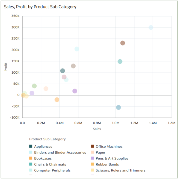
Description of the illustration scatter_color.png
Define a Conditional Formatting Rule
In this section, you define rules that format the data points that show the least profitable and the most profitable product sub categories.
- In the visualization, click Conditional Formatting
 .
. - In Conditional Formatting, enter
Least Profitable Productsin Name. - From the Column list, select Profit. From the operator list, click the less than symbol (<). In Target, enter
0(zero). - Click Format
 . In Format, select a color to use, and then click OK. Click Save.
This example uses bright pink (#f700d8) as the color.
Rubber bands, scissors, rulers, and trimmers aren't profitable items making the paperless office seem like a reality. Surprisingly, bookcases and tables aren't profitable.
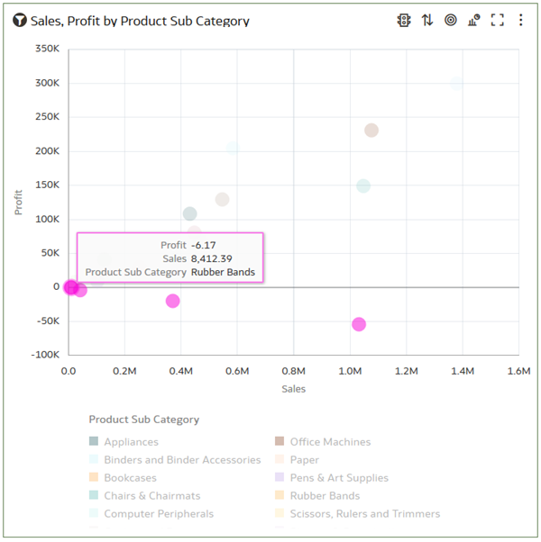
Description of the illustration no_profit_rubber_bands.png
Add a Condition
In this section, you add a condition to the least profitable products rule to format the most profitable products.
- Hover over the visualization and click Conditional Formatting .
- In Conditional Formatting, click Add Condition
 . Leave Profit as the column. From the operator list, select greater than (>), and in Target, enter
 100000. - Click Format , and select a color for the condition, and then click OK. Click Save.
This example uses bright green (#60ff00) as the color.
The colors of the product sub categories change for the data points that meet the conditional formatting rules.
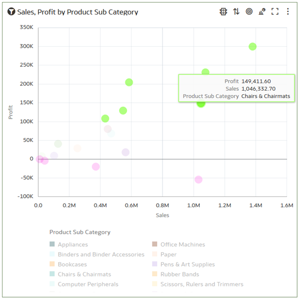
Description of the illustration most_profit.png - Click Save. In Save Workbook, enter
Sample Orders WB, and then click Save.
Change the Visualization Type
In this section, you change the visualization type to show the impact of the conditional formatting rules.
- In the visualization, click Menu
 , select Edit, and then select Duplicate Visualization.
 - Click Change Visualization Type
 , and then select Pivot.
 - In the visualization, click Menu , select Sort by, and then select Custom.
- In Sort Order, select Profit from the Sort By list, and then select Low to High. Click OK.
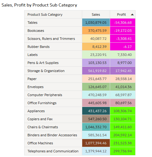
Description of the illustration sales_profit_pivot.png
Create a Threshold Conditional Formatting Rule
In this section, you create a conditional formatting rule that shows high, medium, and low thresholds in your sales data. This rule uses a three color format to represent thresholds and is frequently called stoplight or traffic light formatting.
- In each visualization, click Menu, and select Delete Visualization.
- In the Data panel, hold down the Ctrl key, select Sales and Product Sub Category, and then drag them to the canvas.
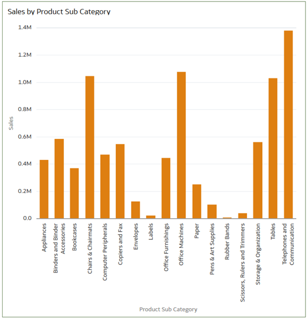
Description of the illustration sales_by_prod_sub_cat.png - Right-click, select Conditional Formatting, and then select Manage Rules.
- In Conditional Formatting, enter
Sales Milestonesin Name. From the Column list under Visualization Columns, select Sales. Click 3 Steps Threshold Preset .
. - In the less than (<) operator, enter
100000. Click Format, enter #e31c3dto make the lowest sales threshold red, and then click OK. - In the value in the next less than (<) operator, enter
500000. Click Format, and then enter #f9c642to color the mid-range sales yellow, and then click OK.Oracle Analytics inserts 500000 in greater than or equal to threshold.
- Next to the greater than or equal to (≥) threshold, click Format , enter
#2e8540to color the product sub categories with the highest sales green, click OK, and then click Save. - In the visualization, click Menu , select Sort by, and then select Sales, and then select Low to High.
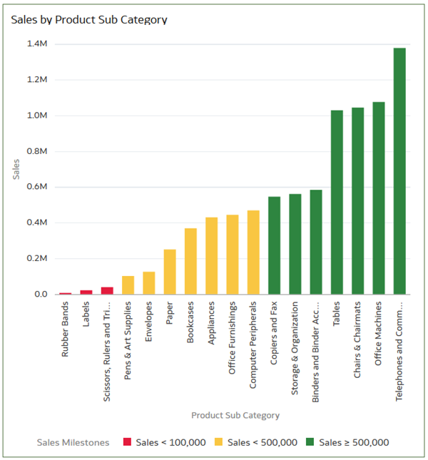
Description of the illustration sales_prod_sub_stoplight.png
Learn More
Define Rules to Conditionally Format Events
F45890-04
January 2026
Learn how to create rules that apply formatting to data when specific events happen in Oracle Analytics.
This software and related documentation are provided under a license agreement containing restrictions on use and disclosure and are protected by intellectual property laws. Except as expressly permitted in your license agreement or allowed by law, you may not use, copy, reproduce, translate, broadcast, modify, license, transmit, distribute, exhibit, perform, publish, or display any part, in any form, or by any means. Reverse engineering, disassembly, or decompilation of this software, unless required by law for interoperability, is prohibited.
If this is software or related documentation that is delivered to the U.S. Government or anyone licensing it on behalf of the U.S. Government, then the following notice is applicable:
U.S. GOVERNMENT END USERS: Oracle programs (including any operating system, integrated software, any programs embedded, installed or activated on delivered hardware, and modifications of such programs) and Oracle computer documentation or other Oracle data delivered to or accessed by U.S. Government end users are "commercial computer software" or "commercial computer software documentation" pursuant to the applicable Federal Acquisition Regulation and agency-specific supplemental regulations. As such, the use, reproduction, duplication, release, display, disclosure, modification, preparation of derivative works, and/or adaptation of i) Oracle programs (including any operating system, integrated software, any programs embedded, installed or activated on delivered hardware, and modifications of such programs), ii) Oracle computer documentation and/or iii) other Oracle data, is subject to the rights and limitations specified in the license contained in the applicable contract. The terms governing the U.S. Government's use of Oracle cloud services are defined by the applicable contract for such services. No other rights are granted to the U.S. Government.
This software or hardware is developed for general use in a variety of information management applications. It is not developed or intended for use in any inherently dangerous applications, including applications that may create a risk of personal injury. If you use this software or hardware in dangerous applications, then you shall be responsible to take all appropriate fail-safe, backup, redundancy, and other measures to ensure its safe use. Oracle Corporation and its affiliates disclaim any liability for any damages caused by use of this software or hardware in dangerous applications.
Oracle and Java are registered trademarks of Oracle and/or its affiliates. Other names may be trademarks of their respective owners.
Intel and Intel Inside are trademarks or registered trademarks of Intel Corporation. All SPARC trademarks are used under license and are trademarks or registered trademarks of SPARC International, Inc. AMD, Epyc, and the AMD logo are trademarks or registered trademarks of Advanced Micro Devices. UNIX is a registered trademark of The Open Group.
This software or hardware and documentation may provide access to or information about content, products, and services from third parties. Oracle Corporation and its affiliates are not responsible for and expressly disclaim all warranties of any kind with respect to third-party content, products, and services unless otherwise set forth in an applicable agreement between you and Oracle. Oracle Corporation and its affiliates will not be responsible for any loss, costs, or damages incurred due to your access to or use of third-party content, products, or services, except as set forth in an applicable agreement between you and Oracle.