 Enrich Data Sets in Oracle Analytics Cloud
 Before You Begin
This 10-minute tutorial shows you how to format and enrich data to remove unused columns, and enrich the existing data.
Background
You can add information to data using enrichment recommendations in the Oracle Analytics Cloud or Oracle Analytics Desktop. For example, in this tutorial you add longitude and latitude data to customers' address zip codes. You can also implement data format changes to improve how data is represented in a visualization. In this tutorial, sales data is a measure but is represented by a number with more than 2 decimal places. You can change the sales data to use a currency format.
After transforming and enriching the data set, you use the data set in this tutorial to create visualizations.
This is the second tutorial in Preparing Data Sets in Oracle Analytics. Read the tutorials in the order listed.
- Transform Data in Oracle Analytics Cloud
- Enrich Data in Oracle Analytics Cloud
What Do You Need?
- Access to Oracle Analytics Cloud or Oracle Analytics Desktop
- Access to the
accountinfo_salesdata set
 Enrich Data with Geographic Coordinates
- On the Home page, click Data in the search bar, enter
accountinfo_salesand the click Search. - In accountinfo_sales, click Options
 , and select Open.
 - In Results, select the zip column, click Enrich zip with Lat (latitude).
- In Recommendations, click Enrich zip with Lon (longitude).
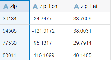
Description of the illustration zip_with_geo.png
 Change Data Properties
When the data is loaded, the columns might not use your expected format. For example, a column containing a number is treated as a measure rather than as an attribute. In this data set, phone number area code is a number. As a result when you extracted area code from the customer phone, it is a measure rather than an attribute.
In this section, you change the Sales and phone_number_area_code data columns to use the preferred data format.
- In Results, select the Sales column. In Properties, click Number Format
 . In Number Format, click Auto, and then select Currency.
 - Click Apply Script.
The changes are complete when the Apply Script progress indicator disappears.
- Click Back
 .
.
 Visualize Transformed and Enriched Data
The Data Elements pane shows the transformed and enriched data elements that you can use to create visualizations.
- On the Home page, click Create, and then click Project. In Add Data Set, click accountinfo_sales, and then click Add to Project.
- From the Data Elements pane, drag Sales to the canvas, and then drag state to the canvas.
A bar visualization is created with sales as the Y-Axis and state as the X-Axis. It looks like sales are the largest in California.
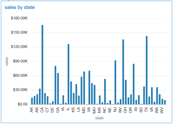
Description of the illustration original_sales_by_state.png - In the visualization, click Menu , select Sort, and then select state by sales High to Low.
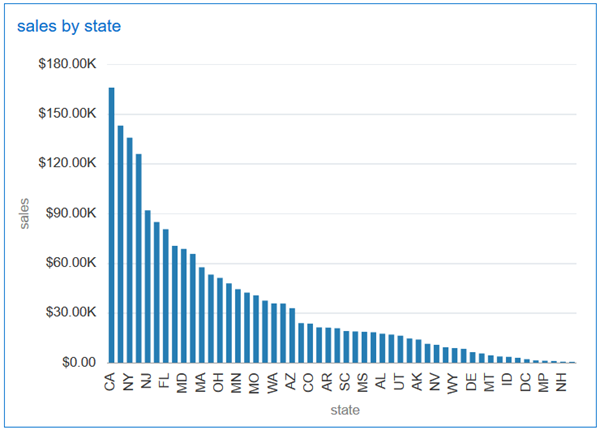
Description of the illustration sales_by_state_hi_low.png - Click Visualization Type
 , and select Map.
 - In the map visualization Properties, click Auto in the Title row, and then select Custom. In Title, enter
Sales by State.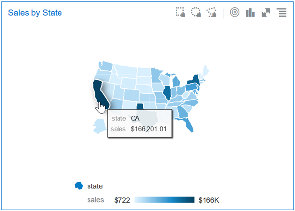
Description of the illustration sale_state_map.png - In the visualization, select Menu , and then select Duplicate Visual.
- Click Visualization Type , and select Area.
- Drag the data elements from the Data Elements pane to the drop targets in the Grammar pane, as shown in the table:
Data Element Drop Target Sales # Values Gender Category product line Color - In the area visualization Properties, click Auto in the Title row, and select Custom. In Title, enter
Sales by Gender and Product Line.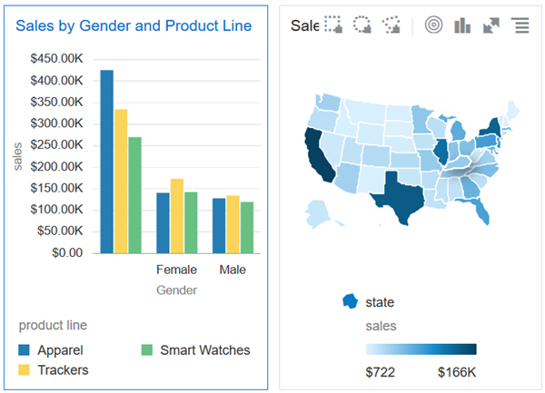
Description of the illustration area_viz_map.png