Before you Begin
This tutorial shows you how to adjust the size of data points in map visualizations in Oracle Analytics.
Background
In this tutorial, you associate latitude and longitude data columns with a map background, create a map visualization, and adjust the size of the data points in the map visualization.
When the data point bubbles are all the same size and use a graduated color scale, it's hard to see any data differences. You can mitigate this issue by changing the size of the bubbles that represent the data points.
What Do You Need?
- Access to Oracle Analytics
- Download donation.xlsx to your computer
Create a Dataset and Specify the Location Columns
In this section, you create a dataset using the donation spreadsheet file. When numerical data is loaded, it's treated as a measure. You need to change the Treat as value property in the SCH_LATITUDE and SCH_LONGITUDE columns to attributes so that you can associate them with a latitude and longitude map layer.
- Sign in to Oracle Analytics.
- On the Home page, click Create, and then click Dataset. In Create Dataset, click Drop data file here or click to browse, select the donation.xlsx file, and then click Open.
- In Create Dataset Table from donation.xlsx, click OK.
- In New Dataset, click the donation tab.
- Click the SCH_LATITUDE column. In Properties, click Measure in the Treat As row, and then select Attribute. In the SCH_LATITUDE column, click Options
 , select Location Details.
 - In Location Details: SCH_LATITUDE, when the Map Layer field contains Latitude, Longitude and the Location Type contains Latitude, click OK.
- Click the SCH_LONGITUDE column. In Properties, click Measure in the Treat As row, and then select Attribute. In the SCH_LONGITUDE column, click Options , select Location Details.
- In Location Details: SCH_LONGITUDE, when the Map Layer field contains Latitude, Longitude and the Location Type contains Longitude, click OK.
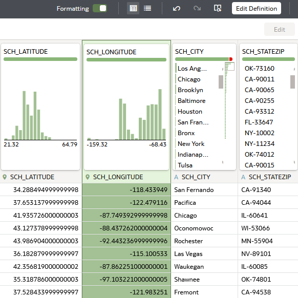
Description of the illustration geo_cols.png - Click Save
 . In Save Dataset As, enter
 donationsin Name, and then click OK.
Create a Map Visualization
In this section, you create a map visualization with data points for total donations at the latitude and longitude locations.
- In the donations dataset, click Create Workbook.
- Close the Auto Insights panel.
- In the Data panel, hold down the Ctrl key, select SCH_LATITUDE, SCH_LONGITUDE, TOTAL_DONATIONS, and then drag them to the canvas.
The data points cover most of the lower United States making the size of the donation at each location hard to determine.
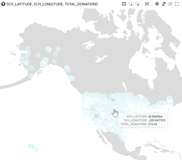
Description of the illustration donations_map.png
Modify the Map and Data Point Size
In this section, you change the map background and default colors to enhance the data points, and enable zoom control in the map visualization.
You don't need to implement the map background and default color changes to change the data point size.
- Click Properties
 . Click Map
  tab.
tab. - Click Off in the Zoom Control row to enable zooming in the visualization.
- In the Background Map row, click Default (Oracle BI), and then select Oracle Maps.
- Click Zoom in
 to focus visualization to show the densest data points.
 - In the visualization, click Menu, select Color, and then select Manage Assignments to change the color gradient used with the data points.
- In Manage Color Assignments under Series (Measures), click Presets
 , and then select Viridis. Click Done.
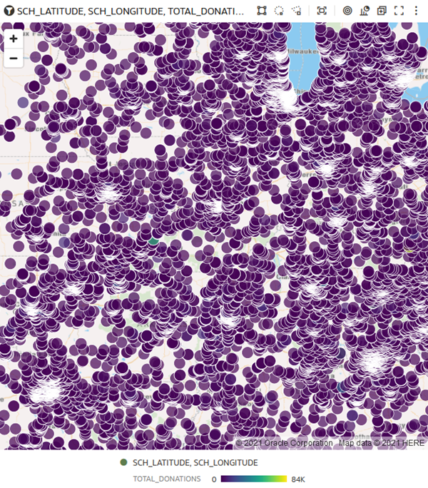
Description of the illustration map_new_colors.png - In the Properties panel, click Data Layers
 .
. - Click 18 in the Size row, use the slider to move to 6 pixels or enter
6in the field.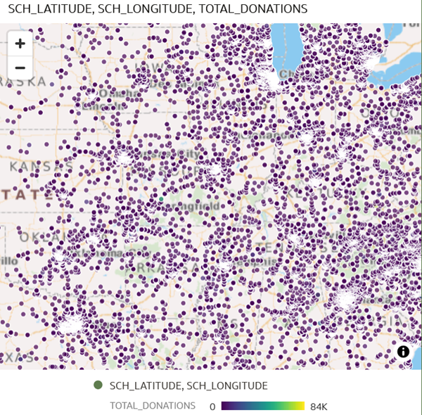
Description of the illustration smaller_data_points.png
Configure Data Point Measure Size
- Use Zoom in to focus the map visualization on the Chicago area or another dense data point area.
Because all of the data points are the same size, it's hard to tell which locations have the most donations.
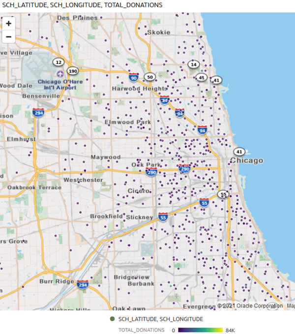
Description of the illustration chicago_datapoints.png - Click Grammar
 . In the Data panel, drag NUM_DONORS to Size in the Grammar pane.
 - Click Properties . Click Data Layers .
- In Min Size, enter
4to replace the 5. In Max Size, enter25to replace 20.The size minimum and maximum updates the data points using larger bubbles for locations with a larger number of donors.
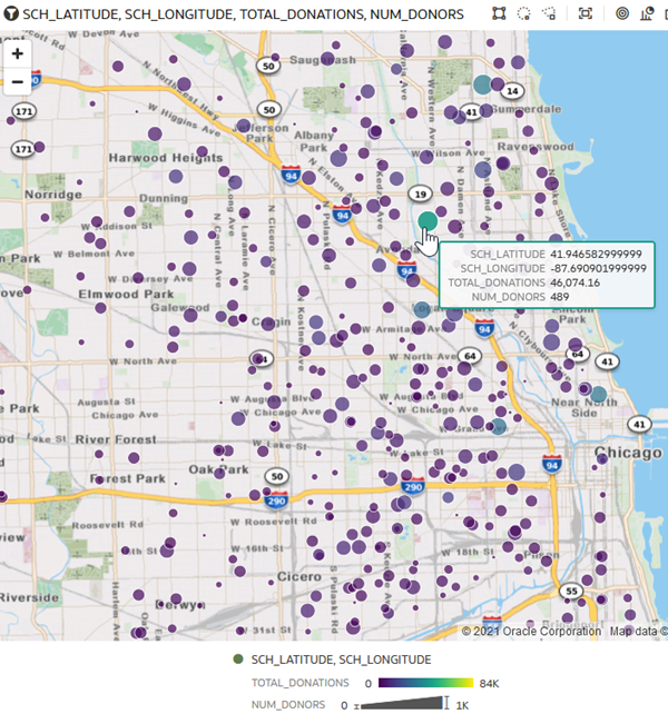
Description of the illustration total_donors_donations.png - Click Save to keep your workbook for review at another time.
Learn More
Change the Data Point Size on Map Visualizations in Oracle Analytics
F78420-02
March 2023
Copyright © 2023, Oracle and/or its affiliates.
Learn how to adjust data point sizes on map visualizations in Oracle Analytics.
This software and related documentation are provided under a license agreement containing restrictions on use and disclosure and are protected by intellectual property laws. Except as expressly permitted in your license agreement or allowed by law, you may not use, copy, reproduce, translate, broadcast, modify, license, transmit, distribute, exhibit, perform, publish, or display any part, in any form, or by any means. Reverse engineering, disassembly, or decompilation of this software, unless required by law for interoperability, is prohibited.
If this is software or related documentation that is delivered to the U.S. Government or anyone licensing it on behalf of the U.S. Government, then the following notice is applicable:
U.S. GOVERNMENT END USERS: Oracle programs (including any operating system, integrated software, any programs embedded, installed or activated on delivered hardware, and modifications of such programs) and Oracle computer documentation or other Oracle data delivered to or accessed by U.S. Government end users are "commercial computer software" or "commercial computer software documentation" pursuant to the applicable Federal Acquisition Regulation and agency-specific supplemental regulations. As such, the use, reproduction, duplication, release, display, disclosure, modification, preparation of derivative works, and/or adaptation of i) Oracle programs (including any operating system, integrated software, any programs embedded, installed or activated on delivered hardware, and modifications of such programs), ii) Oracle computer documentation and/or iii) other Oracle data, is subject to the rights and limitations specified in the license contained in the applicable contract. The terms governing the U.S. Government's use of Oracle cloud services are defined by the applicable contract for such services. No other rights are granted to the U.S. Government.
This software or hardware is developed for general use in a variety of information management applications. It is not developed or intended for use in any inherently dangerous applications, including applications that may create a risk of personal injury. If you use this software or hardware in dangerous applications, then you shall be responsible to take all appropriate fail-safe, backup, redundancy, and other measures to ensure its safe use. Oracle Corporation and its affiliates disclaim any liability for any damages caused by use of this software or hardware in dangerous applications.
Oracle and Java are registered trademarks of Oracle and/or its affiliates. Other names may be trademarks of their respective owners.
Intel and Intel Inside are trademarks or registered trademarks of Intel Corporation. All SPARC trademarks are used under license and are trademarks or registered trademarks of SPARC International, Inc. AMD, Epyc, and the AMD logo are trademarks or registered trademarks of Advanced Micro Devices. UNIX is a registered trademark of The Open Group.
This software or hardware and documentation may provide access to or information about content, products, and services from third parties. Oracle Corporation and its affiliates are not responsible for and expressly disclaim all warranties of any kind with respect to third-party content, products, and services unless otherwise set forth in an applicable agreement between you and Oracle. Oracle Corporation and its affiliates will not be responsible for any loss, costs, or damages incurred due to your access to or use of third-party content, products, or services, except as set forth in an applicable agreement between you and Oracle.