Before You Begin
This tutorial shows you how to create a Sankey visualization to depict flows with thick and thin link lines from a source to a target in Oracle Analytics.
Background
You can use a Sankey visualization to show flows such as website traffic flow, project funding to project costs flow, inventory movement, mechanical process efficiency, budget flow, and population migration between states or between countries.
In this tutorial, your data for a Sankey visualization contains source, target, and value columns. The value column represents the weight of the relationship (value) between the source and target columns. Thick and thin lines depict the weight, the thicker the line the larger the value. The data source must contain one record per row.
You can also create a Sankey visualization In Oracle Analytics with a data source that contains two or more attributes and a measure.
In this tutorial, you create a Sankey visualization with a spreadsheet of prepared data.
What Do You Need?
- Access to Oracle Analytics
- Download sample_income_stmt.xlsx to your computer
Create a Dataset
In this section, you create a dataset that has been prepared with values representing the number of links between the source and the target. The number of links between a source and target result in a larger value.
- Sign in to Oracle Analytics.
- On the Home page, click Create. In Create, click Dataset.
- In Create Dataset, click Drop data file here or click to browse. In File Upload, select the sample_income_stmt.xlsx file and click Open.
- In Create Dataset Table from sample_income_stmt.xlsx, click OK.
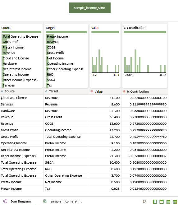
Description of the illustration sample_income_stmt_jd.png - Click Save. In Save Dataset As, enter
sample_sankeyin Name and click OK.
Create Sankey Visualization
In this section, you use the sample_sankey dataset as the data source for the Sankey visualization.
- Click Create Workbook. Close the Auto Insights panel.
- In the Data
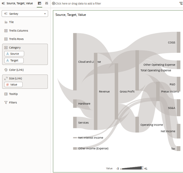
 pane, hold down the Ctrl key, select Source, Target, and Value. Right-click, select Pick Visualization, and then select Sankey
  .
. 
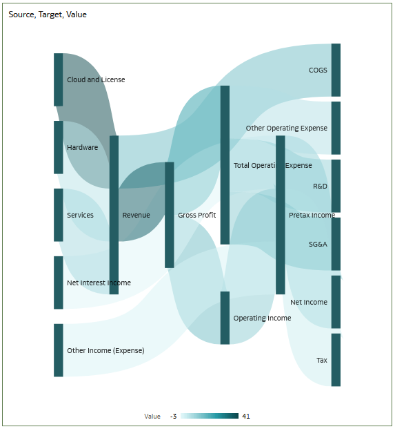
Description of the illustration sankey_line_width.png - In the Grammar
 pane, select Value in Size (Link) and move it to Color (Link).
Instead of width, Value is represented by shade from light to dark. The Sankey visualization has a Value scale showing the range of values.
Description of the illustration sankey_group_by_value.png - Click Properties
 . On the General tab, click Value in the Group By row and select Column.
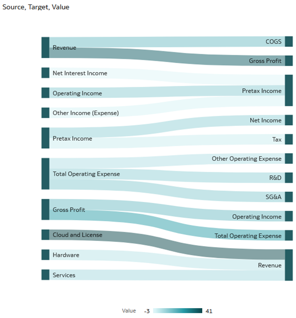
Description of the illustration sankey_group_by_column.png - Click Properties . On the General tab, click Column in the Group By row and select Value.
- In the Data pane, hold down the Ctrl key, select Source, Target, and Value. Right-click, select Pick Visualization, and then select Table
 .
. - In the table visualization, click Menu
 , select Sort By, and then select Custom.
 - In Sort Order, select Value from the Sort By list, select High to Low, and then click OK.
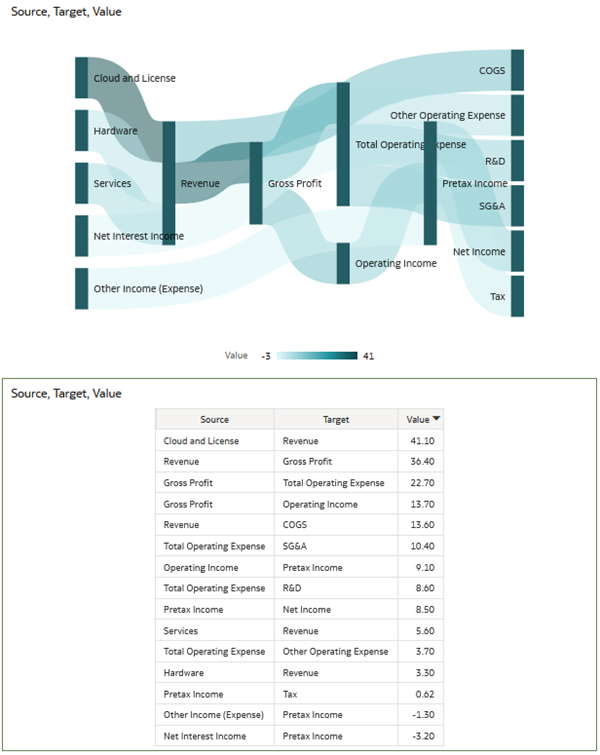
Description of the illustration sankey_n_table.png
Learn More
Create a Sankey Visualization in Oracle Analytics
G10765-01
July 2024
Learn how to create a Sankey visualization in Oracle Analytics.
This software and related documentation are provided under a license agreement containing restrictions on use and disclosure and are protected by intellectual property laws. Except as expressly permitted in your license agreement or allowed by law, you may not use, copy, reproduce, translate, broadcast, modify, license, transmit, distribute, exhibit, perform, publish, or display any part, in any form, or by any means. Reverse engineering, disassembly, or decompilation of this software, unless required by law for interoperability, is prohibited.
If this is software or related documentation that is delivered to the U.S. Government or anyone licensing it on behalf of the U.S. Government, then the following notice is applicable:
U.S. GOVERNMENT END USERS: Oracle programs (including any operating system, integrated software, any programs embedded, installed or activated on delivered hardware, and modifications of such programs) and Oracle computer documentation or other Oracle data delivered to or accessed by U.S. Government end users are "commercial computer software" or "commercial computer software documentation" pursuant to the applicable Federal Acquisition Regulation and agency-specific supplemental regulations. As such, the use, reproduction, duplication, release, display, disclosure, modification, preparation of derivative works, and/or adaptation of i) Oracle programs (including any operating system, integrated software, any programs embedded, installed or activated on delivered hardware, and modifications of such programs), ii) Oracle computer documentation and/or iii) other Oracle data, is subject to the rights and limitations specified in the license contained in the applicable contract. The terms governing the U.S. Government's use of Oracle cloud services are defined by the applicable contract for such services. No other rights are granted to the U.S. Government.
This software or hardware is developed for general use in a variety of information management applications. It is not developed or intended for use in any inherently dangerous applications, including applications that may create a risk of personal injury. If you use this software or hardware in dangerous applications, then you shall be responsible to take all appropriate fail-safe, backup, redundancy, and other measures to ensure its safe use. Oracle Corporation and its affiliates disclaim any liability for any damages caused by use of this software or hardware in dangerous applications.
Oracle and Java are registered trademarks of Oracle and/or its affiliates. Other names may be trademarks of their respective owners.
Intel and Intel Inside are trademarks or registered trademarks of Intel Corporation. All SPARC trademarks are used under license and are trademarks or registered trademarks of SPARC International, Inc. AMD, Epyc, and the AMD logo are trademarks or registered trademarks of Advanced Micro Devices. UNIX is a registered trademark of The Open Group.
This software or hardware and documentation may provide access to or information about content, products, and services from third parties. Oracle Corporation and its affiliates are not responsible for and expressly disclaim all warranties of any kind with respect to third-party content, products, and services unless otherwise set forth in an applicable agreement between you and Oracle. Oracle Corporation and its affiliates will not be responsible for any loss, costs, or damages incurred due to your access to or use of third-party content, products, or services, except as set forth in an applicable agreement between you and Oracle.