Before You Begin
This tutorial shows you how to register a vector embedding model in Oracle Analytics, create a data flow to compare data using the similarity analysis step, and visualize the data flow's output dataset.
Background
The similarity analysis process determines how similar two or more items are to each other. You can perform similarity analysis on a dataset containing documents, products, user profiles, data points, events, and other items. For example, you might have data that shows details about auto engine failure, by using similarity analysis you can find out if these failures are alike. Did the failures occur on the same make and model, the same manufacturing year, the same engine size and other similar or different details?
Similarity analysis uses vector embeddings which are numerical representations that capture the semantic meaning of your data. A vector embedding model assigns numerical values to each element of your data. The closer two data points are to each other, the more similar the underlying content. In Oracle Analytics, you use a vector search to identify and rank records based on the proximity to a source record.
This tutorial uses a dataset of loan borrowers on an Oracle Autonomous Data Warehouse 23ai instance to demonstrate the steps required to perform similarity analysis. If you are performing similarity analysis, your dataset must reside on the Oracle Database 23ai or Oracle Autonomous Data Warehouse 23ai database where your vector embedding model is installed.
You can create a workbook with the original dataset, for example, the Simanalysis_loan_demo used for similarity analysis and add the dataset output, for example, the tutorial_simana_loan_ds to create additional visualizations and insights.
What Do You Need?
- Access to Oracle Analytics
- Create a connection to Oracle Database 23ai or Oracle Autonomous Data Warehouse 23ai with an installed vector embedding model and the dataset to analyze
Register the Vector Embedding Model
In this section, you register the vector embedding model installed on Oracle Database 23ai or Oracle Autonomous Data Warehouse 23ai in Oracle Analytics.
- On your home page, click Page Menu, select Register Model/Function, and then select Vector Embedding Models.
- In Register a Vector Embedding Model, click the 23ai connection containing your vector embedding model.
- In Select Vector Embedding Model, click a model. Keep the default name or enter a Name.
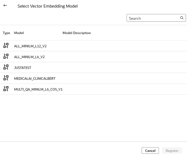
Description of the illustration select_vector_model.png - From Vector Distance, select a function or use the default Cosine function.
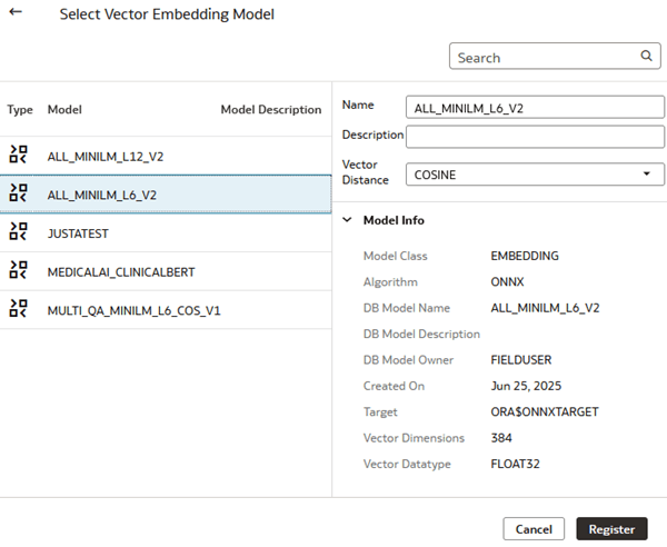
Description of the illustration vector_model_info.png - Click Register.
Create a Data Flow
In this section, you create a data flow to perform the similarity analysis. Select ten to fifteen columns and include a unique identifier column from the dataset. Using more than 15 columns increases the time required for the dataflow to complete.
- On your home page, click Create and click Data Flow.
- In Add Data, click the dataset to convert to numerical vectors and click Add.
This tutorial uses the Simanalysis_loan_demo dataset. A green check
 next to the column name indicates that these columns are selected for analysis.
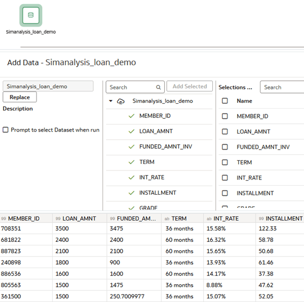
Description of the illustration simana_loan_ds.png - In the Data Flow, review columns in the dataset. Under Name, click the checkbox next to columns that you don't want to include in the similarity analysis and click Remove.
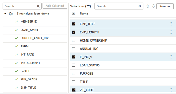
Description of the illustration remove_columns.png - Click Add step
 on the dataset node and select Similarity Analysis
  . In Select Vector Embedding Model, click the model to use and click OK.
Specify the Parameters
In this section, you select the values to use as the Similarity Analysis parameters. This tutorial uses Top to find the 100 records that are the closest matches to the source Member ID and uses Member ID as the unique identifier value in Reference Column1.
- Collapse the Outputs section. .
- In the Parameters section, click Select a value for the Source. From Available Data, click Member_ID and click a value.
- In Top (closest) or Bottom (furthest), select a value. In Number of Results, enter a value.
- In Reference Column1, click Select a column. From Available Data, click the unique identifier. In this dataset Member_ID is the unique identifier.
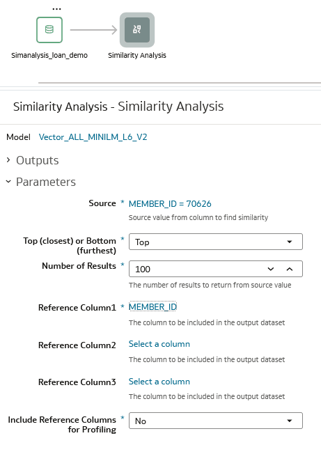
Description of the illustration parameters.png
Specify the Outputs
In this section, you specify the columns to include in the data flow's output dataset. In this tutorial, Reference Column2 and Reference Column3 aren't used as Parameters and aren't selected as Outputs. In the output dataset, distance represents the value between source record and similar records.
When selecting outputs, include Profile Expression, which is a concatenated string of all the columns and their values used in similarity analysis.
- Collapse Parameters and expand Outputs.
- Click the checkbox next to these columns:
- source_value
- source_reference_col1
- result_reference_col1
- distance
- profile_expression
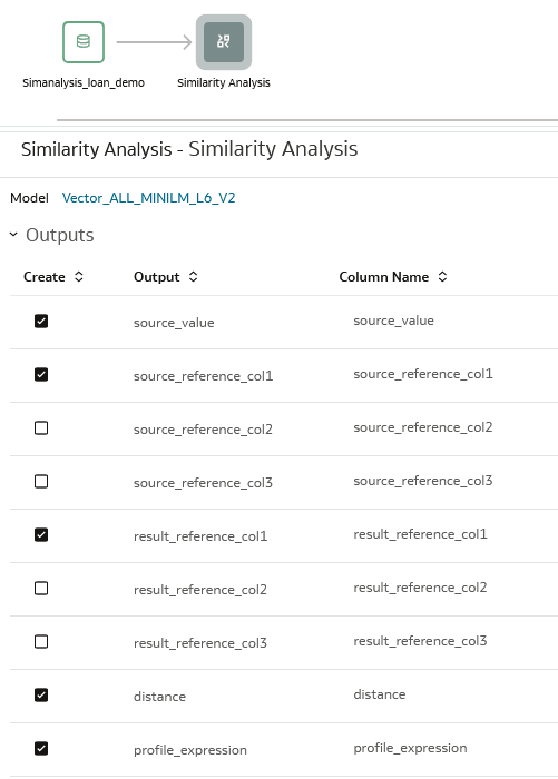
Description of the illustration outputs.png - Click Add Step
 on the Similarity Analytics node and select Save Data.
 - In Save Data, enter a Name in Dataset.
- In Table, enter a name. You can use the same name as the dataset.
- In the distance row under Columns, click Sum from Default Aggregate and click Average.
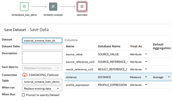
Description of the illustration save_data_step.png - Click Save
 . In Save Data Flow as, enter a name, and click OK.
 - Click Run Data Flow
 .
. - Click Go back
 .
.
Visualize the Similarity Analysis Dataset
In this section, you create a table visualization to show the dataset resulting from running the data flow.
Use the History tab in the data flow to check the run's status. When the data flow run completes, you can visualize the dataset.
- On your home page, click Create and click Create Workbook.
- In Add Data, click the similarity analysis dataset and click Add to Workbook.
- In the Data pane, hold down the Ctrl key and select source_value, result_reference_col1, and distance. Right-click, select Pick Visualization and select Table.
- Right-click the distance column, select Sort By, select Custom. In Sort By, select distance, select from Low to High, and then click OK.
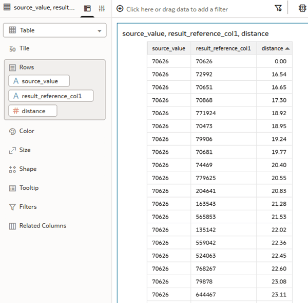
Description of the illustration table_closest_records.png - Click Save
 .
.
Explore the Results
In this section, you create additional visualizations and delve into the details of the similarity analysis results.
- In the Data pane, select distance and drag it to the workbook's filter bar.
- In the distance filter dialog, click Top Bottom. In the Method row, click Top to select Bottom. In the Count row, change the value to
20and click outside of the dialog. - In the table visualization's toolbar, click Menu
 , select Edit, and then select Duplicate Visualization. In the second table visualization, click Change Visualization Type
  in the visualization toolbar and click Radar Line
  .
. 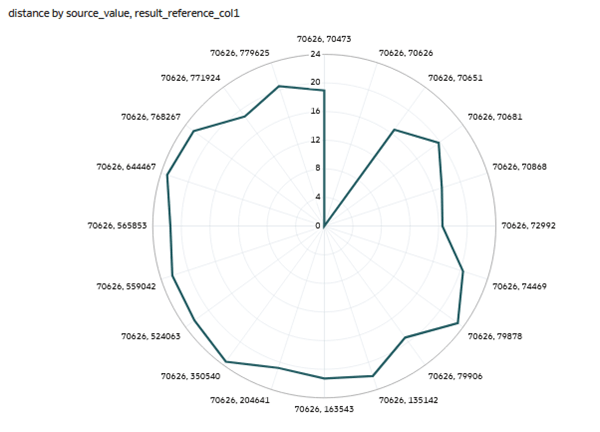
Description of the illustration radar_line_vis.png - In the Data pane, select distance and drag it to Color in the Grammar panel. In Color, click Drop Target Options
 and select Manage Assignments.
 - In Manage Color Assignments, click Presets
 next to distance, select Magma, and then click Done.
 - Click Properties
 . In Properties, click Axis. In the Values Axis, click On in Labels to change to Off disabling axis labels.
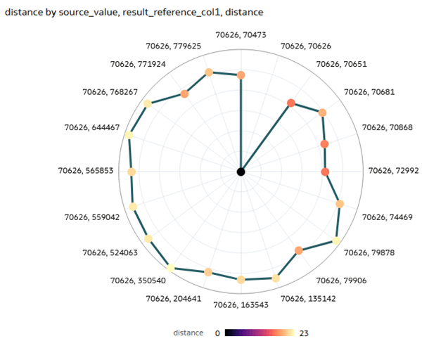
Description of the illustration updated_radar.png
Visualize the Details
In this section, you create a calculation to work with visualizing the profile_expression column.
- In the Data pane, right-click My Calculations and select Create Calculation.
- In Create Calculation, enter
Profile Expin Name. - In the expression field, enter
Casand select CAST. In the expression variable, enterproand select profile_expression. In type, entervarchar(4000).Your expression should look like
CAST(profile_expression AS varchar(4000)). - Click Validate. Click Save.
- In the Data pane, hold down the Ctrl key, select source_value, result_reference_col1, distance, and Profile Exp. Right-click, select Pick Visualization and select Table.
- Right-click the distance column, select Sort By, select Custom. In Sort By, select distance, select from Low to High, and then click OK.
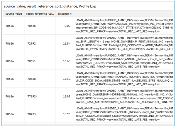
Description of the illustration pro_expression_details.png
Learn More
Perform Similarity Analysis in Oracle Analytics
G43551-01
November 2025
Learn how to use similarity analysis in Oracle Analytics to compare records.
This software and related documentation are provided under a license agreement containing restrictions on use and disclosure and are protected by intellectual property laws. Except as expressly permitted in your license agreement or allowed by law, you may not use, copy, reproduce, translate, broadcast, modify, license, transmit, distribute, exhibit, perform, publish, or display any part, in any form, or by any means. Reverse engineering, disassembly, or decompilation of this software, unless required by law for interoperability, is prohibited.
If this is software or related documentation that is delivered to the U.S. Government or anyone licensing it on behalf of the U.S. Government, then the following notice is applicable:
U.S. GOVERNMENT END USERS: Oracle programs (including any operating system, integrated software, any programs embedded, installed or activated on delivered hardware, and modifications of such programs) and Oracle computer documentation or other Oracle data delivered to or accessed by U.S. Government end users are "commercial computer software" or "commercial computer software documentation" pursuant to the applicable Federal Acquisition Regulation and agency-specific supplemental regulations. As such, the use, reproduction, duplication, release, display, disclosure, modification, preparation of derivative works, and/or adaptation of i) Oracle programs (including any operating system, integrated software, any programs embedded, installed or activated on delivered hardware, and modifications of such programs), ii) Oracle computer documentation and/or iii) other Oracle data, is subject to the rights and limitations specified in the license contained in the applicable contract. The terms governing the U.S. Government's use of Oracle cloud services are defined by the applicable contract for such services. No other rights are granted to the U.S. Government.
This software or hardware is developed for general use in a variety of information management applications. It is not developed or intended for use in any inherently dangerous applications, including applications that may create a risk of personal injury. If you use this software or hardware in dangerous applications, then you shall be responsible to take all appropriate fail-safe, backup, redundancy, and other measures to ensure its safe use. Oracle Corporation and its affiliates disclaim any liability for any damages caused by use of this software or hardware in dangerous applications.
Oracle and Java are registered trademarks of Oracle and/or its affiliates. Other names may be trademarks of their respective owners.
Intel and Intel Inside are trademarks or registered trademarks of Intel Corporation. All SPARC trademarks are used under license and are trademarks or registered trademarks of SPARC International, Inc. AMD, Epyc, and the AMD logo are trademarks or registered trademarks of Advanced Micro Devices. UNIX is a registered trademark of The Open Group.
This software or hardware and documentation may provide access to or information about content, products, and services from third parties. Oracle Corporation and its affiliates are not responsible for and expressly disclaim all warranties of any kind with respect to third-party content, products, and services unless otherwise set forth in an applicable agreement between you and Oracle. Oracle Corporation and its affiliates will not be responsible for any loss, costs, or damages incurred due to your access to or use of third-party content, products, or services, except as set forth in an applicable agreement between you and Oracle.