 Add
Pie Charts and Queries in an Oracle Visual Builder Web Application
Add
Pie Charts and Queries in an Oracle Visual Builder Web Application Before You Begin
This 10-minute tutorial shows you how to add two pie charts to a web application.
Background
Oracle Visual Builder provides many kinds of chart and gauge components that allow a web page to display data in different ways.
In this tutorial, you'll add and configure two pie charts, specifying a query for the second chart.
What Do You Need?
- Access to Oracle Visual Builder
- A supported browser
- Completion of the previous tutorials
 Add a
Pie Chart
Add a
Pie Chart
- In the Web Apps tree, under chartwebapp and Flows, click + (Create Page) next to the main node.
- In the Create Page dialog box, enter
salesregionsin the Page ID field after themain-prefix, and click Create. The main-salesregions page opens in the Page Designer. (Like business object and field IDs, page names can't have spaces.) - In the Components palette, locate the Heading component under Common and drag it onto the page.
- In the Heading's Properties pane, enter
Sales
                    Regions
in the Text field. - Scroll down to the Chart section and drag a Pie Chart to the canvas area below the heading.
- In the Properties pane, click Add Data to open the Add Data Quick Start.
- On the Locate Data page of the Quick Start, select Region under Business Objects and click Next.
- On the Map Fields page,
- Select population to load it to the Slice Values field.
- Select name to load it to the Slice Colors field.
Click Next.
- On the Define Query page, click Finish. The chart is displayed.
- Click the General tab for the chart, then click the Legend button. In
the Legend, Title field, change
nametoRegion, then click Pie Chart to return to the main General tab.
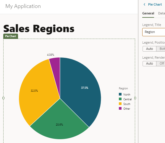
Description of the illustration vbcsch3_apc_s10.png - Scroll to the Common components and drag a Label component between the heading and the chart.
- In the Text field for the Label,
enter
Population by Region.
 Add
Another Pie Chart and Specify a Query Value
Add
Another Pie Chart and Specify a Query Value
Now you'll add a second pie chart to the application. This chart will display different information about the same regions, making it easier to compare the data.
- Drag and drop a second Pie Chart to the
canvas area of the Sales Regions page, next to the first one.

Description of the illustration vbcsch3_aac_s1.png - Click the Quick Start tab if necessary, then click Add Data to open the Add Data Quick Start.
- On the Locate Data page of the Quick Start, select Sales under Business Objects, and then click Next.
- On the Map Fields page,
- Select sales to load it to the Slice Values field.
- Expand the regionObject and items nodes (item[i] is expanded automatically) and select name to load it to the Slice Colors field.
Click Next.
- On the Target side of the Define Query page, expand the uriParameters
node and click the parameter q. (It stands
for Query.)

Description of the illustration vbcsch3_aac_s5.png - In the text area under
 uriParameters.q, enter the following expression,
then select the Expression option.
uriParameters.q, enter the following expression,
then select the Expression option.
"year='2019'" - Click Finish.
- Click the General tab for the chart, then click the Legend button. In
the Legend, Title field, change
nametoRegion. Click Pie Chart to return to the main General tab. - Scroll to the Common components and drag a Label component between the heading and the chart.
- In the Text field for the Label, enter
Sales
                    by Region, 2019
. The chart is displayed. It shows data only for the year 2019. The two charts let you easily compare a region's population with its sales for that year. For example, you can see that the South region had sales proportionally greater than its share of the population.
Description of the illustration vbcsch3_aac_s10.png - To display data for a different year, click the JSON
tab to view the page code. Change the
qline to specify 2016 instead of 2019. (In the Sales business object, the year data is for every third year.)
Description of the illustration vbcsch3_aac_s11.png - Click the Page Designer tab to view the chart
with the new data. In the General tab,
change the label text for the chart to
Sales by Region,
                    2016
.
Description of the illustration vbcsch3_aac_s12.png