Add Components to Pages

You use page components to build the layout of your pages and to add elements that can be used to display content or accept input from a user. You add a component to a page usually by dragging it from the Components palette in the Page Designer and dropping it onto the canvas or in Structure view.

The Components palette contains an extensive list of Oracle JET components that you can add to your page, including dynamic components. Because dynamic components help you develop UIs that dynamically change what's displayed to users based on your own rules, working with them also involves layouts and display logic. See Add Dynamic Components to Pages.

Visual Builder also gives you access to Redwood resources based on the Oracle standard for user experience. If you create a page using a Redwood pattern, the components of that pattern become available to you in the page's Components palette. You also have access to individual Redwood components that provide a rich user experience—from single UI elements, such as a button, to complex modules connected to backend services, such as a form—but you must install them from the Component Exchange before you can use them in your page.

Note:

The next generation of JET components, known as Core Pack components, are available under the Early Access category. Core Pack components, written entirely using the VComponent API and the JET Virtual DOM architecture, are available as a completely new set of components. As a result, developers can use both Core Pack and legacy components side by side. (Core Pack components have a DOM element prefix of oj-c-* instead of the existing oj-* prefix used by legacy components, and are badged Early Access badge for easier identification.)

You can choose when you want to move to the new components in your development cycle—but take note that no updates are planned for legacy components; all updates and new functionality will be available only through the Core Pack. For more information, see Core Pack overview in JET documentation.

  1. If you want to use Redwood components in your page, follow these steps:
    1. Explore the Redwood catalog of components, templates, and patterns and take note of what you'd like to use in your page.
    2. Open the Components tab (Components tab) in the Navigator.
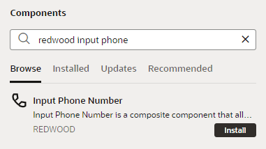
    3. Select the Browse tab and search for the component you want to use. For example, you might use "redwood input phone" to look for the Input Phone Number component:

      You can double-click the component to open it in the canvas area and learn more about it.
    4. Click Install (or Install Component in the canvas).

      Once you install a component, it will become available to you in your page's Components palette. Simply filter to find the component.

  2. Open the page you want to work with in the Page Designer.

    When the page opens in the Page Designer, you'll see a canvas used to display the page’s layout, a Components palette containing a list of components, and a Structure view that displays a structural view of the page’s components. You'll work primarily with these, though you can switch to the Data palette to display data in components suggested by Visual Builder.

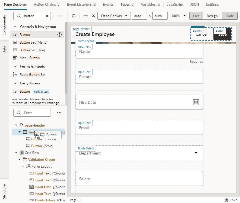
  3. Drag the component from the Components palette and drop it into position on the canvas or in the Structure view. It is sometimes easier to locate, select, and position components in the Structure view:
    Description of page-designer-component-add-designmode.png follows
    Description of the illustration page-designer-component-add-designmode.png

    Elements in the Components palette are organized by type. For each type, there are some rules that determine where they can be used on the canvas, as well as the types of pages where they can be placed. An error message will be displayed if you try to place a component on the canvas where the component is not allowed.

    Tip:

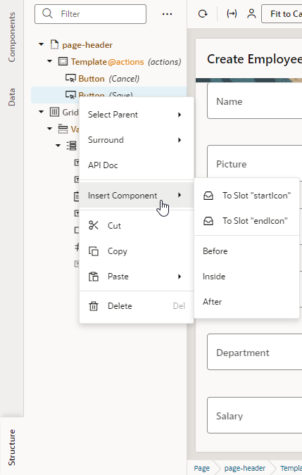
    You can also add a component by clicking Insert Component in the right-click menu. This option is available when you right-click anywhere on the canvas and in Structure view, both with and without a component selected. It's most useful in Structure view, especially in complex layouts, to help you position the component exactly where you want to add it. When you choose this option on a selected component, you'll be able to add a component before, inside, or after the selected one. If the selected component has multiple slots, you will have the option to drop the component into a particular slot as shown here:

  4. After adding the component, you can define its behavior by editing properties that show in the Properties pane when the component is selected. Component properties are organized in tabs in the Properties pane. The component type will determine the tabs that show.
    Component Properties Description
    General

    Contains the most important properties of the selected component, such as layout and style. The slot value of a component inside a parent component's slot also shows here. Select the sub-component added to a slot (for example, a button's icon) and change its slot value to move it from the startIcon slot to the endIcon slot. This way, you can modify the slots of dropped components without accessing the HTML code.

    The slot used by the sub-component is also visible in the sub-component's All tab and can be modified there (for example, to bind it to a variable).

    Data

    Contains properties that are expected to be bound to data. The General tab and All tab also contain properties that can be bound to variables and expressions.

    Events

    Used to bind a component’s events to trigger action chains that define its behavior (for example, to open a URL when a button is clicked). See Start an Action Chain From a Component.

    All

    Contains more advanced component properties and shows all properties, including custom properties. Custom properties are those not defined in component metadata, for example, data-* attributes, and can be added by clicking + next to General Attributes.

    Quick Starts

    Contains a list of Quick Start wizards available for the component. When you add a collection component such as a table or list, this tab contains a list of wizards to help you add some actions that are typically associated with the component, such as mapping the collection to data and adding Create and Detail pages.