Set a Page's Layout
All pages have a preferred layout, and you can add additional layout containers and components within this layout to design your pages.
When you select a page (in other words, when no component on the canvas is selected), you use the Preferred Layout options in the Properties pane to set a layout for your page: Grid (default), Flex, or Block. Here's an overview of each page layout:
| Layout Type | Image | Description |
|---|---|---|
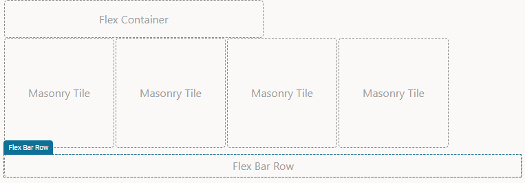
| Flex | The Flex layout lets you add components in rows of any size. In a flex layout, you can lay out the children of a flex container in any direction, and the children will grow to fill unused space or shrink to avoid overflowing the parent. You can also nest boxes (for example, horizontal inside vertical or vertical inside horizontal) to build layouts in two dimensions.
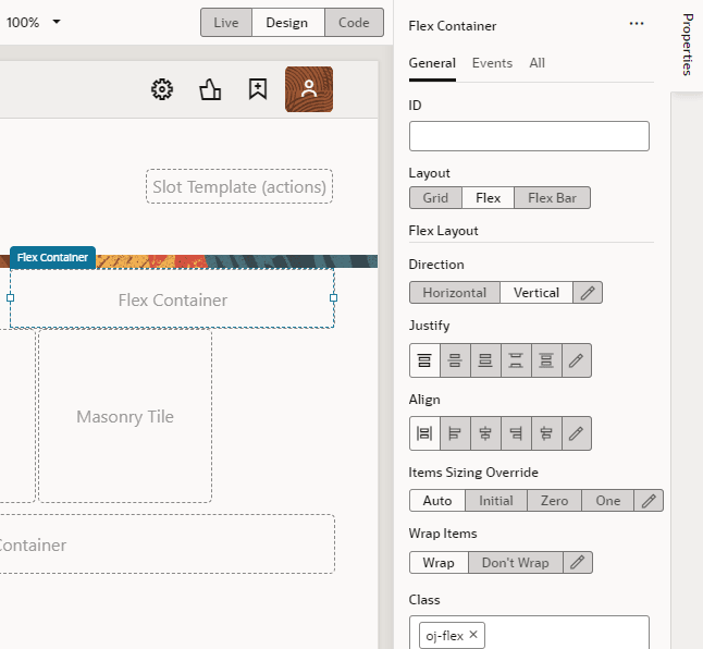
The Flex layout provides the most flexibility and you can adjust several properties for alignment, justification, and so on, in the Properties pane. |
|
| Grid (default) | The Grid layout builds on the Flex layout, but adds a 12-column grid and rows that make it easier to align elements when you position them. The pages in your application incorporate responsive design to resize gracefully based on the size of the display area of the device. | |
| Block | The Block layout displays components that you drop on a page as blocks; each component starts on a new line and takes up as much horizontal space as it can. This layout is useful when your app already includes hand-coded pages, or when you want to drop a few components on a new page and manually adjust the layout. |
Every component you add to the page is placed in a row in the page's layout—or in a layout component that you've placed on the page's layout. Layout components are predefined Oracle JET components and patterns that let you control the initial data display and allow the user to access additional content by expanding sections, selecting tabs, or displaying dialogs and pop-ups. Available under several Layout categories in the Components palette, they are various containers and components that you can drag and drop on to the canvas or in Structure view. Some are specifically designed to help you with design styles; for example, the accordion to display a set of collapsible child elements, a navigation list to navigate between different content sections, or a masonry layout that lays out its children in a grid of tiles. Here's a list of some commonly used layout containers and components:
| Container Components | Description |
|---|---|
| Flex Container | The flex container is a flexible container which is useful for responsive designs that optimize the use of the available space. |
| Grid Container | The grid container is a 12-column grid that is useful when you want to align components precisely according to the grid. |
| Bar Container | The bar container is a three-section layout containing a start and end section sized to its content and a middle section that stretches. |
| Form Layout | The form layout is optimized to display the label and input pairs commonly used in forms. |
| Masonry Layout | The masonry layout is a responsive grid of tiles containing arbitrary content. You can specify the size of each tile in the Properties pane. |
See the Layout & Nav section in the Oracle JET Developer Cookbook for examples of how you can use various layout components.
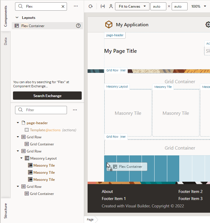
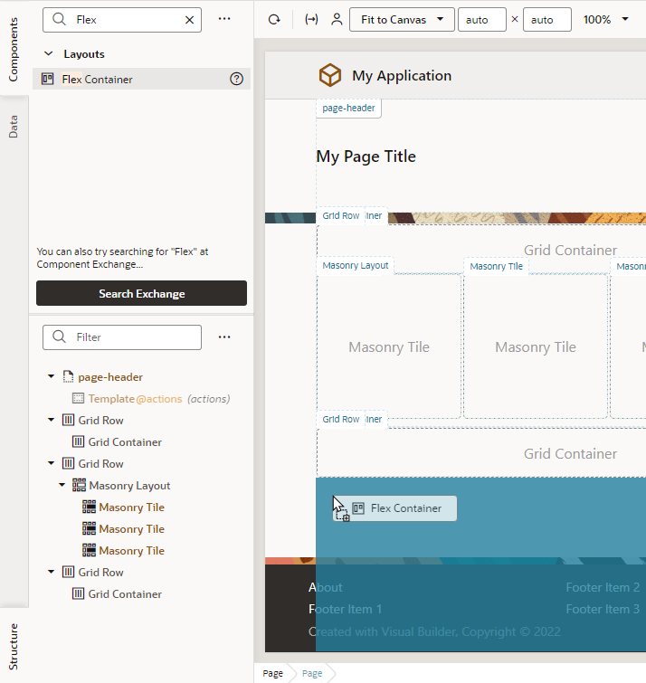
To add a layout container or component to a page:
You can drag additional components into the container, or place them above or below an existing row to create new rows.


