Control How a Field is Rendered with Field Templates

You can customize how a field is rendered in a layout for a dynamic form or table by applying a field template. A field template contains UI components, for example, text fields or images, and defines their properties, such as styling details. Components in a template can access the variables, constants, action chains, and event listeners defined in the layout.

You might define a default template for a field, which is then applied to the field in every layout. You can override the default template if you want to apply your own template. Suppose the visual app has applied a template called BoldType to the Update field. The Update field will have the BoldType template applied in every layout where it appears. However, you can create a field template called Italics and override the BoldType template, either in specific layouts or across all the layouts that you create. You can apply your Italics template to multiple fields, as long as they are part of the same layout.

To create a field template for a field in a dynamic form or table:

  1. Open the layout's Templates tab.

    The Templates tab displays a list of field and form templates that are already defined for the artifact.

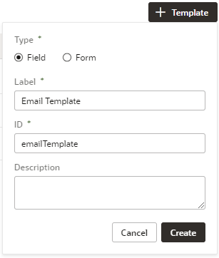
  2. Click + Template. Select Field, specify the Label (the ID is generated for you), and click Create.


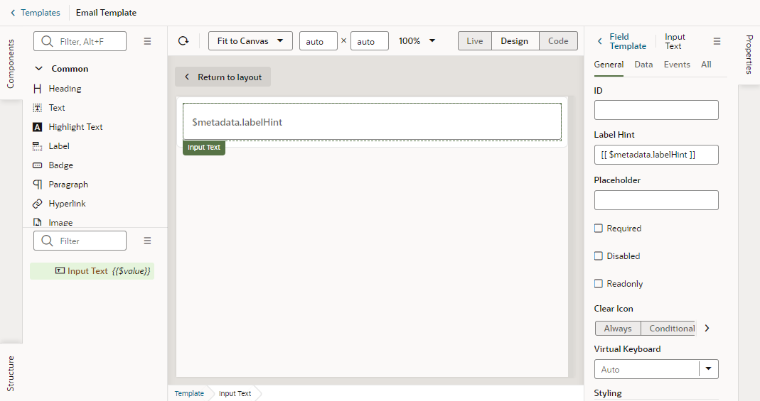
    The new field template opens in the template editor, which contains a Components palette, Structure view, canvas, and a Properties pane. In the Structure view, you'll see that your new field template includes an automatically generated Input Text component. This is used to display the data and display name when you apply the template to a field in the layout.
    Description of template-field-inputtext.png follows
    Description of the illustration template-field-inputtext.png

  3. In the Templates editor, add any other UI components you want to display in the template by dragging them from the Components palette onto the canvas or the Structure view.

    You can add more UI components above or below the Input Text component, or replace the Input Text component with a different one, for example, to render a field using a Rating Gauge component instead of an Input Text component.

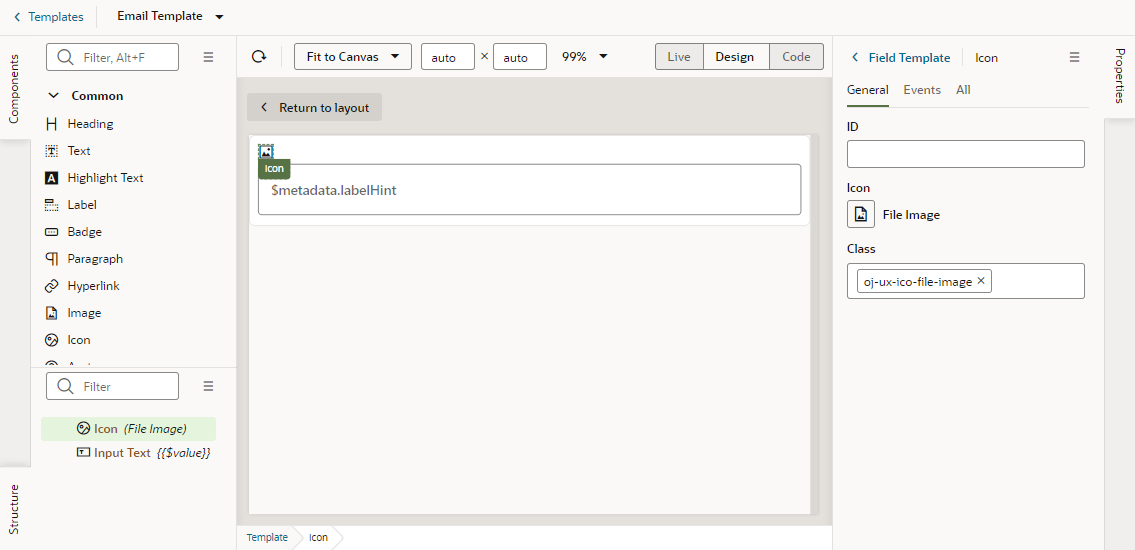
    In this image, you can see in the Structure view that the template contains an Icon component and an Input Text component:


  4. Select a component on the canvas or in the Structure view, then edit its properties in the Properties pane.

    Just like when you are working in the Page Designer, the Properties pane might contain several tabs for editing the component's properties. For example, if you added an icon component to your template, you might decide to also create an event in the Events tab. If you did this, an event listener and action chain would be created for you, and you would then need to edit the action chain to define the behavior.

    Alternatively, you can edit the field template's code directly in the Code editor, and use the editor's code completion to help you. For example:
    <!-- Contains Dynamic UI layout templates -->
    <template id="emailTemplate">
      <span class="vb-icon vb-icon-envelope"></span>
      <oj-input-text value="{{ $value }}" label-hint="[[ $metadata.labelHint ]]"></oj-input-text>
    </template>

After you've created the template, click < Templates to view your template added to the list of field templates in the Templates tab. From here, you can open and duplicate the templates you've created.