Use the Page Designer
While there are several editors available to you in the Designer, the one you'll likely use most frequently is the Page Designer. To open the Page Designer, click a page in the Navigator's Web Apps pane:
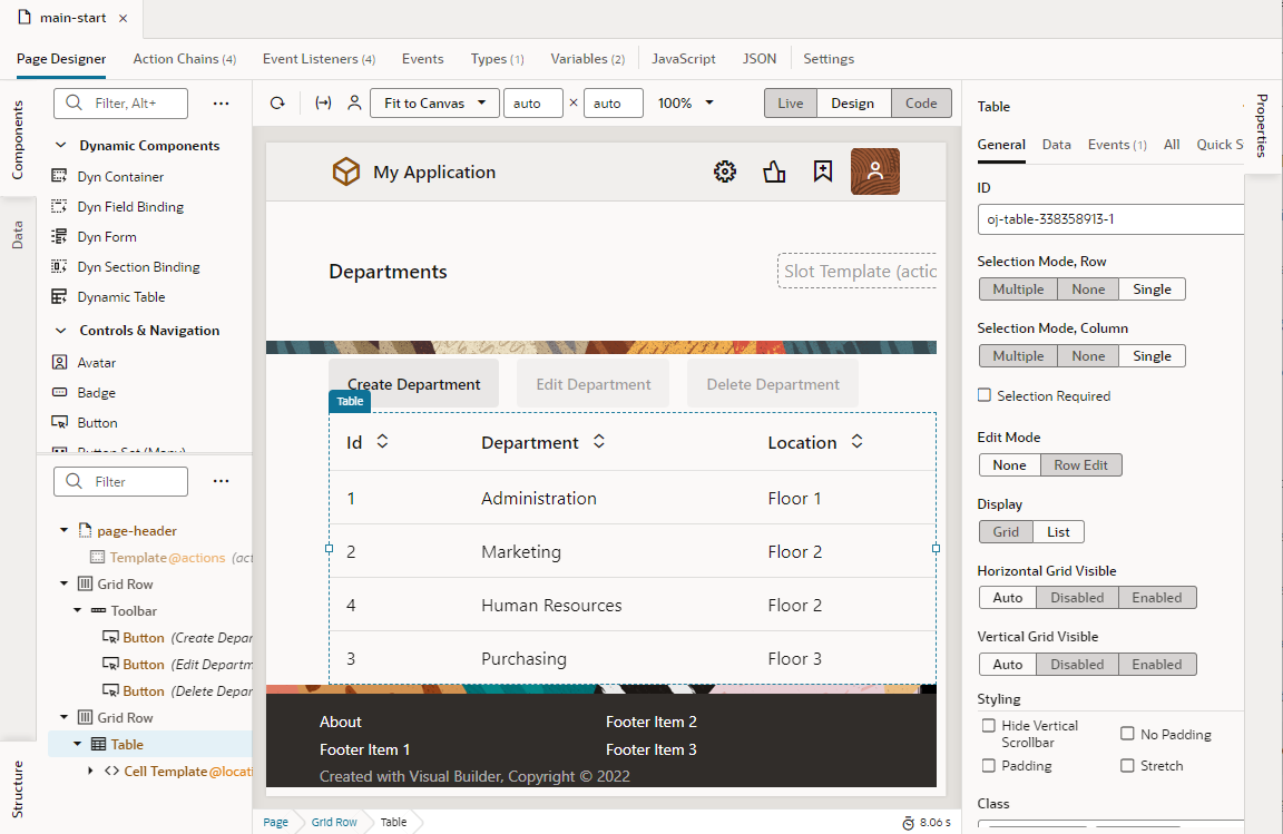
Description of the illustration page-designer-overview.png
- Drag and drop components on to the page using the Components palette;
- Work with components from a hierarchical perspective, in Structure view;
- Start with your data and decide how to represent the data in the user interface, using the Data palette;
- View and update the properties that control the appearance and behavior of whatever is currently selected in the canvas, using the Properties pane.
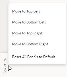
Tip:
You can hide or show any of these panes by clicking the Components, Data, Structure, or Properties tab.To design your pages, you'll drag components from the Components palette to the canvas. Once you add components, the Structure view provides a hierarchical view of the components on the canvas. Use the Properties pane to view or edit a component's properties as well as open any Quick Starts that can be used with a selected component.
Right-clicking a component opens a pop-up menu that lets you perform several actions on the component, such as selecting its parent component, surrounding it with another component or element, or deleting it. You can also insert a component before, inside, or after the selected component. 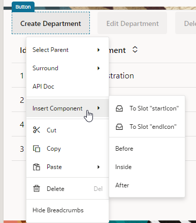
Description of the illustration insert-component.png
You can also bring up the right-click (or context) menu without selecting any component, both on the canvas or in Structure view. When a component isn't selected, the options in the menu will vary.
| Toolbar Item | Description |
|---|---|
| Reloads the page | |
| Opens a dialog box for entering input parameters for the page. | |
| Opens a dialog for selecting the user roles that are used when previewing pages in Live view. | |
| Opens a menu for selecting the screen size represented by the canvas. This menu includes the default Fit to Canvas option that resizes the canvas to always take up all available space between the left and right panes. You can also set the minimum and maximum values for viewport resolution and resize the canvas to whatever size you want, for example, 600x900: |
|
| Opens a dialog box for changing the magnification of the canvas. | |
Toggles between the Live, Design, and Code views:
The Components palette, Structure view, and Properties pane can be used the same way in Live, Design, and Code view. When you select an item in one view, the item remains selected when you switch to a different view. When you switch from Design to Code view (for example), the source code of a component selected on the canvas will be highlighted in the code editor. All the views are synchronized, so changes you make in the Properties pane or Structure view are visible when you switch to a different view. Tip: Hold the Ctrl key (Cmd on Mac) to momentarily switch between Live and Design views. Make sure the cursor is on the canvas, then hold the Ctrl key. For example, you can check the values in a drop-down menu by simply holding the Ctrl key and clicking the menu on the canvas. |
|
At the bottom of the canvas (not in the toolbar), a breadcrumb path displays a hierarchical list of links for a selected component to indicate its placement in the page's structure. Hover over ... (the last link in the breadcrumb path) to navigate to the component's children. You can also view and switch to a component's siblings: Simply hover over a link in the breadcrumb path, then select the component you want to switch to from the menu: 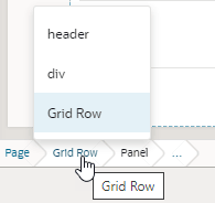 Clicking a component in the breadcrumb path selects that component on the canvas and in Structure view and lets you view its details in the Properties pane. To hide the breadcrumbs (shown by default), select Hide Breadcrumbs in the context menu. |
|
Displays time taken to render and display the page in the canvas. Clicking the icon will show a breakdown of how long different tasks (such as bootstrapping and loading a shell page) take in order to display the page, as shown in this example: 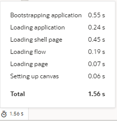 Rendering is done in runtime execution mode, with the Page Designer serving the resources needed to display the page. Because each resource is requested in a different phase of runtime initialization, the time between these resource requests is measured and summarized. This information can thus help you isolate runtime issues that may cause your app to load slowly. For example, if a page takes time because of long REST calls, you might decide to defer the calls or run them in parallel. If the page contains runtime errors, an error message will show instead. Click the message to get details about the errors and resolve them for the page to render correctly. |