Responsive Table Design
Oracle Content Management provides an example CSS of a responsive table within a paragraph component that enables the stacking of row data when displayed on mobile devices.
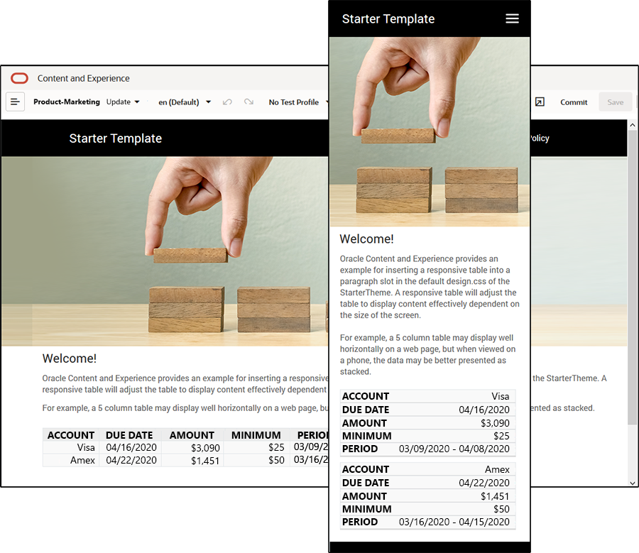
A responsive table will adjust the table to display content effectively dependent on
the size of the screen. For example, a 5 column table may display well horizontally on a
web page, but when viewed on a phone, the data may be better presented as stacked. Note
that responsive tables need a header row in order to behave correctly.
In the following generated HTML, note that there is an added data-label attribute to each table cell with values matching the column header text.
<thead>
    <tr>
        <th scope="col">ACCOUNT</th>
        <th scope="col">DUE DATE</th>
        <th scope="col">AMOUNT</th>
        <th scope="col">MINIMUM</th>
        <th scope="col">PERIOD</th>
    </tr>
</thead>

<tbody>
    <tr>
        <td data-label="ACCOUNT">Visa</td>
        <td data-label="DUE DATE">04/16/2020</td>
        <td data-label="AMOUNT">$3,090</td>
        <td data-label="PERIOD">03/09/2020 - 04/08/2020</td>
    </tr>
Once that attribute is on each cell, the TDs stack on top of each other when you apply the CSS rules below.
  .scs-paragraph:not(.scs-paragraph-edit) table td {
    border-bottom: 1px solid #ddd;
    display: block;
    text-align: right;
  }

  .scs-paragraph:not(.scs-paragraph-edit) table td::before {
    content: attr(data-label);
    float: left;
    font-weight: bold;
  }
Note that the media rule below queries the screen size and will only take effect when the screen size is less than 767 pixels:
@media screen and (max-width: 767px) {The code example for using css to allow inserted tables to be responsive is located in the default design.css of the provided StarterTheme. If building a site from the StarterTheme, the tables inserted into a paragraph slot will be responsive by default. To insert a table:
- In Oracle Content Management, open a site and toggle to Edit mode.
- Create a new update or choose an existing update to modify.
- Drag a new paragraph component onto the page and click where you want to insert a table, or click in an existing paragraph where you want to insert a table.
- On the rich text toolbar, click
 and set the table properties. Make sure to select the first row as a
header, and adjust the table width to work effectively on the smallest screen
expected to be used. For example, if you expect the site to be viewed on a phone,
the default width of 767 pixels will likely be too wide to display fully on a phone
screen, even when stacked. You would want to set the table width to a smaller size,
like 300 pixels, or set width to 100%.
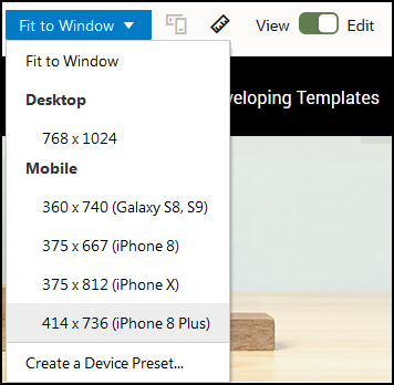
When finished, toggle back to View mode and select a view option with a screen width of anything less than 767 pixels to preview the results. You must be in view mode, as a table does not behave responsively in Edit mode.

If you want to use responsive tables when building a site from a different theme, you will need to copy the code from the StarterTheme design.css to the design.css file of the theme you are using.
- To copy the code from the StarterTheme design.css, click Developer in the side navigation of Oracle Content Management.
- Click View All Themes.
- Select the StarterTheme and click Open.
- Click designs to open the folder and then click default.
- Select the design.css file from the StarterTheme and click Download.
- Open the file in a text editor and locate the section of the file that begins with the comment An example CSS of how to render a table responsively.
- Select the code until the next comment and copy
it.
/** * An example CSS of how to render a table responsively. * It enables stacking of row data on mobile devices. * Only do this for view mode (not for edit mode). * * On each cell rendered, it adds a user-defined attribute * 'data-label' with value matching the column header text. */ @media screen and (max-width: 767px) { .scs-paragraph:not(.scs-paragraph-edit) table { border: 0; } .scs-paragraph:not(.scs-paragraph-edit) table caption { font-size: 1.3em; } .scs-paragraph:not(.scs-paragraph-edit) table thead { border: none; clip: rect(0 0 0 0); height: 1px; margin: -1px; overflow: hidden; padding: 0; position: absolute; width: 1px; } .scs-paragraph:not(.scs-paragraph-edit) table tr { border-bottom: 3px solid #ddd; display: block; margin-bottom: .625em; } .scs-paragraph:not(.scs-paragraph-edit) table td { border-bottom: 1px solid #ddd; display: block; text-align: right; } .scs-paragraph:not(.scs-paragraph-edit) table td::before { content: attr(data-label); float: left; font-weight: bold; } .scs-paragraph:not(.scs-paragraph-edit) table td:last-child { border-bottom: 0; } } - Repeat the steps to download the design.css file of the template you want to modify, open the template, and paste the copied code into the file.
- Save the changes and upload the modified design.css file as a new revision to the theme you are modifying.