Restrict Components in Slots
For any layout slot, you can specify certain restrictions on the components allowed in the slot.
If you restrict components in a slot, any user dragging a component that is not allowed will see a warning message and will not be able to add or move a component to that slot.
To configure this restriction, you edit the layouts in your theme (for example, a layout file themes\theme_name\layouts\oneslot.htm) and add custom data attributes to the slot div.
This is the format of the custom attributes. The main difference from previous versions is that users must specify only the id of the component. Previously to restrict a component, users had to use the verbose "<type> <id>" syntax (which is still supported).
data-allowed-items='["<id>:","<type>,"<type>:<id>",...]'
data-disallowed-items='["<id>":"<type>","<type>:<id>",...]
Note:
The value fordata-allowed-items and data-disallowed-items can use double quote marks (") or single quote marks (‘). In the following example, data-allowed-items uses single quote marks around the JSON array, while data-disallowed-items uses double quote marks around the JSON array:
<div id="slot101"
     class="scs-slot"
     data-allowed-items='["scs-app","scs-title"]'
     data-disallowed-items="['File List', 'scs-map']">
</div>
The following table lists components and their respective IDs provided with Oracle Content Management. To prevent any naming conflict, do not prefix any customized (local or
remote) component ID with scs- or use any type or ID listed in this
table.
| Name | Type | ID |
|---|---|---|
|
Documents Manager |
scs-app |
Documents Manager |
|
Facebook Like |
scs-app |
Facebook Like |
|
Facebook Recommend |
scs-app |
Facebook Recommend |
|
File List |
scs-app |
File List |
|
Folder List |
scs-app |
Folder List |
|
Twitter Follow |
scs-app |
Twitter Follow |
|
Twitter Share |
scs-app |
Twitter Share |
|
Button |
scs-button |
scs-button |
|
Article (custom component) |
scs-component |
scs-comp-article |
|
Headline (custom component) |
scs-component |
scs-comp-headline |
|
Image and Text (custom component) |
scs-component |
scs-comp-image-text |
|
Component Group |
scs-componentgroup |
scs-componentgroup |
| Content Search | scs-contentsearch | scs-contentsearch |
| Content List | scs-contentlist | scs-contentlist |
| Content Placeholder | scs-component | scs-contentplaceholder |
| Content Item | scs-component | scs-contentitem |
|
Divider |
scs-divider |
scs-divider |
|
Document |
scs-document |
scs-document |
|
Gallery |
scs-gallery |
scs-gallery |
|
Gallery Grid |
scs-gallerygrid |
scs-gallerygrid |
|
Image |
scs-image |
scs-image |
|
Map |
scs-map |
scs-map |
|
Paragraph |
scs-paragraph |
scs-paragraph |
|
Social Bar |
scs-socialbar |
scs-socialbar |
|
Spacer |
scs-spacer |
scs-spacer |
|
Title |
scs-title |
scs-title |
|
YouTube |
scs-youtube |
scs-youtube |
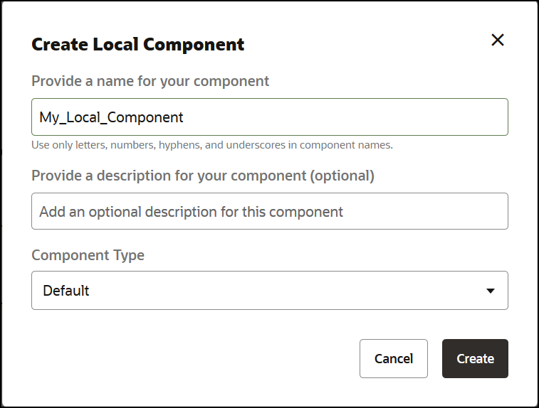
Users can create local or remote components. The name provided in this sample (My_Local_Component) is the ID that can be used to specify this component for restricting inside slots.
