Embed UI API V2 for Oracle Content Management
Introduction
The Embed UI API V2 for Oracle Content Management is a JavaScript API that enables you to embed the Oracle Content Management web user interface into your own web applications using an HTML inline frame (iframe tag). The JavaScript API simplifies the creation of the iframe element and manages communication with the code running in the frame. The embedded web interface can include asset and document lists, conversations, site content, search results, and other Oracle Content Management features.
Here’s an example of what the embedded UI could look like (an Oracle Content Management asset selection list inside the Oracle Eloqua web application):

You configure the web user interface by passing a JavaScript options object into the API. In addition, you can provide callback functions to handle various events that occur when a user interacts with the embedded web user interface.
Important! The current Embed UI API version is V2, which you should use for all new implementations. V1 has been deprecated, but it will remain available until further notice. Sometime in the future, V1 will no longer be supported.
Browser settings that affect third-party cookies can impact embedding of the Oracle Content Management user interface, including single sign-on (SSO). Users may need to adjust their web browser preferences to enable cross-site tracking for the embedded UI to work correctly.
The Embed UI API V2 supports embeddable components to control these user interface elements:
- Assets view
- Asset viewer
- Content item editor
- Content item create
- Documents view
- Document viewer
- Link picker
- Conversations list
- Conversations view
In addition, you can set a number of general options and also customize dialogs in the embedded web user interface.
Configure Oracle Content Management for UI Embedding
Before using the Oracle Content Management web UI embedding features, you’ll need to enable embedded content in the Oracle Content Management administration interface (on the Security tab in the System area). You also need to include the domain for the application hosting the embedded user interface in the list of allowed domains.
Important! Before implementing an interface solution that uses inline frames, make sure you understand the possible security risks associated with hosting external sites in inline frames. Security measures vary between different browsers and browser versions. For more information, see http://www.w3.org/TR/UISecurity/.

Access the Embed UI API
You access the Embed UI API V2 for Oracle Content Management through a simple JavaScript file, which can be obtained and referenced from Oracle’s content delivery network (CDN) using an HTML script tag.
<script type="text/javascript"
src="https://static.ocecdn.oraclecloud.com/cdn/cec/api/oracle-ce-ui-2.15.js"></script>Note: As of Oracle Content Management version 21.8.1, the CDN location has changed from https://static.oracle.com to https://static.ocecdn.oraclecloud.com.
The JavaScript API defines the OracleCEUI namespace, which provides access to the embeddable components. Before any component iframe can be created, the API needs to be initialized with the address of target Oracle Content Management system. This is done by setting the oceUrl property.
OracleCEUI.oceUrl = "https://<service>-<tenant>.cloud.oracle.com"Once the Oracle Content Management system URL is set, you can use the createFrame function for the desired component to create an iframe DOM object. The createFrame function accepts an options object for customizing the features of the embeddable UI and an events object containing callback functions.
var frameElement = OracleCEUI.assetsView.createFrame(options, events);
document.body.appendChild.(frameElement);
Learn About the Embed UI API
These topics provide background information on the Embed UI API V2:
- Authentication and SSO environments
- Oracle Content Management REST APIs
- Options
- Dialog options
- Events
- Action events
- Helper methods
Authentication and SSO Environments
If you’ve signed in to the full Oracle Content Management web client in another tab, then the embedded web UI will load without additional authentication, using the already established session in the web browser.
If there’s no existing browser session, then the behavior of the API is to present a sign-in screen in a popup browser window. Once credentials are provided in the popup sign-in window, the embedded web UI will reload without further authentication.
This behavior requires that any browser popup blockers are configured to allow the popup to display.
When the page hosting the embedded web UI is within the same Oracle access manager domain (single sign-on), you must call OracleCEUI.ssoInit() before creating any embedded components. In single sign-on (SSO) mode, the embedded UI assumes that there’s an existing SSO session established in the browser and no popup authentication is required. The ssoInit function establishes the appropriate session cookies required for access to Oracle Content Management.
The ssoInit function is an asynchronous call and therefore returns a Promise object.
For example:
OracleCEUI.oceUrl = "https://<service>-<tenant>.cloud.oracle.com"
OracleCEUI.ssoInit().then(function() {
  var frameElement = OracleCEUI.assetsView.createFrame(options, events);
  document.body.appendChild.(frameElement);
});
Oracle Content Management REST APIs
The OracleCEUI.ssoInit function is also useful for making REST API calls to Oracle Content Management. As with its use for embedded components in an SSO environment, ssoInit can be used in the same way to establish SSO session cookies before making REST API calls to Oracle Content Management. Note that for this to work, the Cross Origin Resource Sharing (CORS) configuration must be set up properly in the Oracle Content Management administration web interface (Security tab) to allow requests from the hosting domain.
OracleCEUI.oceUrl = "https://<service>-<tenant>.cloud.oracle.com"
OracleCEUI.ssoInit().then(function() {
  var xhr = new XMLHttpRequest();
  xhr.onreadystatechange = function(){ if (this.readyState == 4 && this.status == 200) {//do something with xhr.responseText}};
  xhr.open("GET", OracleCEUI.oceUrl + "/content/management/api/v1.1/repositories", true);
  xhr.setRequestHeader("Authorization", "Session");
  xhr.send();
});
Options
The options parameter to the createFrame function is a simple JavaScript object that contains properties for each of the embeddable components. Properties for multiple components can be passed into createFrame at the same time. For example, when creating an embedded assets view (using the assetsView component), you may choose to pass both the assetsView property as well as the assetViewer property. This allows for independent configuration for the asset viewer screen if the user chooses to select and open an asset in the embedded assets view.
For example, the following options will hide the header in assets view, but display it when a user opens an asset in the viewer.
var options = {
  assetsView: {
    header: {
      hide: true;
    }
  },
  assetViewer: {
    header: {
      hide: false;
    }
  }
};
The options parameter is optional. If not provided (or if an empty object is provided), the embedded user interface will default all possible settings. Generally speaking, the default view is a base user interface with most features disabled. You must deliberately “opt in” to the features you want to present.
Option settings can only be used to enable a feature that’s available in the full web client user interface for a given context. For example, enabling the categories filter panel tab (options.assetsView.filter.tabs.categories = true) will only display the tab if the selected repository is configured with taxonomies.
Dialog Options
In addition to providing settings for the primary, embeddable components, the options object also provides settings for configuring certain dialogs that may appear as users work with the embedded web user interface. As with the primary components, most features of a dialog are disabled for the embedded web user interface and must be deliberately enabled. Only dialog features that are available in the full user interface for that dialog can be enabled.
Dialog options are available for the following dialogs:
- Preview (assetPreview)
- Archived assets (archivedAssets)
- Archived asset view (archivedAssetView)
- Add to Repository (addToRepository)
- Languages (assetLanguages)
- Select File (documentPicker)
- Select Media (mediaPicker)
- Select Reference (referencePicker)
For example, the following options will enable the preview action in assets view and disable the download action when the preview dialog is opened.
var options = {
  assetsView: {
    actions: {
      preview: true;
    }
  },
  dialogs: {
    assetPreview: {
      actions: {
        download: false;
      }
    }
  }
};
Events
User activity with the embedded web user interface will trigger a specific event. You can enable event handler functions for these events by providing them in the events parameter for the createFrame function.
In the following example, the selectionChanged event is handled for the embedded assets view to enable an OK button element. The selection mode is set to single-select.
var options = {
  assetsView {
    select: "single"
  }
};

var events = {
  selectionChanged: function(frame, selection) {
    document.getElementById("okButton").disabled = (selection.length > 0);
  }
};

var frameElement = OracleCEUI.assetsView.createFrame(options, events);

document.body.appendChild.(frameElement);
Action Events
User actions from the toolbar within the assetsView component will trigger special action events that can prevent the default handling of the action by the embedded asset viewer. The default handling is prevented by returning a “truthy” value from the handler. The events triggered are the same as the configurable action options available under assetsView.actions, but prefixed with “action.”.
Handlers for all of the actions under assetView.actions can prevent the default behavior with the exception of uploadNewVersion. The UploadNewVersion event can be handled, but the default behavior can’t be canceled.
var options = {
  assetsView: {
    delete: true
  }
};

var events = {
  actionDelete: function(frame, items) {
    // perform custom delete handling for items
    return true; // prevent default behavior
  }
};

var frameElement = OracleCEUI.assetsView.createFrame(options, events);

document.body.appendChild.(frameElement);
Helper Methods
Certain components provide functions to allow programmatic control of certain features of the embedded UI or to obtain additional information. These helper methods are provided as functions on the component property within the OracleCEUI namespace.
The following example clears any selected items in the assets view:
var frameElement = OracleCEUI.assetsView.createFrame(options, events);

document.body.appendChild.(frameElement);

OracleCEUI.assetsView.clearSelection(frameElement);
The example below obtains more detailed information (specifically, the published channels) about a selected item in response to the selectionChanged event.
The assetsView.getItem method is an asynchronous call and therefore returns a Promise object.
var events = {
  selectionChanged: function(frame, selection) {
    if (selection.length > 0) {
      OracleCEUI.assetsView.getItem(frame, selection[0].id,
        {expand: "publishedChannels"}).then(function(item) {
        console.log(item.publishedChannels);
      });
    }
  }
};

var frameElement = OracleCEUI.assetsView.createFrame({}, events);

document.body.appendChild.(frameElement);
Use the Embed UI API
These topics provide more information on using the Embed UI API V2 for specific scenarios:
- Real-time updates for embedded conversations
- Use Annotations in the Embedded UI
- Embed Folders and Files Using a Public Link
- Embed Folders and Files Using an Applink
- Support Asset Action Events in the Embedded UI
- Support Asset itemsPublished and itemsUnpublished Event Views in the Embedded UI
- Support ResultsDisplayed Event So Assets Can Be Selected on Load
- Load the Oracle Content Management Web UI Component
Real-Time Updates for Embedded Conversations
Embedding a conversation view in the web user interface disables back-channel communication with the server by default. This means the view is a static display of the conversation at the time it was loaded, and the view won’t display real-time updates. To get real-time updates, you set the conversations.enterHive option to ‘true’ when creating any component that may use a conversation view (including sidebars in asset or document views).
If real-time updates are initialized for an embedded user interface, their listening service must be terminated before destroying the iframe that contains the embedded UI. Terminating this service is an asynchronous operation and the hosting application must wait for this operation to complete. To close the listening service, you must call the closeService method on either the conversationsList or conversationView component. Calling the closeService method on either component will do the same thing, regardless of which component was used to load the embed UI.
The conversationView.closeService method is an asynchronous call and therefore returns a Promise object.
var frameElement = OracleCEUI.conversationView.createFrame({id: "18123", enterHive: true});

document.body.appendChild.(frameElement);

...

OracleCEUI.conversationView.closeService(frameElement).then(function() {

frameElement.remove();

});
Use Annotations in the Embedded UI
The header buttons to add and show annotations in the assetViewer, contentItemEditor, and documentViewer components are hidden by default, but they can be displayed by setting the header.annotate option to ‘true’ for each component. However, annotations rely on the conversation side panel and therefore the sidebar.conversation option must be enabled as well. Additionally, annotation functionality is dependent on real-time updates from the conversation to function properly, so converations.enterHive must also be enabled. As described in Real-Time Updates for Embedded Conversations, whenever enterHive is used, the listening service must be terminated by calling and waiting for conversatonView.closeService to complete.
var options = {
  assetViewer: {
    id: "<id>",
    header: { annotate: true },
    sidebar: { conversation: true }
  },
  conversations: { enterHive: true }
};

var frameElement = OracleCEUI.assetViewer.createFrame(options);

document.body.appendChild.(frameElement);

...

OracleCEUI.conversationView.closeService(frameElement).done(function() {
  frameElement.remove();
});
Embed Folders and Files Using a Public Link
You can use a public link generated by Oracle Content Management to embed a folder or file using the documentsView and documentViewer components, respectively. Using the link ID from the public link in the options for the documentsView and documentViewer components circumvents authentication, displaying the folder or file with the permissions configured by the creator of the public link.
To embed a public link, identify the item ID and link ID in the path segments of the link and pass them as options to the component:
- For folders: https://<ocmdomain>/documents/link/<linkId>/folder/<folderId>
- For files: https://<ocmdomain>/documents/link/<linkId>/fileview/<fileId>
var options = {
  documentsView: {
    id: <folderId>,
    linkId: <linkId>
  }
}

var frameElement = OracleCEUI.documentsView.createFrame(options);

document.body.appendChild.(frameElement)
Embed Folders and Files Using an Applink
You can use an Applink resource to display the embeddable documents view and document viewer. The Applink resource encrypts the user and permissions that will be available when the folder or file is embedded. The Applink is obtained using the AppLink REST API, which returns a response containing appLinkID, accessToken, and refreshToken values.
To embed the Applink, the appLinkID, accessToken, and refreshToken values from the Applink REST API response are passed as options into the documentsView or documentViewer component.
// Get <appLinkID>, <accessToken>, and <refreshToken> from Applink REST API response

var options = {
  documentsView: {
    id: <folderId>,
      appLink: {
        appLinkID:"<appLinkID>",
        accessToken:"<accessToken>",
        refreshToken:"<refreshToken>"
      }
  }
}

var frameElement = OracleCEUI.documentsView.createFrame(options);

document.body.appendChild.(frameElement)
Support Asset Action Events in the Embedded UI
When a user in the embedded user interface selects asset actions, you can invoke a callback event. The embedded user interface supports the ability for the embedding host to cancel the action and handle the operation itself.
An asset action event affects the assetsView and documentsView components and triggers an event for (most) toolbar actions available for the asset, folder, or file. Each toolbar action controlled by an action embed option value will trigger the action named, the same as the config option, prefixed with “action”. So, for assetsView.actions.open = true, the triggered action would be “actionOpen.” For action options in documentsView that have a sub-object, the parent object property is included as well, so the action for documentsView.open.folder = true is “actionOpenFolder.”
Each action callback, set on the events parameter, has the following signature:
events.actionOpen = function(frame, items)If the callback function returns a false value, such as false or undefined, the toolbar action will execute as normal after the callback returns. Returning a truthful value, such as true or not undefined, from the callback prevents the default toolbar action behavior from executing.
events.actionOpen = function(frame, items) {
   openAssetInDialog(items[0].id);
   return true; //prevent default open in embedded view
};
This allows for a use case where the hosting app can handle an open or preview action by launching the selected asset in a separate window and not having the embedded view open the asset. All actions can be canceled except for upload actions such as uploadNewVersion or uploadToFolder.
Support Asset itemsPublished and itemsUnpublished Event Views in the Embedded UI
The itemsPublished event is triggered after the asynchronous publish operation is complete. The items array argument includes all assets that were published during the operation, not only those that were selected in the view (translations and dependencies).
The channels property for each item includes the channels to which the item was newly published and is not a list of all of the item’s currently published channels.
itemsPublished (frame, items, repository);
itemsUnpublished (items, repository)
[
{
"id": "CORE8B36122745EB47BDB934432F9E58C223",
"name": "Lion",
"type": "Article",
"language": "en",
"varSetId": "C2A0E7EC71A90E03E053020011ACCF96",
"languageIsMaster": true,
"isPublished": true,
"status": "published",
"version": "34",
"channels": [
{
"id": "RCHANNEL7D748AB0573E420499CB724342BF4EFF"
}
]
}
]
[
{
"id": "CORE93D3356EF4B749B586EB71B91670BFB2",
"type": "Article",
"status": "translated",
"version": "27",
"channels": [
{
"id": "RCHANNEL7D748AB0573E420499CB724342BF4EFF"
}
]
},
{
"id": "CORE8B36122745EB47BDB934432F9E58C223",
"name": "Lion",
"type": "Article",
"language": "en",
"varSetId": "C2A0E7EC71A90E03E053020011ACCF96",
"isPublished": false,
"status": "draft",
"version": "34",
"channels": [
{
"id": "RCHANNEL7D748AB0573E420499CB724342BF4EFF"
}
]
}
],The itemsUnpublished event is triggered after the asynchronous unpublish event is complete. The items argument includes all assets that were unpublished during the operation, not just those in the selection.
Support ResultsDisplayed Event So Assets Can Be Selected on Load
A resultsDisplayed event will fire when the embedded assetView component results are rendered in the view.
This will occur when the embedded view is first loaded as well as whenever the filter is changed, when the search is manually re-executed, or when the sort order changes.
resultsDisplayed(items, repository)The items array includes all items in the results, like this:
 [
    {
      "id": "CORE8B36122745EB47BDB934432F9E58C223",
      "name": "Lion",
      "type": "Article",
      "typeCategory": "ContentType",
      "fileGroup": "contentItem",
      "version": "34",
      "language": "en",
      "languageIsMaster": true,
      "translatable": true,
      "status": "draft",
      "isPublished": false
    },
    {
      "id": "CONTAD4F48D4C01C468BBB7D8092D28B1F59",
      "name": "lion 3.jpg",
      "type": "Image",
      "typeCategory": "DigitalAssetType",
      "fileGroup": "Images",
      "version": "57",
      "status": "published",
      "isPublished": true
Load the Oracle Content Management Web UI Component
As a developer, you can use the URL-only option in the Embed UI API V2 to create a link to load the Oracle Content Management web UI component.
Create a parametrized link to an Oracle Content Management web UI component, which you can share with external or internal users. The JavaScript Embed UI API V2 provides configuration options, but it requires a page with an iframe to host it.
In use cases that simply require sharing of a parametrized link to the Oracle Content Managment web UI component, you don’t need to use an iframe. You can meet this requirement with the Embed UI API V1 because it uses URL parameters for configuring the Oracle Content Management web UI component.
Important! The Embed UI API V1 has been deprecated. It will remain available until further notice, but at some point it will no longer be supported.
The URL-only option will support the following web UI components that are required for typical use cases for sharing a parametrized link:
- Asset viewer: /documents/assets/view/{asset_guid} for both content items and digital assets
- Folder view: /documents/folder/{folder_guid}
- File viewer: /documents/fileview/{file_guid}
Use the UI Configurator
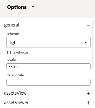
If you want to embed the Oracle Content Management web interface into other applications using the JavaScript Embed UI API V2, you can use the UI Configurator to define which user interface elements you want to show. You can set display options and then copy and paste the code you need to include in your web application.

To use the UI Configurator:
Sign in to the Oracle Content Management web interface.
Click Developer in the left navigation menu.
If you don’t see the Developer option, then you don’t have the required user privileges.Click Open UI Configurator in the Embeddable UI tile.
From the dropdown menu next to the Embed UI header, choose the UI component that you’d like to embed in your application, for example Documents View or Conversations List. As you select UI components, a live preview shows what the embedded UI would look like, based on the current state in the Oracle Content Management instance.
You can further define how the embedded UI will appear in your web application by clicking the
 icon to open the configuration side panel.
In the Options panel, you can set a number of configuration options for each UI component to fine-tune what the embedded UI looks like and what users can do. Here are some of the embedded UI changes you can make:
- Specify the locale and date format of the embedded UI. If no value is specified for the locale, the default browser locale is used. If no value is specified for the date locale, then the format for the specified locale is used.
- Show or hide individual UI elements, such as the header, breadcrumbs, or toolbar.
- Define how items are displayed.
- Change whether and how items can be selected.
- Enable or disable actions that users can perform in the embedded UI (for example, upload new items).
The Source panel shows a JavaScript JSON structure based on your current selections, which you can pass into your web application to ensure that the embedded UI is presented the way you want.
Click to show all option values and not just the ones that are different from their defaults.
Click to copy the current JSON structure to your clipboard.
Click to launch the embedded UI in a new browser window or tab to see what it looks like with the current settings.
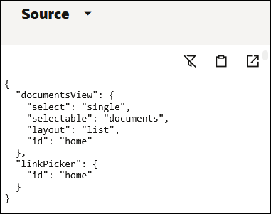
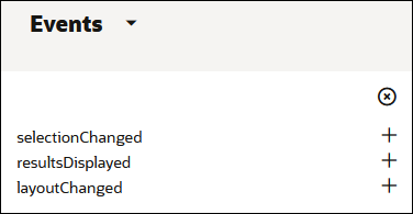
The Events panel shows code that you can use to monitor events (user interactions) in the embedded UI and control them in your web application. For example, you can track what items in a list have been selected and make sure your web application responds accordingly.
Embed UI API Reference
Below is detailed information for all Embed UI API V2 elements. It’s divided into three parts:
General Options
These are options at the root of the option object that are not specific to any component.
| Property | Type | Values | Description |
|---|---|---|---|
| scheme: default | string | [“default”, “light”, “dark”] | |
| hideColorStripe: false | boolean | Hides the header color stripe | |
| takeFocus: false | boolean | Sets the selection mode to single-select, multi-select, or no selection. | |
| locale: undefined | string | See the language setting in the user preferences in the full web UI for the complete list. |
Sets the language for the embedded UI. Must be a valid language code supported by Oracle Content Management.
The default value of |
| dateLocale: undefined | string | See the date format setting in the user preferences in the full web UI for the complete list. |
Sets the date format for dates displayed in the embedded UI. It must be a valid language code supported by Oracle Content Management.
The default value of |
Components
- assetsView
- assetViewer
- contentItemEditor
- contentItemCreate
- documentsView
- documentViewer
- linkPicker
- conversationsList
- conversationView
assetsView
The options for the assetsView component described below allow you to customize assets view in the embedded user interface.
Options
| Property | Type | Values | Description |
|---|---|---|---|
| assetsView { | |||
| select: “multiple” | string | [“multiple”, “single”, “none”] | Sets the selection mode to single-select, multi-select, or no selection. |
| layout: undefined | string | [““,”grid”, “table”] | Sets the view layout to Grid or Table. |
| availableLayouts: [ ] | array | [“none”, “table”, “grid”] | Either hides the layout control if none or one option is set, or restricts the layout options to the values in the array. If a layout value is specified that is not in the availableLayouts list, then it will be added to the list. |
| sort: undefined | string | [““,”relevance”, “nameasc”, “updated”] | Sets the initial sort order for returned results to Relevance, Name, or Last Updated. |
| header { | |||
| hide: false | boolean | Hides the Assets header in embed UI. | |
| add { | |||
| upload: false | boolean | Enables the ‘Add from this computer’ action in the content header. | |
| documents: false | boolean | Enables the ‘Add from Documents’ action in the content header. | |
| connectors: [ ] | array |
[“all”, “ |
Enables the specified connectors in the Add menu. Connectors will only be displayed if they are configured for the repository. |
| } | |||
| create: false | boolean | Enables the Create action in the content header. | |
| analytics: false | boolean | Enables the Content Analytics action in the content header. | |
| translations: false | boolean | Enables the Translation Jobs action in the content header. | |
| collections: false | boolean | Enables the Collections action in the content header. | |
| categorySuggestions: false | boolean | Enables the Category Suggestions action in the content header. | |
| workflowTasks: false | boolean | Enables the Workflow Tasks action in the content header. | |
| scheduledPublishing: false | boolean | Enables the Publishing Jobs action in the content header. | |
| publishingEvents: false | boolean | Enables the Publishing Event Logs action in the content header. | |
| archivedAssets: false | boolean | Enables the Archived Assets action in the content header. | |
| } | |||
| filter { | |||
| expand: false | boolean | Displays the sidebar on the left as initially expanded or initially collapsed. Ignored if no tabs are enabled. | |
| tabs { | If no tabs are enabled, the filter panel control is hidden. | ||
| filter: false | boolean | Enables the Filter tab in the filter panel. | |
| categories: false | boolean | Enables the Categories tab in the filter panel. Categories tab will only display if selected repository has assigned taxonomies. | |
| fields: false | boolean | Enables the Fields tab in the filter panel. | |
| } | |||
| bar { | |||
| hide: false | boolean | Hides the filter bar. | |
| keywords: true | boolean | Enables display and entry of keywords in the filter bar. | |
| capsules: true | boolean | Enables display of filter settings in the filter bar. | |
| relatedKeywords: false | boolean | Enables display of related keywords below filter bar. | |
| } | |||
| colorFilter: false | boolean | Enables display of color filter control in the filter panel. | |
| repositories: undefined | array | Displays a list of repository IDs for the user to choose from. | |
| collections: undefined | array |
[“all”, “notInCollection”, “ |
Displays a list of collection IDs for the user to choose from. |
| channels: undefined | array |
[“all”, “notTargeted”, “ |
Displays a list of channel IDs for the user to choose from. |
| languages: undefined | array | Displays a list of language IDs for the user to choose from. | |
| digitalAssetTypes: [ ] | array | Deprecated: use mediaGroup and assetTypes. | |
| contentItemTypes: [ ] | array | Deprecated: use mediaGroup and assetTypes. | |
| mediaGroups: [ ] | array | [“none”, “images”, “videos”, “documents”, “contentitem”, “other”] |
Enables the specified media group filters on the filter panel. If “none” is included, the Media Groups section in the filter panel is hidden. If only “contentitem” is included, only content item types are displayed in the Asset Types section. If “contentitem” is not included, only digital asset types aredisplayed in the Asset Types section. |
| assetTypes: [ ] | array |
[“none”, “ |
Enables the specified asset type filters on the filter panel. The asset types displayed are also partially controlled by the Media Groups setting. |
| assetStatus: [ ] | array | [“all”, “none”, “published”, “unpublished”, “inreview”, “approved”,“rejected”, “translated”, “draft”, “recategorized”] | Enables the specified asset status filters on the filter panel. |
| colorTags | array | Displays an array of color tags for the user to choose from. | |
| taxonomies: undefined | array | Displays a list of taxonomy IDs in the filter panel for the user to choose from. | |
| } | |||
| filterValue { | Defines the initial filter criteria. The user may change these options as permitted by the values provided in the filter option. | ||
| repositoryId: undefined | string | Sets the initial repository to load. Required when using filter.repositories for limiting the repositories; must also be one of the entries of filter.repositories. | |
| keywords: [ ] | array | Sets the initial list of keywords to use for filtering assets. | |
| collectionId: undefined | string |
“all”, “notInCollection”, “ |
Sets the initial collection to use for filtering assets. |
| channelId: undefined | string |
“all”, “notTargeted”, “ |
Sets the initial channel to use for filtering assets. |
| languageId: undefined | string | Sets the initial language to use for filtering assets. | |
| digitalAssetTypes: [ ] | array | Deprecated: use mediaGroups and assetTypes. | |
| contentItemTypes: [ ] | array | Deprecated: use mediaGroups and assetTypes. | |
| mediaGroups: [ ] | array | [“images”, “videos”, “documents”, “contentitem”, “other”] | Sets the initial list of media groups to use for filtering assets. |
| assetTypes: [ ] | array |
[“ |
Sets the initial list of asset types to use for filtering assets. |
| assetStatus: [ ] | array | [“published”, “unpublished”, “inreview”, “approved”, “rejected”, “translated”, “draft”, “recategorized”] | Sets the initial list of asset status values to use for filtering assets. |
| colorTags | array | Sets the initial color tags to use for filtering assets. | |
| includeChildCategories: true | boolean | Sets whether category filtering returns assets assigned directly to a category as well as any assigned to children of the category. | |
| notCategorized: false | boolean | When set, results will include only assets with no categories assigned. | |
| categories: [ ] | array | Sets the initial list of categories to use for filtering assets. | |
| suggestionData: undefined | string | Text to use for generating suggested keyword content. | |
| } | |||
| sidebar { | Controls the panels displayed in the right sidebar. Only panels allowed for the selected models will display regardless of being enabled by the embedded UI configuration. If no panels are enabled, then the toggle sidebar control in the content header is removed and no sidebar is present. | ||
| expand: false | boolean | Displays the sidebar on the right as initially expanded. | |
| active: undefined | string | [““,”analytics”, “categories”, “channels”, “conversation”, “inventory” “properties”, “tagsAndCollections”, “workflow”] | Sets the initially active sidebar panel. |
| analytics: false | boolean | Enables display of the Analytics sidebar panel. | |
| categories: false | boolean | Enables display of the Categories sidebar panel. | |
| channels: false | boolean | Enables display of the Channels sidebar panel. | |
| conversation: false | boolean | Enables display of the Conversation sidebar panel. | |
| inventory: false | boolean | Enables display of the Inventory sidebar panel. | |
| properties: false | boolean | Enables display of the Properties sidebar panel. | |
| tagsAndCollections: false | boolean | Enables display of the Tags and Collections sidebar panel. | |
| workflow: false | boolean | Enables display of the Workflow sidebar panel for repositories with external content workflows assigned. For repositories using built-in manager approval workflow, this enables display of the Submit for Approval, Approve, and Reject actions. | |
| options { | |||
| taxonomies: undefined | array | A list of taxonomy IDs to limit the taxonomies listed in the Categories sidebar panel for user to choose from when adding new categories. | |
| } | |||
| } | |||
| toolbar { | |||
| hide: false | boolean | Hides the toolbar area. No actions will display for selected assets even if otherwise enabled. | |
| } | |||
| actions { | |||
| view: false | boolean | Enables the View action. | |
| preview: false | boolean | Enables the Preview action. | |
| edit: false | boolean | Enables the Edit action. | |
| languages: false | boolean | Enables the Epand Languages action. | |
| addTranslation: false | boolean | Enables the Add Translation action. | |
| publish: false | boolean | Enables the Publish action. | |
| publishLater: false | boolean | Enables the Publish Later action. | |
| unpublish: false | boolean | Enables the Unpublish action. | |
| download: false | boolean | Enables the Download action. | |
| uploadNewVersion: false | boolean | Enables the Upload New Version action. | |
| findVisuallySimilar: false | boolean | Enables the Find Visually Similar action. | |
| findCategorizedSimilarly: false | boolean | Enables the Find Categorized Similarly action. | |
| copy: false | boolean | Enables the Copy action. | |
| duplicate: false | boolean | Enables the Duplicate action. | |
| translatable: false | boolean | Enables the Translatable action. | |
| nonTranslatable: false | boolean | Enables the Nontranslatable action. | |
| setTranslated: false | boolean | Enables the Set Translated action. | |
| setMaster: false | boolean | Enables the Set Master action. | |
| translate: false | boolean | Enables the Translate action. | |
| delete: false | boolean | Enables the Delete action. | |
| lock: false | boolean | Enables the Lock action. | |
| unlock: false | boolean | Enables the Unlock action. | |
| convertType: false | boolean | Enables the Convert Type action. | |
| convertVideo: false | boolean | Enables the Convert Video action. | |
| archive: false | boolean | Enables the Archive action. | |
| syncAsset | boolean | Enables the ‘Check for linked file updates’ action./td> | |
| } | |||
| card { | |||
| conversationIcon: false | boolean | Displays the conversation indicator on the asset card. | |
| status: true | boolean | Displays the status indicator or column (published, draft, etc.) on the asset card. | |
| language: true | boolean | Displays the language indicator or column (published, draft, etc.) on the asset card. | |
| version: undefined | string | all(undefined), latest | Fixes the asset cards to a specified version. Status control will not present as a drop menu to allow toggling to a different version. |
| drag: false | boolean | Enables drag-and-drop support. |
Events
| Event | Arguments | Description |
|---|---|---|
| selectionChanged(frameElement, selection, additions, deletions, repository) |
frameElement: the frame element triggering the event selection: array of items in the current selection additions: array of items added since the previous selectionChanged event. deletions: array of items deleted since the previous selectionChanged event. repository: The repository opened in the assets view. |
Fired when selection changes within the embedded view. Selection argument contains the current selection. Additions and Deletions contain items that were added or removed respectively since the previous selectChanged event. |
| filterChanged(frameElement, filter, repository) |
frameElement: the frame element triggering the event filter: the new value of the Assets view filter repository: The repository opened in the assets view. |
Fired when filter parameters change within the embedded Assets view. The filter argument passed to filterChanged is the same as assetsView.filterValue in the Assets view option. It can be persisted and passed as the filterValue option when reloading the assets view to restore filter changes made by the user. |
| itemUploaded(frameElement, item, repository) |
frameElement: the frame element triggering the event item: the uploaded item |
Fired when a new digital asset is uploaded or added to the repository through a connector. |
| itemsPublished(frameElement, items, dependencies, repository) |
frameElement: the frame element triggering the event items: items included in publish dependencies: dependency items published repository: repository containing items |
Triggered for items successfully published. |
| itemsUnpublished(frameElement, items, repository) |
frameElement: the frame element triggering the event items: items included in publish repository: repository containing items |
Triggered for items successfully unpublished. |
| resultsDisplayed(frameElement, items, repository) |
frameElement: the frame element triggering the event items: items included displayed results repository: repository containing items |
Triggers when the results displayed on the initial load of the assetView and after any change in filter citeria. |
| layoutChanged(frameElement, layout) |
frameElement: the frame element triggering the event layout: the new layout value |
|
| sortChanged(frameElement, sort) |
frameElement: the frame element triggering the event sort: the new sort value |
|
| navigate(frameElement, route) |
frameElement: the frame element triggering the event route: the route of the destination of the navigation. |
When opening asset, this will trigger with
route = assets/view/ |
| drawerOpened |
frameElement: the frame element triggering the event drawer: the drawer that was opened. |
Possible values for drawer:
|
| drawerClosed |
frameElement: the frame element triggering the event drawer: the drawer that was closed. |
|
| dragStart(frameElement, data) |
frameElement: the frame element triggering the event data: details of the items being dragged |
dragStart will only fire when the assetView.card.drag option is true. |
| dragEnd(frameElement) | frameElement: the frame element triggering the event |
Methods
| Method | Description |
|---|---|
| clearSelection(frameElement) | Clears selection for all items. |
| selectItem(frameElement, id) | Selects the specified item. |
| clearItem(frameElement, id) | Clears the selection from the specified item. |
| getItem(frameElement, id, parameters) |
Gets a full item resource for the specified item. The item must be currently displayed in the embedded UI. The method is asynchronous and returns a Promise object. The Promise done callback function will be called when the item response is available.
Internally this calls the /items/<id> REST API call. ‘Parameters’ is an object used to pass parameters to the REST API call. Refer to the Swagger documentation for details of how parameters are used and which values are available. |
| refreshItem(frameElement, ids) | Updates the card/row data for item IDs past in IDs array parameter. If the item no longer exists, the card/row is removed. |
| createNewItems(frameElement, assetType) |
Opens the drawer to create a new content item in the same way as if user had selected the Create actions in the asset view header and chosen the assert type. The asset type must be a content item type and must be associated with the repository currently selected in the assetsView. This method returns a promise object that can be user to catch errors. |
assetViewer
The options for the assetViewer component described below allow you to customize the asset viewer in the embedded user interface.
Options
| Property | Type | Values | Description |
|---|---|---|---|
| assetViewer { | |||
| id: undefined | string | REQUIRED. Sets the ID of the asset to display. | |
| version: undefined | string | The version to be displayed. If not set, the latest version is displayed. | |
| header { | |||
| hide: false | boolean | Hides the content header. | |
| create: false | boolean | Enables the Create action in the content header. | |
| annotate: false | boolean |
Enables annotation controls in the content header. For annotations to work, sidebar.conversation must be enabled. Additionally, enterHive needs to be enabled in the conversations section and conversationView.closeService must be called before destroying the iFrame hosting the embeddable UI. |
|
| fullScreen: false | boolean | Enables the Full Screen action in the content header. | |
| close: false | boolean | Enables the Close button in the content header. | |
| } | |||
| actions { | |||
| edit: false | boolean | Enables the Edit action in the content header. | |
| publish: false | boolean | Enables the Publish action in the content header. | |
| publishLater: false | boolean | Enables the Publish Later action in the content header. | |
| download: false | boolean | Enables the Download action in the content header. | |
| uploadNewVersion: false | boolean | Enables the Upload New Version action in the content header. | |
| makeCurrent: false | boolean | Enables the Make Current action in the content header. | |
| compare: false | boolean | Enables the Compare button. | |
| preview: false | boolean | Enables the Preview action for Media and Reference fields. | |
| previewLayouts: false | boolean | Enables the Preview Layouts action for digital assets | |
| convertVideo | boolean | Enables the Convert Video action. | |
| } | |||
| controls { | |||
| fit: “default” | string | [“default”, “width”, “page”, “original”] | Sets the initial zoom for digital assets to Fit to Width, Fit Page, or 100%. A value of ‘default’ lets the viewer figure out the fit. |
| zoom: true | boolean | Enables display of the zoom controls including the slider control. | |
| fitOriginal: true | boolean | Enables the Zoom 100% option. | |
| fitPage: true | boolean | Enables the Fit Page option. | |
| fitWidth: true | boolean | Enables the Fit to Width option. | |
| } | |||
| thumbnails { | |||
| hide: false | boolean | Hides the thumbnail panel displayed for multi-page documents. | |
| expand: true | boolean | Displays the thumbnail panel as either initially expanded or initially collapsed. | |
| } | |||
| sidebar { | Controls the panels displayed in the sidebar. Only panels allowed for the selected models will display regardless of being enabled by the embed configuration. If no panels are enabled, then the toggle control in the content header is removed and no sidebar is present. | ||
| expand: false | boolean | Displays the sidebar as initially expanded. | |
| active: undefined | string | [““,”analytics”, “categories”, “channels”, “conversation”, “inventory”, “properties”, “renditions”, “tagsAndCollections”, “workflow”] | Sets the initially active sidebar panel. |
| analytics: false | boolean | Enables the Analytics sidebar. | |
| attributes | boolean | Enables the Attributes sidebar. | |
| categories: false | boolean | Enables the Categories sidebar. | |
| channels: false | boolean | Enables the Channels sidebar. | |
| conversation: false | boolean | Enables the Conversations sidebar. | |
| inventory: false | boolean | Enables the Inventory sidebar. | |
| properties: false | boolean | Enables the Properties sidebar. | |
| renditions: false | boolean | Enables the Renditions sidebar. | |
| tagsAndCollections: false | boolean | Enables the Tags and Collections sidebar. | |
| workflow: false | boolean | Enables display of the Workflow sidebar panel for repositories with external workflows assigned. For repositories using manager approval workflow, this enables display of the Submit for Approval, Approve, and Reject actions. | |
| options { | |||
| taxonomies: undefined | array | A list of taxonomy IDs to limit the taxonomies listed in the Categories sidebar panel for user to choose from when adding new categories. | |
| addRendition: true | boolean | Controls whether the Add rendition button is displayed on the Renditions sidebar panel. Action edit is also required to show Add Rendition button. Setting this to ‘false’ will hide the button, even if action edit is enabled. | |
| } | |||
| } | |||
| videoControls { | |||
| hide: false | boolean | Hides the video controls for video content. | |
| autoplay: false | boolean | Enables auto-play of video content. | |
| loop: false | boolean | Enables loop options for video content. | |
| mute: false | boolean | Enables the mute option for video content. | |
| } | |||
| views { | |||
| layouts: undefined | string | [“ContentForm”, “Default”, “Content List Default”, “Empty Content List Default”, “Content Placeholder Default”, “<custom layout name>”] | Limits the set of available content layouts displayed in the view menu when viewing a content item. If undefined, all layouts are displayed. If set, at least one content layout must be provided. If no layouts provided listed match those available for the content item, a content form will be included automatically. |
| inPlacePreview: undefined | string | [“none”, “<site:page>”, “<site>”, “<:page>”, “external page”] |
Limits the set of available in-place preview options displayed in the view menu when viewing a content item. If undefined, all in-place preview options are displayed. If set, only options that match the in-place preview options defined for the type will be displayed. (‘none’ will display no options). Site pages are provided in the form “site:page”, where ‘site’ may be either the site ID or site name, and ‘page’ may be either a page name or page ID. If ‘site’ is provided alone, all configured in-place preview pages for the type are displayed. If ‘page’ is provided alone, all matching pages on any site are displayed. |
| default: undefined | string | “<custom layout name>” or “<site:page>” or “<external site name:page url>” |
Default content layout or in-place preview to view the asset. Layout name is provided in the form of “content layout name” for a content layout, or “site:page” for an in-place preview where ‘site’ may be either site ID or site name or external site name and ‘page’ may be either a page name or page ID or external page url. |
| } | |||
| } |
Events
| Event | Arguments | Description |
|---|---|---|
| navigate(frameElement, route) |
frameElement: the frame element triggering the event route: the route of the destination of the navigation. |
When closing assetViewer, this will trigger with route = assets |
| itemUploaded(frameElement, item, repository) |
frameElement: the frame element triggering the event item: the uploaded item repository: the repository containing the asset |
Fired when a new version of the asset is uploaded. The assetViewer will not refresh to display the updated version until the itemUploaded handler has returned. If the handler is defined as an asynchronous function (returns a promise), then the refresh will wait for the promise to resolve before refreshing. |
| drawerOpened(frameElement, drawer) |
frameElement: the frame element triggering the event drawer: the drawer that was opened. |
Possible values for drawer:
|
| drawerClosed(frameElement, drawer) |
frameElement: the frame element triggering the event drawer: the drawer that was closed. |
Methods
None.
contentItemEditor
The options for the contentItemEditor component described below allow you to customize the content item editor in the embedded user interface.
Options
| Property | Type | Values | Description |
|---|---|---|---|
| contentItemEditor { | |||
| id: undefined | string |
REQUIRED. Sets the ID of the asset to display. The contentItemEditor can only edit content item type assets. Digital asset type assets are not supported. |
|
| header { | |||
| hide: false | boolean | Hides the content header. | |
| create: false | boolean | Enables the Create action in the content header. | |
| annotate: false | boolean |
Enables annotation controls in the content header. For annotations to work, sidebar.conversation must be enabled. Additionally, enterHive needs to be enabled in the conversations section and conversationView.closeService must be called before destroying the iFrame hosting the embeddable UI. |
|
| preview: false | boolean | Enables the Preview action in the content header. | |
| done: true | boolean | Enables the Done action in the content header. | |
| save: true | boolean | Enables the Save button in the content header. | |
| close: true | boolean | Enables the Close button in the content header. | |
| } | |||
| actions { | |||
| open: false | boolean | Enables the Open action in the content header. | |
| edit: false | boolean | Enables the Edit action in the content header. | |
| preview: false | boolean | Enables the Preview action for Media and Reference fields. | |
| publish: false | boolean | Enables the Publish action in the content header. | |
| publishLater: false | boolean | Enables the Publish Later action in the content header. | |
| } | |||
| sidebar { | Controls the panels displayed in the sidebar on the right. Only panels allowed for the selected models will display regardless of being enabled by the embed configuration. If no panels are enabled, then the toggle control in the content header is removed and no sidebar is present. | ||
| expand: false | boolean | Displays the sidebar as initially expanded. | |
| active: undefined | string | [““,”analytics”, “categories”, “channels”, “conversation”, “inventory”, “properties”, “tagsAndCollections”, “workflow”] | Sets the initially active sidebar panel. |
| analytics: false | boolean | Enables the Analytics sidebar. | |
| categories: false | boolean | Enables the Categories sidebar. | |
| channels: false | boolean | Enables the Channels sidebar. | |
| conversation: false | boolean | Enables the Conversation sidebar. | |
| inventory: false | boolean | Enables the Inventory report sidebar. | |
| properties: false | boolean | Enables the Properties sidebar. | |
| tagsAndCollections: false | boolean | Enables the Tags and Collections sidebar. | |
| workflow: false | boolean | Enables display of the Workflow sidebar panel for repositories with external workflows assigned. For repositories using manager approval workflow, this enables display of the Submit for Approval, Approve, and Reject actions.Download | |
| options { | |||
| taxonomies: undefined | array | A list of taxonomy IDs to limit the taxonomies listed in the Categories sidebar panel for user to choose from when adding new categories. | |
| } | |||
| } | |||
| } |
Events
| Event | Arguments | Description |
|---|---|---|
| itemSaved(frameElement, item, keepOpen) |
frameElement: the frame element triggering the event item: the saved item keepOpen: indicates whether the component should not be closed |
Fired when the item in the editor is saved. This can be due to the user clicking the Save button or due to the item being implicitly saved when the user clicks Done, Publish, or Preview. If fired as a result of Done, the keepOpen argument will be false, indicating the component can be closed by the hosting application. If keepOpen is false, the hosting application should not close the component. For Save and Preview, the component is expected to remain open. For Publish, the hosting application should wait for the itemsPublished event to close the component. |
| closed(frameElement) | frameElement: the frame element triggering the event | Fired when the Close button in the content header is clicked. The default behavior is to navigate back to the Assets View, but the hosting application may choose to close the embedded frame during the handling of this message. |
| itemsPublished(frameElement, items, dependencies, repositories) |
frameElement: the frame element triggering the event items: the items directly selected for publish dependencies: dependencies of the select assets that were also published repository: |
|
| drawerOpened(frameElement, drawer) |
frameElement: the frame element triggering the event drawer: the drawer that was opened. |
Possible values for drawer:
|
| drawerClosed(frameElement, drawer) |
frameElement: the frame element triggering the event drawer: the drawer that was closed. |
Methods
None.
contentItemCreate
The options for the contentItemCreate component described below allow you to customize the create content item interface in the embedded user interface.
Options
| Property | Type | Values | Description |
|---|---|---|---|
| contentItemCreate { | |||
| type: undefined | string |
REQUIRED. Sets the type of the content item to create. contentItemCreate only support content item types. Digital asset types are not supported. |
|
| repositoryId | string | RECOMMENDED: Sets the repository in which to create the assets. If not set, the last repository viewed by the use will be used. It is recommended that this be set to ensure the asset is created in the expected repository. | |
| header { | |||
| hide: false | boolean | Hides the content header. | |
| preview: false | boolean | Enables the Preview button in the content header. | |
| done: true | boolean | Enables the Done button in the content header. | |
| save: false | boolean | Enables the Save button in the content header. | |
| close: true | boolean | Enables the Close button in the content header. | |
| } | |||
| actions { | |||
| publish: false | boolean | Enables the Publish action in the content header. | |
| publishLater: false | boolean | Enables the Publish Later action in the content header. | |
| } | |||
| sidebar { | Controls the panels displayed in the sidebar on the right. Only panels allowed for the selected models will display regardless of being enabled by the embed configuration. If no panels are enabled, then the toggle control in the content header is removed and no sidebar is present. | ||
| expand: false | boolean | Displays the sidebar as initially expanded. | |
| active: undefined | string | [““,”categories”, “channels”, “tagsAndCollections”] | Sets the initially active sidebar panel. |
| categories: false | boolean | Enables the Categories sidebar. | |
| channels: false | boolean | Enables the Channels sidebar. | |
| tagsAndCollections: false | boolean | Enables the Tags and Collections sidebar. | |
| options { | |||
| taxonomies: undefined | array | A list of taxonomy IDs to limit the taxonomies listed in the Categories sidebar panel for user to choose from when adding new categories. | |
| } | |||
| } | |||
| default { | Controls the ability to set initial values for tags, collections and channels. | ||
| tags: undefined | array | A list of tag values to be the initial set of values for the content item being created. | |
| channels: undefined | array | A list of channel IDs to be the initial set of values for the content item being created. | |
| collections: undefined | array | A list of collection IDs to be the initial set of values for the content item being created. | |
| } | |||
| } |
Events
| Event | Arguments | Description |
|---|---|---|
| itemSaved(frameElement, item) |
frameElement: the frame element triggering the event item: the saved item |
Fired when the Save button in the content header is clicked. The default behavior is to navigate back to assets view, but the hosting application may choose to close the embedded frame during the handling of this message. |
| closed(frameElement) | frameElement: the frame element triggering the event | Fired when the Close button in the content header is clicked. The default behavior is to navigate back to assets view, but the hosting application may choose to close the embedded frame during the handling of this message. |
Methods
None.
documentsView
The options for the documentsView component described below allow you to customize documents view in the embedded user interface.
Options
| Property | Type | Values | Description |
|---|---|---|---|
| documentsView { | |||
| id:home | string | Sets the ID of the folder to display. If not set, the user home folder is displayed. | |
| linkId: undefined | string | Link ID used for displaying embedded view for a public link. | |
| appLink: undefined | object | Sets the applink tokens using the response structure from the Applink REST API. It can be the entire response, but must contain at least appLinkID, accessToken, and refreshToken properties. | |
| select: multiple | string | [multiple”,“single”, “none”] | |
| selectable: “any” | string | [“any”, “documents”, “folders”] | Sets which types of items can be selected: only documents, only folders, or any type of item. |
| layout: undefined | string | [““,”grid”, “table”, “list”] | Sets the view layout to Grid, Table, or List. |
| availableLayouts: [ ] | array | [‘none’, ‘table’, ‘list’, ‘grid’] | Either hides the layout control if none or one option is set, or restricts the layout options to the values in the array. If a layout value is specified that is not in the availableLayouts list, then it will be added to the list. |
| sort: undefined | string | [““,”nameasc”, “updated”] | Sets the initial sort order for returned results. |
| header { | |||
| hide: false | boolean | Hides the content header. | |
| title: true | boolean | Hides the header title. | |
| menu: true | boolean | Hides the header submenu. | |
| create { | If both folder and o365 are enabled, the Create button displays as a menu. | ||
| folder: false | boolean | Enables the Create new folder action in the content header. | |
| o365: false | boolean | Enables the Create new Office documents in the content header. | |
| } | |||
| upload: false | boolean | Enables the Upload action in the content header. | |
| trash: false | boolean | Enables the trash option in the header submenu. | |
| favorites: false | boolean | Enables the favorites option in the header submenu. | |
| } | |||
| toolbar { | |||
| hide: false | boolean | Hides the actions toolbar. | |
| } | |||
| breadcrumb { | |||
| hide: false | boolean | Hides the breadcrumb area. | |
| back: false | boolean | Enables a back button in the breadcrumb area. | |
| } | |||
| actions { | |||
| open { | |||
| folder: true | boolean | Enables the Open action for folder items. | |
| file: false | boolean | Enables the Open action for file items. | |
| o365: false | boolean | Enables the Open in Office 365 action for Office documents (when supported). | |
| } | |||
| edit { | |||
| web: false | boolean | ||
| o365: false | boolean | ||
| } | |||
| favorite: false | boolean | Enables the Favorite action. | |
| uploadToFolder: false | boolean | Enables the Upload to this Folder action. | |
| uploadNewVersion: false | boolean | Enables the Upload New Version action. | |
| download: false | boolean | Enables the Download action. | |
| rename: false | boolean | Enables the Rename action. | |
| lock: false | boolean | Enables the Lock and Unlock actions. | |
| move: false | boolean | Enables the Move action. | |
| copy: false | boolean | Enables the Copy action. | |
| delete: false | boolean | Enables the Delete action. | |
| shareLink: false | boolean | Enables the Share Link action. | |
| members: false | boolean | Enables the Members action. | |
| addToAssets: false | boolean | Enables the Add To Assets action. | |
| } | |||
| sidebar { | |||
| expand: false | boolean | Displays the sidebar as initially expanded. | |
| active: undefined | string | [““,”properties”, “conversation”, “tagsAndMetadata”] | Sets the initially active sidebar panel. |
| properties: false | boolean | Enables display of the Properties sidebar panel. | |
| conversation: false | boolean | Enables display of the Conversations sidebar panel. | |
| tagsAndMetadata: false | boolean | Enables display of the Tags and Metadata sidebar panel. | |
| } | |||
| } |
Events
| Event | Arguments | Description |
|---|---|---|
| selectionChanged(frameElement, selection, additions, deletions, repository) |
frameElement: the frame element triggering the event selection: array of items in the current selection additions: array of items added since the previous selectionChanged event.
deletions: array of items deleted since the previous selectionChanged event. folder: The folder opened in the Documents view. |
Fired when selection changes within the embedded view. Selection argument contains the current selection. Additions and Deletions contain items that were added or removed respectively since the previous selectChanged event. |
| itemUploaded(frameElement, item, folder) |
frameElement: the frame element triggering the event item: the uploaded item |
Fired when a new file is uploaded to a folder. |
Methods
| Method | Description |
|---|---|
| clearSelection(frameElement) | Clears selection for all items. |
| selectItem(frameElement, id) | Selects the specified item. |
| clearItem(frameElement, id) | Clears the selection from the specified item. |
documentViewer
The options for the documentViewer component described below allow you to customize the document viewer in the embedded user interface.
Options
| Property | Type | Values | Description |
|---|---|---|---|
| documentViewer { | |||
| id:undefined | string | Required. Sets the ID of the file to display. | |
| linkId: undefined | string | Link ID used for displaying embedded view for a public link. | |
| version: undefined | string | The version to be displayed. If not set, the latest version is displayed. | |
| appLink: undefined | object | Sets the applink tokens using the response structure from the Applink REST API. It can be the entire response, but must contain at least appLinkID, accessToken, and refreshToken properties. | |
| header { | |||
| hide: false | boolean | Hides the content header. | |
| annotate: false | boolean |
Enable annotation controls in the content header. For annotations to work, sidebar.conversation must be enabled. Additionally, enterHive needs to be enabled in the conversations section and conversationView.closeService must be called before destroying the iFrame hosting the embeddable UI |
|
| fullScreen: false | boolean | Enables the Full Screen action in the content header. | |
| close: false | boolean | Enables the Close button in the content header. | |
| } | |||
| breadcrumb { | |||
| hide: false | boolean | Hides the breadcrumb area. | |
| back: false | boolean | Enables a back button in the breadcrumb area. | |
| nextprev: false | boolean | Enables the next/previous control. | |
| } | |||
| actions { | |||
| view { | |||
| o365: false | boolean | ||
| } | |||
| edit { | |||
| web: false | boolean | ||
| o365: false | boolean | ||
| } | |||
| download: false | boolean | Enables the Download action. | |
| uploadNewVersion: false | boolean | Enables the Upload New Version action. | |
| favorite: false | boolean | Enables the Favorite action. | |
| shareLink: false | boolean | Enables the Share Link action. | |
| rename: false | boolean | Enables the Rename action. | |
| addToAssets: false | boolean | Enables the Add To Assets action. | |
| lock: false | boolean | Enables the Lock and Unlock action. | |
| } | |||
| controls { | |||
| fit: “default” | string | [“default”, “width”, “page”, “original”] | Sets the initial zoom for digital assets to Fit to Width, Fit Page, or 100%. A value of ‘default’ lets the viewer figure out the fit. |
| zoom: true | boolean | Enables display of the zoom controls including the slider control. | |
| fitOriginal: true | boolean | Enables the Zoom 100% option. | |
| fitPage: true | boolean | Enables the Fit Page option. | |
| fitWidth: true | boolean | Enables the Fit to Width option. | |
| } | |||
| thumbnails { | |||
| hide: false | boolean | Hides the thumbnail panel displayed for multi-page documents. | |
| expand: true | boolean | Displays the thumbnail panel as either initially expanded or initially collapsed. | |
| } | |||
| sidebar { | Controls the panels displayed in the sidebar. Only panels allowed for the selected models will display regardless of being enabled by the embed configuration. If no panels are enabled, then the toggle control in the content header is removed and no sidebar is present. | ||
| expand: false | boolean | Displays the sidebar as initially expanded. | |
| active: undefined | string | [““,”properties”, “conversation”, “customProperties”] | Sets the initially active sidebar panel. |
| properties: false | boolean | Enables display of the Properties sidebar panel. | |
| conversation: false | boolean | Enables display of the Conversations sidebar panel. | |
| tagsAndMetadata: false | boolean | Enables display of the Tags and Metadata sidebar panel. | |
| customProperties: false | boolean | Enables display of the Custom Properties sidebar panel. | |
| } | |||
| videoControls { | |||
| hide: false | boolean | Hides the video controls for video content. | |
| autoplay: false | boolean | Enables auto play of video content. | |
| loop: false | boolean | Enables loop options for video content. | |
| mute: false | boolean | Enables the mute option for video content. | |
| } | |||
| } |
Events
| Event | Arguments | Description |
|---|---|---|
| itemUploaded(frameElement, item, folder) |
frameElement: the frame element triggering the event item: the uploaded item |
Fired when a new version of the document is uploaded. |
Methods
None.
linkPicker
LinkPicker is intended to be used inside a modal dialog or drawer user interface element, but does not implement the dialog or drawer itself. It is expected that such a dialog or drawer be implemented using a framework such as OJET or JQueryUI, provided by the hosting application.
Link Picker supports three modes of operation:
- Internal - In this mode, all navigation buttons and dialog semantics are rendered internally by the component, including Next, Back, Cancel, and Done buttons. The hosting application need only display the component in an empty dialog element, and handle the Close and Done callback events to obtain the resulting link and close the dialog element.
- External - In this mode, all buttons are rendered by the the hosting application’s dialog element and no buttons are rendered by the component. The hosting application can react to the selectionChanged event, invoke the next and previous functions to navigate forward and backwards, and call copyLink to obtain the configured link before closing the dialog element.
- Mixed - In this mode, navigation buttons are rendered by the component, but dialog semantic functions are controlled by the hosting application dialog element. This mode is appropriate when the hosting application has little control over the behavior of the dialog element itself and cannot add additional actions beyond basic “Ok” and “Cancel”. The hosting application enabled the “Next” and “Back” header options on the component, handle selectionChanged and stepChanged events to keep track of navigation within the component, and call copyLink before closing the dialog element.
Options
| Property | Type | Values | Description |
|---|---|---|---|
| linkPicker { | |||
| id:home | string | Sets the ID of the folder to display. If not set, the user home folder is displayed. | |
| selectable: “any” | string | [“any”, “documents”, “folders”] | Sets which types of items can be selected: only documents, only folders, or any type of item. |
| layout: undefined | string | [““,”grid”, “table”, “list”] | Sets the view layout to Grid, Table, or List. |
| sort: undefined | string | [““,”nameasc”, “updated”] | Sets the initial sort order for returned results. |
| header { | |||
| hide: false | boolean | Hides the content header. | |
| done: false | boolean | Enables the Done action in the content header. | |
| cancel: false | boolean | Enables the Cancel action in the content header. | |
| next: false | boolean | Enables the Next action in the content header. | |
| back: false | boolean | Enables the Back action in the content header. | |
| } | |||
| autoNext: true | boolean | Enables the auto next behavior. When is enabled, the link picker automatically progresses to link configuration as soon as a document is selected. | |
| linkType: public | string | [“public”, “member”, “both”] | Sets the types of links that user can choose to configure. |
| editOptions: false | boolean | Enables display of the edit options link on link configration step. If true, user will be able alter configuration settings by expanding the options panel. If false, the user will not be able to expand the options and cannot change the link configuration. | |
| expandOptions: true | boolean | Sets the initial visibility of the option panel. If true, the panel is initially expanded. If false, it is initially collapsed. If the editOptions setting is false, user will not be able to change the panels expanded state from its initial state. | |
| showExisting: false | boolean | Enabled display of the “Pick Existing Link” control. | |
| hidePermissions: false | boolean | Hides the “Link Permissions” control. | |
| selectedPermission: default | string | [“default”, “viewer”, “downloader”,“contributor”] | Sets the initial value of the Link Permissions control. This option value can not override the maximum role imposed by administrative configuration. |
| hideAccess: false | boolean | Hides the “Who can access this link?” control | |
| selectedAccess: default | string | [“default”, “anyone”, “registeredUsers”] | Sets the initial value of the “Who can access this link?” control. This option value can not override limitation imposed by administrative configuration. |
| hideExpiration: false | boolean | Hides the Link Expiration Date control. The initial value is not configurable. | |
| hideAccessCode: false | boolean | Hides the Link Access Code control. The initial value is not configurable. | |
| } |
Events
| Event | Arguments | Description |
|---|---|---|
| selectionChanged(frameElement, selection, additions, deletions, repository) |
frameElement: the frame element triggering the event selection: array of items in the current selection additions: array of items added since the previous selectionChanged event.
deletions: array of items deleted since the previous selectionChanged event. folder: The folder opened in the Documents view. |
Fired when selection changes within the embedded view. Selection argument contains the current selection. Additions and Deletions contain items that were added or removed respectively since the previous selectChanged event. |
| closed(frameElement) | frameElement: the frame element triggering the event | Fired when the Cancel button in the content header is clicked. No link is generated. |
| done(frameElement, link) |
frameElement: the frame element triggering the event link: the generated link |
Fired when the Done button in the content header is clicked. The newly configured link is returned. |
| stepChanged(frameElement, step) |
frameElement: the frame element triggering the event step: the new step displayed. The value will be “step2” when navigating foreward (next) to the link configuration step. The value will be “step1” when the navigating back to the folder or file selection step. |
Fired when navigating forward to the link configuration step or back to the item selection step. |
Methods
| Method | Description |
|---|---|
| next(frameElement) | Navigates forward (next) to the link configuration step. Equivalent to the “Next” header button action. |
| previous(frameElement) | Navigates backward (back) to the item selection step. Equivalent to the “Back” header button action. |
| copyLink(frameElement) |
Obtains the link for the selected item. It should only be called while the component is on the link configuration step. The method is asynchronous and returns a Promise object. The Promise done callback function will be called when the item response is available. |
conversationsList
The options for the conversationsList component described below allow you to customize conversation lists in the embedded user interface.
Options
The conversationsList and conversationsView components are configured using the same options.conversations property.
| Property | Type | Values | Description |
|---|---|---|---|
| conversations { | |||
| id:undefined | string | REQUIRED for conversationView. Sets the ID of the file to display when creating the conversation component. | |
| linkId: undefined | string | Link ID used for displaying embedded view for a hybrid link. | |
| enterHive: false | boolean | Must be true to enable real-time updates for conversations. If set, closeService must be called before destroying the iframe element containing the embedded conversations list or conversation view. | |
| header { | |||
| hide: false | boolean | Hides the content header. | |
| create: false | boolean | Enables the Create action in the content header. | |
| members: false | boolean | Enables member controls in the content header. | |
| } | |||
| breadcrumb { | |||
| hide: false | boolean | Hides the breadcrumb for conversation view. | |
| back: false | boolean | Shows a back button in conversation view. | |
| } | |||
| findBar { | |||
| show: false | boolean | Shows the find bar in conversation view. | |
| } | |||
| actions { | |||
| open: false | boolean | Enables the open action in the conversations list. | |
| } | |||
| } |
Events
| Event | Arguments | Description |
|---|---|---|
| selectionChanged(frameElement, selection, additions, deletions, repository) |
frameElement: the frame element triggering the event selection: array of items in the current selection additions: array of items added since the previous selectionChanged event. deletions: array of items deleted since the previous selectionChanged event. |
Fired when the selection changes within the embedded view. Selection argument contains the current selection. Additions and Deletions contain items that were added or removed respectively since the previous selectChanged event. |
Methods
| Method | Description |
|---|---|
| clearSelection(frameElement) | Clears selection for all items. |
| selectItem(frameElement, id) | Selects the specified item. |
| clearItem(frameElement, id) | Clears the selection from the specified item. |
| closeService(frameElement) |
Must be called when any component is created with options.conversation.enterHive=true. This initializes real-time updates for conversations and you must delay destroying the containing iframe until this real-time update service hive has completely closed. The method is asynchronous and returns a Promise object. The Promise done callback function will be called when the item response is available. |
conversationView
The options for the conversationView component described below allow you to customize conversation view in the embedded user interface.
Options
The conversationsList and conversationsView components are configured using the same options.conversations property.
| Property | Type | Values | Description |
|---|---|---|---|
| conversations { | |||
| id:undefined | string | REQUIRED for conversationView. Sets the ID of the file to display when creating the conversation component. | |
| enterHive: false | boolean | Must be true to enable real-time updates for conversations. If set, closeService must be called before destroying the iframe element containing the embedded conversations list or conversation view. | |
| header { | |||
| hide: false | boolean | Hides the content header. | |
| create: false | boolean | Enables the Create action in the content header. | |
| members: false | boolean | Enables member controls in the content header. | |
| } | |||
| breadcrumb { | |||
| show: false | boolean | Shows the breadcrumb for conversation view. | |
| back: false | boolean | Shows a back button in conversation view. | |
| } | |||
| findBar { | |||
| show: false | boolean | Shows the find bar in conversation view. | |
| } | |||
| actions { | |||
| open: false | boolean | Enables the open action in the conversations list. | |
| } | |||
| } |
Events
None.
Methods
| Method | Description |
|---|---|
| closeService(frameElement) |
Must be called when any component is created with options.conversation.enterHive=true. This initializes real-time updates for conversations and you must delay destroying the containing iframe until this real-time update service hive has completely closed. The method is asynchronous and returns a Promise object. The Promise done callback function will be called when the item response is available. |
Dialogs
Options for a number of components allow you to customize drawer dialogs in the embedded user interface:
- assetPreview
- archivedAssets
- archivedAssetView
- addToRepository
- assetLanguages
- documentPicker
- mediaPicker
- referencePicker
assetPreview
The Preview action in web interface opens asset for preview in a drawer.
Options
| Property | Type | Values | Description |
|---|---|---|---|
| assetPreview { | |||
| header { | |||
| fullScreen: false | boolean | Enables the Full Screen action in the content header. | |
| } | |||
| actions { | |||
| download: false | boolean | Enables the Download action in the content header. | |
| preview: false | boolean | Enables the Preview action. | |
| previewLayouts: false | boolean | ||
| } | |||
| controls { | |||
| zoom: true | boolean | Enables display of the zoom controls in the content header, including the slider control. | |
| fitOriginal: true | boolean | Enables the Fit 100% action in the content header. | |
| fitPage: true | boolean | Enables the Fit Page action in the content header. | |
| fitWidth: true | boolean | Enables the Fit to Width action in the content header. | |
| } | |||
| layouts: undefined | string | [“ContentForm”, “Default”, “Content List Default”, “Empty Content List Default”, “Content Placeholder Default”, “<custom layout name>] | Limits the set of available content layouts displayed in the view menu when viewing a content item. If undefined, all layouts are displayed. If set, at least one content layout must be provided. If no layouts listed match those available for the item, then the content form will be included automatically. |
| inPlacePreview: undefined | string | [“none”, “<site:page>”, “<site>”, “<:page>”, “external page”] |
Limits the set of available in-place previews options displayed in the view menu when viewing a content item. If undefined, all in-place preview options are displayed. If set, only options that match the in-place preview options defined for the type will be displayed. (“none” will display no options). Site pages are provided in the form “site:page”, where ‘site’ may be either the site ID or site name, and ‘page’ may be either a page name or page ID. If ‘site’ is provided alone, all configured in-place preview pages for the type are displayed. If ‘:page’ is provided alone, all matching pages on any site are displayed. |
| } |
archivedAssets
The Archived Assets drawer is opened from the asset view header menu.
Options
| Property | Type | Values | Description |
|---|---|---|---|
| archivedAssetsView { | |||
| select: “multiple” | string | [“multiple”, “single”, “none”] | Sets the selection mode to Single Select, Multi Select, or No Selection. |
| layout: undefined | string | [““,”grid”, “table”] | Sets the view layout to Grid or Table. |
| sort: undefined | string | [““,”relevance”, “nameasc”, “updated”] | Sets the initial sort order for returned results to Relevance, Name or Last Updated. |
| header { | |||
| hide: false | boolean | Hides the Assets header in embed UI. | |
| } | |||
| filter { | |||
| expand: false | boolean | Displays the sidebar on the left as initially expanded or initially collapsed. Ignored if no tabs are enabled. | |
| tabs { | If no tabs are enabled, the filter panel control is hidden. | ||
| filter: false | boolean | Enables the Filter tab in the filter panel. | |
| categories: false | boolean | Enables the Categories tab in the filter panel. Categories tab will only display if selected repository has assigned taxonomies. | |
| fields: false | boolean | Enables the Fields tab in the filter panel. | |
| } | |||
| bar { | |||
| hide: false | boolean | Hides the filter bar. | |
| keywords: true | boolean | Enables display and entry of keywords in the filter bar. | |
| capsules: true | boolean | Enables display of filter settings in the filter bar. | |
| relatedKeywords: false | boolean | Enables display of related keywords below filter bar. | |
| } | |||
| colorFilter: false | boolean | Enables display of color filter control in the filter panel. | |
| collections: undefined | array | [“all”, “notInCollection”, “<collectionId>”] | A list of collection IDs that are listed in embedded UI for the user to choose from. |
| channels: undefined | array | [“all”, “notTargeted”, “<channelId>”] | A list of channel IDs that are listed in embedded UI for the user to choose from. |
| languages: undefined | array | A list of language IDs that are listed in embedded UI for the user to choose from. | |
| mediaGroups: [ ] | array | [“none”, “images”, “videos”, “documents”, “contentitem”, “other”] |
Enables the specified media group filters on the filter panel. If “none” is included, the Media Groups section in the filter panel is hidden. If only “contentitem” is included, only content item types are displayed in the Asset Types section. If “contentitem” is not included, only digital asset types are displayed in the Asset Types section. |
| assetTypes: [ ] | array | [“none”, “<asset type>”] |
Enables the specified asset type filters on the filter panel. The asset types displayed are also partially controlled by the Media Groups setting. |
| archivalStatus: | boolean | ||
| colorTags | array | Array of color tags in the embedded UI for the user to choose from. | |
| taxonomies: undefined | array | A list of taxonomy IDs that are listed in the filter panel for the user to choose from. | |
| } | |||
| filterValue { | Defines the initial filter criteria. User may change these options as permitted by the values provided in the filter option. | ||
| keywords: [ ] | array | Sets initial list of keywords to use for filtering assets. | |
| collectionId: undefined | string | “all”, “notInCollection”, “<collectionId>” | Sets initial collection to use for filtering assets. |
| channelId: undefined | string | “all”, “notTargeted”, “<channelId>” | Sets initial channel to use for filtering assets. |
| languageId: undefined | string | Sets initial language to use for filtering assets. | |
| digitalAssetTypes: [ ] | array | Deprecated: use mediaGroups and assetTypes. | |
| contentItemTypes: [ ] | array | Deprecated: use mediaGroups and assetTypes. | |
| mediaGroups: [ ] | array | [“images”, “videos”, “documents”, “contentitem”, “other”] | Sets initial list of media groups to use for filtering assets. |
| assetTypes: [ ] | array | [“<asset type>”, “<asset type>”] | Sets initial list of asset types to use for filtering assets. |
| assetStatus: [ ] | array | [“published”, “unpublished”, “inreview”, “approved”, “rejected”, “translated”, “draft”, “recategorized”] | Sets initial list of asset status values to use for filtering assets. |
| colorTags | array | Sets of initial color tags to use for filtering assets. | |
| includeChildCategories: true | boolean | Sets whether category filtering returns assets assigned direct to a category as well as any assigned to children of the category. | |
| notCategorized: false | boolean | When set, results will include only assets with no categories assigned. | |
| categories: [ ] | array | Sets initial list of categories to use for filtering assets. | |
| archivalStatus: false | boolean | ||
| } | |||
| sidebar { | Controls the panels displayed in the right sidebar. Only panels allowed for the selected models will display regardless of being enabled by the embed configuration. If no panels are enabled, then the Toggle sidebar control in the content header is removed and no sidebar is present. | ||
| expand: false | boolean | Displays the sidebar on the right as initially expanded. | |
| active: undefined | string | [““,”analytics”, “categories”, “channels”, “conversation”, “inventory” “properties”, “tagsAndCollections”, “workflow”] | Sets the initially active sidebar panel. |
| properties: false | boolean | Enables display of the Properties sidebar panel. | |
| } | |||
| toolbar { | |||
| hide: false | boolean | Hides the toolbar area. No actions will display for selected assets even if otherwise enabled. | |
| } | |||
| actions { | |||
| view: false | boolean | Enables the View action. | |
| download: false | boolean | Enables the Download action. | |
| delete: false | boolean | Enables the Delete action. | |
| scheduleRestoration: false | boolean | Enables the Schedule Restoration action. | |
| cancelRestoration: false | boolean | Enables the Cancel Restoration action. | |
| } | |||
| card { | |||
| status: true | boolean | Displays the status indicator or column (published, draft, etc.) on the asset card. | |
| language: true | boolean | Displays the language indicator or column (published, draft, etc.) on the asset card. | |
| } | |||
| } |
archivedAssetView
Options
| Property | Type | Values | Description |
|---|---|---|---|
| archivedAssetView { | |||
| header { | |||
| fullScreen: false | boolean | Enables the Full Screen action in the content header. | |
| scheduleRestoration: false | boolean | Enables the Schedule Restoration button in the content header. | |
| cancelRestoration: false | boolean | Enables the Cancel Restoration button in the content header. | |
| properties: false | boolean | Enables the Properties button in the content header. | |
| attributes: false | boolean | Enables the Attributes button in the content header. | |
| } | |||
| actions { | |||
| download: false | boolean | Enables the Download action in the content header. | |
| preview: false | boolean | Enables the Preview action for Media and Reference fields. | |
| } | |||
| controls { | |||
| fit: “default” | string | [“default”, “width”, “page”, “original”] | Sets the initial zoom for digital assets to Fit to Width, Fit Page, or 100%. A value of ‘default’ lets the viewer figure out the fit. |
| zoom: true | boolean | Enables display of the zoom controls including the slider control. | |
| fitOriginal: true | boolean | Enables the Zoom 100% option. | |
| fitPage: true | boolean | Enables the Fit Page option. | |
| fitWidth: true | boolean | Enables the Fit to Width option. | |
| } | |||
| videoControls { | |||
| hide: false | boolean | Hides the video controls for video content. | |
| autoplay: false | boolean | Enables auto-play of video content. | |
| loop: false | boolean | Enables loop options for video content. | |
| mute: false | boolean | Enables the mute option for video content. | |
| } | |||
| } |
addToRepository
The Add action opens the Add to Repository dialog in a drawer.
Options
| Property | Type | Values | Description |
|---|---|---|---|
| addToRepository { | |||
| sidebar { | Controls the panels displayed in the sidebar on the right. Only panels allowed for the selected models will display regardless of being enabled by the embedded configuration. If no panels are enabled, then the toggle control in the content header is removed and no sidebar is present. | ||
| expand: false | boolean | Displays the sidebar as initially expanded. | |
| active: undefined | string | [““,”categories”, “channels”, “tagsAndCollections”] | Sets the initially active sidebar panel. |
| categories: false | boolean | Enables display of the Categories sidebar panel. | |
| channels: false | boolean | Enables display of the Channels sidebar panel. | |
| tagsAndCollections: false | boolean | Enables display of the Tags and Collections sidebar panel. | |
| options { | |||
| taxonomies: undefined | array | A list of taxonomy IDs to limit the taxonomies listed in the Categories sidebar panel for the user to choose from when adding new categories. | |
| } | |||
| } | |||
| mediaGroupTypes: { |
Defines media group to type mapping. This can be used to set the default types as well as the types available for selection for file extensions that map to the a given media groups. The first type in the array that is valid for files extension will be the default and the drop down list will be limited to only the valid items in the array. If the second type provided is the keyword “any”, then the first element (if valid for the extension) is the default selection, and all valid types in the repository are available for selection in the dropdown menu. Setting none as the only element in the array will result no “No Matching Asset Types”. Undefined or empty array will allow selection from all valida types in the repository and no specific default is defined. Examples:[“MyImages1”, “MyImages2”] Default to “MyImages1”, but allow user to select only “MyImages1” or “MyImages2” [“MyImages1”, “any”] Default to “MyImages1”, but allow user to select any type in the repository valid for the extension [“none”] Display “No Matching Asset Types”. Assets of this media group cannot be added. |
||
| Images: undefined | array | Sets the media group to type mapping for files extensions that map to the Images media group. | |
| Videos: undefined | array | Sets the media group to type mapping for files extensions that map to the Videos media group. | |
| Documents: undefined | array | Sets the media group to type mapping for files extensions that map to the Documents media group. | |
| Other: undefined | array | Sets the media group to type mapping for files extensions that map to the Other media group. | |
| } | |||
| default: { | |||
| tags: undefined | array | Default tags to be assigned to the assets. Tags will appear in sidebar and can be removed by user, but will be added to assets even if sidebar is not present. | |
| channels: undefined | array | Default channels to be assigned to the assets. Channels will appear in sidebar and can be removed by user, but will be added to assets even if sidebar is not present. | |
| collections: undefined | array | Default collections to be assigned to the assets. Collections will appear in sidebar and can be removed by user, but will be added to assets even if sidebar is not present. Note: User must have contributor permissions on the collection or the add-to-repository operation will fail. | |
| } | |||
| } |
assetLanguages
The Languages (formerly Expand) action opens the language management interface for a multilingual asset in a drawer.
Options
| Property | Type | Values | Description |
|---|---|---|---|
| assetLanguages { | |||
| header { | |||
| addTranslation: false | boolean | Enables the Add Translation action in the content header. | |
| publish: false | boolean | Enables the Publish action in the content header. | |
| unpublish: false | boolean | Enables the Unpublish action in the content header. | |
| } | |||
| actions { | |||
| view: false | boolean | Enables the View action. | |
| edit: false | boolean | Enables the Edit action | |
| setTranslated: false | boolean | Enables the Set Translated action. | |
| setMaster: false | boolean | Enables the Set Master action. | |
| translate: false | boolean | Enables the Translate action. | |
| delete: false | boolean | Enables the Delete action. | |
| lock: false | boolean | Enables the Lock action. | |
| unlock: false | boolean | Enables the Unlock action. | |
| } | |||
| sidebar { | Controls the panels displayed in the sidebar. Only panels allowed for the selected models will display regardless of being enabled by the embed configuration. If no panels are enabled, then the toggle control in the content header is removed and no sidebar is present. | ||
| expand: false | boolean | Displays the sidebar as initially expanded. | |
| active: undefined | string | [““,”properties”, “workflow”] | Sets the initially active sidebar panel. |
| properties: false | boolean | Enables display of the Properties sidebar panel. | |
| workflow: false | boolean | Enables display of the Workflow sidebar panel for repositories with external workflows assigned. For repositories using manager approval workflow, this enables display of the Submit for Approval, Approve, and Reject actions. | |
| } | |||
| } |
documentPicker
The Add from Documents or Select File actions open Pick a File dialog in a drawer.
Options
| Property | Type | Values | Description |
|---|---|---|---|
| documentPicker { | |||
| layout: undefined | string | [““,”grid”, “table”, “list”] | Sets the view layout to Grid, Table or List. |
| sort: undefined | string | [““,”nameasc”, “updated”] | Sets the initial sort order for returned results. |
| header { | |||
| create { | If both folder and o365 are enabled, the Create button displays as a menu. | ||
| folder: false | boolean | Enables the Create new folder action in the content header. | |
| o365: false | boolean | Enables the Create new office documents in the content header. | |
| } | |||
| upload: false | boolean | Enables the Upload action in the content header. | |
| } | |||
| } |
mediaPicker
Options
| Property | Type | Values | Description |
|---|---|---|---|
| mediaPicker { | |||
| header { | |||
| add { | |||
| upload: false | boolean | Enables the “Add from this computer” action in the content header. | |
| documents: false | boolean | Enables the “Add from Documents” action in the content header. | |
| connectors: [ ] | array | [“all”, “<connectorId>”] | Enables the specified connectors in the Add menu. Connectors will only be displayed if they are configured for the repository. |
| } | |||
| } | |||
| filter { | |||
| expand: false | boolean | Displays the sidebar as initially expanded or initially collapsed. Ignored if no tabs are enabled. | |
| tabs { | If no tabs are enabled, the filter panel control is hidden. | ||
| filter: false | boolean | Enables the Filter tab in the filter panel. | |
| categories: false | boolean | Enables the Categories tab in the filter panel. Categories tab will only display if selected repository has assigned taxonomies. | |
| fields: false | boolean | Enables the Fields tab in the filter panel. | |
| } | |||
| bar { | |||
| hide: false | boolean | Hides the filter bar. | |
| keywords: true | boolean | Enables display and entry of keywords in the filter bar. | |
| capsules: true | boolean | Enables display of filter settings in the filter bar. | |
| relatedKeywords: false | booleans | ||
| recommendationsForYou: false | boolean | ||
| } | |||
| colorFilter: false | boolean | Enables display of color filter control in the filter bar. | |
| } | |||
| actions { | |||
| findVisuallySimilar: false | boolean | Enables the Find Visually Similar action. | |
| findCategorizedSimilarly: false | boolean | Enables the Find Categorized Similarly action. | |
| preview: false | boolean | Enables the Preview action. | |
| uploadNewVersion | boolean | Enables the Upload new Version action. | |
| } | |||
| } |
referencePicker
Options
| Property | Type | Values | Description |
|---|---|---|---|
| referencePicker { | |||
| header { | |||
| create: false | boolean | Enables the Create action in the content header. | |
| } | |||
| filter { | |||
| expand: false | boolean | Displays the sidebar as initially expanded or initially collapsed. Ignored if no tabs are enabled. | |
| tabs { | If no tabs are enabled, the filter panel control is hidden. | ||
| filter: false | boolean | Enables the Filter tab in the filter panel. | |
| categories: false | boolean | Enables the Categories tab in the filter panel. Categories tab will only display if selected repository has assigned taxonomies. | |
| fields: false | boolean | Enables the Fields tab in the filter panel. | |
| } | |||
| bar { | |||
| hide: false | boolean | Hides the filter bar. | |
| keywords: true | boolean | Enables display and entry of keywords in the filter bar. | |
| capsules: true | boolean | Enables display of filter settings in the filter bar. | |
| } | |||
| colorFilter | boolean | Enables display of color filter control in the filter bar. | |
| } | |||
| actions { | |||
| preview: false | boolean | Enables the Preview action. | |
| } | |||
| } |
Embed UI API V2 for Oracle Content Management
F58915-08
August 2023
Copyright © 2021, 2023, Oracle and/or its affiliates.
Primary Author: Oracle Corporation