Analyze the Performance of SQL Statements
The Performance Analysis section of the SQL Analytics home page displays a graph of the performance of a set of SQL Statements in their databases based on the percentage database time.
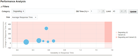
For example, to view a graph of the degrading SQL Statements among a set of 40 SQL Statements that are taking more than 1% database time in their respective databases:
- Select Degrading in the Category field.
- Enter
1in the DB Time (%) > field. - Enter
40in the Limit field. The Limit field specifies the number of SQL Statements that you want to base your graph on. - Click Update.
- (Optional) Select Average Response Time in the Size drop-down list.
The display of the graph changes based on the value that you select from the Size drop-down list. The other available values are Active Sessions and Executions Per Hour.
Figure 4-10 SQL Performance Analysis Graph

Description of "Figure 4-10 SQL Performance Analysis Graph"
The bubbles on the chart denote the degrading SQL Statements. Hovering the mouse cursor over a blob displays the SQL details. For information about analyzing the performance of a SQL, see Findings and Performance Analysis.
Similarly, you can view a graph with top SQL Statements that are variant, inefficient, and/or with plan changes by selecting the relevant values in the Category field.