Monitor SQL Performance Across Databases
The Performance Summary section of the SQL Analytics home page displays a snapshot of the performance categorization of SQLs across databases and applications.
The categorizations are:
-
Degrading SQLs: SQLs with more than 20% increase in SQL response time, based on linear regression. The value of the SQL response time is derived from the total elapsed time divided by the total number of executions for the SQL.
-
Variant SQLs: SQLs with a relative variability of more than
1.66. Relative variability of an SQL is measured by the standard deviation of the SQL response time divided by the average of the SQL response time. Those SQLs that have a relative variability of more than3are identified as SQLs with highly variant performance. -
Inefficient SQLs: SQLs with inefficiency of more than 20%. Inefficiency percentage of an SQL is derived from the inefficient wait time (wait time other than I/O, CPU, or idle wait time events) divided by the total database time.
-
SQLs with Plan Changes: SQLs that utilize multiple execution plans.
Figure 4-1 SQL Performance Summary Dashboard

Description of "Figure 4-1 SQL Performance Summary Dashboard"
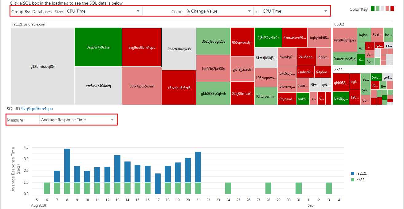
Clicking the SQL count of each categorization displays a heat map of all the SQLs across databases under the selected category. By default, the SQL with the maximum number of active sessions is selected. You can customize the heat map based on the following:
-
Size: Customizes the size of the heat map segments based on Active Sessions, Average Response Time, Executions/Hour, I/O Time, and CPU Time.
-
Color: Customizes the color coding of the heat map based on percentage change value or absolute value of Active Sessions, Average Response Time, Executions/Hour, I/O Time, and CPU Time.
When you select a SQL from the heat map, if the same SQL exists across databases, all SQLs get selected. This view helps you identify the SQLs that are common across databases. The SQL details (grouped by databases) are displayed in a bar chart in the section below the heat map. This display is based on the current time period. You can customize the bar chart display based on the following:
-
Active Sessions
-
Average Response Time
-
Executions Per Hour
-
I/O Time
-
CPU Time
The Performance Summary section also contains the following links to identify the high-load SQL statements across databases that consume a disproportionate amount of system resources and causes a large impact on the database performance:
-
Top SQLs By CPU: SQLs with the highest growth in CPU usage
-
Top SQLs by I/O: SQLs with the highest growth in I/O usage.
Clicking the links opens heat maps that display the SQLs with the highest growth in CPU and I/O usage differentiated by color keys.
Clicking each SQL in the heat map displays the SQL details (grouped by databases) in a bar chart in the section below the heat map. You can customize the bar chart display based on the following:
-
Active Sessions
-
Average Response Time
-
Executions Per Hour
-
I/O Time
-
CPU Time
-
Other Wait Time
