Section Fragment Properties for Display in the Properties Pane
Define a custom layout of sections to display a fragment's most important properties when the fragment is selected on the page or container that uses it.
Typically, when a fragment is added to a page or container, its input parameters display in the Properties pane based on the order they appear in the fragment's source. To best represent the fragment's structure for those who use the fragment, you can further organize its input parameters—as well as any other components you want to highlight—in sections.
The ability to section a fragment's properties is most useful in pages where a fragment is used as a page template. Here's an example of a page based on a Welcome Page Pattern fragment: what you see on the left is the standard view of input parameters; what you see on the right is the sectioned view: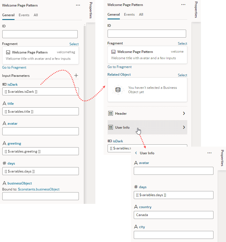
Description of the illustration fragment-sections-comparison1.png
Users will be able to drill down to view input parameters in each section, as shown in the image, where clicking User Info shows the avatar, days, country, and city input parameters. Take note also of the Related Object property, which has been customized to show a component for selecting a business object.
Welcome Page Pattern example to see how to section a fragment's properties:
- Open the fragment's Design Time editor.
- Review the list of input parameters, as well as dynamic components and slots (if any), and decide which ones you want to display as properties in the fragment's page or container. If you want to group them by sections, decide which properties go into each section.
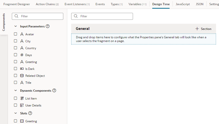
- Drag and drop items onto the valid area under General, or simply select an item's checkbox in the Components palette to add it to the end of your layout.
- If you want, use each item's Properties pane to set additional properties:
- Add a Label to display a user-friendly name for the item. The Label field is particularly useful for dynamic components with data that may take a while to display in the Page Designer. Instead of a generic
Dynamic FormorDynamic Tablelabel, users can get a better idea of what the component will display. - Enter a Description to provide helpful information about the item.
-
If the item relies on other items to display its data, select those items in the Dependent On list.
Suppose your fragment has two input parameters:
CountryandCity. To indicate thatCitydepends onCountryfor its data (allowing fragment users to select a list of cities in that country), you'd selectCountryinCity's Dependent On list. This way, when the fragment is selected on the page or container that uses the fragment,Citywill not show in the fragment's Properties pane untilCountryhas a value.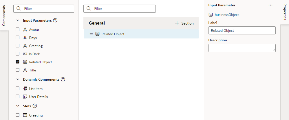
Description of the illustration fragment-designtimetab-dnd.png
- Add a Label to display a user-friendly name for the item. The Label field is particularly useful for dynamic components with data that may take a while to display in the Page Designer. Instead of a generic
- To create a section and add items to it:
- Click + Section, enter a section label in the pop-up (for example, User Info), and click Create.
- Drag the items you want to add to the section and drop it onto the section header (for example, drag the avatar and days input parameters (among others) and drop them onto the User Info header).
- Optionally, select the header and update its properties in the Properties pane:
- Change the default icon to more easily identify the section: click the Default Icon, select an icon from the Icon Gallery, and click Select.
- If you want to hide the section in the fragment's Properties pane until items in that section have values, select those dependent items in the Dependent On list.
-
If you want fragment users to see the section's items as a group when they click it on the page or container it's been added to, you can associate the section with a component in the Fragment Designer. To do this, click the associate a fragment component link under Associated Component to go to the Fragment Designer, select a component to associate with the section, then in the component's Properties pane, select the section in the Design Time Section list.
Let's say you want fragment users to view all
User Infoproperties (such as avatar and days) when the section is selected on a page. In the Fragment Designer, you might select the Grid Row component that contains the avatar and days items, then in the Grid Row's Properties pane, select User Info in the Design Time Section list.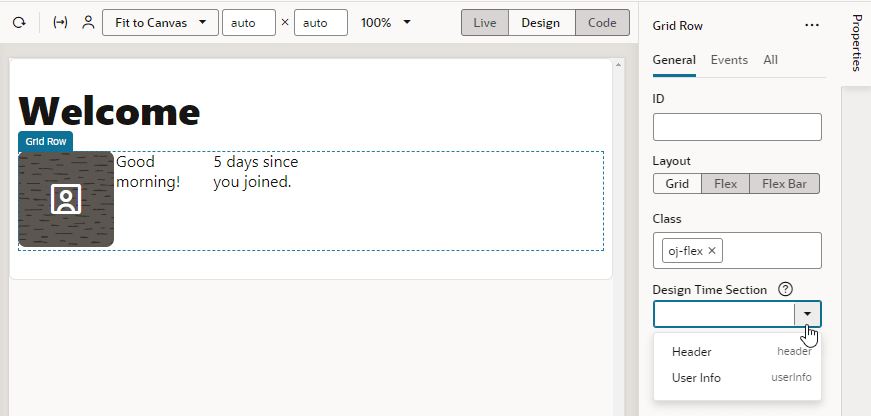
Description of the illustration fragment-designtimetab-associatedcomp1.png
To remove a parameter you added from a section, right-click the parameter and select Remove from Section, or deselect the item in the Components palette.
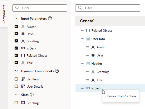
Description of the illustration fragment-designtimetab-delete.pngTo delete a section, right-click the section and click Delete Section.
If you want to reorder the list, drag a property's Handle icon
 and move it up or down as desired.
Now after the fragment is added to a page or a container, you'll see its properties display as sections in the Properties pane when the fragment is selected on the page. The sections also show in the Structure view.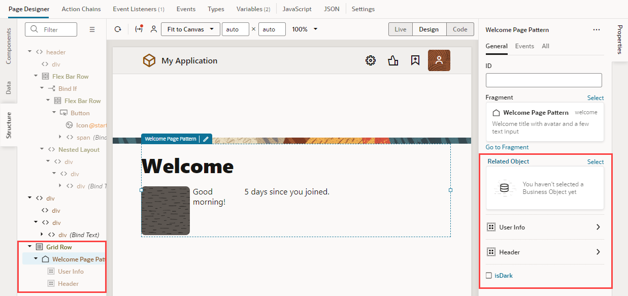
Description of the illustration sectioned-result-page-designer.png
If the fragment is used as a page template to create a page, the sectioned view shows on the page's Properties pane as well as in the page's Structure view, with the fragment considered the root element instead of the page:
Description of the illustration sectioned-result-page-designer-rootview1.png
Note how selecting User Info in the Structure View highlights the fragment components by section on the canvas. Notice also the section's items that show in the Properties pane, allowing users to more easily access all the section's items. If country had a value, city would also show in the Properties pane.
