Introduction
The Redwood UI is a modern interface for WebCenter Sites, created with the Oracle Redwood design pattern. This general-purpose interface allows users to create, view, edit, and manage assets within a site. The Redwood UI provides access to site assets using intuitive and familiar design elements.
Getting Started
To use the Redwood UI, the WebCenter Sites Administrator must enable the Redwood UI app for a site. Follow the steps below to enable the Redwood UI for a site:
- Navigate to the AdminSite, WEM Admin application.
- In the Sites list, choose the site for which the Redwood UI should be enabled.
- Select the Manage Site Apps menu option for the site and choose Assign Apps.
- Move the Redwood UI to the Selected list and choose Continue.
- Select the roles whose users should be granted access to the Redwood UI application. Move RedwoodUser to the Selected list and choose Save and Close.
- Assign users the role RedwoodUser in order to grant those users access to the Redwood UI application.
When the Redwood UI has been enabled for a site, its icon appears in the top WEM bar.
The Redwood UI
The Redwood UI is a general-purpose user interface providing access to a range of Asset Contribution features. It requires minimal training because it is intuitive and simple. With it you can easily create, update, and manage a wide variety of assets.
Different asset lists and features can be viewed by selecting the appropriate icon in the footer toolbar.

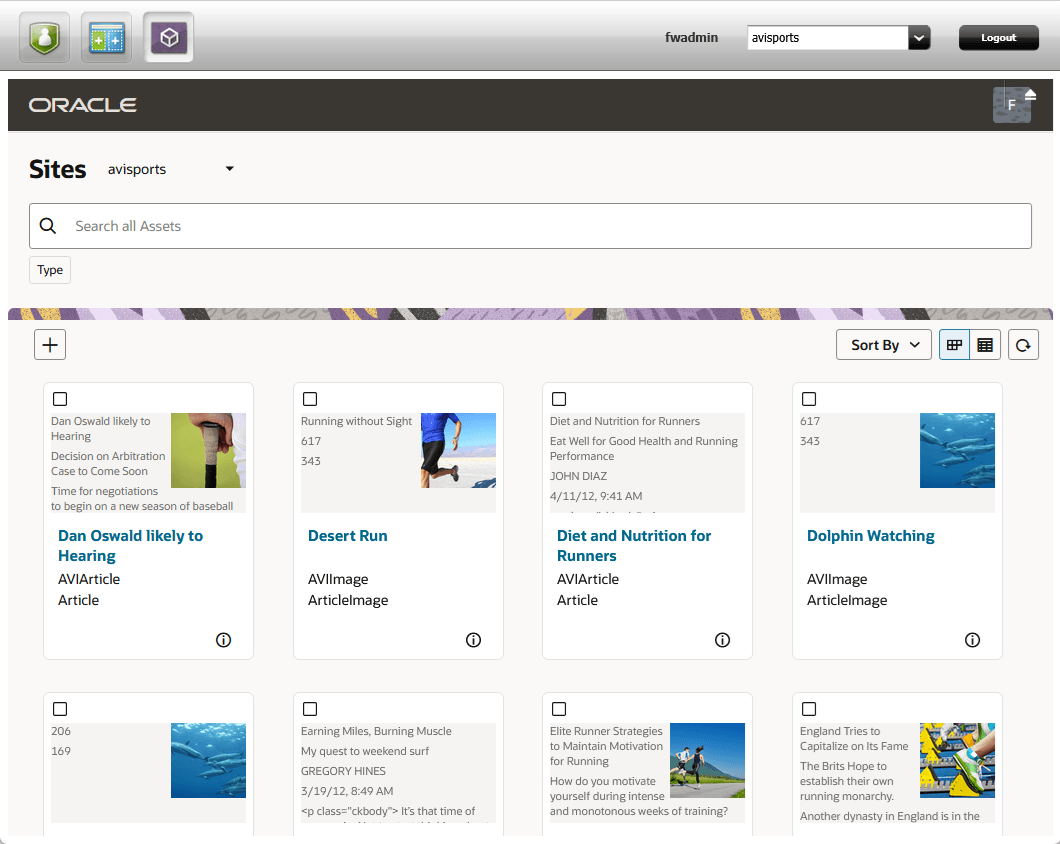
The Search Display
The Redwood UI initially displays the Assets List in the Search display, in either Card View or in Table View. Both views show the assets currently available in the site, filtered by the criteria in the filter settings.
| Item | Image | Description |
|---|---|---|
| 1 |  |
In the branding header located at the top of the screen, you will find the Oracle logo on the left and the user menu on the right. |
| 2 |  |
The user avatar displays the logged in user initials. Clicking this item reveals the user menu, containing the following items:
|
| 3 |  |
Use the WEM Toggle to show or hide the WEM bar at the top of the page. |
| 4 | 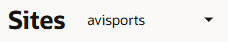 |
The site selector allows the user to start working with the assets of another site. Only the sites enabled for the Redwood UI will be shown in this list. |
| 5 | 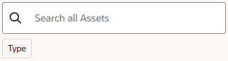 |
The search bar filters the items in the content area. You can choose to filter by the Type predefined facet, or you can manually enter keywords. The results in the content area will be filtered automatically as filter terms are added and removed. |
| 6 |  |
The actions menu shows actions available for assets in the current view. The asset create button is always present in the menu. Other actions only appear when an asset is selected.
If the browser window is too narrow to display all of the available actions for a selected item, any actions that do not fit will be collapsed into a More option or show the actions as icons. Clicking the More option will open a drop-down menu that provides access to all of the actions that could not be displayed in the main actions menu area. |
| 7 | 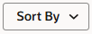 |
Choose the sort order for results in the content area. You can sort by Name, Type, or Subtype, and choose whether to sort in Ascending or Descending order. |
| 8 |  |
Select the layout for the displayed assets in the content area. Choose either Card layout or Table layout. |
| 9 |  |
The Refresh button refreshes the display of the results area, synchronizing data with the server. This can be useful when you are expecting changes to the data that may have been caused outside of the current session or when updates to displayed items may have been delayed for some reason. |
The Bookmarks Display
The Bookmarks display shows a list of assets you have selected to bookmark for later access. Similar to the Search view, assets can be viewed in Card view or Table view.
Items can be removed from this list using the Unbookmark toolbar action.
Asset Operations
From the Asset List the user has the ability to create a new asset. Additionally, when an asset is selected, several operations become enabled related to that asset, including:
Creating an Asset
The Create ( ) button allows you to create new assets. Selecting this button initially displays the Type Selection dialog.
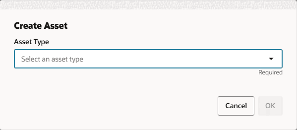
This dialog presents a list of asset types. Select the type of asset you want to create and press OK.
Subsequently the asset metadata collection form appears.
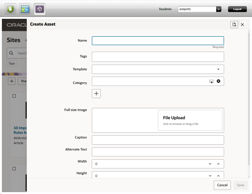
Enter the metadata relevant to the asset. The fields presented will be specific to the type of asset chosen.
Additional asset properties can be displayed by selecting the Show Properties ( ) button.
To create the asset, press the Save button. To discard changes without creating a new asset press the Cancel button.
Inspecting an Asset
The Inspect action allows the user to preview the attributes and metadata of the selected asset. The action opens a side panel that displays the name and attributes of the asset on one side and the standard metadata in a separate closeable panel.
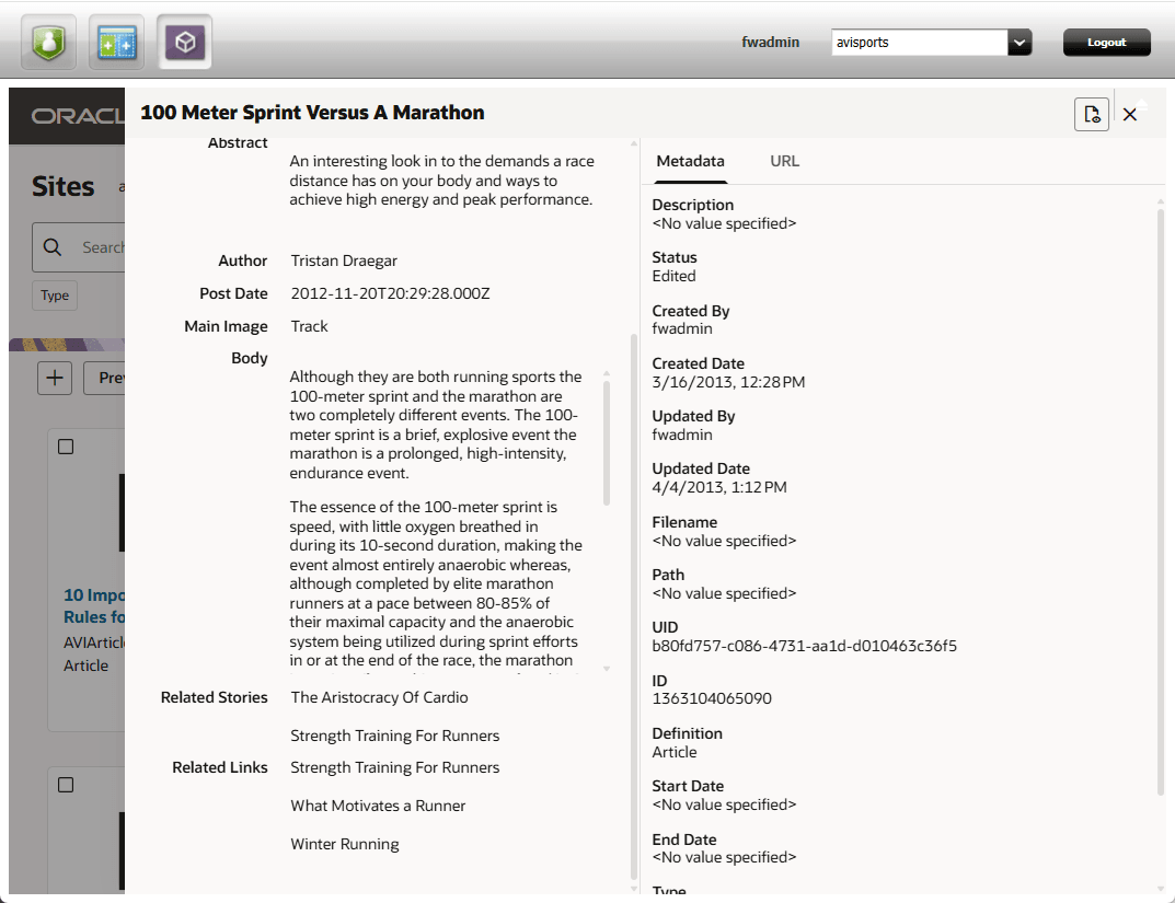
To inspect an asset from the list of assets:
- Select the desired asset.
- Click the Inspect toolbar button.
- Toggle the Properties () button to show or hide the asset properties.
- Press the Close (
 ) button to close the inspect panel.
Editing an Asset
The Edit action allows the user to update the attributes and metadata of the selected asset. The action opens a side panel that displays the name and attributes of the asset on one side and the standard metadata in a separate closeable panel.
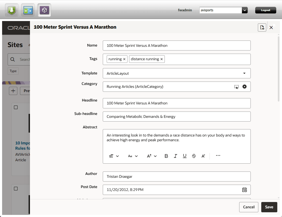
To edit an asset from the list of assets:
- Select the desired asset.
- Click the Edit toolbar button.
- Toggle the Properties () button to show or hide the asset properties.
- Alter the attribute and properties as desired.
- Press the Save button to commit the changes. Press the Cancel button to cancel the edit operation.
Tagging Assets
The Tags action allows the user to assign descriptive keywords to the selected asset or assets. This is useful for classifying and describing assets topically.
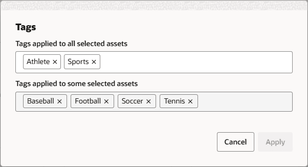
To apply tags to one or more assets:
- Select the desired asset or assets.
- Click the Tags toolbar button.
- Update tag information in the fields.
- If more than one asset is selected, the tags shared in common among the assets are displayed in the upper field. Tags added or removed there will be added to or removed from all of the selected assets. Tags displayed in the lower field are distinct to one or more assets, not shared in common among all of the selected assets. Removing tags from this field will remove the tags from the selected assets in which they exist.
- If only one asset is selected, the Tags dialog only shows one field.
- Click the Apply button. Press the Cancel button to cancel the tagging operation.
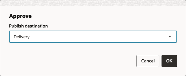
Approving Assets
The Approve action allows the user to approve or unapprove the selected assets for publishing. The Approve panel provides the ability to manage the approval status of the selected assets.
To approve one or more assets:
- Select the desired asset or assets.
- Click the Approve toolbar button.
- In the Destination dialog, choose the appropriate publish destination for the approval operation and press OK.
- In the Approve Assets panel, select the desired assets and click the Approve or Unapprove toolbar button.
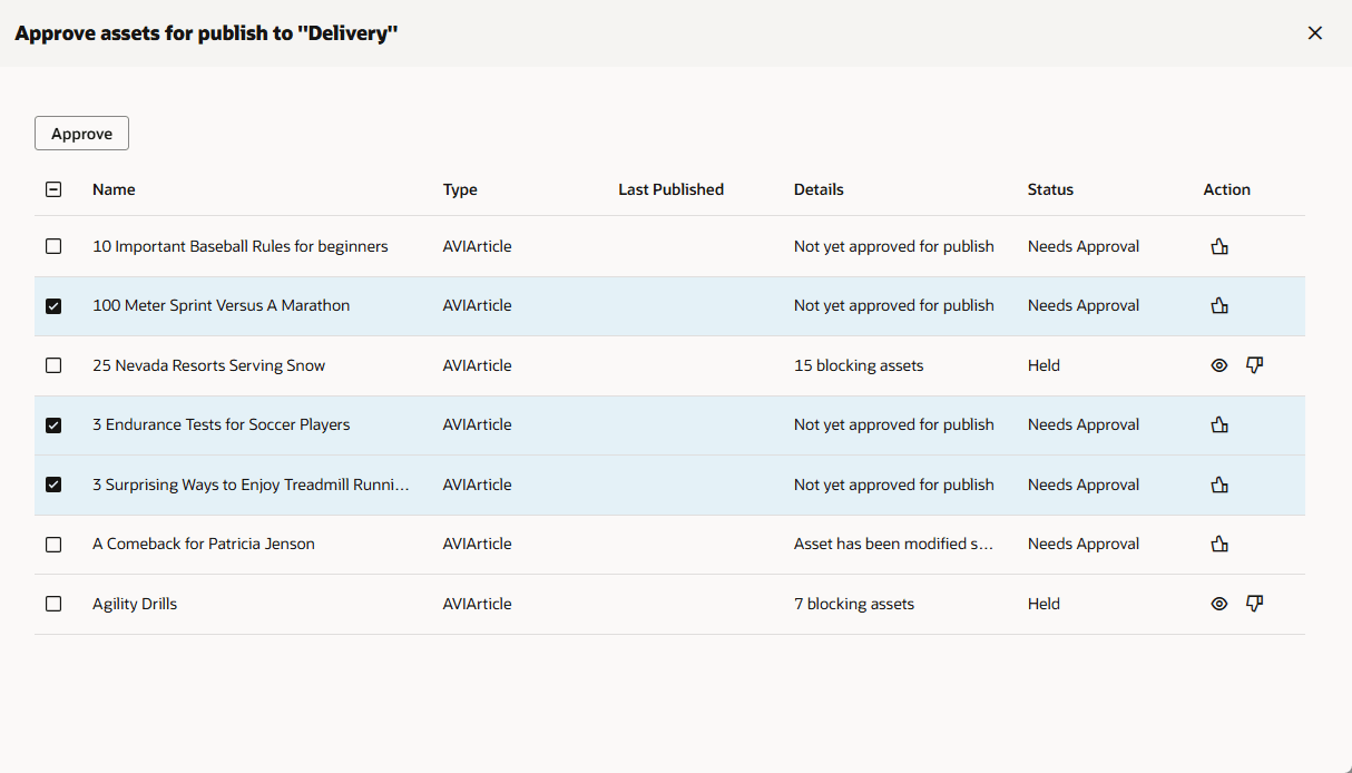
- To approve or unapprove a single asset, click the Approve (
 ) or the Unapprove (
 ) action button for the asset.
 - To view the dependencies for an asset, click the View Dependencies (
 ) button.
- To approve or unapprove a single asset, click the Approve (
- If an asset is held due to dependencies that also need to be approved, click the View Dependencies () button. This will display the Approve Dependencies panel.
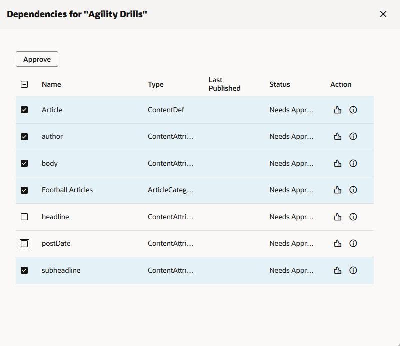
- To approve an asset dependency, click the Approve () button.
- To view additional status information about an item, select the Show Details (
 ) button.
- To approve an asset dependency, click the Approve (
- Click the Close () button to close the panel.
Copying Assets
The Copy action allows the user to make a copy of the selected asset or assets.
Copying Single Assets
When one asset is selected for copying, the action opens a side panel that displays the prefilled attributes of the asset on one side and the standard metadata in a separate closeable panel.
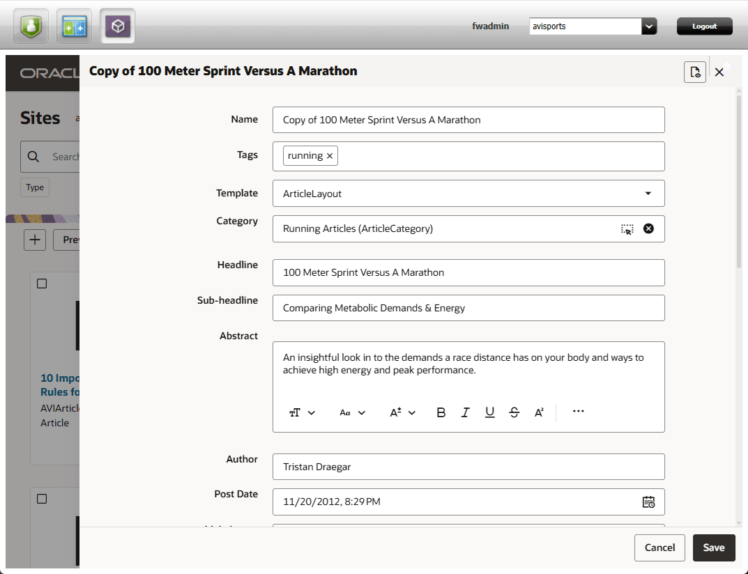
To copy an asset from the list of assets:
- Select the desired asset to copy.
- Click the Copy toolbar button.
- Toggle the Properties () button to show or hide the asset properties.
- Alter the attribute and properties as desired.
- Press the Save button to commit the copy. Press the Cancel button to cancel the copy operation.
Copying Multiple Assets
If more than one asset is selected for copying, the Copy toolbar action immediately starts a copy operation. A notification popup will show the progress of the copy operation and indicate when it has completed.
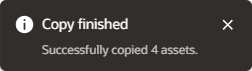
Copied items will have the original name of the asset prefixed by “Copy Of”.
Deleting Assets
The Delete action allows the user to delete the selected asset or assets. The action opens the Delete Assets panel.
To delete one or more assets:
- Select the desired assets to delete.
- Click the Delete toolbar button.
- The Delete Assets panel shows the state of the selected assets.
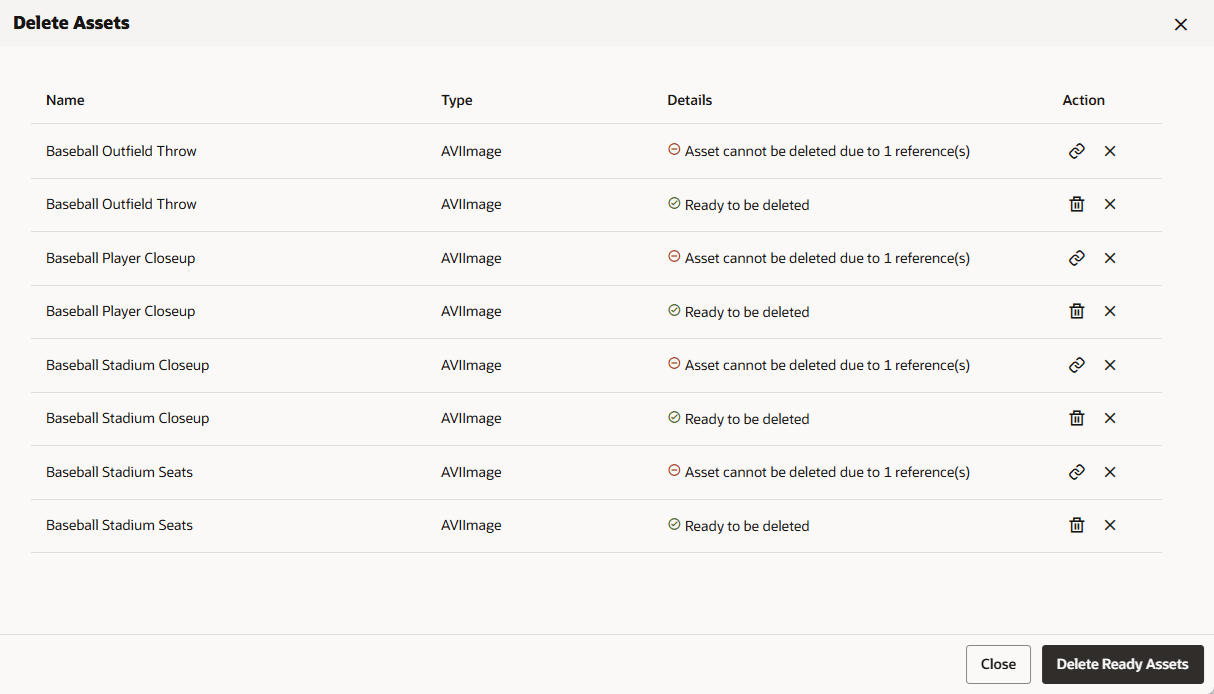 Some assets may be ready to be deleted. Others may have references that must be removed before the asset can be deleted.
- To delete an asset click the Delete Asset (
 ) button. The Delete Ready Assets button will delete all of the assets in the list in the “Ready to be deleted” state.
 - To remove an asset from the list without deleting it, press the Remove from List (
 ) button.
 - To view a list of assets that have references to the asset, select the View References (
 ) button.
- To delete an asset click the Delete Asset (
- To view references to an asset in the list, click the View References () button. This displays a list of referencing assets in a panel.
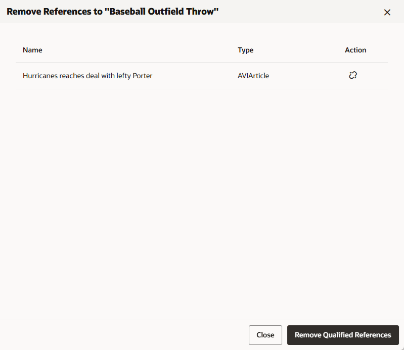
- To unlink the references in the other asset, select the Remove References (
 ) button.
 - To unlink all of the references in all of the listed assets, select the Remove Qualified References button.
- To unlink the references in the other asset, select the Remove References (
- Click the Close () button to close the panel.
Sharing Assets
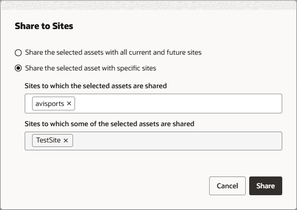
The Share action allows the user to share selected assets with other sites. The action opens the Share to Sites dialog.
To share one or more assets:
- Select the desired assets to share.
- Click the Share toolbar button.
- The Share to Sites dialog shows the Sharing settings of the selected assets. Update the controls to change the sharing options for the selected assets.
- If only one asset is selected, the Share to Sites dialog only shows one sites field.
- If multiple assets are selected and some assets share to all sites and some assets share to specific sites, then the top radio buttons will display in the indeterminate state. Choose the desired sharing option for the selected assets.
- The sites presented in the sites lists are those to which the user has access and the asset types for the selected assets are also shared.
- Click the Share button. Press the Cancel button to cancel the sharing operation.
Bookmarking Assets
The Bookmark action allows the user to save selected assets for later quick access. This action is available in the Search display. Items that have been bookmarked can be viewed in the Bookmarks display by choosing the Bookmarks button in the application footer.
To bookmark an asset:
- In the Search display, select the desired asset or assets.
- Click the Bookmark toolbar button.
- View the bookmarked assets in the Bookmarks display.
Removing Asset Bookmarks
Bookmarked assets can be removed from the list of bookmarks by using the Unbookmark action. The operation is available only from the Bookmarks display.
To remove a bookmark:
- Click the Bookmarks button in the application footer to open the Bookmarks display.
- Select the bookmarked asset.
- Click the Unbookmark toolbar button.
Showing Asset Properties
The Properties action allows the user to view or edit the properties of the selected asset. The action opens a side panel that displays the name and other properties of the asset in tabs.
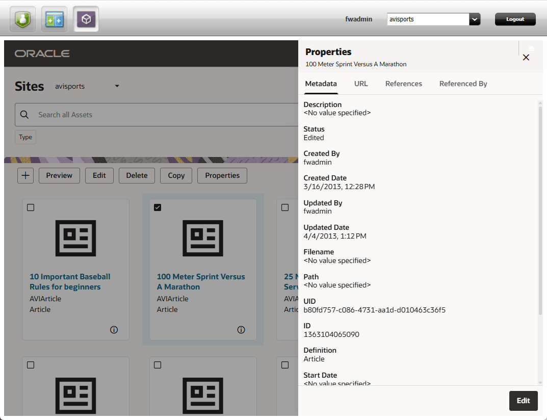
To show the properties for an asset from the list of assets:
- Select the desired asset.
- Click the Properties toolbar button.
- To edit the asset properties, click the Edit button.
- Press the Close () button to close the properties panel.
The Asset Metadata Tab
The Properties Metadata tab displays the metadata associated with the asset. If necessary, the list can be scrolled to view other metadata values.
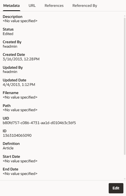
To edit the metadata for the asset, click the Edit button.
The Asset URL Tab
The URL tab in the Properties panel displays the URLs, if any, associated with the asset.
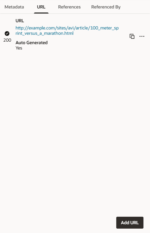
- To add a URL for the asset, click the Add URL button and provide the URL values.
- To copy the URL to the clipboard, click the Copy to Clipboard (
 ) button.
 - To invoke additional operations for the URL, click the Actions (
 ) button.
- Click the Show More option to display additional information about the URL.
- Click the Use As Default option to designate the default URL.
- Click the Delete option to remove a user-generated URL. Note that this option will not display for system generated URLs.
- Click the Change Status option to change the HTTP response code associated with the URL. Note that this option will not display for system generated URLs.
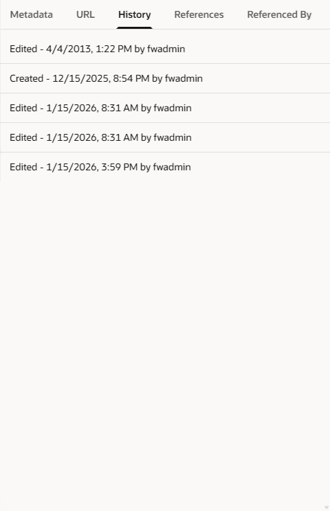
The Asset History Tab
The Properties History tab displays the record of the editorial, workflow, and approval operations performed on the asset. If necessary, the list can be scrolled to view other entries.
The Asset References Tab
The References tab in the Properties panel displays a list of other assets that the selected asset references, if any. Links within the entries can be clicked to show a preview of the associated asset.
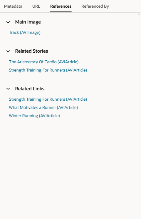
The sections of the panel can be expanded and collapsed by pressing the Expand ( ) and Collapse (
 ) buttons.
The Asset Referenced By Tab
The Referenced By tab in the Properties panel displays a list of other assets with references to the selected asset, if any. The entries can be clicked to show a preview of the referencing asset.

Using the Redwood UI for WebCenter Sites, 14c (14.1.2.0.0)
G44281-03