Using Site Builder in Oracle WebCenter Sites
Editing Sites
Get to Know the Site Builder Page
When you edit an existing site, the page opens in Site Builder. Take a minute to become familiar with the layout of the page and the tools available.
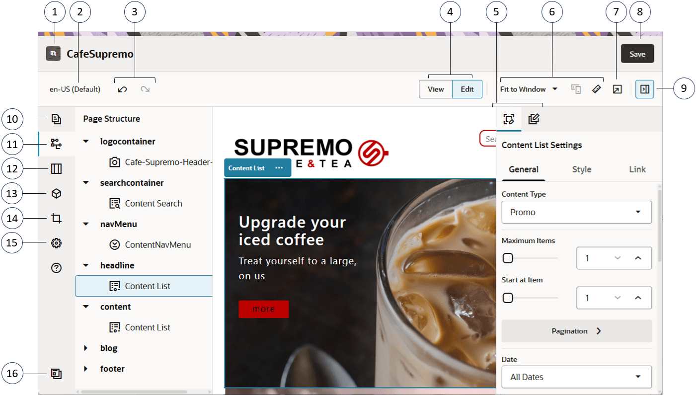
Here are a few things to note:
| Callout | Description |
|---|---|
| 1 | The name of your site is listed next to the site icon. |
| 2 | The language selector shows which version you’re currently viewing. |
| 3 | Use Undo |
| 4 | Select View to see a preview of the site and Edit and make changes. |
| 5 | Option menu for the side panel. Click |
| 6 | Use the preview options to see how the content will look under different circumstances. You can navigate to any page and see the site changes. Click Fit to Window and choose a dimension to view the page as it will appear on a device with that screen size. Several sizes are given and you can create your own device presets. Click  to see markings. Click an interval on the ruler to quickly see how the site appears at different sizes. You can also select to see markings. Click an interval on the ruler to quickly see how the site appears at different sizes. You can also select Themes with a responsive design automatically arrange page content for the best use on the selected screen size. |
| 7 | Click |
| 8 | Use the Save button to commit your changes. |
| 9 | Click |
Click an icon (10–16) in the sidebar to open the panel and manage pages, add components, and more. Click the selected icon again to close the panel.

| Callout | Click… | To… |
|---|---|---|
| 10 | Edit pages, view nested page structures, and change page settings. | |
| 11 | View the structure of your page with the elements displayed in a hierarchy. Drag-and-drop the elements in the hierarchy to move them on the page. To adjust component settings, select an element in the hierarchy, open the right side panel and select the element settings option If a component or slot has become orphaned, usually because of switching to a different layout that has a different set of slots, then those items get moved out of the page layout grid and you will find them at the bottom of the hierarchy panel in the Orphaned Component and Orphaned Slots sections. Components can be moved back into the page by dragging them into one of the current slots, and orphaned slots can be deleted to clean up page data. From there you can either move them back into the grid or delete them from the site. Note that only the top-level of an orphaned hierarchy is listed in the orphaned component section. For example, if a section layout has orphaned components, the orphaned component section will only show the section layout, not any orphaned components in it. To see them, you need to drag the section layout into the frame. Also, if any inline components are used, they’re displayed at the top of the hierarchy in the Inline Components section. |
|
| 12 | Add section layouts, such as horizontal or vertical layouts. | |
| 13 |  |
Add assets to your site. You can select and use any Content Item or Digital Assets associated with your site. |
| 14 | Insert components into your site. You can choose from different types of components, such as themed, custom, seeded, or see all available components. | |
| 15 |  |
Adjust the settings for the site, such as keywords for search engine optimization (SEO) and site properties. See Customize Site Settings. |
| 16 |  |
Return to the Sites page to manage your sites. |
Editing Tips and Tricks
Here are some things about the editor that will help you get started.
- Hiding or Showing the Sidebar
- Getting Around
- Managing Pages
- Drag and Drop Editing
- Components
- Adjusting the Size and Spacing of Components
- Editable Layout Content
- Styles and Formatting
- Undoing Your Changes
Hiding or Showing the Sidebar
Click ![]() to show options for managing and editing pages and page content.
to show options for managing and editing pages and page content.
Set ![]() to Edit to access the sidebar.
to Edit to access the sidebar.
Getting Around
To select another page using the site tree, click  in the sidebar. Use the search box at the top of the page list to search for a page. You can also use the site navigation or links on the pages themselves.
Any changes you make on a page are stored when you switch to another page. You can also click Save to save changes.
Managing Pages
To change page settings, such as metadata, header, footer, and other options, click  . See Change Page Settings.
Drag and Drop Editing
To add a component from the sidebar, or to move a component on the page, click, drag, and drop the item to the location on the page. When you drag an item to the page, the boundaries of available slots and any existing items are shown. A placement bar ![]() indicates where the new content can go (above, below, left, right):
indicates where the new content can go (above, below, left, right):
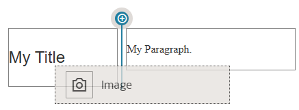
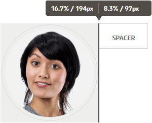
You can have multiple items in a slot and move items on the page just by dragging them to a new location. You can also adjust the relative width of two components in a slot by clicking and dragging the boundary between the two components. The component snaps to the next grid line indicated in the “ruler” displayed above the components.
The size of each component is displayed both in pixels and as a percent of the available space in the slot. To adjust widths to values other that those defined by the grid, press and hold the Ctrl key while you click and drag the component boundary.
Components
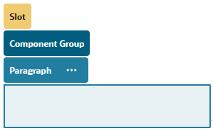
After you place a component on the page, you can adjust its alignment, spacing, and other properties by selecting the item, clicking the item’s menu icon ![]() , and choosing Settings. If you click the component name instead of the menu icon, you can see and select the menu icon for the containing slot, section layout, and component group (if the current component is part of a section layout or component group). If you select one of the other tabs, you can see the menu icon and set properties for that element:
, and choosing Settings. If you click the component name instead of the menu icon, you can see and select the menu icon for the containing slot, section layout, and component group (if the current component is part of a section layout or component group). If you select one of the other tabs, you can see the menu icon and set properties for that element:
Theme designers can specify which components are included with the theme, so some components available with one site may not be available with another. Theme designers can also specify which components are allowed in a given slot in a given page layout. If a component isn’t allowed in a particular slot, the placement bar changes color and symbol (slash) ![]() and a message similar to the following is displayed:
and a message similar to the following is displayed:

Adjusting the Size and Spacing of Components
You can adjust the size of many components, such as galleries or images, to different CSS units, as well as adjust the spacing around the component. For example:
- px (pixels): the default. If only a numeric value is specified, pixels is assumed.
- % (percent): sets the item to a percentage of its parent HTML element size. Example: 25%
- em: sets the size of the component in em-spaces. Example: 20em
- vw: sets the size as a percentage of the width of the viewing area and is responsive to the size of the viewing area. Example: 10vw
Editable Layout Content
Theme designers can add “built-in” content to page layouts, such as copyright notices, that can’t be changed in the editor. Theme designers can also designate simple text and image content as editable, including digital assets. This allows a contributor to change the text or image content, but not alter the location or other layout attributes. Editable text elements have a menu with options for specifying bold, italic, and underline text and for changing or removing a link:

Editable graphic elements have a settings icon Image icon and panel where you can specify an image, title, and alternate text.
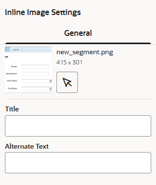
The frame that encloses the text or image adjusts to accommodate the length of the text or the size of the image.

Styles and Formatting
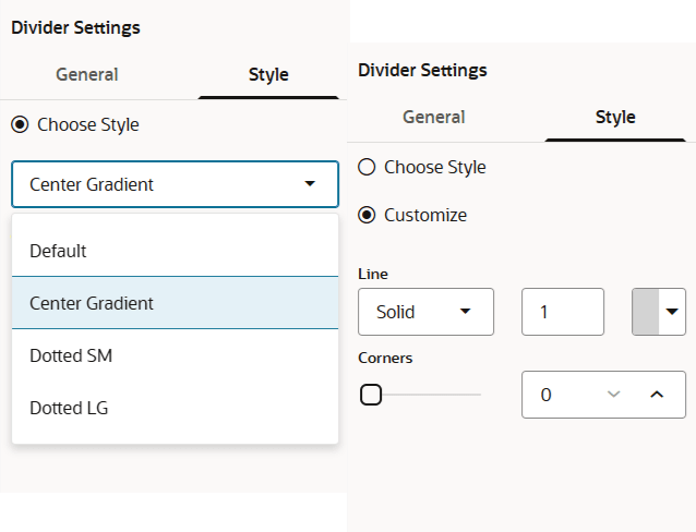
Most components have one or more base styles defined by the theme that specify aspects of the component’s appearance. You can easily switch styles or override a style. To choose between available styles, open the component’s Settings panel, click the Style tab, click Choose Style, and choose a style from the menu. To specify your own values for the properties specified in the style definition, click Customize and specify the formatting options.
Undoing Your Changes
Use ![]() to reverse the last edit or change you made in the editor. You can use undo multiple times to reverse a series of changes.
to reverse the last edit or change you made in the editor. You can use undo multiple times to reverse a series of changes.
Use ![]() to reapply the most recent change you reversed using undo. You can use redo multiple times if you have used undo multiple times in succession.
to reapply the most recent change you reversed using undo. You can use redo multiple times if you have used undo multiple times in succession.
You can undo changes in content, style, and page organization. Some actions aren’t included in the undo chain:
- If you change views in the editor, such as switching pages or changing the size for a given page, you must manually reverse those types of changes.
- If you edit text components, such as titles or paragraphs, the text editor has its own undo chain. When you leave the text editor, you can no longer undo those changes.
Use Styles and Formatting
Most components have one or more base styles defined by the theme that specify aspects of the component’s appearance. You can easily switch styles or override a style with options that you choose.
- Navigate to the page you want to edit and make sure that
 is set to Edit.
 - To set the base style for a component, click the component’s menu icon
 and choose Settings. Click the Style tab.
- To use a style from the site’s theme, click Choose Style and choose the style from the menu. Styles are defined for individual components, so the list of styles may vary. For example, the styling for an image is different from that for a paragraph.
- To specify your own base formatting options, click Customize and specify the formatting options.
- To copy and paste the base style to one or more similar components, click the component’s menu icon
 and choose Copy component Style. Click a similar component’s menu icon
  and choose Paste component Style.
 - To format the text within a title or paragraph component, click in a text component. A tool bar with formatting options is shown. Select the text that you want to format, then select any of the options, such as font, color, or alignment. The changes you make are applied immediately. To remove the formatting, select the text and click
 . Formatting changes are applied over the base style. If you change the base style, the overrides stay in place.
Customize Site Settings
You can customize certain settings in each site.
- SEO — Set keywords, edit headers and footers, and enable various other options for search engine optimization.
- Site — Set the component JavaScript module behavior and select a provider for the map features.
- Properties — Define custom site properties as name/value pairs for use in components and scripts.
Set Search Engine Properties
You can provide keywords and text to help search engines identify the content of the site.
You can define search engine optimization (SEO) settings at the site level and at the page level. The page-level settings augment or override similar settings for the site as described in the table below.
| Option | Site Level | Page Level |
|---|---|---|
| Description or Page Description | Provides general information about the site that isn’t included in the site itself. The site description is included on each page in the site. This description is also used as the page-level description for the home page only if there’s no value set using Page Settings for the home page. |
Provides general information about the page that isn’t included in the page itself. The page description is in addition to the site description included with every page in the site. |
| Keywords | Identifies terms or concepts that apply to all pages on the site. These values are added (appended) to the keywords specified for individual pages. |
Identifies terms or concepts that apply to the individual page. Page keywords may be useful to identify terms or concepts that don’t appear in the text of the page or that appear in images. |
| Header or Page Header | Add scripting or tags for analytics or tracking to your site. The site header content is included on each page in the site. | Add scripting or tags for analytics or tracking to your site. The page header content is in addition to the site header content included on each page. |
| Footer or Page Footer | Add scripting or tags for analytics or tracking to your site. The site footer content is included on each page in the site. | Add scripting or tags for analytics or tracking to your site. The page footer content is in addition to the site footer content included on each page. |
If you select the following search exclusion options at the site level, the setting applies to all pages and overrides the setting on the individual pages. If you don’t select the option at the site level, then only those pages that individually specify the option use the option.
| Option | Site Level | Page Level |
|---|---|---|
| Hide from search engines | If selected, add the NOINDEX meta tag to every page so that search engines won’t index the content of any page on the site. In this case, the site and all its pages won’t shown up in the web search results. | If selected, add the NOINDEX meta tag to the current page so that search engines won’t index the content of the page. In this case, the individual page won’t shown up in the web search results. |
| Hide page links from search engines | If selected, add the NOFOLLOW meta tag to every page so that search engines won’t follow links (and then index the destination) on any page on the site. | If selected, add the NOFOLLOW meta tag to the current page so that search engines won’t follow links (and then index the destination) on the page. |
| Hide page descriptions from search engines | If selected, add the NOSNIPPET meta tag to every page so that search engines won’t include the description (specified above) after the page in the search results. | If selected, add the NOSNIPPET meta tag to the current page so that search engines won’t include the page description (specified above) after the page in the search results. |
To change search engine optimization (SEO) settings:
- Open a site for editing.
- Click
 in the sidebar and then click
  SEO.
SEO. - Provide an optional description for the site. The site description is included on each page in the site.
This description is also used as the page-level description for the home page only if there’s no value set using Page Settings for the home page. - Optionally, specify keywords separated by commas to help search engines identify the content of the site.
Site keywords identify terms or concepts that apply to all pages on the site. These values are added (appended) to the keywords specified using Page Settings for individual pages. - Optionally, add header scripting or tags for analytics or tracking to your site. The header content is included on each page in the site. Validate any code you use in the header to make sure that it works properly and that it does not introduce any security risks to your site.
- Optionally, add footer scripting or tags for analytics or tracking to your site. The footer content is included on each page in the site. Validate any code you use in the footer to make sure that it works properly and that it does not introduce any security risks to your site.
- Optionally, select one or more of the options to exclude information from appearing in search results, as described in the previous table.
- To save all pending changes, click Save.
Add Custom Site Properties
You can add custom properties to sites and site pages in the form of name/value pairs. These properties are stored with the site and are made available to scripts and components on the site’s pages. These can help to parameterize or customize the site without having to change the underlying scripts and component code.
For example custom properties can be used to change the page background color, refine search results, populate lists, and in general control site-dependent variables.
Custom site properties are added using the settings panel when editing a site.
- Open a site for editing.
- Click
 in the sidebar and then click
  Properties.
 - Click Add.
- Enter a name and value for the custom site property. You can add up to 50 custom site properties. There is a 200 character limit on the name field and a 2000 character limit to the value field.
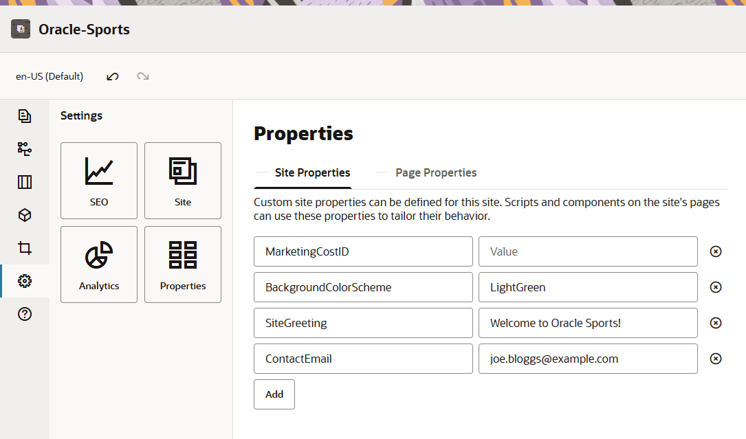
- Click the X next to a name/value pair to delete it.
- When you are finished adding or removing your custom site properties, click Save.
Once defined, custom site properties can be used in scripting throughout the site and site components, for example in the footer or in the Additional Query String field in components supporting SCSMacro expansion, such as content list, or through tokens in title and paragraph components.
This scripting works with the SCSRenderAPI during runtime and while designing. For example, let’s say you want to define a custom section layout that uses the SCSRenderAPI to call and retrieve custom site properties for the header, contact name and contact email. The following script builds an HTML string using custom site properties that gets appended to the DOM.
define([
    'jquery'
], function( $ ){
    'use strict';

    function SectionLayout( params ) {
    }
    SectionLayout.prototype = {
        render: function( parentObj ) {
            var html = '';

            try {
                html += '<div>';
                    html += '<h1>' + SCSRenderAPI.getCustomSiteProperty('SiteGreeting') + '</h1>;
                    html += '<div>For more information, contact <a href="mailto:' + SCSRenderAPI.getCustomSiteProperty('ContactEmail')
                        '"> + SCSRenderAPI.getCustomSiteProperty('ContactName') + '</a></div>';
                html += '</div>';
                $(parentObj).append( html );
            } catch( e ) {
                console.error( e );
            }
        },
    };
Also, note that custom properties are preserved when exporting and importing sites.
Add Default Common Page Properties
You can define common page properties along with the site properties at the site level. Common page properties are available on all pages by default. Additional custom page properties specific to a particular page can also be added in the page settings properties tab.
To add default page properties common to all pages:
- Open a site for editing.
- Click
 in the sidebar and then click
  Properties.
 - Click the Page Properties tab.
- Click Add.
- Enter a name and value for the page property. You can add up to 50 custom properties. There is a 64 character limit on the name field and a 300 character limit to the value field.
- Click the X next to a name/value pair to delete it.
- When you are finished adding or removing your page properties, click Close.
Work with Tables
Within a paragraph component, you can include tables that you create or that you paste from an existing HTML source.
- Go to the page you want to edit and make sure that
 is set to Edit.
 - Add the component to the page or click in an existing paragraph component.
- To add a table from another HTML page, just click and drag to select the table, then copy and paste it into the paragraph component. To create a new table at the current cursor position, click
 . Choose the number of rows, column, the width, and other formatting options. You can add an optional Caption centered above the table.
 - To change these table settings later, right-click in the table and choose Table properties. To delete the table, right-click in the table and choose Delete table.
Note: If developing for differing display sizes such as mobile screens, you can use code to create a responsive table that enables the stacking of row data when displayed on mobile devices.
- To add, remove, or modify specific rows, columns, or cells, right-click in the row, column, or cell a choose from the menu of options. For example:
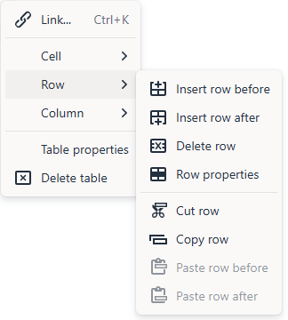
Note: You can change cell properties for only one cell at a time.
- You can merge and split cells to create complex table layouts. For example:

- To split a cell into two cells, right-click in the cell, choose Cell, and then choose Split Cell Horizontally or Split Cell Vertically.
- To merge two horizontal cells, right-click in the left cell, choose Cell, and then choose Merge Right.
- To merge two vertical cells, right-click in the top cell, choose Cell, and then choose Merge Down.
- Use the general formatting menu options to changes the format and alignment of text within cells.
Manage Custom Components and Layouts
Custom components include component groups you create in the editor, and local and remote components you create using options described in this section. Custom layouts include section layouts for arranging components in a slot on a page and content layouts for arranging the fields in a content item.
To learn how to use components with your site, see Arrange Page Content.
For information about using individual components, see Use Built-In Components.
Understand Custom Components
Components are the individual parts of a web page. When you look at a web page, what do you see? You probably see a few titles, some paragraphs of text, and several links to other pages in the site. You might also see images, buttons, dividers, maps, and galleries. Each of these items is a component.
To add a component to a page, make sure that ![]() is set to Edit, click
is set to Edit, click ![]() and choose which type of component you want to use.
and choose which type of component you want to use.
Drag the component from the panel and drop it into a slot on the page. That’s it. Drag and drop titles, paragraphs, images, and other components where you want them on a page.
Understand Layouts
A page layout arranges slots and content on a page. A section layout arranges content within a slot. A content layout arranges the fields in a content item.
In general, a layout specifies the presentation of content, but not the content itself. Separating the content from its presentation makes it easier to present the same content in different ways or to change the presentation without having to touch the content.
Page Layout
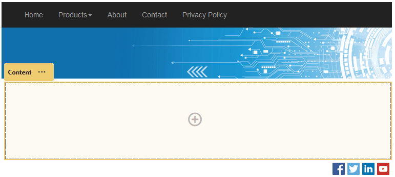
When you add a page to a site, you select a layout to use for that page. Each layout has areas on the page, called slots, where a contributor can drag and drop content. A page layout defines the number and position of slots on the page. A layout can also include content that is predefined and positioned on the page. This content can be static and not editable, such as a company logo, or it can be minimally editable, such as heading text that a contributor can change, but the position or appearance of which they can’t.
Page layouts are stored in the theme. Themes can have one or more page layouts.
Section Layout
A section layout automatically organizes content added to it, making it easy for a contributor to add content without spending time formatting it on the page. For example, a section layout can automatically organize content into multiple columns or into a vertical list. A site contributor can add one or more section layouts to a slot to organize content.
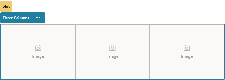
In addition to the layouts provided, a developer can create additional section layouts to solve particular layout problems or to simplify authoring for contributors. A theme designer can even build section layouts into a slot in a page layout.
Content Layout
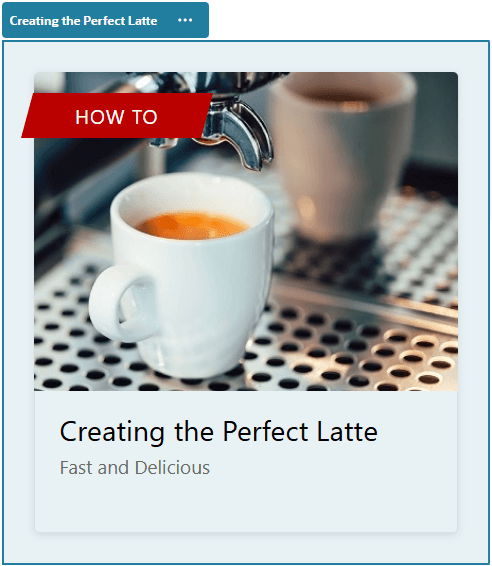
You can create and use content items based on content types and layouts provided for you. Content structured in this way makes it possible for you as a contributor to assemble the content for a content item outside of Site Builder. Multiple content layouts associated with the content type make it possible for the site designer to display the content item in different contexts without having to touch the authored content.
Work with Site Pages
Navigate to a Page
To view and navigate the hierarchy of pages:
- Open a site for editing. Make sure that
 is set to Edit.
 - Click
 to show options for managing and editing pages and page content.
 - Click
 to list the first level of pages.
 - Click a page to view the page.
- Pages with an arrow (>) have a nested layer of pages. Click the page to show the nested pages.
- You can also use the search box at the top of the page list to find the page you want.
- To view or change settings for a particular page, click Settings icon for that page. See Change Page Settings.
View Pages
To view the pages in a site, open the site in the editor and use the different preview, size, and orientation options.
To change how you view pages while using the editor:
-
Open a site for editing.
-
Navigate to a page.
-
To preview the page in the editor, make sure that
 is set to View. This shows the page as it appears to your site visitors, without the visual aids used while editing.
 -
To preview the page as it appears on a device with a particular screen size, click Fit to Screen in the top menu bar and choose a set of screen dimensions from the list. Themes with a responsive design automatically arrange the page content for the best use on the selected screen size.

-
To create a custom size, click Fit to Window and choose Create a device preset… Complete the necessary fields. To delete a custom size, click
 next to the size. You can also activate the ruler
  and select any interval on the ruler to quickly see different sizes.
 -
To alternate the page orientation between portrait and landscape, click
 .
.
-
To view the site in a separate browser window, click
 .
.
Change Page Settings
You can change page settings such as name, title, URL, headers, footers, and other options. You can also use the Properties tab to add custom page properties.
- Open a site for editing.
- Click the page for which you want to change the settings, then click
 .
. - Change the settings as needed:
- Page Type:
-
Web Page: The page and content reside with the site. You name the page and define its content, specify where the page goes in the site, and specify how the page behaves in the context of the current site.
If you select Web Page, you see the following settings:
-
Page Name: You can use letters, numbers, underscores (_), and hyphens (-).
Don’t use the following names for site templates, themes, components, sites, or site pages: authsite, content, pages, scstemplate_*, _comps, _components, _compsdelivery, _idcservice , _sitescloud, _sitesclouddelivery, _themes, _themesdelivery.
-
Page Layout: The page layout defines the general structure of the page, but not the content. A layout contains one or more named slots where you can put content. The number and type of page layouts depends on the theme associated with your site.
-
Mobile Page Layout: The mobile page layout defines the general structure of the page when viewed on a mobile device.
-
Page Title: The page title doesn’t show up on the page itself, but in the browser title bar or browser tab when the page displays. To add a title on the page, use the editor to add a title component.
-
Page Description: The description doesn’t show up on the page directly, but lets you add information about the page for search engines, social media posts, web crawlers, and other tools and users.
-
Keywords: Specify optional keywords separated by commas to help search engines identify the content of the page. Keywords are useful to identify terms or concepts that don’t appear in the text of the page or that appear in images. The keywords don’t appear on the page, but search engines use them to locate and identify your site. Good descriptions, keywords, and synonyms can increase traffic to your website.
-
Page Header: Add an optional page header, scripting, or tags for analytics or tracking. Validate any code you use in the header or footer to make sure it works properly and doesn’t introduce any security risks to your site.
-
Page Footer: Add an optional page footer, scripting, or tags for analytics or tracking. By default, the footer contains the text for pop-ups displayed regarding the use of cookies on the site with a link to the Privacy Policy. If you’re a developer, you can edit the text that’s displayed. Validate any code you use in the header or footer to make sure it works properly and doesn’t introduce any security risks to your site.
-
Page Options:
-
Error page: If an error prevents a requested page from displaying, show this page instead of the default error page. By default, when you select this option, Hide page from navigation and all the search engine options are also selected. You can deselect the options if you want the error page to be included in the navigation or in search engine results.
-
Hide page from navigation: Don’t include the page in the automatically generated navigation for the site.
-
Detail page: Use this page to display detail information for a content item selected on another page. By default, when you select this option, Hide page from navigation is also selected. You can deselect the option if you do want the detail page to be included in the navigation.
When structured content items are configured to use the detail page and a user clicks the link for more details on a structured content item, the detail page is displayed with detailed information for the content item.
-
Search page: Use this page to display results from a search. You can select this page in the Link settings of a Content Search component. See Content Search. By default, when you select this option, Hide page from navigation is also selected. You can deselect the option if you do want the search page to be included in the navigation.
-
-
SEO Options:
- Hide page from search engines: Notify search engines not to index the content of the page so it doesn’t show up in search results.
- Hide page links from search engines: Notify search engines not to follow links on the page and consequently don’t index the link destinations.
- Disable search engine page caching: Notify search engines not to cache this page.
- Hide page descriptions from search engines: Notify search engines not to include the description (specified above) after the page in the search results.
-
Analytics Options: If this site includes an analytics tracking snippet, you can override the snippet for this page. Click the override switch, and edit the script. If you edit the site snippet, a message says that the script has been modified. To remove your customizations click Restore to Latest Site Script.
-
-
External Link: The page is referenced from another location specified by a URL. You can name the page, specify where goes in the site, and specify how the page behaves in the context of the current site. Because you’re using a page from a live site, you can’t change the content of a linked page. In the site tree, a page that links to an external URL has
 before the page name.
If you select External Link, you see the following settings:
- Page Name: You can use letters, numbers, underscores (_), and hyphens (-). The name is used in the site tree to identify the page. Spaces are automatically replaced with hyphens.
- Link URL: Specify the full URL to the page. For example: https://www.example.com/sharedpage.htm.
- Open link in a new window: If you want the page to open in a new browser window or tab, select this option. If you don’t select this option, the page opens in the current window, replacing your site page and navigation.
- Page Options:
-
Error page: If an error prevents a requested page from displaying, show this page instead of the default error page. By default, when you select this option, Hide page from navigation is also selected. You can deselect the option if you want the error page to be included in the navigation.
-
Hide page from navigation: Don’t include the page in the automatically generated navigation for the site.
-
Detail page: Use this page to display detail information for a content item selected on another page. Structured content is available for enterprise users only. By default, when you select this option, Hide page from navigation is also selected. You can deselect the option if you do want the detail page to be included in the navigation. When structured content items are configured to use the detail page and a user clicks the link for more details on a structured content item, the detail page is displayed with detailed information for the content item.
-
Search page: Use this page to display results from a search. You can select this page in the Link settings of a Content Search component. See Content Search. By default, when you select this option, Hide page from navigation is also selected. You can deselect the option if you do want the search page to be included in the navigation.
-
-
- Page Type:
- To save all pending changes, click Save.
Add Custom Page Properties
Custom properties specific to a particular page can be added in the page settings properties tab. Unlike common page properties, custom page properties are exclusive to the page for which they’re defined.
- Open a site for editing and select the page to which you want to add custom properties, then click
 for the page, next to the page name.
 - Click the Properties tab. If any common properties are defined in site properties, they are listed in the common properties section and are available for use on this page. You can also edit common properties here and the edits apply only to this specific page. To reset the values for any common property you edit back to the default, click
 .
. - In the custom properties section, click Add.
- Enter a name and value for the custom page property. You can add up to 50 custom site properties. There is a 64 character limit on the name field and a 300 character limit to the value field.
- Click the X next to a name/value pair to delete it.
- When you are finished adding or removing your custom page properties, click Close.
Change the Page Layout
A layout defines how content is arranged on the page. Different layouts can contain a different number of named slots. A slot can contain one or more types of content.
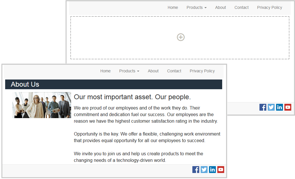
Every theme has several page layouts. When you add a page to a site, you select a layout to use for that page. Each layout has slots where you can drag and drop content. What content goes into these slots is up to you. It can be anything from titles, text, and dividers to multimedia, galleries, and social media. You can arrange the content in a slot, but you can’t change the number or arrangement of slots on the page. To do that, you have to use a new page layout.

The following illustration shows a sample layout for a page. You can see the empty slot in the page layout and the completed page with title, image, and text added to the slot.
To select a different layout for a page:
- Open a site for editing.
- Navigate to the page and click
 .
. - Go to the Page Layout field and select a different layout from the menu. The number and type of page layouts depends on the theme associated with your site.
- To save all pending changes, click Save.
Change the Background
You can specify the background color and image for the page, for individual slots on the page, and for section layouts and component groups within a slot.
A slot is a region of the page and can contain one or more types of content. The background you specify for a slot applies to the entire slot and all the components in the slot.
Backgrounds layer on top of each other. If you specify a background for a slot, it sits “on top” of the background specified for the page. For most images and colors, the upper layer effectively overrides the lower layer. If you use a degree of transparency either in a background color or in images, the colors in lower layers can show through or blend with the colors used in upper layers.
Some components, like paragraphs and titles, can provide a background color as part of a predefined style or as a customized style. If you specify a background color for a component, it also layers on top of any section layout, slot, or page background. See Use Styles and Formatting.
The background options are similar for pages, slots, component groups, and section layouts, though you access them in slightly differently ways:
- Open a site for editing.
- Navigate to the page you want to edit and make sure that
 is set to Edit.
 - To change the background for a page open the Page Settings sidebar panel, and then click Background tab.
- To change the background for a slot, component group, or section layout:
- Click the menu icon
 for the section layout and choose Settings.
 - Click Background. The background options are the same for pages, slots, and section layouts.
- Click the menu icon
- Click
 to open the File Picker panel and navigate to the digital asset you want to use. You can use images from any location you can access.
 - Select an image and click OK.
- To adjust the image settings:
- Use Position to place the image on the page or in the slot.
- Select a Scale option to adjust the presentation of the image:
- Fit: The image is scaled so the entire image fits in the available space without distorting the image.
- Stretch: The larger of the two dimensions (width or height) is scaled to fit the available space and the smaller dimension is stretched to fill the available space.
- None: The image is used at its full pixel resolution and is cropped uniformly if it doesn’t fit in the available space.
- Select a Repeat option to tile an image that’s too small to fill the available space. This option doesn’t apply if you select Stretch as the Scale option.
- Select Do not scroll with page to keep the image stationary while the user scrolls the page.
- To select a color for the background, choose a color from the Color menu palette or click More to select a color from the complete range of colors.
- Click in the spectrum bar on the right to choose a color and to display variations of the color in the color range display. The display shows the selected color in the upper right corner and shades of the selected color with increasing amounts of white toward the left and increasing amounts of black toward the bottom.
- To select a variation of the color, click within the color range display or click and drag the selection point to a new color position. The current color box and the 6-digit color code show the selected color.
- To adjust the transparency (alpha channel), click and drag the transparency slider to the bottom to the desired transparency. An alpha value of 0% makes the color transparent, allowing color and content from lower layers to show through completely. An alpha value of 100% makes the color completely opaque, blocking out all color and content from lower layers. Other values allow images and colors from lower layers to show through and their colors to blend with those of upper layers to different degrees.
- To apply the current color selection, click OK.
Arrange Page Content
Components and content items provide the features and content your users want and section layouts let you arrange them automatically.
- Add Components and Section Layouts
- Work with Assets and Content Items
- Use Triggers and Actions
- Use Horizontal Section Layouts
- Use Vertical Section Layouts
- Use Two and Three Column Layouts
- Use Tabbed Section Layouts
- Use Slider Section Layouts
For information about using individual components, see Use Built-In Components.
To learn how to manage components and layouts, see Manage Custom Components and Layouts.
Add Components and Section Layouts
Components are the individual parts of a web page. A section layout automatically organizes content added to it, making it easy for a contributor to add content without spending time formatting it on the page.
Add Components
To add a component to a page:
-
Navigate to the page you want to edit and make sure that
 is set to Edit.
 -
Click
 and then one of the following types of components:
- Click Themed to show the list of components that were chosen to be used in the theme associated with the site.
- Click Custom to show the list of custom components that are available for the site.
- Click Seeded to show the list of default components available with the service.
- Click All to show all available components.
-
Click and hold a specific icon and drag it where you want it on the page. When you drag an item to the page, the boundaries of available slots, section layouts, and any existing items are shown. A horizontal placement indicator
 or a vertical placement indicator
 (put it to the left or right) indicates where the new content will go. A solid border around a section layout or content item indicates you can drop the item and it will be placed automatically. You can have multiple items in a slot and move items on the page just by dragging them to a new location.
 -
When you’re in the right location, drop the item onto the page.
-
To adjust the properties for an item, click the item’s menu icon
 and choose Settings. Depending on the item, you’ll need to add text, specify a link to an image, specify a URL to another site or a map, resize the item, or other actions.
Each component has settings such as size, alignment, spacing, color, and borders. These define how the component looks and acts. For example, paragraph settings include font type, font size and other features that determine how text is presented.
To adjust the properties of a component, select the component, and then click ![]() and choose Settings. Different components have different kinds of settings:
and choose Settings. Different components have different kinds of settings:
| Settings | Description |
|---|---|
| General | General settings include spacing, alignment, and settings that are common among components. |
| Style | A style is a named set of default values that govern appearance. Styles are defined in the theme. Different themes can have different styles, and within a theme, different components can have different styles. You can also manually specify style settings for a specific instance of a component. |
| Link | Link settings include the locations of images, documents or other resources used by the component. For buttons and other components that perform actions, link settings also include the triggers and actions supported by the component. |
| Components | Components that include other standard components, such as the article component, provide a list of the individual components and give you access to the settings for each of those components. |
| Custom | Custom settings are unique to the component and are presented separately from the standard setting groups. Remote components, for example, may store preferences at a unique URL and present them as custom settings. |
Using Section Layouts
A section layout can automatically organize content into multiple columns, a vertical list, or a set of tabbed areas. A site contributor can add one or more section layouts to a slot to organize content. To add a layout to a page:
- Navigate to the page you want to edit and make sure that
 is set to Edit.
 - Click
 to insert a section layout on your page. Choose the type of layout you want to use and follow the same guidance for placing the item as you use for placing a component.

A placement icon ![]() indicates where the section layout will go (above, below, left, right). A solid border around a section layout or content item indicates you can drop the item and it will be placed automatically:
indicates where the section layout will go (above, below, left, right). A solid border around a section layout or content item indicates you can drop the item and it will be placed automatically:

You can assign a section layout when you add a list of content items to a page and the section layout will automatically format the items on the page.
In addition to the layouts provided, a developer can create additional section layouts to solve particular layout problems or to simplify authoring for contributors. A theme designer can even build section layouts into a slot in a page layout.
Work with Assets and Content Items
Your site can include digital assets and content items stored in Oracle WebCenter Sites. To add a digital asset or content item to a page, make sure that ![]() is set to Edit, then click
is set to Edit, then click  . You can search and filter your assets to find exactly what you need.
Drag the digital asset or content item from the panel and drop it into a slot on the page. You can embed images directly into a Paragraph component at a cursor location, with options to enter alternative text, set the image height and width, and set the alignment.
If you add a Content Item or Digital Asset to a page, it is automatically placed in a component of the appropriate type. For example, if you add an image digital asset, it is automatically placed in an image component. If you add a content item, it is automatically placed in a content item component. Alternatively, you can add the image or content item component first and then drag the content item from the Content panel onto the component at a later time. Or you can select Settings for the component, then click Select to choose an image from your assets.
Use Triggers and Actions
Button components can initiate one or more actions such as showing or hiding page components and showing messages. Certain components, such as folder and file lists, can initiate actions in the companion component based on the selection a user makes.
For example, you can configure a button so that when the button is pushed (the trigger), the user is directed to another page or external URL and an alert is shown that notifies them of the change (the actions). The display you see will change depending on what kinds of components are also used.
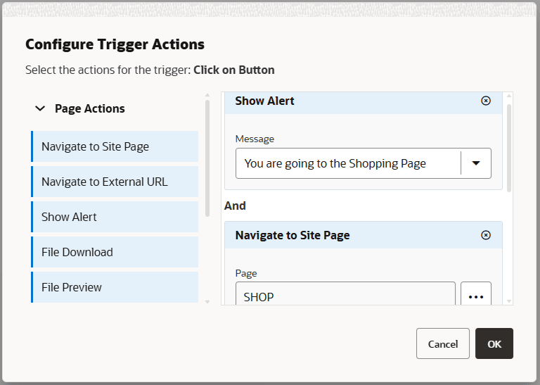
If you use more than one action, consider the order of operations and put the actions in the order you want them performed. In the example above, list the alert action first. This will give the user time to read and dismiss the message before they are redirected to the page. If you list the redirect action first, the message may be replaced with the new page before the user has a chance to read it.
Page Actions
All components that support triggers and actions support page actions:
- Navigate to Site Page: Select a page on the current site.
- Navigate to External URL: Specify a full URL to an external page or site.
- Show Alert: Show a specified message in a window.
- Show or Hide a Component: Select a component from the list of components on the current page to show, hide, or toggle.
- Show or Hide a Slot: Select a slot from the list of slots on the current page to show, hide, or toggle.
Component-specific actions
In addition to page actions, components can define their own actions. These actions can allow a component to communicate with other components and initiate actions in a companion component.
When you add components that support actions to a page, the component and any actions they support are added to the list of available actions. Some components support only certain actions. Some component provide triggers, but do not themselves support any actions.
For example, to specify one or more actions for a button component:
- Click the button’s menu icon
 and choose Settings.
 - In the Settings panel, click Link.
- Click Select Link Type and choose Trigger Actions.
- Under Available Triggers, click Click on Button.
- In the Configure Trigger Action window, click and drag an action from the column on the left and drop it on the slot labeled Do something.
Use Horizontal Section Layouts
You can use a section layout to automatically determine the spacing and arrangement of components you add to the layout.
A horizontal layout arranges the items added to it one after the other in a horizontal line. The layout changes proportionally as the page width is increased or decreased. By default, items are fit into one line and are allocated equal horizontal space.
To add a layout to a page:
-
Navigate to the page you want to edit and make sure that
 is set to Edit.
 -
Add the layout to the page.
-
To place other content in the section layout, drag and drop the content onto the layout.
The layout highlights with a solid border and a banner that shows Add Item.

You can continue adding items to the layout and the layout will format them accordingly. You can even add other section layouts to create sophisticated layouts.
The following is a horizontal layout with numbered text components to show the sequence of items in the layout:

-
To edit the component and its appearance, click its menu icon
 , and choose Settings. You can set the width for individual areas if you don’t want to use the default proportional sizing. You can also set the alignment (left, center, or right).
 -
Use the General tab to modify settings for the individual components in the layout. Click a component name to see the settings for that component.
-
Use the Background tab to modify background settings for the layout. See Change the Background.
Use Two and Three Column Layouts
You can use a multi-column section layout to automatically determine the spacing and arrangement of components you add to the layout.
To add a layout to a page:
-
Navigate to the page you want to edit and make sure that
 is set to Edit.
 -
Add the layout to the page.
-
To place other content in the section layout, drag and drop the content onto the layout. The layout highlights with a solid border and a banner that shows Add Item.

You can continue adding items to the layout and the layout will format them accordingly. You can even add other section layouts to create sophisticated layouts or add component groups.
The following is a two-column layout with image components as placeholders:
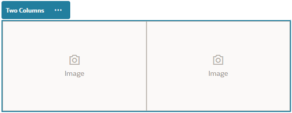
If you add more items, they are shown in additional rows, each with a maximum of two items.
-
To edit the component and its appearance, click its menu icon
 , and choose Settings.
 -
Use the General tab to modify settings for the individual components in the layout. Click a component name to see the settings for that component.
-
Use the Background tab to modify background settings for the layout.
-
Choose Custom Settings to set additional defaults for the content that’s displayed.
- First Column Width (%): Specify the column width as a percentage of the space available to the layout.
- Second Column Width (%): Specify the column width as a percentage of the space available to the layout.
- Third Column Width (%): Specify the column width as a percentage of the space available to the layout.
- Responsive Breakpoint (in pixels): For responsive page designs that automatically reformat the content when the available display size varies, specify the width in pixels where the section layout switches between the standard two-column layout and the Responsive Behavior options you specify below.
- Responsive Behavior: Select how the layout changes when the available display size is smaller than the Responsive Breakpoint value.
- No Action: Do not adjust the layout behavior.
- Stack the columns: Arrange the items from top to bottom in a single column with all items from column one, followed by items from column 2, and so on.
- Hide the first column: Hide the content in the first column to provide more space for the remaining columns.
- Hide the second column: Hide the content in the second column to provide more space for the remaining columns.
- Hide the third column: Hide the content in the third column to provide more space for the remaining columns.
- Hide both columns: Hide all the content in the layout.
- Move the second column under the first column: Arrange items in a single column with all items from column one followed by all items from column two.
- Move the first column under the second column: Arrange items in a single column with all items from column two followed by all items from column one.
Use Vertical Section Layouts
You can use a section layout to automatically determine the spacing and arrangement of components you add to the layout.
A vertical layout arranges the items added to it one after the other in a vertical line.
To add a layout to a page:
-
Navigate to the page you want to edit and make sure that
 is set to Edit.
 -
Add the layout to the page.
-
To place other content in the section layout, drag and drop the content onto the layout. The layout highlights with a solid border and a banner that shows Add Item.

You can continue adding items to the layout and the layout will format them accordingly. You can even add other section layouts to create sophisticated layouts.
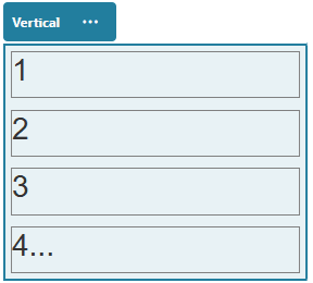
The following is a vertical layout with numbered text components to show the sequence of items in the layout:
-
To edit the component and its appearance, click its menu icon
 , and choose Settings.
 -
Use the General tab to modify settings for the individual components in the layout. Click a component name to see the settings for that component.
-
Use the Background tab to modify background settings for the layout.
Use Tabbed Section Layouts
You can use a tabbed section layout to create spacing and arrangement of the components you add into the layout.
To add a layout to a page:
-
Navigate to the page you want to edit and make sure that
 is set to Edit.
 -
Add the layout to the page. By default, a single tab is added with the layout. Click New Tab to add additional tabs.
-
To place other content in a tab, drag and drop the content onto the tab.
You can continue adding items to the layout and the layout will format them accordingly. You can even add other section layouts to create sophisticated layouts or add component groups.
-
To edit a tab and its appearance, click its menu icon
 , and choose Settings.
 -
Use the Background settings tab to modify background settings for the section layout tab. You can use an image for the tab, change its position, and so on. See Change the Background.
-
Use the Style settings tab to modify other appearance settings for the section layout tab. Choose a style, such as hairline, frame, and so on, or customize the border and the corners for the tab.
Collapse Tabs in Section Layout Settings
When using tabs in a section layout component, you can specify the pixel width that triggers the tabbed content to stack and allows a site visitor to collapse and expand each tab. This is useful when a site visitor is viewing on a mobile device with a limited screen size for content.
To specify the pixel breakpoint that triggers the collapse response, use the custom settings in the General settings options of the section layout component that contains the tabs.
- On the site page you are editing, add a section layout component.
- Create the number of tabs you need and add the content you want in each tab.
- Open the settings for the section layout component that contains the tabs.
- Click Custom Settings.
- Enter the pixel width at which you want the tabbed content to stack and collapse in the Responsive Breakpoint field.
- Select Show in Accordion from the Responsive Behavior selector.
- Close the settings and click Save in the action bar to save the changes.
- Test the settings by toggling to View mode and selecting a viewport with a width below the breakpoint.
Use Slider Section Layouts
You can use a slider section layout to create content that remains in place until it is “slid” to one side, making room for new content. Users navigate through the slides by clicking the navigation dots under the slide section.
To add a slider layout to a page:
-
Navigate to the page you want to edit and make sure that
 is set to Edit.
 -
Add the layout to the page. By default, a single slide is added with the layout. Click New Slide to add additional slides.
-
To place content on a particular slide, display the slide in the slider, then drag and drop the component or content item onto the slide.
You can continue adding items to the slide and positioning them as needed. You can add other section layouts to create sophisticated layouts or add component groups, letting you position content where you want.
-
To edit a slide layout and its appearance, click its menu icon
 , and choose Settings.
 -
Use the Background settings tab to modify background settings for the entire slide area. See Change the Background. You can use an image, change its position, and so on.
-
Use the Style settings tab to modify other appearance settings. Choose a style, such as hairline, frame, and so on, or customize the border and the corners for the slide.
-
To modify settings for each individual slide, click the name of the slide to open its settings. Change the background, style, and so on for each slide as needed.
Use Built-In Components
Components, section layouts, digital assets, and structured content give you the flexibility to provide the content and features your users want.
This section provides information about using individual components.
To learn how to use components in your site, see Arrange Page Content.
Basic Components
Basic components provide the building blocks for text content.
Titles
To add and format a title component:
-
Navigate to the page you want to edit and make sure that
 is set to Edit.
 -
Add the component to the page.
-
Click in the title component to enter the title text. The text takes on the formatting of the default style for the component.
-
To add a link within the title text:
-
Enter and select the text you want to use as the link text, then click
 .
. -
Click Select Link Type and choose one of the following options:
- Web Page: Specify a full URL to an external page or site, and select where to open the link.
- Site Page: Use the page picker to select a page on the current site, and select where to open the link. You can specify additional URL parameters in the format
key1=value1&key2=value2. Empty values are supported; for example,key1=&key2=value2. You can also specify a URL anchor, but that anchor should exist on the target page where you want the anchor link to resolve. - File Download: Download a selected file. Select a file to download.
- File Preview: Preview and optionally download a selected file in an overlay over a dimmed and inactive version of the page.
- Content Item: Click
 to select a content item. Choose the detail page you want displayed and target the page to open in the same or new window.
 - Email: Specify a valid email address and, optionally, a subject. The resulting message is opened in and sent through the default email client.
- Map: Enter a valid address or coordinates, and select where you want the map to open in desktop and mobile browsers.
- Phone call: Enter a valid phone number.
To remove a link, click anywhere in the link text and click
 .
.
-
-
If you want to change the default formatting, select the text that you want to format, then select any of the options in the formatting tool bar, such as font, color, or alignment. Depending on your theme, you may not see all these options.

Changes you make are applied immediately. These formatting changes are applied over the base style. If you change the base style, the overrides remain in place.
-
To remove the formatting applied with these options, select the text and click
 .
.
Paragraphs
To add and format a paragraph component:
-
Navigate to the page you want to edit and make sure that
 is set to Edit.
 -
Add the component to the page.
-
Click in the paragraph component to enter the text. The text takes on the formatting of the default style for the component.
-
To add a video (
 ), image (
 ), or content item (
 ) to a paragraph, click the appropriate icon.
 -
Click
 to open the Select Asset panel and navigate to the content item you want to use.
 -
To add an additional paragraph within a paragraph component, just press Enter.
-
To add a link within the paragraph:
-
Enter and select the text you want to use as the link text, then click
 .
. -
Click Select Link Type and choose one of the following options:
-
Web Page: Specify a full URL to an external page or site, and select where to open the link.
-
Site Page: Use the page picker to select a page on the current site, and select where to open the link. You can specify additional URL parameters in the format
key1=value1&key2=value2. Empty values are supported; for example,key1=&key2=value2. You can also specify a URL anchor, but that anchor should exist on the target page where you want the anchor link to resolve. -
File Download: Download a selected file. Select a file to download. If you select a digital asset, you can select a specific rendition. If you don’t select a rendition, the original size will be used.
-
File Preview: Preview and optionally download a selected file in an overlay over a dimmed and inactive version of the page.
-
Content Item: Click
 to select a content item. Choose the detail page you want displayed and target the page to open in the same or new window.
 -
Email: Specify a valid email address and, optionally, a subject. The resulting message is opened in and sent through the default email client.
-
Map: Enter a valid address or coordinates, and select where you want the map to open in desktop and mobile browsers.
-
Phone call: Enter a valid phone number.
To remove a link, click anywhere in the link text and click
 .
. -
-
-
If you want to change the default formatting for any portion of text, select the text that you want to format, then select any of the options in the formatting tool bar, such as font, color, or alignment. Depending on your theme, you may not see all these options.
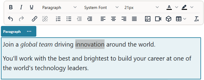
Changes you make are applied immediately. These formatting changes are applied over the base style. If you change the base style, the overrides remain in place.
-
To remove the formatting applied with these options, select the text and click
 .
.
Plain Text
The text component lets you add text to the page and format it exclusively using styles defined in the theme. The formatting tool bar is not available when editing the content, so you can’t override the selected style with custom formatting.
This can be useful if you use standardized formatting for elements such as headings. You can update the styles defined in the theme and automatically update the associated text throughout the site without format overrides that would prevent it.
To add a text component:
-
Navigate to the page you want to edit and make sure that
 is set to Edit.
 -
Add the component to the page.
-
Click in the text component to enter the text. The text takes on the formatting of the default style for the component (<p> or paragraph element). To add an additional content, just press Enter.
Note: You can copy and paste content from other sources into the text component, but images and underlying HTML tags are removed.
-
To change the base style for the text component:
- Click the component’s menu icon
 , and choose Settings.
 - Click Choose Style and choose the style from the menu. The list includes standard HTML tags for paragraph and headings. The style you select assigns the associated tag to the content.
The component reflects the selected base style.
- Click the component’s menu icon
Buttons
Use a button to make a link or other functionality more apparent on the page.
To add a button to the page:
-
Navigate to the page you want to edit and make sure that
 is set to Edit.
 -
Add the component to the page.
-
To adjust the properties for the button, click its menu icon
 and choose Settings.
You can specify the text on the button (label), size, alignment and other display options for the button.
Note: If you set the Width and Height fields to 0 (zero), the button will automatically size to the fit the text you specify for the label.
To specify the background color, font, border, and other settings, click the Style tab. You can choose from the predefined styles in the current theme. Depending on your theme, you may also be able to click Customize to specify your own values.
-
To associate a link or other actions with a button:
-
In the Settings panel, click Link.
-
Click Select Link Type and choose one of the following options:
-
No Link: The button performs no action when the user clicks it.
-
Web Page: Specify a full URL to an external page or site, and select where to open the link.
-
Site Page: Use the page picker to select a page on the current site, and select where to open the link. You can specify additional URL parameters in the format
key1=value1&key2=value2. Empty values are supported; for example,key1=&key2=value2. You can also specify a URL anchor, but that anchor should exist on the target page where you want the anchor link to resolve. -
File Download: Download a selected file. Select a file to download. If you select a digital asset, you can select a specific rendition.
-
File Preview: Preview and optionally download a selected file in an overlay over a dimmed and inactive version of the page.
-
Content Item: Click
 to select a content item. Choose the detail page you want displayed and target the page to open in the same or new window.
 -
Email: Specify a valid email address and, optionally, a subject. The resulting message is opened in and sent through the default email client.
-
Trigger Actions: Select one or more page actions to perform when the button is pushed. Page actions include:
- Navigate to Site Page: Select a page on the current site.
- Navigate to External URL: Specify a full URL to an external page or site.
- Show Alert: Show a specified message in a window.
- Show or Hide a Component: Select a component on the current page to show, hide, or toggle.
- Show or Hide a Slot: Select a slot on the current page to show, hide, or toggle.
-
Map: Enter a valid address or coordinates, and select where you want the map to open in desktop and mobile browsers.
-
Phone call: Enter a valid phone number.
-
-
Structure Components
Structure components help to separate content on the page.
Dividers
Use a divider (horizontal line) to create a visual break in a column or across a page.
To add a divider to the page:
-
Navigate to the page you want to edit and make sure that
 is set to Edit.
 -
Add the component to the page.

-
To adjust the properties for the divider, click its menu icon
 and choose Settings.
You can specify the horizontal placement and length of the divider by adjusting the left and right spacing options.
Line color, thickness, and other settings are defined by the component style. You can choose from the predefined styles in the current theme or click Customize to specify your own values.
Spacers
Managing the “white space” on pages can make the page more visually appealing and more readable. Use the spacer component to add white space without having to override the spacing defined in styles or in other components.
To add vertical blank space between components in the page:
-
Navigate to the page you want to edit and make sure that
 is set to Edit.
 -
Add the component to the page.
-
To adjust the height of the spacer, click its menu icon
 and choose Settings.
Media Components
Media components bring image and video to your pages.
Images
Images can direct a viewer’s attention and invite the viewer to explore different content areas on the page.
To add an image to a page:
-
Navigate to the page you want to edit and make sure that
 is set to Edit.
 -
Add the component to the page. The image component shows a placeholder image until you select the image you want to use.
-
To select an image, double-click the component on the page to open the image selection panel directly, or click the menu icon
 , choose Settings, and click Select next to the Image field to open the selection panel.
 -
Select an image
- Locate and select the image you want to use.
- Once you’ve selected an image, click OK to close the image selection panel.
- If you selected a digital asset, you can select a specific rendition. If you don’t select a rendition, the original size will be used.
-
Use the General panel of the Settings menu
 to add a caption or to modify spacing, alignment, style, and other options.
 -
You can associate a link or other actions with an image:
- In the Settings panel, click Link.
- Select one of the following options:
-
No Link: The image performs no action when the user clicks it.
-
Web Page: Specify a full URL to an external page or site, and select where to open the link.
-
Site Page: Use the page picker to select a page on the current site, and select where to open the link. You can specify additional URL parameters in the format
key1=value1&key2=value2. Empty values are supported; for example,key1=&key2=value2. You can also specify a URL anchor, but that anchor should exist on the target page where you want the anchor link to resolve. -
File Download: Download a selected file. Select a file to download.
If you select a digital asset, you can select a specific rendition. If you don’t select a rendition, the original size will be used.
-
File Preview: The selected file will appear as an overlay on the page.
-
Content Item: Select a content item, choose the detail page you want it displayed at, and target the page to open in the same or new window.
-
Email: Specify a valid email address and, optionally, a subject. The resulting message is opened in and sent through the default email client.
-
Image Preview: The selected image will appear as an overlay on the page.
-
Map: Enter a valid address or coordinates, and select where you want the map to open in desktop and mobile browsers.
-
Phone call: Enter a valid phone number.
-
-
When you’ve finished, close the image settings dialog.
Galleries
Use an image gallery to present a series of images. You can choose to let the images automatically cycle or let the user advance through the images manually.
To add an image gallery to the page:
-
Navigate to the page you want to edit and make sure that
 is set to Edit.
 -
Add the component to the page. The gallery component shows a placeholder image until you select the images you want to use.
-
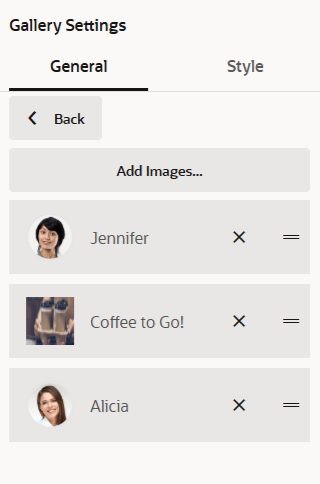
To add one or more images to the gallery, click its menu icon
 , choose Settings, and click Images on the General tab.
 -
Click Add Images.
-
Select one or more images.
- Locate and select the images you want to use.
- Click OK.
- If you selected a digital asset, you can select a specific rendition. If you don’t select a rendition, the original size will be used.
The selected images are added to the list of images. Drag and drop the images to reorder them in the list. The default title of each image is the file name without the extension.
-
To change the title, description, or other options for a particular image, click the image in the list and make the change.
You can also associate a link or other actions with an image in the gallery:
- In the Settings panel for a particular image, click the Link field.
- Select one of the following options:
-
No Link: The image performs no action when the user clicks it.
-
Web Page: Specify a full URL to an external page or site, and select where to open the link.
-
Site Page: Use the page picker to select a page on the current site, and select where to open the link. You can specify additional URL parameters in the format
key1=value1&key2=value2. Empty values are supported; for example,key1=&key2=value2. You can also specify a URL anchor, but that anchor should exist on the target page where you want the anchor link to resolve. -
File Download: Download a selected file. Select a file to download. If you select a digital asset, you can select a specific rendition. If you don’t select a rendition, the original size will be used.
-
Content Item: Select a content item, choose the detail page you want it displayed at, and target the page to open in the same or new window.
-
Email: Specify a valid email address and, optionally, a subject. The resulting message is opened in and sent through the default email client.
-
Map: Enter a valid address or coordinates, and select where you want the map to open in desktop and mobile browsers.
-
Phone call: Enter a valid phone number.
-
- Click Back to return to the image settings panel. Click Back again to return to the image list to select another image to update.
- When you’re done updating individual images, click Back to specify gallery options.
-
To size and scale images in the gallery:
- Use Width to specify the width, in pixels, of the gallery within the slot. Click an alignment option other than Fill to specify the width. After you set the width, you can use Fill to extend the image to the specified width.
- Select a Scaling option to adjust the presentation of images in the gallery:
- Crop: The smaller of the two dimensions (width or height) is scaled to fit the available space and the larger dimension is cropped to prevent stretching the image.
- Fit: Each image is scaled so the entire image fits in the available space without distorting the image.
- Stretch: The larger of the two dimensions (width or height) is scaled to fit the available space and the smaller dimension is stretched to fill the available space.
- None: The image is used at its full pixel resolution and is cropped uniformly if it doesn’t fit in the available space.
-
To help the user move through the gallery:
- Select a Navigation method:
- Thumbnails: Show a list of the images in the gallery in sequence below the gallery. The user clicks a thumbnail image to go to the associated image in the gallery.
- Indexer: Show a series of buttons
 below the gallery to represent each image in the gallery. The user clicks a button to go to the associated image in the gallery.
 - None: Provide no visual navigation. The user can swipe right or left to display the adjacent image. This manual method is always available.
- Enable Show Previous/Next to include arrow icons on each image to advance to the previous or next image in the gallery.
- Enable or disable Use arrow keys to navigate to determine whether or not the arrow keys on the keyboard can be used to advance to the previous or next image in the gallery. If more than one gallery component is used on a page, all galleries with this setting enabled will move when an arrow is depressed. To avoid confusion when more than one gallery component is used on a page, it’s best to enable this setting on one primary gallery and disable it on all the rest, instead enabling Show Previous/Next icons to allow someone to navigate images in a specific gallery.
- Select a Navigation method:
-
You can elect to show or hide a caption for the image by selecting the Show Caption box.
-
To have the gallery cycle through the images automatically, select Autoplay and specify Transition Time and Display Time. The user can still use all the manual navigation features you set up.
Gallery Grid
Use a gallery grid to present a set of images at one time in rows and columns.
To add a gallery grid to the page:
-
Navigate to the page you want to edit and make sure that
 is set to Edit.
 -
Add the component to the page. The gallery grid component shows a placeholder image until you select the images you want to use.
-
To add one or more images to the gallery, double-click the component on the page to open the image selection panel directly, or click its menu icon
 , choose Settings, and click Images on the General tab.
 -
Click Add Images.
-
Select one or more images.
- Locate and select the images you want to use.
- Once you selected the images, click OK to close the image selection panel.
- If you selected a digital asset, you can select a specific rendition. If you don’t select a rendition, the original size will be used.
The selected images are added to the list of images. Drag and drop the images to reorder them in the list (and in the grid). The default title of each image is the file name without the extension.
-
To change the title, description, or other options for a particular image, click the image to open additional settings and make the change. You can also associate a link or other actions with an image in the gallery:
- In the Settings panel for a particular image, click the Link field.
- Select one of the following options:
-
No Link: The image performs no action when the user clicks it.
-
Web Page: Specify a full URL to an external page or site, and select where to open the link.
-
Site Page: Use the page picker to select a page on the current site, and select where to open the link. You can specify additional URL parameters in the format
key1=value1&key2=value2. Empty values are supported; for example,key1=&key2=value2. You can also specify a URL anchor, but that anchor should exist on the target page where you want the anchor link to resolve. -
File Download: Download a selected file. Select a file to download. If you select a digital asset, you can select a specific rendition. If you don’t select a rendition, the original size will be used.
-
Content Item: Select a content item, choose the detail page you want it displayed at, and target the page to open in the same or new window.
-
Email: Specify a valid email address and, optionally, a subject. The resulting message is opened in and sent through the default email client.
-
Image Preview: The selected image will appear as an overlay on the page.
-
Map: Enter a valid address or coordinates, and select where you want the map to open in desktop and mobile browsers.
-
Phone call: Enter a valid phone number.
-
- Click Back to return to the image settings panel. Click Back again to return to the image list to select another image to update.
- When you’re done updating individual images, click Back to specify gallery options.
-
Use the Layout option to arrange the images in a grid.
- Masonry
- Columns
- Custom
Each of these options is described in the steps that follow.
-
Choose the Masonry layout to automatically arrange the images in rows within the available space. The resulting rows have a uniform height, but no defined columns.
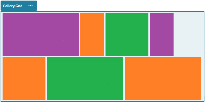
- Specify Height to proportionately scale all images to the specified height in pixels.
- Specify Image Spacing to increase or decrease the space between images in the row.
-
Choose the Column layout to arrange the images in rows and columns.
-
Select a Scaling option to adjust the presentation of images in the grid:
-
Crop: The smaller of the two dimensions (width or height) is scaled to fit the available space and the larger dimension is cropped to prevent stretching the image.
For example, the following grid uses four columns and crops the six images:
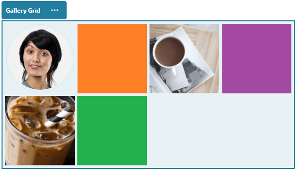
-
Fit: Each image is scaled so the entire image fits in the available space without distorting the image. For example, the following grid uses four columns and scales the six images to fit:
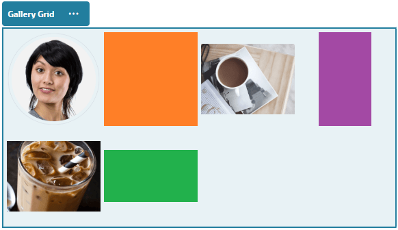
-
-
Specify an Aspect Ratio to determine the shape of the cells in the grid.
- Square: An aspect ratio of 1:1.
- Landscape: An aspect ratio of 16:9.
- Portrait: An aspect ratio of 9:16.
- Custom: Specify your own numeric values for the aspect ratio.
-
Specify the number of Columns. The grid adjusts automatically to create columns of equal width.
-
Specify Image Spacing to increase or decrease the space between images in both rows and columns.
-
-
Choose the Custom layout to arrange the images in rows and columns based on an image size and width that you specify.
- Select a Scaling option to adjust the presentation of images in the grid:
- Crop: The smaller of the two dimensions (width or height) is scaled to fit the available space and the larger dimension is cropped to prevent stretching the image.
- Fit: Each image is scaled so the entire image fits in the available space without distorting the image.
- Specify an Image Height and Image Width to determine the shape of the cells in the grid. The grid adjusts automatically to create cells with the dimensions you specify.
- Specify Image Spacing to increase or decrease the space between images in both rows and columns.
- Select a Scaling option to adjust the presentation of images in the grid:
-
Specify Alignment, Width, and Spacing options to position the grid within the slot.
Use Width to specify the width, in pixels, of the gallery within the slot. Click an alignment option other than Fill to specify the width. After you set the width, you can use Fill to extend the image to the specified width.
-
When you’ve finished, close the Gallery Grid settings dialog.
YouTube Videos
Include streaming YouTube videos to add motion and visual engagement to the page.
To use videos other than those hosted by YouTube, see Videos.
To add a YouTube video to the page:
- Navigate to the page you want to edit and make sure that
 is set to Edit.
 - Add the component to the page. The component shows a placeholder image until you select the video you want to use.
- To specify the YouTube video to use and to adjust its display properties, click its menu icon
 and choose Settings.
 - Locate the video you want to use, then copy the URL and paste it into the YouTube URL field.
- Specify any display options:
- Show Controls: Enable on-screen and device options to allow the user to manually control video playback.
- Show info: Temporarily include the video description in the upper left corner of the video.
- Autoplay: Automatically start video playback.
- Loop: Automatically repeat the video after it completes.
- Use the Aspect Ratio defined for the video (Auto) or choose another aspect ratio to determine the shape of the video display.
- Specify any alignment or spacing options to position the video.
Videos
Include videos from Oracle WebCenter Sites to add motion and visual engagement to the page.
Oracle WebCenter Sites offers several options to add video to a page. You can embed YouTube Videos hosted on their site, or you can add a video stored, managed, and delivered from Oracle WebCenter Sites.
To use videos hosted by YouTube, see YouTube Videos.
To use a video stored in an Oracle WebCenter Sites:
-
Navigate to the page you want to edit and make sure that
 is set to Edit.
 -
To select a video, double-click the component on the page to open the video selection panel directly, or click the menu icon
 , choose Settings, and click Select next to the Video field to open the selection panel.
 -
Select a video.
-
Once you’ve selected a video, click OK to close the video selection panel.
When using standard video, choose a video file of type MP4. The MP4 video format is common to all supported browsers. Also, some standard videos have a predefined preview image. Those that don’t show a blank screen as the preview image. If you want to use a graphic in place of a blank screen, click Select in the video settings dialog and choose a preview image from Oracle WebCenter Sites.
-
Once you have selected a video, use the settings dialog to specify any display options:
- Show Controls: Enable on-screen and device options to allow the user to manually control video playback.
- Autoplay: Automatically start video playback.
- Loop: Automatically repeat the video after it completes.
- Muted: Automatically mute the video when the page loads.
-
Specify any width, alignment or spacing options to position the video.
-
Click Style to choose or define a custom style for the video border.
-
When you’ve finished, close the video settings dialog.
Social Components
Social components help your users stay connected and communicate.
Social Bar
Easily add icons and links to popular social media, such as Facebook and X. The social bar includes some targets by default, but you can add and remove items in the social bar.

To add and modify a social bar:
-
Navigate to the page you want to edit and make sure that
 is set to Edit.
 -
Add the component to the page. The social bar shows the icons included by default.
-
To add or change the icons in the social bar, click its menu icon
 , choose Settings, and click Icons at the top of the General tab.
To remove a social icon, click the X next to the name.
-
Select one or more images and click OK.
- Locate and click the image or images you want to use.
- Click OK.
The selected images are added to the list of images. Drag and drop the images to reorder them in the list. The default title of each image is the file name without the extension.
-
To change the target URL, title, description or other options for a particular image, click the image in the list and make the change. When you’re done updating individual icons, click Back to specify general options.
-
Specify the size, spacing, orientation, and alignment for all of the icons in the social bar.
Facebook Like and Recommend
You can add a Facebook Like button to a page to let viewers easily like your site on Facebook.
- Navigate to the page you want to edit and make sure that
 is set to Edit.
 - Add the component to the page.
- To edit the app and its appearance, click its menu icon
 , and choose Settings.
 - Choose Facebook Like Settings or Facebook Recommend Settings to set the URL and to optionally add a Share button so you can easily post a link to your site on a Facebook page.
- Use the General tab to modify spacing, alignment, and other presentation options.
- Use the Style tab to format the frame that contains the app with predefined styles or with your own custom choices.
X/Twitter Share and Follow
You can add an X Share button to a page to let viewers quickly share a link on an X account.
- Navigate to the page you want to edit and make sure that
 is set to Edit.
 - Add the component to the page.
- To edit the app and its appearance, click its menu icon
 , and choose Settings.
 - Choose X Follow Settings to set the X user name and to choose whether to show the user name and to choose the size of the Follow button. Choose X Share Settings to set the following defaults. Users can change the values when they use the button.
- Share URL: The URL of the site a user can share.
- Tweet Text: The text of a tweet about the page.
- Via @: The X user account used for the tweet.
- Recommend @: The X user account used for an X recommendation.
- Hashtag #: A hash tag you’d like used for the post.
- Count: A display of the Share count, either vertical or horizontal.
- Large button: Choose either a large or smaller button for the app.
- Use the General tab to modify spacing, alignment, and other presentation options.
- Use the Style tab to format the frame that contains the app with predefined styles or with your own custom choices.
Content Items
Every site has a collection of associated digital assets and content items. Content item components make it easy to add material to your site.
You can drag and drop digital assets and content items directly from the Content panel in the editor and the appropriate component is automatically used, whether for a digital asset image or for a structured content item.
Additional components selected from the Component panel let you dynamically display content items based on the content type.
Content Item Component
You can use a content item component to help lay out a page and set up page interactions until you are ready to add the content items themselves.
When you drag and drop a content item from the Content panel onto a page, it automatically inserts a content item component to hold the item, unless the content item is a custom digital asset type. Dragging a custom digital asset onto a page causes the asset to be inserted as an image or video component. You need to remove it and add the content item component first, then drag a custom digital asset or standard content item from the Content panel onto the component for proper display.
To add a content item component to a page:
- Navigate to the page you want to edit and make sure that
 is set to Edit.
 - Add the component to the page.
- To edit the component appearance, click its menu icon
 , and choose Settings.
 - Use the General tab to modify spacing, alignment, and other presentation options. If a content item is assigned to the component, a thumbnail view of the content items is shown. If no content item is assigned yet, a placeholder image is displayed.
- Choose from the following to set additional defaults for the content that’s displayed.
-
Item View: Select the layout used to display the content item. The supplied Default layout shows all fields in the content item. If the content item has other, custom layouts designed for it, you can choose any available layout. If you select a custom layout, then you can add custom data to the layout by clicking
 entering data into the Custom Data field, and then click Back to return to the General tab.
 -
Page to display individual item: If you have designated one or more pages as a detail pages, they are listed here. Choose a page to display detailed information when a user clicks the link on a the content item to view detailed information.
Note: If you do not create a detail page, the link to display details is not shown for the content item in the default layout.
-
- Use the Style tab to format the frame that contains the component with predefined styles or with your own custom choices.
- Click
 to open the Select Asset panel and navigate to the content item you want to use.
 - Close the settings panel and click Save to save the changes.
Content Placeholder
You can use a content placeholder component to dynamically display content items of one or more types.
You can use a content item placeholder on a designated detail page and when a user clicks a link to get more detailed information for a particular content item, it will automatically load the detail view for the associated content item. For example, if there is a page with multiple articles, each with a headline and image, and the user clicks a particular article, the detail page displays the full article regardless of which article is chosen.
To add a content placeholder component to a page:
- Navigate to the page you want to edit and make sure that
 is set to Edit.
 - Add the component to the page.
- To edit the component and its appearance, click its menu icon
 , and choose Settings.
 - Use the General tab to modify spacing, alignment, and other presentation options.
- Choose from the following to set additional defaults for the content that’s displayed.
-
Content Type: Select one or more of the available content types. The content types are those of the content items in the site collection and include custom digital asset types.
-
Item View: Select the layout used to display the content item. The supplied Default layout shows all fields in the content item. If the content item has other, custom layouts designed for it, you can choose any available layout.
-
Page to display individual item: If you have designated one or more pages as a detail pages, they are listed here. Choose a page to display detailed information when a user clicks the link on a the content item to view detailed information.
Note: If you do not create a detail page, the link to display details is not shown for the content item in the default layout.
-
- Use the Style tab to format the frame that contains the component with predefined styles or with your own custom choices.
Content List
You can use a content list component to dynamically display content items of a particular type.
You can use a content item list on a designated detail page and when a user clicks a link to get more detailed information for a particular content item, it will automatically load the detail view for the associated content item. For example, if there is a page with multiple articles, each with a headline and image, and the user clicks a particular article, the detail page displays the full article regardless of which article is chosen.
To add a content list component to a page:
- Navigate to the page you want to edit and make sure that
 is set to Edit.
 - Add the component to the page.
- To edit the component and its appearance, click its menu icon
 , and choose Settings.
 - Use the General tab to modify spacing, alignment, and other presentation options.
- Choose from the following to set additional defaults for the content that’s displayed.
-
Content Type: Select one of the available content types. The content types are those of the content items in the site collection and includes custom digital asset types.
-
Maximum Items and Start at Item: Specify the maximum number of items to display and where the display will begin. Additional items are not displayed.
-
Pagination: Specify if you want to include pagination options with the list. If selected, you can then tailor the way the pagination is displayed with buttons or page numbers and different labels if needed.
-
Date: Use the options provided to select content items to display based the item creation date before, after, between, or within selected dates or date ranges.
-
Categories: Select categories to filter the list of content items to show only those items in a particular taxonomy category or categories. Click Select Categories to open a slide-out panel you can use to select categories from the taxonmomies associated with the site. If you select more than one category in the same taxonomy, displayed items just have to have one of the selected categories assigned to them. If you select more than one category from different taxonomies, displayed items must have all of the selected categories assigned to them. For example, if you select categories for Cities and Parks from the Destination taxonomy, then items that are cities or parks are displayed. If you select the category Cities from the Destination taxonomy and the category Europe from the Regions taxonomy, then items that are cities in Europe are displayed.
-
Language: Choose a language from those associated with the site.
-
Additional Query String (optional): Specify additional query parameters to further refine the list of items displayed using a syntax similar to:
field.dept eq "Finance". See the table below for the list of available operators. -
Order By: Sort the items by name or date in ascending or descending order. If the content type includes other date, number, or decimal fields, you can also sort by those fields.
You can also select Custom, and then enter a custom expression. For example, to sort by department number in ascending order, you might enter
fields.deptno:asc. You could also define a URL parameter for sorting. For example, you might enter ``, then you could add the following parameter to the end of your site URL:?sortBy=fields.deptno:asc. -
Item View: Select the layout used to display the content item. The supplied Default layout shows all fields in the content item. If the content item has other, custom layouts designed for it, you can choose any available layout. If you select a custom layout, then you can add custom data to the layout by clicking
 entering data into the Custom Data field, and then click Back to return to the General tab.
 -
Page to display individual item: If you have designated one or more pages as a detail pages, they are listed here. Choose a page to display detailed information when a user clicks the link on a the content item to view detailed information.
Note: If you do not create a detail page, the link to display details is not shown for the content item in the default layout.
-
List View: Select a section layout to arrange the items. This list can include custom layouts. The following layouts are provided:
- Horizontal: Arranges the items one after the other in a horizontal line.
- Vertical: Arranges the items one after the other in a vertical line. This is the default if no layout is selected.
- Two Columns: Arranges the items by twos in multiple rows.
- Three Columns: Arranges the items by threes in multiple rows. Click the right arrow next to the selected layout to modify settings for the layout.
-
Empty List View: Select how an empty list should be displayed.
-
Options: choose if there should be an auto-refresh on the search query specified in the Content Search component.
-
Spacing: Choose how the items will be displayed.
-
- Use the Style tab to format the frame that contains the component with predefined styles or with your own custom choices.
Table of Query Operators
| Operator | Example | Supported Data Types | Description |
|---|---|---|---|
| eq | ?q=name eq “John” ?q=type eq “DigitalAsset” ?q=type eq “Employee” and fields.DOB eq “1994/09/26T16:23:45.208” ?q=type eq “Employee” and fields.DOB eq “1994/09/26T16:23:45.208” |
text, reference, number, decimal, boolean, datetime | Equals operator (eq) matches the exact value supplied in the query. This operator is not applicable to multivalued data types. The value provided with this operator is not case-sensitive except for standard fields. This operator considers even special characters in the value. Note: Attributes queried with this operator should not be tokenized in the search index. |
| co | ?q=(type eq “Employee” AND name co “john alex”) ?q=(type eq “Car” AND fields.features co “manual”) |
text, reference, number, decimal, datetime, largetext | Contains operator (co) matches every word given in the criteria. The words are formed by splitting the value by special characters. It gives the results that have at least one of the words (in this example, john or alex or both). This operator does not consider special characters in the value while searching. This operator does not perform a search on stop words. Refer to Apache Lucene documentation to know more about stop words. This operator is applicable to text, largetext in case of single-valued attributes, whereas for multivalued attributes, it is applicable to text, reference, number, decimal, datetime, largetext. To understand the possible datetime formats, refer to the Supported date/datetime formats (24Hrs) table below. The value provided with this operator is not case-sensitive. Note: Attributes queried with this operator should be tokenized in the search index. |
| sw | ?q=type eq “Employee” AND name sw “Joh” ?q=type eq “Employee” AND fields.city sw “Los” |
text | Starts with operator (sw) matches only the initial character values given in the field condition. This operator is not applicable to multivalued data types. The value provided with this operator is not case-sensitive. Note: Attributes queried with this operator should be tokenized in the search index. |
| ge | ?q=(type eq “Employee” AND fields.age ge “40”) ?q=type eq “DigitalAsset” AND updatedDate ge “20171026” |
number, decimal, datetime | Greater than or equal to operator (ge) matches only numeric and datetime values. To understand the possible datetime formats, refer to the Supported date/datetime formats (24Hrs) table below. This operator is not applicable to multivalued data types. Note: Attributes queried with this operator should not be tokenized in the search index. |
| le | ?q=(type eq “Employee” AND fields.weight le “60.6”) | number, decimal, datetime | Less than or equal to operator (le) matches only numeric and datetime values. To understand the possible datetime formats, refer to the Supported date/datetime formats (24Hrs) table below. This operator is not applicable to multivalued data types. Note: Attributes queried with this operator should not be tokenized in the search index. |
| AND | ?q=(type eq “Employee” AND name eq “John” AND fields.age ge “40”) | N/A | AND operator, can be used to put an AND condition between multiple query conditions. This takes precedence over OR. |
| OR | type eq “Employee” AND name eq “John” OR fields.age ge “40” | N/A | OR operator can be used to put an OR condition between multiple query conditions. |
| ( ) | ?q=type eq “Employee” AND (name eq “John” AND fields.age ge “40”) ?q=type eq “Employee” AND ( (name eq “John” AND fields.age ge “40”) OR fields.weight ge 60) |
N/A | Parentheses, enclosing operator to group the conditions in the criteria. This takes highest precedence, followed by AND, and then by OR. |
Dynamic List
You can use a dynamic list component to dynamically display content items of multiple content types.
- Navigate to the page you want to edit and make sure that
 is set to Edit.
 - Add the dynamic list component to the page.
- To edit the component and its appearance, click its menu icon
 , and choose Settings.
 - Use the General tab to modify spacing, alignment, and other presentation options.
- Enter the query expression to query across multiple types. A multi-type search is specified by using curly braces
{}to enclose type predicates in the query ‘q’ parameter, signifying a type scope. For example:{type eq "Article" and fields.author eq "Smith"} or {type eq "Event" and fields.sponsor eq "Oracle"}.
For a list of query operators, examples, supported data types, and descriptions, see the topic on Content List components. - Enter any optional parameters:
-
The ‘orderBy’ parameter can also have a typed section and takes the form of:
{<type-name-1>:fields.<field-name-1>[:asc|:desc]};
{<type-name-2>:fields.<field-name-2>[:asc|:desc]};
This parameter only supports one orderBy field per type scope.
-
The ‘fields’ parameter can be ‘typed’ as well and takes the form of:
{<type-name-1>:fields.<field-name-1>[,fields.<field-name-2>]};
{<type-name-2>:fields.<field-name-1>[,fields.<field-name-2>]};
-
- Choose from the following to set additional defaults for the content that’s displayed.
-
Maximum Items and Start at Item: Specify the maximum number of items to display and where the display will begin. Additional items are not displayed.
-
Pagination: Specify if you want to include pagination options with the list. If selected, you can then tailor the way the pagination is displayed with buttons or page numbers and different labels if needed.
-
Item View: Select the layout used to display the content item. The supplied Default layout shows all fields in the content item. If the content item has other, custom layouts designed for it, you can choose any available layout. If you select a custom layout, then you can add custom data to the layout by clicking
 entering data into the Custom Data field, and then click Back to return to the General tab.
 -
Page to display individual item: If you have designated one or more pages as a detail pages, they are listed here. Choose a page to display detailed information when a user clicks the link on a the content item to view detailed information.
Note: If you do not create a detail page, the link to display details is not shown for the content item in the default layout.
-
List View: Select a section layout to arrange the items. This list can include custom layouts. The following layouts are provided:
- Horizontal: Arranges the items one after the other in a horizontal line.
- Vertical: Arranges the items one after the other in a vertical line. This is the default if no layout is selected.
- Two Columns: Arranges the items by twos in multiple rows.
- Three Columns: Arranges the items by threes in multiple rows. Click the right arrow next to the selected layout to modify settings for the layout.
-
Empty List View: Select how an empty list should be displayed.
-
Spacing: Choose how the items will be displayed.
-
- Use the Style tab to format the frame that contains the component with predefined styles or with your own custom choices.
Content Search
You can use a content search component and specify the actions returned by the search.
You can insert a customized search bar to change or refresh the content that’s displayed on the page or choose another action, such as opening a search results page or displaying an alert.
To add a content search component to a page:
- Navigate to the page you want to edit and make sure that
 is set to Edit.
 - Add the content search component to the page.
- To edit the component and its appearance, click its menu icon
 , and choose Settings.
 - Use the General tab to modify placeholder text, spacing, alignment, and other presentation options.
- Use the Style tab to format the frame that contains the component with predefined styles or with your own custom choices for the font, border, background color, and so on.
- If you want to use the search component to refresh data on the current page, add a Content List component to the page. Go to Settings and pick the content type and any other query information, such as number of items to display, whether to paginate the results, or lazy load on scroll (loading content as the page is scrolled). You can now go to View mode and try out the search.
- If you want to use the search component to refresh data on the current page and you have more than one Content List component on the page, you’ll need to turn off the auto-query on all content lists except for the one that will display results. Go to the Content List settings and uncheck Auto-refresh on search query in Content Search component.
- If you want to have more than one content search component on a page (with each search component driving a certain content list for results), you must uncheck all auto-refresh options in the Content List components and use Trigger/Actions to associate the content search component to its respective content list.
- For the search component, use the Link tab to associate actions with the component. Choose an option from the Select Link Type drop-down list. Select Trigger Actions then click On search query to see the available triggers or to create a new trigger. Find the content list you want to search, expand it, and drag Search Content to the actions list. Under Search select Search String. The content list you chose is selected in the Do this action in te list.
- You can also use the content search component to pass the query to a search results page. On the Link tab of the search component, select Search Page to display a search result page. You can use the default page or link to a search result page that you created. Select the page from the Page drop-down list and choose the display actions for the page. You can tailor the results to a specific content type, open the results in a new window, and so on.
The following pointers can help you design an effective search results page:
- Create a page and designate it as a search page. By default, it’s marked as hidden, but you can change the setting in the page properties.
- Edit the page and add a content list to the page. You can edit the settings for the content list, specifying a content type. Or the content type can be specified from the search component link settings (above). If you use the link settings, that lets you use a search results page that can show results from different content types, depending on which component is used to initiate the search.
- To edit the display, change the settings, such as choosing lazy load pagination (because the page will probably be used exclusively for search results).
- On the search results page, you can also put in a content search component. This will echo the search string used to launch the page, letting a user refine the search if needed.
Other Components
Other components combine different types of content.
Maps
Add a map to your site to let users interactively explore the area around a location.
To add a map to the page:
- Navigate to the page you want to edit and make sure that
 is set to Edit.
 - Add the component to the page. The Oracle map component shows a default location.
- To change the location for the map and to adjust its display properties, click its menu icon
 and choose Settings.
 - Enter the starting Location for the map. You can use an address, zip code, or comma-separated latitude and longitude (for example, 40.5,-57.6) If you use an address, make sure you provide enough information to match a single location. If the address matches more than one location, the map remains blank.
- Specify an initial Zoom level for the map. You can optionally allow the user to adjust the zoom level using a mouse, track pad, or on-screen controls.
- Specify any style, alignment, and display options:
- Zoom: Enable on-screen and device options to allow the user to adjust the zoom level of the map.
- Pan: Enable on-screen and device options to allow the user to move the area of focus of the map.
- Display Marker: Mark the starting location with a pin icon.
- Scale: Include an indicator that shows the scale of the current zoom level.
- Overview: Include an inset map that shows the current view in a larger context.
Headlines
You can add a headline to call attention to a certain spot on the site with title text and a supporting image and paragraph.
- Navigate to the page you want to edit and make sure that
 is set to Edit.
 - Add the component to the page.
- Click in the different areas of the component to add text. You add content to the main headline and the paragraph below the main headline. The text takes on the formatting of the default style for the component. Press Enter to add additional lines of text.
- If you want to change the default formatting for any portion of text, select the text that you want to format, then select any of the options in the formatting tool bar, such as font, color, or alignment.
- To remove the formatting applied with these options, select the text and click
 .
. - To edit the component and its appearance, click its menu icon
 , and choose Settings.
 - Choose Components to set the details about the content that’s displayed.
- Image: Click Select to locate and select the image you want to use.
- Title: Enter text you’d like to have displayed in a tooltip.
- Alternate Text: Enter the alternate text that will be displayed for accessibility purposes.
- Caption: Enter a caption that appears under the image.
- Alignment, Width, and Spacing: Change the layout of the image as needed.
- Title: Change the spacing for the headline title.
- Paragraph: Change the spacing for the text that appears under the headline.
- Image: Click Select to locate and select the image you want to use.
- Use the General tab to modify spacing, alignment, and other presentation options.
- Use the Style tab to add formatting around the text and to customize the background color, fonts, and borders.
Articles
You can add an article to your site, which combines the components of a headline, paragraph, and image in one easy-to-use component.
- Navigate to the page you want to edit and make sure that
 is set to Edit.
 - Add the component to the page.
- Click in the different areas of the component to add text. You add content to the article headline and a sub-head below that. Then you can add the text of your article below the sub-heading. All text takes on the formatting of the default style for the component. Press Enter to add additional lines of text.
- If you want to change the default formatting for any portion of text, select the text that you want to format, then select any of the options in the formatting tool bar, such as font, color, or alignment.
- To remove the formatting applied with these options, select the text and click
 .
. - To edit the component and its appearance, click its menu icon
 , and choose Settings.
 - Choose Components to set the details about the content that’s displayed.
- Image: Click Select to locate and select the image you want to use.
- Title: Enter text you’d like to have displayed in a tooltip.
- Alternate Text: Enter the alternate text that will be displayed for accessibility purposes.
- Caption: Enter a caption that appears under the image.
- Alignment, Width, and Spacing: Change the layout of the image as needed.
- Title: Change the spacing for the article title.
- Paragraph (sub heading) and Paragraph: Change the spacing for the text that appears under the article title.
- Image: Click Select to locate and select the image you want to use.
- Use the General tab to modify spacing, alignment, and other presentation options for the component.
- Use the Style tab to add formatting around the text and to customize the background color, fonts, and borders.
Images with Text
You can add use the image and text component which combines the components of a paragraph and an image in one easy-to-use component.
- Navigate to the page you want to edit and make sure that
 is set to Edit.
 - Add the component to the page.
- Click in the paragraph area of the component to add text. All text takes on the formatting of the default style for the component. Press Enter to add additional lines of text.
- If you want to change the default formatting for any portion of text, select the text that you want to format, then select any of the options in the formatting tool bar, such as font, color, or alignment.
- To remove the formatting applied with these options, select the text and click
 .
. - To edit the component and its appearance, click its menu icon
 , and choose Settings.
 - Choose Components to set the details about the content that’s displayed.
- Image: Click Select to locate and select the image you want to use.
- Title: Enter text you’d like to have displayed in a tooltip.
- Alternate Text: Enter the alternate text that will be displayed for accessibility purposes.
- Caption: Enter a caption that appears under the image.
- Alignment, Width, and Spacing: Change the layout of the image as needed.
- Paragraph: Change the spacing of the text.
- Image: Click Select to locate and select the image you want to use.
- Use the General tab to modify spacing, alignment, and other presentation options for the component.
- Use the Style tab to add formatting around the text and to customize the background color, fonts, and borders.
Component Groups
You can combine one or more components to create a component group that you can name and reuse.
When you save a component group, the component group is saved as a custom component with the name you give it and it then appears in the list of custom components in the editor.
-
Navigate to the page you want to edit and make sure that
 is set to Edit.
 -
Add a component group to the page. The component group is identified by
 .
. -
Drag and drop one or more components into the frame of the custom component.
-
Position and size the components within the component group in the same way you do for components in a slot.
-
To edit a component and its appearance, click its menu icon
 , and choose Settings. If you click the component name instead of the menu icon, you can see and select the menu icon for the component group (or slot):
The Settings tab for the component group lets you specify the position of the component group, a background image, and other settings that apply to the entire component group.
-
If you want to save the component group for reuse elsewhere, click the component group, click its menu icon
 , and choose Save.
- In the dialog, enter a name for the component group. You can use letters, numbers, underscores (_), and hyphens (-). If you enter a space, it’s automatically replaced with a hyphen. If this is a new component group, you cannot use the name of an existing custom component. If you added an existing component group to the page, modified the component group, and then tried to save your changes, you are given the option to provide a name to create a new component group to select Overwrite the existing component group to update the existing component group with your changes.
- Click Save. The component group is saved with the specified name as a custom component. It appears the list of custom components in the editor.
Copying Component Groups to the Clipboard
For easy access to component groups used while editing, you can copy component groups to the component clipboard.
-
Find and select the component group you want to copy.
-
Click the component menu
 of the component group, and select Copy to Clipboard. The component group is now listed in the clipboard section of the component panel.
Note: Each time you copy a component group to the clipboard, it is listed by a new name, whether you have edited the component group or not.
-
Drag-and-drop the component group from the clipboard section of the component panel onto any page.
Note: The clipboard is emptied when closing Site Builder.
Using the Site Builder User Interface of Oracle WebCenter Sites, 14c (14.1.2.0.0)
G34086-01
Copyright ©2025, Oracle and/or its affiliates.