Add Statistical Analytics to Visualizations

Statistical analytics enable you to highlight clusters or outliers, add forecasts, and show trend and reference lines in your workbooks.

  1. On the Home page, select a workbook, click the Actions menu, and then select Open.
  2. Make sure that you have the required data in your visualization for the type of analytics you want to add.
    For example, for a forecast, you need at least one time dimension and a measure or metric.
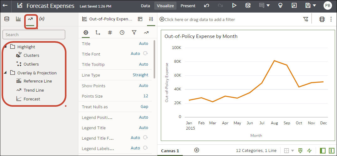
  3. In the Data Panel or Grammar Panel, click the Analytics icon Use the Analytics icon on the Data panel or Grammar panel to access statistical analytics.

    AAA Description of (3)
  4. Drag and drop the analytic you want from the Analytics pane to a visualization.
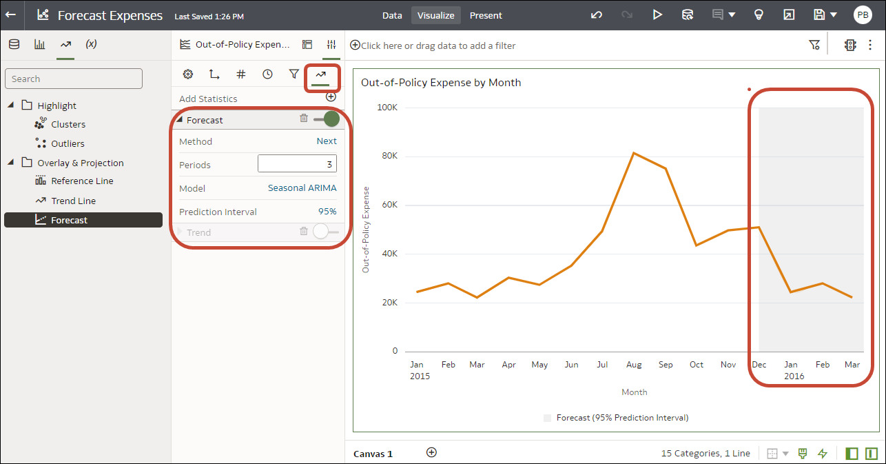
  5. To configure the analytic, use the Analytics pane on the Grammar panel.
    For example, if you add a Forecast, you can change the model type or the number of periods to forecast.

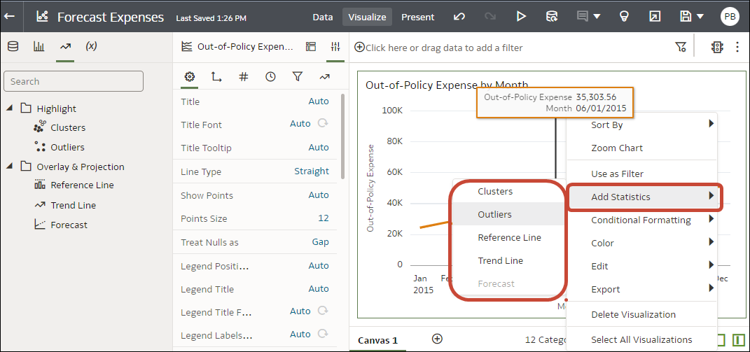
You can also access the statistical analytics options by right-clicking on a visualization, and selecting Add Statistics.

.