How Flexfield Segments are Rendered on Pages
Flexfield segments appear on pages as attributes of business objects. When you create or edit flexfield segments, the value you enter for the display type determines how the segment appears on a page.
How Display Type Values Appear
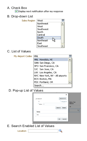
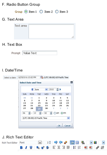
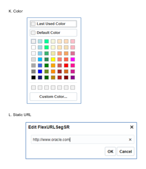
The series of figures (A to L) represent how the display types render on the UI. Each display type screenshot is assigned an alphabetic character that maps to the display type and its description in the table.


The table describes each display type:
|
Figure Reference |
Display Type |
Description |
|---|---|---|
|
A |
Check Box |
The field appears as a check box. If you select the check box, the checked value is used. Otherwise, the deselected value is used. |
|
B |
Drop-down List |
The field appears as a list of values from which you can select. It supports a smaller number of values. |
|
C |
List of Values |
The field appears as a list of values from which you can select. |
|
D |
Pop-up List of Values |
The field appears as a list of values from which you can select. It supports large volumes of values. |
|
E |
Search Enabled List of Values |
The field appears as a text field with a Search icon. You can type a value in the text field. You can also click the Search icon that opens another window for searching. |
|
F |
Radio Button Group |
The field appears as a set of radio buttons. You can click a button to select an option. When you select an option, previously selected option is automatically deselected. |
|
G |
Text Area |
The field appears as a text area where you can enter multiple lines of text. The display width and height specify the visible width and number of lines in the text area. |
|
H |
Text Box |
The field appears as a text field where you can enter a single line of text. The display width controls the width of the text box. |
|
I |
Date Time |
The field enables you to enter a date if the data type is Date. You can enter a date and time if the data type is Date Time. You can select the date in a calendar. If the data type is Date Time, you can also specify the hour, minutes, seconds, AM or PM, and the time zone. |
|
J |
Rich Text Editor |
The field appears as a text area where you can enter and edit multiple lines of formatted text. The display width and height specify the visible width and number of lines in the rich text editor. Note: This display type is available for extensible flexfields
only.
|
|
K |
Color |
The field displays a color palette. You can select a color and assign it to the segment. You can select the display type only if the value set for the segment is set to ORA_FND_COLOR_#RRGGBB. |
|
L |
Static URL |
The field appears as a text field where you can enter a fixed URL that opens the web page when clicked. Note: The length of the URL must not exceed 255 characters.
|