Add and Configure the Primary Chart for the KPI_2 Dashboard Panel
-
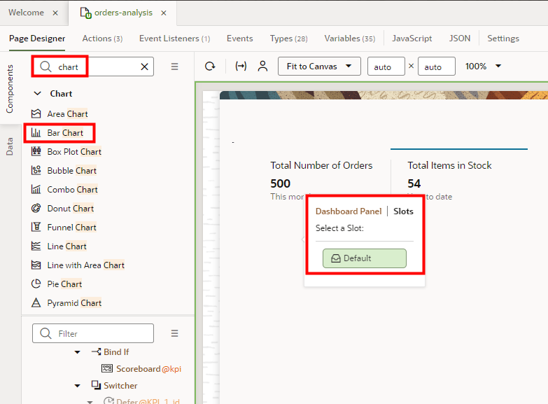
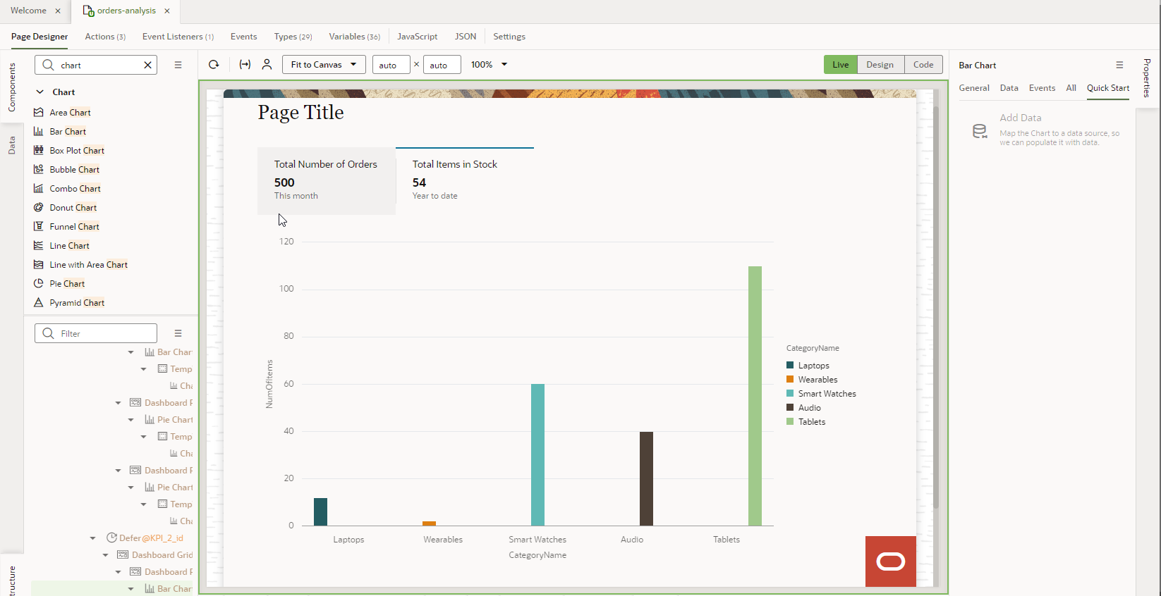
Add a bar chart to the default slot of the KPI_2 dashboard panel.
- On the canvas, navigate to Live mode (if you already aren't in Live mode), and then click the Total Items in Stock KPI.
- Switch to Design mode.
- In the Components palette, search for chart.
- Click Bar Chart and drag it over until you see the Dashboard Panel tag, then drop it.
- If the Dashboard Panel | Slots dialog box appears, click
Default.

-
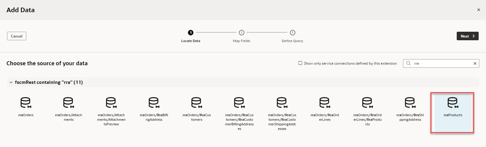
Locate the data to add to the bar chart.
- In the Properties pane for the Bar Chart, on the Quick Start tab, click Add Data.
- In the Add Data dialog box, filter the data sources by entering rra.
- Expand fscmRestcontaining "rra".
- Select rraProducts.
- Click Next.
-
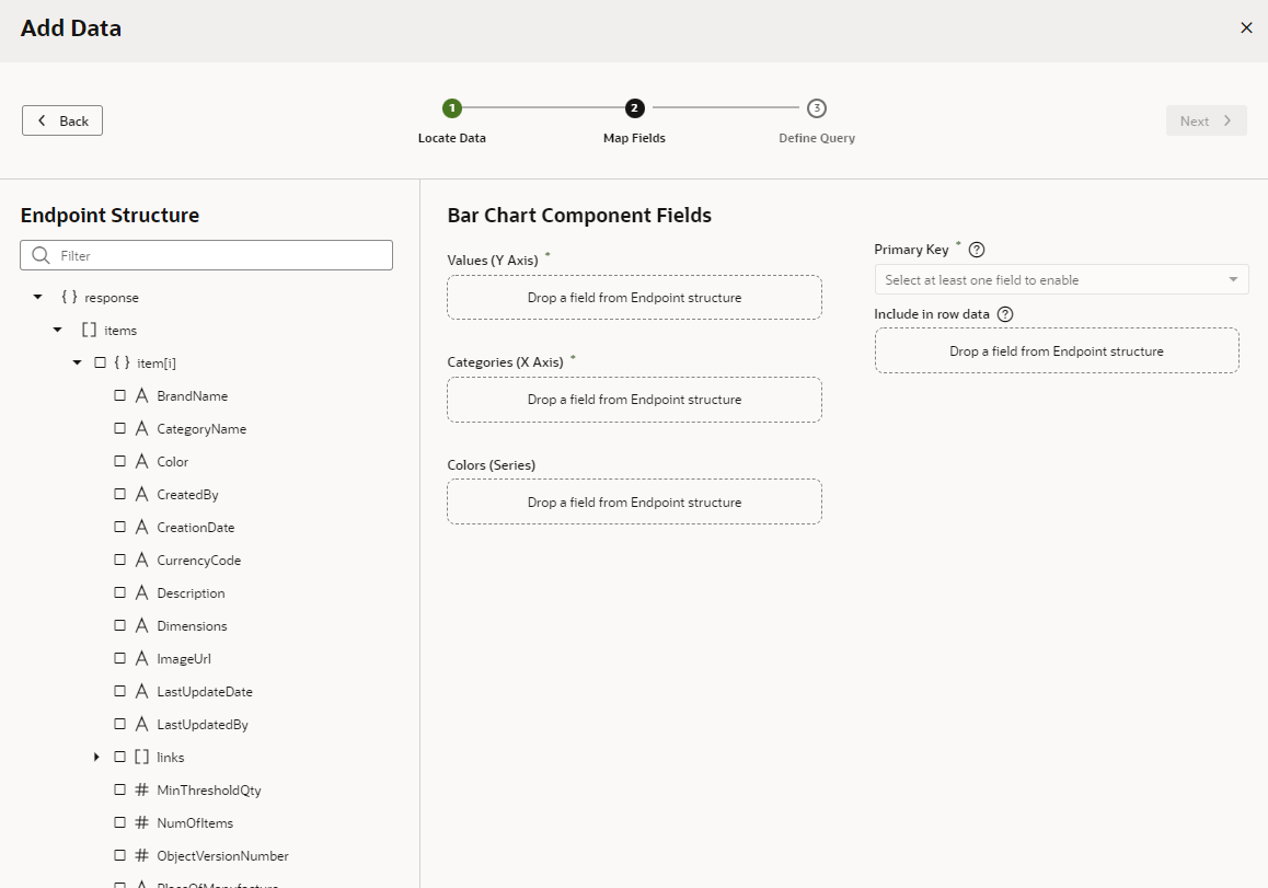
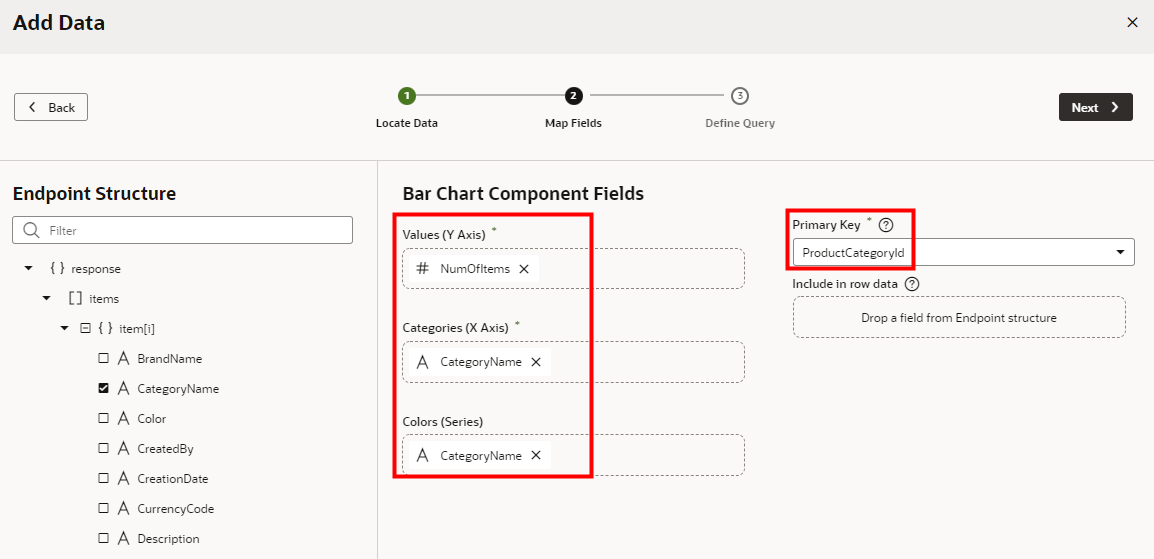
Map the endpoints to the Y and X axes of the bar chart.
- On the Map Fields stop, in the Endpoint Structure panel, scroll to #NumOfItems.
- Click # NumOfItems.
It should automatically appear in the Values (Y Axis) field. If it doesn't, drag the endpoint over the field and drop it.
- Click CategoryName.
It should automatically appear in the Categories (X Axis) field. If it doesn't, drag the endpoint over the field and drop it.
- Select CategoryName and drag it over the Colors (Series) field, then drop it.
- Change the Primary Key value to ProductCategoryId.
- Click Next.
This time you won't set any limits.
- On the Define Query stop, click Finish. You're in the Design mode with the first KPI selected.
-
Switch to the Live mode and click the second KPI to see the chart.
- Switch to the Design mode.
- Make the small quantity of bars more visually appealing.
- Ensure that Bar Chart is selected in Structure view.
- In the Properties pane, on the General tab, for Stack
Values, click On.
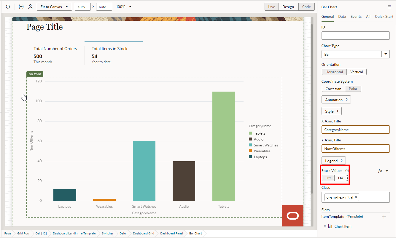
- Test your application in Live mode.
Congratulations, you have completed this tutorial.