Exploring the User Experience
Oracle Fusion Cloud Enterprise Performance Management and Oracle Fusion Cloud Enterprise Data Management environments utilize the Redwood Experience, which offers a modern interface with unique features.
The Home Page
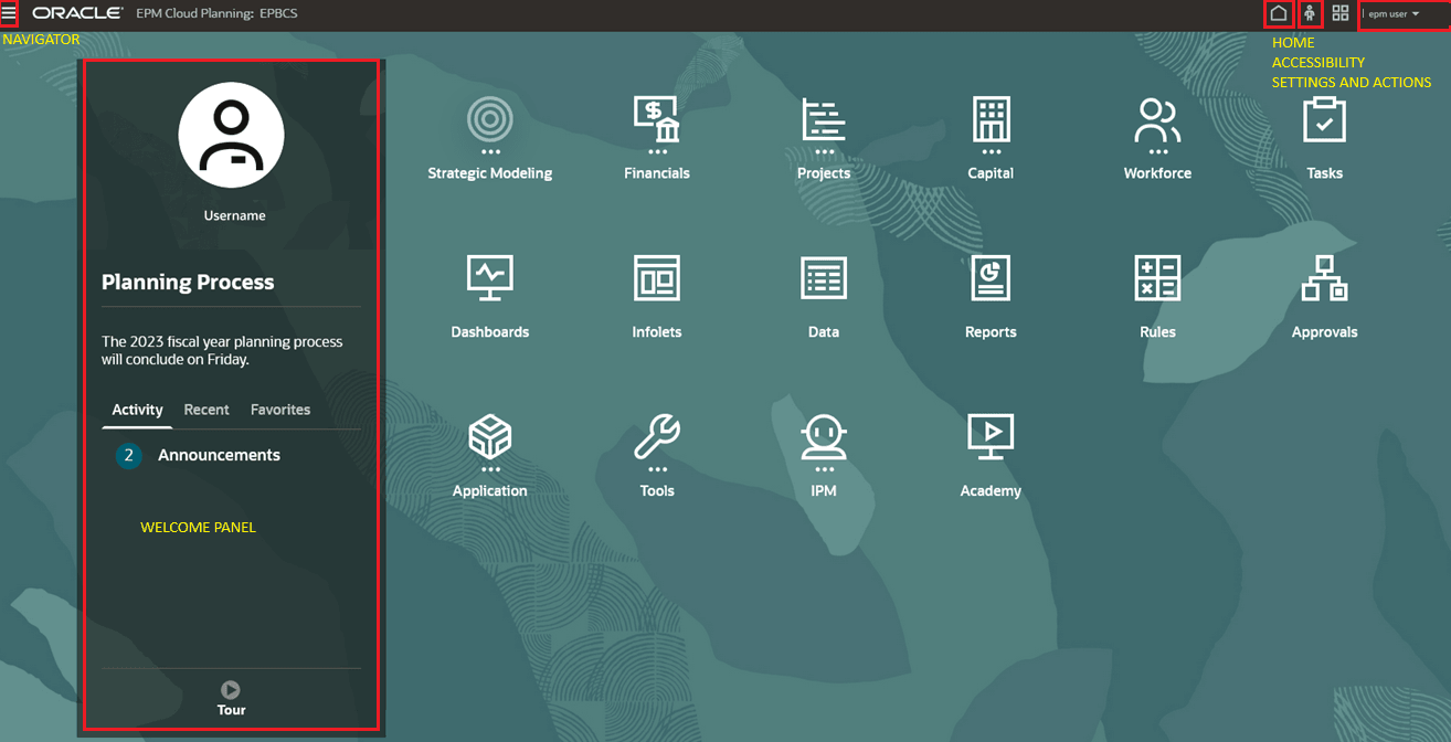
When you sign in to an environment, you will be taken to the Home Page.
- Navigator - In the top-left corner, you’ll see the Navigator icon. Click it to open a list of shortcuts that match the features and functions available on the Home Page cards.
- Welcome Panel - This is located in the center-left of the screen and gives you quick access to important info, like your messages and tasks. The details here may change depending on the service you're using.
- Home - On the top-right corner, this icon lets you return to the Home Page from anywhere in the environment.
- Accessibility - Right next to the Home icon, the Accessibility icon helps you adjust settings like screen readers and high contrast mode.
- Settings and Actions- Click your user name in the top-right corner to access settings such as Help, Provide Feedback, Oracle Support, Sign Out and more. Additionally, you can join Oracle Cloud Customer Connect, a community where members collaborate on common goals and objectives. See Joining Oracle Cloud Customer Connect.

Simplified Cards and Clusters Identification
The Home Page features cards that group various activities you can perform in the
environment. These cards offer access to key tasks, tutorials, and related
information. Clicking on a card opens a page with available shortcuts, which vary
based on your role in the environment. Each card is highlighted with its related
cluster of features expanded underneath, making it easier to identify. This layout
maintains the existing navigation flow while simplifying the process of locating
cards.
Compact Headers
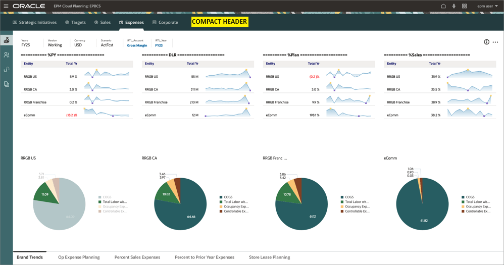
When you open a card to view a service capability, compact headers at the top of the screen help save space. These headers make it unnecessary to expand or collapse the screen to see information. The color of the compact header matches the selected theme and saves approximately 90 pixels of vertical space, creating more room for URL display at the bottom.

Tabs Positioning
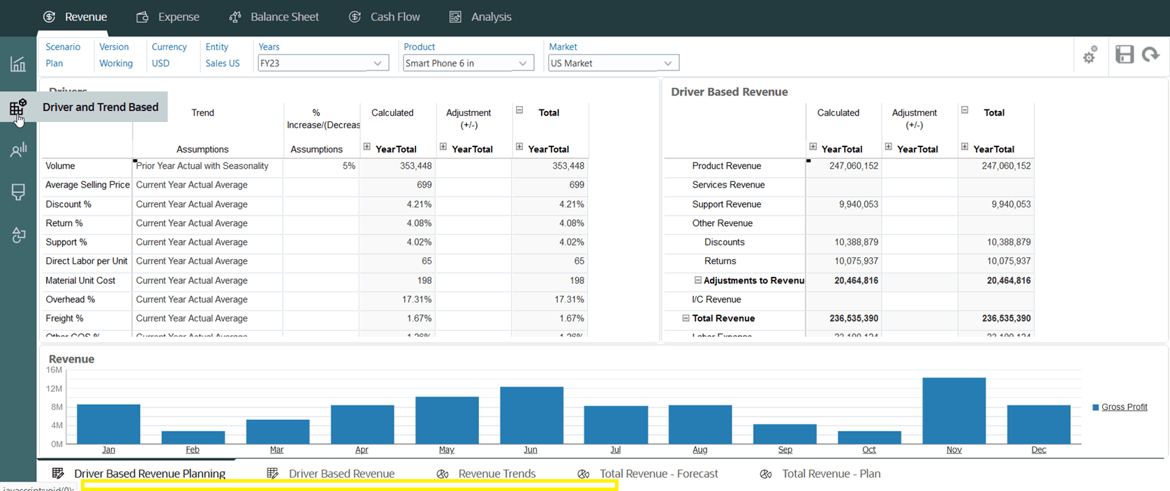
The tabs are located in the left pane, with their corresponding sub-tabs positioned at the bottom of the page for improved clarity and navigation. When you hover over a vertical tab, the tab name appears directly rather than a tooltip. Additionally, more space is allocated to the bottom tab to better accommodate URL display.
