- Administering Oracle Fusion Field Service
- Configure the Form Elements
Configure the Form Elements
After you create a Form, you must add elements to it. Form elements are the fields in which a Mobile Worker can display and capture the required data. Some form elements that you can add are date and time fields, barcode scanners, text boxes, and check boxes.
- Click Configuration > Forms & Plugins.
-
Click the stack icon and click Modify content for the Form that
you want to edit.
The Visual Form Editor page appears and displays an accordion type panel with these options to help you add, edit, and search for elements:
-
New element: All the element types that you can use in this context are listed here. To add a new element, drag it to the desired location on the form. You can also use the search option to search for an element within this section. If you add a List element, the values you added for it display in alphanumeric order.
-
Data fields: All the data fields that you can use in this context across all element types are listed in this section. Drag an element from this section and drop it to the form, to add the data field with a preconfigured binding to the data source. You can also use the search option to search for a data field within this section.
-
Content navigator: All the fields you've used in the layout. Each field has an icon representing the GUI type of the element that's defined when you bind the field to a data source. The features of this section are:
-
Clicking an item scrolls the content to the appropriate item in the layout and highlights it without opening the context menu editor.
-
Clicking an item in the layout focuses the list to the appropriate item, if the panel is active (not collapsed).
-
If a field is present more then once in the content, you see a marker in a format (n / m). For example, (1 / 3) means first of the three occurrences. Clicking the marker takes you to the item on the layout.
-
The order in the list is according to the appearance on the configured form, top to bottom, left to right.
-
The search option lets you search for a field within this section.
-
-
-
Drag the element that you want to add to the Form. For example, add a section, a text
box, a checkbox, or a other available element type.
Here are some special elements that you can add:
-
Form Field: Adds a field such as text box, list, checkbox and so on, to the Form. This type of fields exist on the Form only for presenting and gathering information. The data entered in Form fields will only be captured in a screenshot of the Form when the Form is Submitted. This data isn't stored in the application. However, data for other fields and properties is captured as normal.Note: You must add an instance of a property, button, or field only once in a form. More than one instance of a field, button, or property on a form might lead to application error such as property not being saved or the action being denied.
-
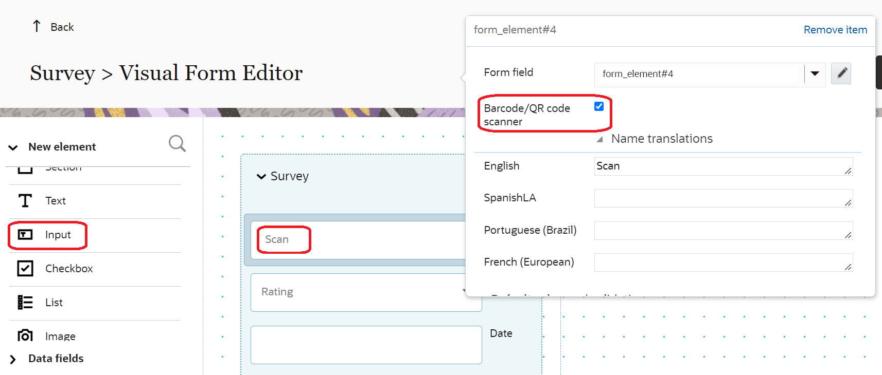
Barcode/QR Code/ NFC Tag Scanner: Adds an icon to the Form, using which users can scan a barcode, a QR code, or an NFC tag. The embedded scanning functionality (that's, camera) on the resource's mobile device is used to scan the code. The results of the scan is populated automatically in the associated field. This option is available as part of the Input element. You can add the scanner any number of times on a form. Before using the scan option, users must ensure that the Android and iOS app that's installed on their devices has access to the device’s camera. In Core Application, Barcode/QR scanner is displayed as a text box.Note: When you add multiple scanner check boxes on a form or page, ensure that the section contains only the scanner check boxes and Text elements. If the section contains any other type of element, the scanner isn't triggered.
-
Date and Time: Adds a date, time, or date and time field to the Form. The format of data in the data and time field is controlled by user settings. Specifically 'Time' (sudate_fid) and 'Date' (sudate_fid) user fields. The data captured from 'Date', 'Time', and 'DateTime' components is stored and exposed through the 'formSubmitted' event of Events API in a predefined format. Date and Time are form fields and not available for binding to a custom property. The formats are:
-
yyyy-mm-dd for 'Date'
-
HH:mm for 'Time'
-
yyyy-mm-dd HH:mm for 'DateTime'
-
-
Hidden value: Adds a field to:
-
Include calculated values, which aren't required to be displayed when the Form is filled.
-
Include prepopulated values by open parameters. The values for these parameters are configured on the Form button. When the user opens the Form, these values are populated on the Form.
-
Use in other expressions, whose values will be included into the submitted Form data with the values of all other Form elements.
-
-
-
In the Data binding section, bind the elements to appropriate
entities and fields:
-
Click the Form field drop-down list and select the entity and start entering the
entity name that defines the data source.
The application displays only those fields that contain the entered text in their label or caption.
-
Select the field that you want to define as the data source.
The application populates the Type field automatically, based on the field you select as the data source. If you don't bind your field to any entity, then you can use the text as a form field label.Note: You can also add supported Fusion business object product fields and descriptive flexfields (DFFs) to Oracle Fusion Field Service forms. These fields let mobile workers view or update authoritative Fusion data directly in Oracle Fusion Field Service without duplicate custom properties or separate integrations.
-
Optionally, click the pencil icon. In the Data field list,
select the specific field that you want to associate with the selected element.
If the Show only fields appropriate for element type checkbox is selected, only the fields that are appropriate for the selected entity and the element type are displayed. If the checkbox isn't selected and a different type of field is selected, the element type is changed accordingly. For example, if your element type is Input and you select Activity Type [aworktype], then the element type is changed to the one that the Activity Type belongs to.
- Click OK.
-
Click the Form field drop-down list and select the entity and start entering the
entity name that defines the data source.
-
In the Visibility section, configure the visibility
settings.
- To change the visibility, click Add new. In the Access mode section, select the required visibility.
- To add any conditions to make the element visible, click the plus icon.
- Add the required condition and click Save.
The visibility is Read-write (RW) by default for form elements. However, for bound data sources, the effective access can't exceed the permission supported by the selected field. For example, a supported Fusion business object field that is read-only remains read-only in the form. -
In the Translations section, add the labels for the field in the
required languages.
The number of languages in this section is same as the number of languages you've configured on the Configuration > Display page. The application adds a label by default and you can change it here. You can use this label in default expressions and in the visibility conditions of other Form items. Further, you can use this label to refer to the submitted values in APIs. Here's the screenshot that shows Form elements:
-
Click Actions on the Visual Form Editor page, and do the
following:
- Click Validate to validate your Form's configuration.
- Click Attach HTML Template to update/replace the old template with a new one.
-
To view the form as your end-users see it and to verify upcoming configuration changes,
click Preview.
The preview includes all fields, except those that are Read-Only and don't have any data currently. Within the form preview:
- You can enter values into the required and optional fields.
- Any default values that are configured are calculated and displayed in the fields.
- Any configured visibility conditions are applied.
- Any validation rules that are set up are applied and the relevant validation messages are triggered.
- Any regular expressions configured for custom properties validate the data you've entered and trigger error messages, if necessary.
- The preview includes the saved and unsaved changes.
- The data you enter while viewing the preview is saved and displayed the next time you open the preview.
- You can clear the data you had entered in the preview page and start again, using the Start Over button.
- Any visibility conditions configured for the Submit and Dismiss buttons are applied.
-
Click Publish on the Visual Form Editor
page.
The Form elements are published to the users of the selected user type. The next step is to add the Form to a context layout through a User Type page configuration.