View the Capacity by Category Report
The Capacity by category report shows the expected duration in minutes and the quota (amount of work performed) for a specific work type and time slot. You can view this report only when selecting a quota enabled bucket.
- Modify the following values, if necessary
Major Capacity Usage
Critical Capacity Usage
This figure shows the Capacity by category report that appears as a gauge.
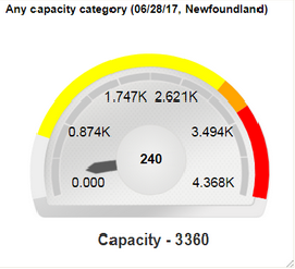 The gauge shows in minutes the anticipated total activity duration (based on work orders) and the amount of quota assigned for each specific time slot and work type:
The gauge is set up with 0 in the lower left quadrant.
The hand of the gauge sweeps from left (0) to right as capacity is used, pointing to the current amount of capacity that has been consumed.
The higher value is determined automatically by multiplying Capacity and 1.3 shown in the lower right quadrant.
The space between capacity and the higher value represents the point at which the number of work orders for that work type has exceeded quota. If the hand moves into this area (as a result of those additional minutes being consumed) the area will be highlighted in red. Apart from differentiating the capacity change in colors, you can also view the capacity value as text.
Time Slot is 8-10.
Date is 06/18/09.
Capacity (based on available resources and their calendars) is 1100 minutes and is shown as a tic mark highlighted in yellow at the outer edge. Apart from highlighting the capacity in yellow color, the capacity is also shown as text in the center of the gauge.
The hand points to the current capacity that has been consumed (415 minutes). The current capacity value is also shown at the bottom of the gauge.