Example: Creating a Chart to Display Forms and their Status
This example creates a chart that displays the statuses of a particular supplemental data form.
Note:
This a general example based on application-specific data explaining how you can set up a similar chart on your data. You cannot replicate this example.
The generated chart is displayed as shown. Click any area within the chart to drill down and view of the individual records that comprise that aggregated area.

To create this chart:
- From the Home page, click Tasks. Click Supplemental Data Tasks to display the Supplemental Data Task List.
-
From the View Selector at the top-right of the page, select Chart View.
The Chart view appears, with a default chart displayed.
- Click Edit at the top-right to display the Edit Chart dialog.
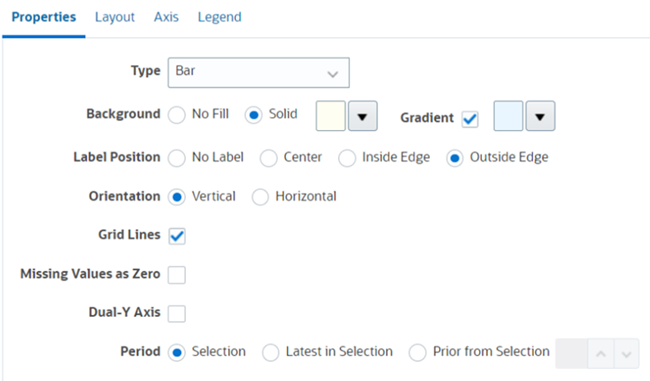
- In the Properties tab, specify the following:

- In Type, select Bar.
- In Background, select Solid. Select the color of your preference from the drop down.
- Select the Gradient checkbox. Select the color of your preference.
- In Label Position, select Outside Edge.
- In Orientation, select Vertical.
- Select Grid Lines.
- Deselect Missing Values as Zero.
- Deselect Dual Y Axis.
- In Period, select Selection.
-
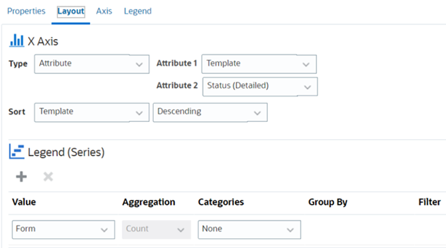
In the Layout tab, specify the following:

- In the X-Axis section, for Type, select Date.
- In the Legend (Series) section, enter 2 values:
- In Value, select Form.
- In Categories, select None.
- In the Axis tab, leave the default settings as is.
-
In the Legend tab, specify the following:
- In Legend Position, select Right.
- In Palette, select Redwood.
- Click OK.