Analyzing Advanced Prediction Results
Depending on how your administrator set up Advanced Predictions, you can review forms and dashboards to analyze Advanced Prediction results, and use Explain Prediction to review more details about the prediction results.
This topic shows some of the options that might be available to you, depending on your implementation.
To review Advanced Predictions:
- Navigate to the Advanced Predictions results form or dashboard as directed by your administrator.
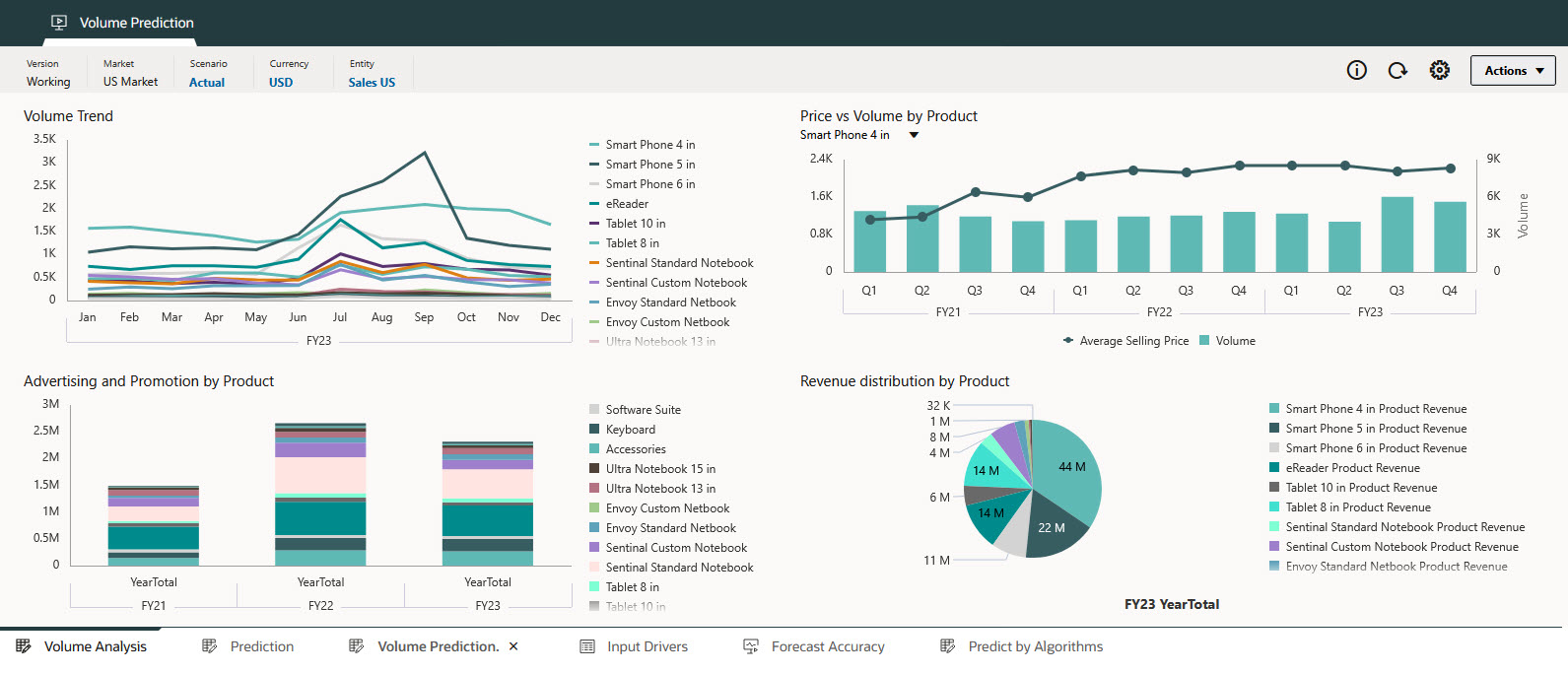
- Depending on the implementation, you can use a dashboard to see an overview of the
prediction, including historical data trends, and review the historical impact of
various external and input drivers, such as industry volume, advertising and
promotions, sales price, and GDP rates on historical sales volume.

-
Depending on the implementation, you can also review:
- Prediction—Review prediction details, historical data, and input driver details.
- Input Drivers—Review and edit the input driver details. You can review historical and predicted input driver values. If you edit the input drivers, an administrator can re-run the prediction to get updated prediction results.
- Forecast Accuracy—Review and ensure the accuracy of the prediction.
- Predict by Algorithms—Explore prediction results using different algorithms.
-
To get more information about the prediction, in a form with predicted values, right-click a cell with predicted data and then select Explain Prediction.
Note:
Explainability is available only in Forms 2.0 on the web. It is not available in dashboards or in Oracle Smart View for Office. -
To see more information about the data, in the Explainability panel, click Prediction Analysis:

-
The historical data is shown as an orange series to the left of the vertical separator line.
-
The base case (most likely case) for predicted data is in the purple series to the right of the vertical separator line.
-
The predicted data series is bounded by dotted lines that show the confidence intervals (the upper and lower prediction intervals)—the range between the Best Case predicted scenario and the Worst Case predicted scenario.
- The Model estimates line, also known as the fitted value line, shows the ML model’s estimates for historical data based on its learning of underlying logic and trends. Comparing the fitted values with historical actuals data indicates how well the prediction model was able to capture the variations in the provided data. The prediction is made using the selected algorithm for future values using the fitted values of historical data.
-
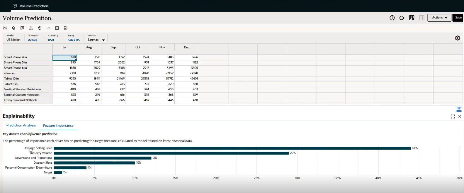
- To see more information about the key drivers that
influence the prediction, in the Explainability panel, click
Feature Importance:

The Feature Importance chart shows the relative importance each driver has on predicting the target measure for a particular slice of data. In this example, which is predicting volume for Smart Phone 4 in., you see that Average Selling Price has the biggest influence. Events are also taken into consideration for their impact on the target. For example, a Marketing Campaign event can contribute to the predicted volume.
You see what drivers most impact the predictions and can use this information to take more informed actions. For example, if you change the driver value that has the most importance, you will see a larger impact on the predicted value.
- The feature importance is global, meaning it is applicable to the entire series of data for the selected slice of data for all time periods.
- The features are limited to the top ten. If there are more than ten features that contribute to the prediction, the remaining are grouped into a category called Other. (Administrators can see the details of the features that contribute to the Other category in the Advanced Predictions report. (From the Home page, click IPM, then click Configure. From the Actions menu next to an Advanced Prediction definition, select Download Report.)
Your administrator might have selected the option to Enable automated feature engineering and selection.
When Enable automated feature engineering and selection is selected, multiple engineered features are created, and the top 15 (or fewer) features are selected for model generation and predictions. The Feature Importance chart shows the importance of the selected top 15 features for the output variable.

When Enable automated feature engineering and selection is not selected, no engineered features are created. However, feature importance is still assessed, and any features found to be unimportant are excluded from the model. All other features are used as-is for model generation.
The Feature Importance chart shows the importance of the given features for the output variable. The chart shows the top nine features; any remaining features are aggregated by their percentage values and grouped under the heading Others.
Feature Engineering finds the hidden relationship between input features and the output variable. Well-engineered features allow models to capture more relevant information, leading to improved model performance and better predictions. Feature Selection identifies the most relevant business drivers that impact forecast accuracy, and filters out "noisy" or low-impact variables to avoid over-fitting. It also improves performance by reducing complexity and processing time. It supports explainability by ranking features based on predictive power.
You can review prediction results with and without Enable automated feature engineering and selection to compare the results.
- You might have the option to refine input drivers. Then, ask your administrator to run the Advanced Prediction job again. Review the impact of your changes.
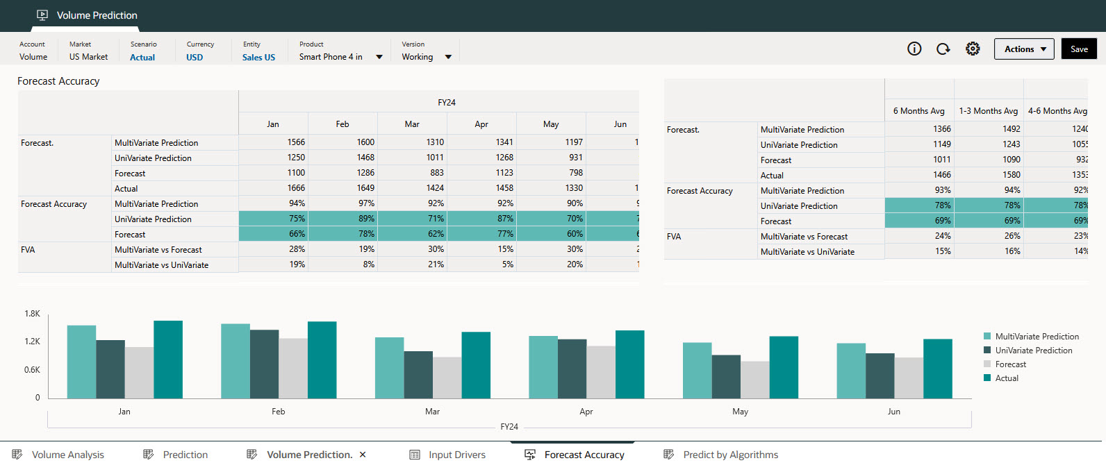
- If your administrator implemented an option to review Forecast Accuracy, you can
compare the accuracy of the prediction results using the Forecast Value Add (FVA)
metric. In this example, you can compare the Advanced Prediction results
(Multivariate Prediction), Univariate Prediction (results from Predictive Planning) and Forecast to
backtesting that is performed to measure the prediction accuracy based on the
historical data.
To calculate FVA, the accuracy of the adjusted forecast is compared to the accuracy of a baseline. If the adjusted forecast reduces errors compared to the baseline, then it has a positive FVA; if it increases errors, the FVA is negative. This metric helps you focus on the steps that improve accuracy and eliminate non-value-adding activities in the forecasting process.
