Image Toggles
Image toggles are controls that have one image used to represent the selected state and another image to represent the not selected state.
There is the option to include a caption (by default, the question text) below the image to explain the choice that the toggle represents.

Note: Image toggles are only available in Latest Version interviews.
To specify the images to use for the toggle buttons:
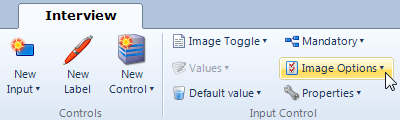
- Select the image toggle input in the screen list or screen layout view, and click the Image Options button.
- In the drop-down window:
- Select the image you want to use for the Unchecked button image. To do this, either:
- click the Browse button to browse to the location of the image file, or
- (for an image stored on a server) type or paste the URL of the image into the Select Image field.
- (Optional) Select the image you want to use for the Checked button image.
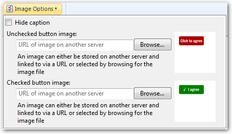
Note that if a checked button image is not provided, then the checked state will be indicated in an interview with a check mark overlaid on the unchecked image. - Select the image you want to use for the Unchecked button image. To do this, either:
To hide the caption that is shown below the image toggle:
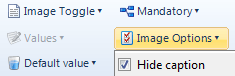
- Select the input in the screen list or screen layout view, and click the Image Options button.
- In the drop-down window, select the Hide caption check box.
Note: Even if a caption is hidden, its text is still used as the control description for accessibility purposes.