Create Visual Representations of Test Case Results
You can use Excel chart functionality to create visual representations of test case results. For example:
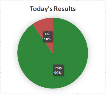
- You could create a pie chart showing the percentage of passed tests versus the percentage of failed tests. This type of chart is demonstrated in the myBenefits example policy model in the LIHEAP test document.
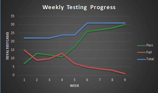
- You could use a line graph of the results and compare this over time to see if test case results are improving. This type of chart is also demonstrated in the myBenefits example policy model in the LIHEAP test document.
- You could use a column graph to show the differences in outcomes between two different sets of policies. This type of chart is demonstrated in the myBenefits example policy model in the What-If Analysis test document.
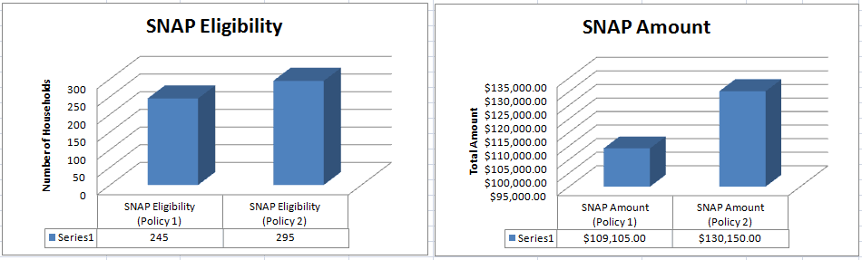
For more information on comparing outcomes, see Conduct What-If Analysis.