Visualize and Compare Past Metric Data

You can view past metric data, in addition to the current metric value, for your dashboard metric gadgets. Choose between the chart view and the tabular view to look at data up to 180 days in the past, depending on your metric storage policies. Past metric data is available for both built-in and custom metrics.

You can also compare up to four metrics in the chart view. For example, you may wish to study possible correlation between two metrics, say AveragePressure and AverageTemperature. If the metric values are disparate, you can choose multiple y-axes, so that you are able to see each metric plot using the correct scale.
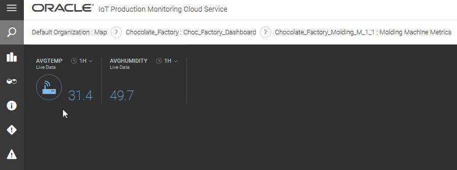
  1. In the Operations Center Dashboard view, click the gadget corresponding to the metric.

    Sample Dashboard Metric: Average Temperature

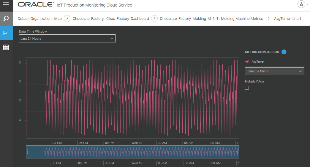
    The metric chart view appears by default.
  2. Select a pre-defined or custom Data Time Window value to see the chart for the specified period.

    Sample Metric Chart

    Depending on your metric data storage policies, you can visualize data up to 180 days in the past.
  3. Use the Metric Comparison area to add metrics to compare.
    You can compare up to four metrics in the chart view. If the metric values are disparate, you can choose multiple y-axes, so that you are able to see each metric plot using the correct scale.
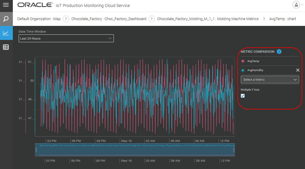
    Comparing metrics in the chart view

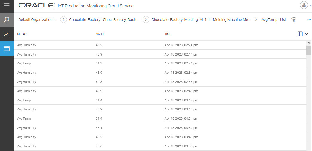
  4. Click List List View icon in the menu bar on the left to view tabular data for the metric values.

    List/Tabular view of historical metric values

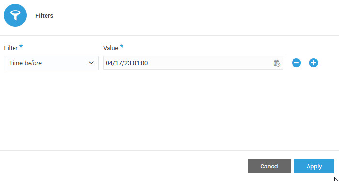
  5. (Optional) Choose filters to look at data of interest.

    Filters Dialog

  6. Use the breadcrumb navigation link to go back to the dashboard.