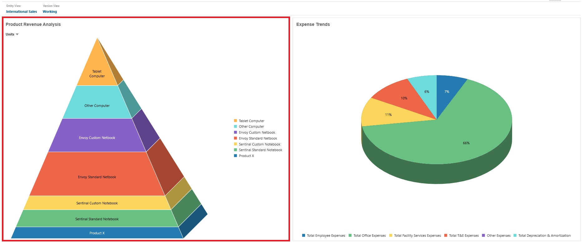
About the Pyramid Chart Type
Pyramid chart types use a triangle diagram to represent hierarchies visually. The triangle is divided into sections, illustrating vertically top-down and broad-narrow structures and processes.
Example 3D Pyramid Chart

Dashboard designers can set these pyramid chart properties:
Table 13-8 Pyramid Chart Properties
| Setting | Description |
|---|---|
|
Legend Position |
Choose Left, Right, Top, Bottom, or None. |
|
Value Scale |
Especially useful for large numbers, you can scale how a value is displayed. For example, if the value is 1,689,000 and you select K - Thousand as the scaling option, the chart displays the value as 1,689K. Your scaling options:
|
|
3D Graph |
Choose Yes to visualize the data as a 3D chart. |
|
Color |
Select Default or click a section of the pyramid chart and choose a custom color for that section. |