7Creating Intake Forms
Intake Form Designer Topics
The following topics apply to using the Intake Form Designer to create and publish intake forms, which registered users access online to initiate transactions, such submitting a permit application, reporting an issue, and so on.
Using the Intake Form Designer
This topic describes the purpose of the Intake Form Designer, lists the prerequisites that must be completed prior to creating a form, and introduces you to the designer interface.
To initiate a transaction, such as a permit, an intake form needs to be submitted to capture the information required for the process. Examples of transactions include permit applications, planning and zoning applications, and so on. You use the Intake Form Designer to create application forms that public users can access online, fill out, submit, and monitor.
Oracle does not deliver a predefined form for each type of transaction because for each form and for each municipality, the information required will be unique. For example, for a fence permit, the City of San Diego may require only basic information about the material to be used and the measurements. On the other hand, the City of Sacramento may require the same information as San Diego, but also require the contact information of the contractor building the fence, the exact location of the fence, the area enclosed by the fence, and so on. Each municipality has its own set of requirements, and the Intake Form Designer enables you to tailor the forms to reflect your agency's requirements.
With the Intake Form Designer, you can create unique application forms for each transaction type offered. The Intake Form Designer provides modular sets of common fields, called predefined field groups, which are ready-to-use form elements you can assemble like building blocks to create the intake form. If a predefined field group does not contain all the fields you require, you can add user-defined fields to capture the additional information.
The type of intake form you create depends on the offering.
| Public Sector Compliance and Regulation Offering |
Intake Form Types |
|---|---|
| Permits |
Permit applications |
| Planning and Zoning |
Planning pre-application Planning application |
| Code Enforcement |
Report an issue |
| Business Licenses |
Business license:
Note: For business licenses, typically the consultation activity uses a separate intake form. You can use a single form design to address origination, amendment, and renewal license activity.
|
Once you have created, configured, and tested your form, you can publish the form for public users to access, complete, and submit for review and approval.
Completing Prerequisites
Before creating a form, you need to:
Create a transaction type.
A transaction type represents the type of intake form you will create such as a permit application, a business license application, and so on.
For more information on creating a transaction type, see Setting Up Permit Types, Setting Up Business License Types, Setting Up Planning Application Types, Setting Up Issue Types.
Set up any fees associated with the form.
For more information on fees, see Setting Up Fee Itemsand Setting Up Fee Schedules.
Set up workflow for the transaction.
For more information on workflow, see Setting Up Process Definitions for Workflow.
Accessing the Designer
Before you can create an application form, you must first create a transaction type on the Transaction Type page.
From the Transaction Type page for the appropriate offering, select the Design Form button.
Working with the Designer Interface
This example illustrates the interface of the designer when you begin creating an application form.
This example illustrates the Intake Form Designer interface. The controls in the image are described in the text surrounding the image.
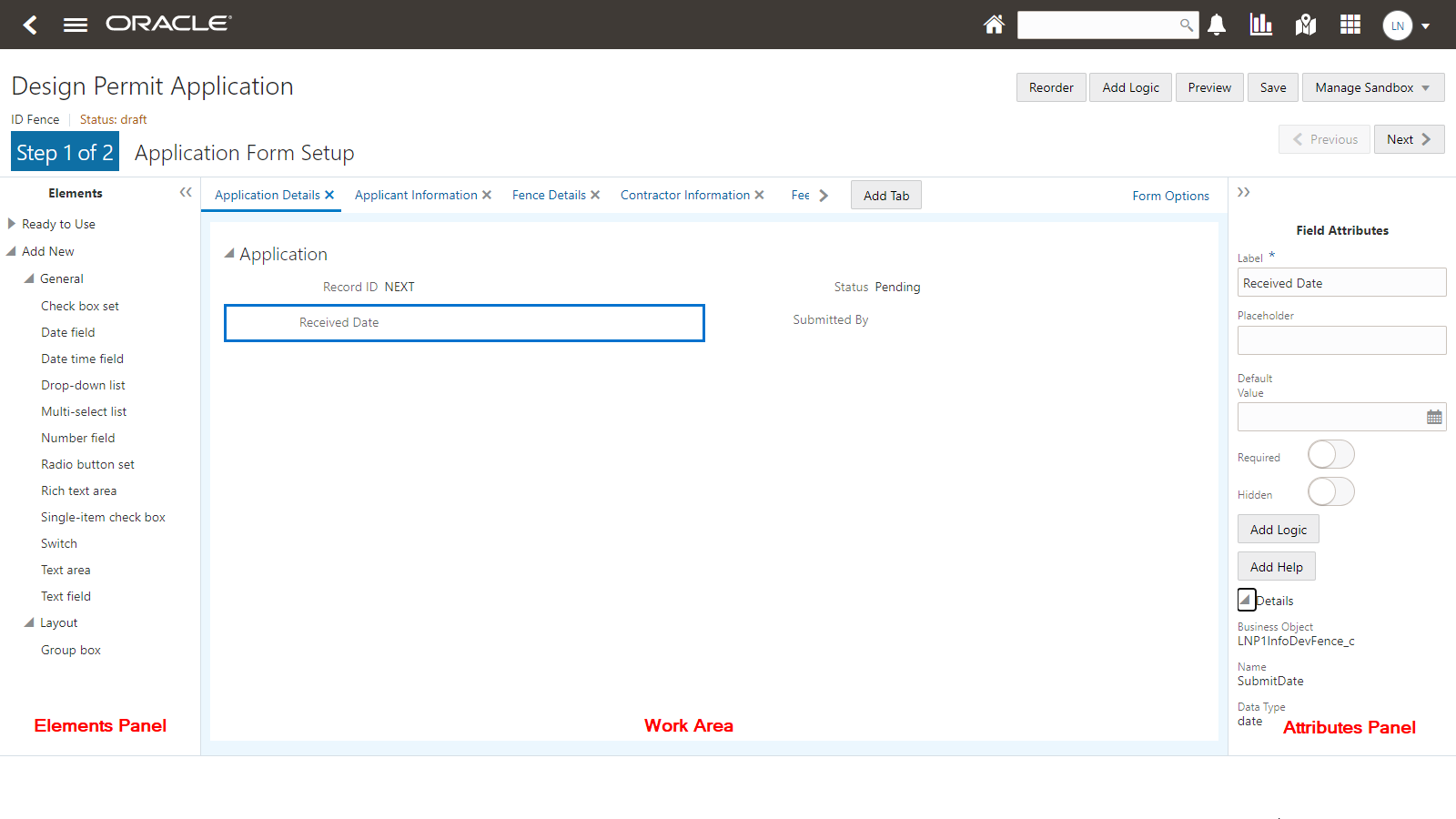
| Page Element |
Description |
|---|---|
| Status |
Indicates the status of the current design.
For more information on form status, see Working with Sandboxes and Publishing Intake Forms. |
| Reorder |
Click to open the Reorder Intake Form window to move form elements to different locations within the form design. For more information on reordering intake forms, see Reorder Intake Form Elements. |
| Add Logic |
Enables you to add programming logic scripts using the Groovy programming language. For more information on Groovy, see Adding Logic. |
| Preview |
Enables you to preview your form to get a snapshot of the current layout. For more information, see Testing Intake Forms. |
| Save |
Saves changes made to the form design. |
| Manage Sandbox |
Enables you to manage the development sandbox associated with the intake form while you are creating it and to publish it after development and testing is complete. For more information on sandboxes, see Working with Sandboxes. For more information on publishing, see Publishing Intake Forms. |
| Next |
Takes you to the Fee Mapping page, which is the next step in the form design process. If the transaction type is not associated with a fee schedule, the Fee Mapping page is not displayed. For more information on mapping fees, see Mapping Form Fields to Decision Model Attributes. |
| Form Options |
Click to display the Form Options dialog box where you can set options that apply to the entire form. For more information on form options, see Setting Form Options. |
| Elements panel |
The Elements panel contains all of the items that you use to build an intake form. It displays lists of all pre-defined field groups and user-defined elements you can add to your form design by dragging and dropping. The Ready to Use section contains:
The Add New section contains:
For more information see, Working with Predefined Field Groups, Working with Pages, and Working with Fields. |
| Add Tab |
Adds additional pages to your form. You navigate between the pages by using the page tab for each page. For more information, see Working with Pages. |
| Workspace |
The area where you drag and drop form elements from the Elements panel and configure them. This is the main work area used for creating, configuring, and designing the layout out your forms. |
| Attributes panel |
Displays the available attributes that you can configure for the currently selected form element. For example, if you have a field selected, the attributes panel reads "Field Attributes,” and it contains attributes specific to that field type. If you have a group box selected, the attributes panel reads "Group Box Attributes,” and it contains attributes specific to group boxes. |
Using the Keyboard to Drag and Drop Elements
You can drag and drop form elements manually using your mouse, or you can use keyboard hot keys.
| Key |
Description |
|---|---|
| Enter |
Use to:
|
| Tab |
Use the tab key to select either the first element in the list or the last selected item in the list if a previous visit was made to the list. |
| Up and Down Arrows |
Use to:
|
| Space |
When an element is selected, the space key highlights the selected element and displays available drop zones for the current page on the Select a Drop Zone dialog box. The drop zones can be the page or group boxes contained by the page. For user-defined fields, the drop zones are group boxes. |
Organizing the Tasks for Creating Forms
This section provides the core set of tasks to complete when creating an intake form. The remaining topics in this chapter discuss the details of each task.
| Step |
Link |
|---|---|
| Add page tabs. |
|
| Add predefined field groups. |
|
| Modify field attributes in predefined field groups. |
|
| Add group boxes. |
|
| Add user-defined fields. |
|
| Testing intake forms. |
|
| Publishing intake forms. |
Using the Intake Form Designer for Code Enforcement
This topic describes how to use the Intake Form Designer for the Code Enforcement offering.
Public users access an online form, fill out it out, and submit it to report issues. You use the Intake Form Designer to create intake forms for Oracle Public Sector Compliance and Regulation offerings, including Code Enforcement.
Using the Intake Form Designer to create intake forms for the Code Enforcement offering is similar to creating intake forms for the other Public Sector Compliance and Regulation offerings, such as permits or planning applications. However, in the case of Code Enforcement, creating intake forms relies on a delivered template that has all the pages and fields already in place for a working form right from the start. You can add user-defined fields in specific areas to capture additional information if needed. This underlying template both simplifies and streamlines the form design process, requiring you to create little, if anything, from scratch.
This topic describes the concepts and steps you’ll need to understand to create intake forms specifically for the Code Enforcement offering. For concepts that apply to all Oracle Public Sector Compliance and Regulation offerings, you will be linked to that common topic in the “Creating Intake Forms” chapter of this guide.
Prerequisites
Before creating an intake form for a Code Enforcement issue subtype, these items must exist:
Issue type
Issue subtype
For more information see Setting Up Issue Types and Setting Up Issue Subtypes.
Accessing the Intake Form Designer for Code Enforcement
An intake form for a Code Enforcement incident is associated with an issue subtype.
To access the Intake Form Designer, click Design Form from the Issue Subtype page.
For more information on creating issue subtypes, see Setting Up Issue Subtypes.
Working with the Intake Form Designer
After you have created an issue subtype, you use the Intake Form Designer to create the form public users will access to report issues to your agency.
This example illustrates the general user interface of the Intake Form Designer used to create issue intake forms for Code Enforcement.
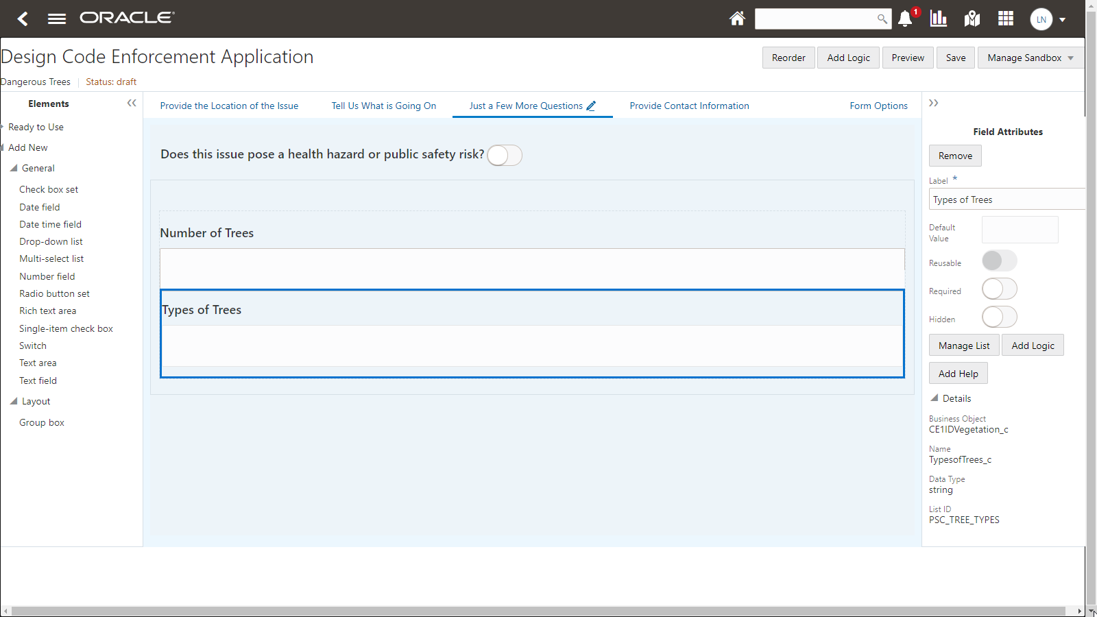
| Page Element |
Description |
|---|---|
| Status |
Indicates the status of the current design.
For more information on form status, see Working with Sandboxes. |
| Reorder |
Enables you to move form elements from the initial location.
Note: For Code Enforcement, you can reorder only the group boxes and user-defined fields you have added to the editable area of the template.
For more information on reordering form elements, see Reorder Intake Form Elements. |
| Add Logic |
Enables you to add programming logic scripts using the Groovy programming language. For more information on Groovy, see Adding Logic. |
| Preview |
Enables you to preview your form to get a quick snapshot of the current layout. For more information, see Testing Intake Forms. |
| Save |
Saves changes made to the form design. |
| Manage Sandbox |
Enables you to manage the development sandbox associated with the intake form while you are creating it and to publish it after development and testing is complete. For more information on sandboxes, see Working with Sandboxes. For more information on publishing, see Publishing Intake Forms. |
| Form Options |
Click to display the Form Options dialog box where you can set options that apply to the entire form. For more information on form options, see Setting Form Options. |
| Elements panel |
Displays the list of user-defined elements you can add to your form design, such as the fields you can add to your form by dragging and dropping into the drop zone on selected pages.
Note: The elements within the Ready to Use node are not intended to be added to your intake forms manually. They have already been added by way of the underlying template. For Code Enforcement, the Ready to Use node is intended to be used by internal Oracle development teams.
|
| Workspace |
This is the main area displaying page tabs and drop zones used for configuring your forms. |
| Attributes panel |
Displays the available attributes that you can configure for the currently selected form element. For example, if you have a field selected, the attributes panel reads "Field Attributes,” and it contains attributes specific to fields. If you have a group box selected, the attributes panel reads "Group Box Attributes,” and it contains attributes specific to group boxes. |
Working with Page Tabs
Page tabs appear across the top of the work area.
Each page tab represents a separate page that the public user will access at runtime to provide the necessary information when reporting an issue. The majority of the intake form for Code Enforcement is defined by the underlying template, which you can’t modify. Because the page tabs are defined in the underlying template, you can’t add or remove page tabs that appear in the default Code Enforcement intake form.
The page tab containing the pencil icon indicates where the drop zone resides. The drop zone is the area of the intake form where you can add user-defined fields and group boxes to configure the intake form to include any additional requirements for that issue subtype.
For example, if you want to add a field to capture the length of the overgrown grass being reported, you can drag and drop a Number field type into the drop zone.
The following table provides descriptions of the default page tabs provided by the template. The page tabs derived from the template are:
| Page Tab |
Description |
|---|---|
| Provide the Location of the Issue |
Used for specifying the location of an issue that’s being reported. This tab includes a map with a crosshair marker for identifying a location. A search field enables user to easily find a location and place it in the crosshairs. A separate text field captures additional location information such as an apartment number or a description of where to find the issue at the given address. |
| Tell us what’s going on |
Used to describe the issue that’s being reported. This tab includes a freeform text field for describing the issue. The tab also supports attachments so that users can upload photos, videos, or other documentation. |
| Just A Few More Questions |
Used to collect additional information about the issue that’s being reported. In the delivered template, the only field on this page is a switch for indicating if the issue is a health hazard or public safety risk. This tab also has a drop zone where you can add your own fields for collecting additional information. |
| Provide Contact Information |
Used to collect the name and contact information for the person who is reporting the issue. The template includes a switch for hiding the user’s information, but this switch is visible to the end user only if the agency allows anonymous reporting. This option is configured on the Code Enforcement Options page. See Setting Up Agency-Level Options for Code Enforcement. |
Working with the Drop Zone
The drop zone is the area of the issue subtype intake form where you can add user-defined fields and group boxes. You can locate drop zones by selecting the page tabs with the pencil icon.
This example illustrates the pencil icon on a page tab, which indicates which tab(s) a drop zone resides where you can add custom fields.

You can drag and drop these form elements into a drop zone:
User-defined fields
Group boxes
This example illustrates dragging and dropping a user-defined field type from the Elements panel into the drop zone.
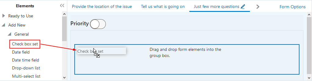
The drop zone itself is a group box into which you can drag user-defined fields and other group boxes if needed.
Working with User-Defined Fields
You can drag and drop user-defined fields directly into the drop zone, or you can add group boxes to the drop zone and drag and drop user-defined fields into the group boxes.
To add a user defined field to the drop zone:
Expand the Add New list.
Expand the General list.
Select the desired field type by clicking and holding.
Drag and drop the field type onto the drop zone.
To modify field attributes:
Select the field in the drop zone.
Use the Field Attributes panel to configure the field.
Click Save.
For more information on working with fields, see Working with Fields.
Working with Group Boxes
You can use group boxes to organize user-defined fields you add to the drop zone. User-defined fields can be added only to the drop zone or to group boxes.
For more information on group boxes, see Working with Group Boxes.
Displaying Form Elements Conditionally
In some cases, you may want to display or hide certain elements in the drop zone only if the public user has made specific selections on previous fields also in the drop zone.
For more information on conditional display, see Displaying Form Elements Conditionally.
Setting Form Options
Form options enable you to configure features that apply to the entire form. For example, for the Code Enforcement issue intake form, you can control whether a review page displays to show the public user all their selections before submitting.
For more information on form options, see Setting Form Options.
Working with Sandboxes
When developing intake forms, you design and modify the form layout within a sandbox. A sandbox is an Oracle Fusion Applications technology that enables intake form developers to work on projects simultaneously, save, and test their work without affecting other developers or testers in the environment.
For more information on sandboxes, see Working with Sandboxes.
Testing Intake Forms
After creating an issue intake form, you can test it by:
Viewing it in preview mode.
Making it available from the landing page where you can select Report an Issue, which can be done in draft mode and published mode.
For more information on testing, see Testing Intake Forms.
Publishing Intake Forms
While you are actively designing or modifying an intake form, the intake form resides in draft mode in a development sandbox. You can test the intake form in draft mode while it is still in the sandbox. To make the intake form available to migrate to another environment, the intake form needs to be published.
For more information on publishing forms, see Publishing Intake Forms.
Cloning Transaction Type Definitions
You can clone issue subtype definitions and the associated intake form layout to:
Avoid duplicating work while creating similar issue subtypes and intake forms.
Create a new version of an existing issue subtype and intake form.
To clone an issue subtype and its associated intake form, click Clone on the Issue Subtype page.
For more information on cloning, see Cloning Transaction Type Definitions.
Managing Transaction Type Configurations
After developing your intake forms on your development and/or test environment, you need to migrate the setup data and configuration data from the source development/test environment to the target production environment.
For more information on migrating setup data and configuration data from one environment to another, see Managing Transaction Type Configurations.
Example: Adding User-Defined Fields to an Intake Form for an Issue Subtype
While the default intake form based on the underlying template is ready to be used without any changes, this section illustrates how you can add user-defined fields to the drop zone if you need to capture additional information.
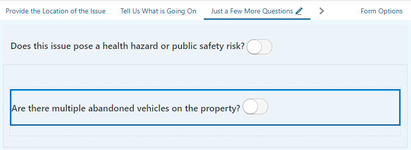
This example creates an intake form for an issue subtype that enables public users to report an issue for an abandoned vehicle. Assume that the code enforcement organization wants to capture all of the information in the default intake form and also a user-defined field to indicate if there are multiple vehicles on the property.
To create an intake form for an issue subtype:
Ensure a valid issue and issue subtype exist.
You create issue types and issue subtypes separately.
For more information see Setting Up Issue Types and Setting Up Issue Subtypes.
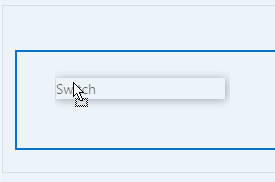
While on the Issue Subtype page, make sure your issue subtype is saved and click Design Form.
In the Intake Form Designer, locate the page tab with the drop zone.
This example illustrates the pencil icon on a page tab, which indicates which tab(s) a drop zone resides where you can add custom fields.
Expand the Add New list in the Elements panel.
In the General list, select Switch, and drag and drop it in the drop zone.
This example illustrates dragging and dropping a field type into the drop zone.
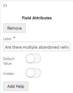
Select the switch, and observe the attributes you can configure for that field in the Field Attributes panel on the right.
Update the Label value.
For example Are there multiple abandoned vehicles on the property?
This example illustrates setting the label attribute.
Click Save.
Result:
This example illustrates a user-defined field added to the drop zone of an issue subtype form layout.
Working with Sandboxes
This topic provides an overview of the concept of sandboxes and how they are used within the Intake Form Designer, and it describes sandbox usage and behavior.
Most modern development environments typically require several different individuals to work simultaneously on application changes while sharing the same data model and configuration starting point. The Intake Form Designer utilizes the Oracle Fusion Applications technology referred to as sandboxes to enable form developers to work on projects simultaneously, save their work, and test their forms without affecting other members of the implementation team in the environment.
The sandbox acts as the development and test mode of your application form. During sandbox mode, the form design can be viewed only internally by application developers or business analysts. In sandbox mode you can create your form, add required form elements, add UI elements, and test your changes. When you have completed all of your design, development, and test work, you can then publish the form so it can be migrated to other environments and be accessed by public users.
Types of Sandboxes
Oracle Fusion Applications provides these types of sandboxes:
Classic sandboxes
Unified sandboxes
Classic sandboxes are the default sandboxes that are enabled out-of-the-box and always stay enabled. During implementation, ensure that unified sandboxes are enabled.
For more information on sandboxes, see the Fusion Applications Common topic: Sandboxes.
Starting a Sandbox Instance for a New Application Form
Before you can create an application form in Intake Form Designer, you must first create the transaction type. For example, for the permit offering, the transaction type is a permit. When you save a permit type, the application creates a sandbox instance. From that point, the transaction type and the associated form design exist within the newly created sandbox instance.
Each form your implementation team is currently developing exists within its own, separate sandbox instance.
Until you publish the form, the transaction type and the form design remain in the sandbox instance. When you publish a transaction type, the system eliminates its sandbox instance.
Starting a Sandbox Instance for a Published Intake Form
After an application form has been published, you can initiate sandbox instances to make any required changes discovered after the initial publication.
To initiate a sandbox for a published form:
Open the transaction type for the form.
Select Design Form.
Begin making the desired changes.
Click Save.
By clicking Save, the Intake Form Designer creates a new sandbox instance to store the current changes.
Viewing the Sandbox Status
You can determine if a form is in sandbox mode using the Status indicator located in the top left-hand corner of the Intake Form Designer. The Status indicator appears when you are creating the form or previewing the form. The sandbox status does not appear on the published version of the form.
| Status |
Description |
|---|---|
| draft |
The form is in sandbox mode. All changes exist in the sandbox instance only. |
| published |
The form design is complete and is not in sandbox mode. When a form is published it can be migrated to other environments. |
Managing Sandboxes
Use the Manage Sandbox drop-down list to select the actions for the current sandbox.
| Page Element |
Description |
|---|---|
| Publish |
Select when your initial testing and design work is complete and you no longer require the use of the development sandbox. The sandbox is deleted and the form design is set to a state of published. Form designs in the published state can’t be modified until they are back in the draft state inside of a different sandbox instance. A form design that is published can be migrated from the source environment to the target environment. |
| Refresh |
Select to synchronize the current sandbox with current system data. Sandboxes share common elements, such as field groups, reusable fields, and other system metadata. If those common elements are updated, sometimes that requires the sandbox to be refreshed so that it is synchronized with current system metadata to enable successful saving or publishing. |
| Revert to Last Published |
Select to remove all current changes and modifications and return the form design to the state of the most recent successful publish. Use this option when you are making changes that you no longer need and you’d like to return to the previous published state or you have encountered an issue with the sandbox. |
| Manage Sandbox (FA) |
Select to go to the Sandboxes page in Oracle Fusion Applications to view details about the sandbox or update it manually. The sandbox naming convention is: <Transaction Type Code>__sb_<number of publications>. For example, if for a permit, the Type Code value is REMODEL, and the sandbox has been published twice previously, the sandbox for that permit is named REMODEL__sb_2. For information on managing sandboxes using the Sandboxes page, refer to the Fusion Applications Common sandbox documentation. |
Managing Labels for Application Form Elements
This topic describes how to manage changes made to labels for existing and user-defined form elements.
When making changes to the labels for elements within your application form, you need to consider what type of element it is. Changing the label of some elements is a global change, while changing the label of other elements is a local change.
Global: A global label change means that a change to the label affects every intake form definition using that field or element.
Local: A local label change means that a change to the label affects only the current intake form definition where the field or element appears.
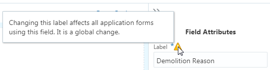
When you select a form element or field and a label change would have global effects, a warning icon appears above the Label field in the attributes panel.
When selecting an item in the workspace, if changing the label for that item has global effect on all application forms using the item, the system displays a warning icon.
| Form Element |
Scope of Label Change |
Label Change Considerations |
|---|---|---|
| Predefined Field Group |
Global |
The label of a predefined field group is the heading used to describe the grouping of the fields it contains. Changing the label of a predefined field group is a global change. For example, if you change the label in the Applicant predefined element used in the fence permit intake form, that change will be reflected in the Applicant predefined element used in the electrical permit intake form (and any other application form using the Applicant predefined field group). |
| Predefined Field Group: Parent Field |
Local |
Some fields appearing in predefined form elements are part of the parent record within the data structure storing the transaction data. You know a field in a predefined field group is part of the parent record when the warning icon does not appear above the Label field in the attributes panel. For example, the Description field in the Application predefined field group does not display the warning icon. Changing this label affects only the current intake form definition. It is a local change. |
| Predefined Field Group: Child Field |
Global |
Some fields appearing in predefined field groups are part of a child record within the data structure storing the transaction data. You know a field in a predefined field group is part of a child record when the warning icon appears next to the Label field in the attributes panel. For example, the Demolition Reason field in the Demolition predefined field group displays the warning icon. Changing this label affects all intake form definitions using the Demolition predefined element. It is a global change. |
| User-Defined Fields |
Local |
You can change the labels for the fields that you add to your application forms, such as text fields, number fields, drop-down lists, and so on. Because you add these fields manually to your application form, you can change the default labels as needed to suit your business requirements. The scope of any changes to the label for user-defined fields apply only to the current intake form. |
| HTML Constructs |
Local |
A general HTML construct refers to layout elements such as group boxes and page tabs. You can change the labels for general HTML constructs as needed to suit your business requirements. The scope of the construct and any changes to the label apply only to the current intake form definition. For example, changing the label of the default label for HTML constructs such as Group box or Field 0 to your desired label affects only the current intake form definition.
Note: If you change a label for a page tab or a group box used in an intake form after the form has been migrated and used in the production system, make sure to update any instructions or documentation that may reference the previous label.
|
Working with Pages
This topic describes how to add page tabs to your intake form and how to modify page attributes.
An intake form can include one or more page tabs to contain the field groups and fields that you want to add to your form.
Adding Pages
When you create an intake form, by default, the application includes one page tab for your form.
To add additional page tabs to your intake form, click the Add Tab button at the top of the workspace.
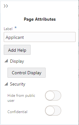
Setting Page Attributes
This example illustrates the page attributes. Details are in the surrounding text.
| Page Element |
Description |
|---|---|
| Label |
The name of the page that appears on the page tab. The default name is Page 1, Page 2, and so on. Change the name to your desired label. |
| Add Help |
Click to launch the Contextual Help page, which you can use to add help information to aid end users in completing the application form. Page-level help should provide information pertaining to the overall page content. If the information applies to a specific UI element on the page, such as a field group, group box, or field, consider adding help directly to that UI element. For more information on adding contextual help, see Adding Contextual Help to Forms. |
| Control Display |
Expand the Display section to view this attribute. Determine if the page displays or is hidden based on the value of a previous element in the form, such as a single-item check box or a switch. For more information on controlling page display, see Displaying Form Elements Conditionally. |
| Hide from public user |
Expand the Security section to view this attribute. Hides the page tab and all the elements on the page from the public user at runtime. Only agency staff can view and update information for a page with this attribute turned on. In addition to hiding the UI element from the public user in the interface, the application also secures the back end for that specific UI element, such as preventing any unauthorized access to the fields within the UI element using a REST API, for example.
Note: An intake form must have at least one page that is viewable to the public user. That is, Hide from public user must
not be enabled for at least one page tab in the form.
Note: You can’t add a predefined field group to a page set to be hidden from the public. The Hide from public user attribute can be set only for pages and group boxes, and it applies only to user-defined fields within those containers. You can’t apply the Hide from public user attribute to field groups.
Note: The Hide from public user setting and the Confidential setting are mutually exclusive.
Note: You can't apply this setting to pages containing fields that have default values or fields that are set as required.
|
| Confidential |
Expand the Security section to view this attribute. Turn this attribute on to specify that the user-defined fields within the page container hold confidential information. At run time, fields with confidential information will be hidden to all users except for users without the appropriate privilege. These users can see the confidential information:
Note: The field does appear in the JSON payload for the page, however the field value will be null.
Note: The Confidential attribute applies only to the Business Licenses offering.
Note: You can’t add a predefined field group to a page with the Confidential attribute turned on. The Confidential attribute can be set only for pages and group boxes, and it applies only to user-defined fields within those containers. You can’t apply the Confidential attribute to field groups.
Note: The Hide from public user setting and the Confidential setting are mutually exclusive.
Note: You can’t apply this setting to pages containing fields that have default values or fields that are set as required.
|
Deleting Pages
If you delete a page from your form, keep in mind that any UI elements you have added to the page, such as predefined form elements, group boxes, and fields will also be removed from your form.
To delete a page from your form:
Click the Remove button on the page tab (the “x”).
On the Confirm dialog box, click OK.
Save your changes.
Working with Predefined Field Groups
This topic provides an overview of predefined field groups and how you use them to build your application forms.
Oracle provides a set of predefined field groups to help you build application forms easily. Each predefined field group contains a collection of fields commonly used to capture information for a particular facet of the transaction type. For example, the Applicant field group captures information about the person applying for a permit, and the Electrical field group captures information about the scope of electrical work for a project. Using predefined field groups, you can assemble application forms in a matter of minutes.
Predefined field groups are:
Pre-mapped to attributes in the application view object (VO).
Grouped logically to provide descriptive metadata for a particular element of an intake form, such as Applicant, Electrical Equipment, Pool Information, and so on.
You drag the desired predefined field group from the Elements panel onto the workspace and use various combinations of predefined and user-defined form elements to assemble your application forms.
For example, assume that you need to create a form for applying for a fence permit. In this case, you can drag the Applicant field group, the Fence field group, along with other field groups you need onto the workspace to build your form.
For more information on the delivered predefined field groups, see Using Predefined Field Groups.
Adding Predefined Field Groups
To add a predefined field group to your form:
Make sure the page to which you want to add the predefined field group is the active page.
Expand the Ready to Use list in the Elements panel to the left of the workspace.
Click on the desired field group to activate it.
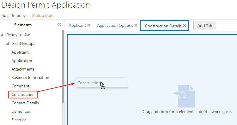
Select the field group to drag and drop it in the workspace.
This example illustrates dragging and dropping a field group onto the workspace.
Adding Required Predefined Field Groups
The field groups you add to your intake form design will vary, depending on the type of form you are creating. While most field groups are optional to add to your forms, some field groups are required to ensure that specific information is captured or represented in the underlying data structure. In some cases, it is the offering that requires the data, while in other cases a field group may have built-in dependencies on another field group.
| Offering |
Required Field Groups |
|---|---|
| Permits |
Applicant Application Fee Summary (if fees are involved) |
| Planning and Zoning |
Applicant Application Fee Summary (if fees are involved) |
| Business Licenses |
Applicant Application Business Information Business Owners Business Locations Fee Summary (if fees are involved)
Note: The Business Owners and Business Locations field groups depend on the Business Information field group. They must appear
after the Business Information field group in the sequence, either in a subsequent page tab or below it on the same page tab.
|
The Applicant predefined field group is required to be added to your application forms. The internal save logic checks for a valid applicant address when an end user attempts to save or submit an application form. The Application predefined field group displays useful information, including the transaction ID, status, description, important dates related to the application, and so on.
Deleting Predefined Field Groups from a Form
To delete a predefined field group, click the Remove button in the Attributes panel.
Setting Predefined Field Group Attributes
Select the field group to view its attributes in the Attributes pane. To select the field group, click around the border or within empty space within the field group. If you click near a field, the field will become selected.
| Page Element |
Description |
|---|---|
| Remove |
Click to remove the field group from the page. |
| Label |
The name of the predefined field group that describes the set of fields in the field group. For example, the fields in the Photovoltaic field group apply to solar projects. Modify the label to suit your requirements. For example, you may want to change the delivered field group named Photovoltaic to Solar.
Note: Changing the label for predefined field groups is a global change, affecting other intake forms using the field group. After changing the label, note that the label of the field group in the left panel’s field group list is updated to reflect the modified label. The change you make will be available globally only after you publish the current intake form. Make sure future intake form developers on your implementation team are aware of the change to avoid confusion.
|
| Show Label |
Control whether to show the label. By default, the system shows labels for predefined field groups (Show Label is on). To hide the label, turn off Show Label. When turned off, the system hides the label at both design-time and runtime. Typically, you’d want the label to be visible to describe the logical grouping of the fields in the form element. In some cases, the page tab name and the predefined field group label might be redundant, in which case you may opt to hide the label. You may also want to group multiple predefined field groups within a single group box. In this case, you can hide the individual predefined field group labels within the group box container, using the group box label to represent the combined set of fields.
Note: When you turn off Show Label, the system disables the collapsible feature for a predefined field group.
Note: If the predefined field group is delivered without a label, the Show Label attribute does not appear when you select that form element.
|
| Add Help |
Click to launch the Contextual Help dialog box, which you can use to add help text to a predefined field group for assisting users with interacting with your intake form. When adding help for a predefined field group, the help text should apply to the overall contents of the predefined field group. You can add help also at the page level and the field level, depending on the scope of the help text. For more information on adding contextual help to your intake form, see Adding Contextual Help to Forms. |
| License Activity |
Note: This attribute applies only to the Business Licenses offering.
Expand the Display section to view this feature. License activity filtering enables you to control the display of field groups, depending on the current business license activity selected by the applicant. For more information on setting display filters, see Configuring Activity Filtering for Business Licenses. |
| Control Display |
Expand the Display section to view this feature. Click to define other elements in the form to control wether the field group displays. For more information on controlling the display of form elements, see Displaying Form Elements Conditionally. |
Adding a Predefined Field Group Multiple Times to the Same Form
The same predefined field group can be dragged into your form multiple times. This is referred to as a multiple-instance element. How you adjust the Multi-Instance Options attribute determines how the application stores the data for that predefined field group.
If you make no changes to the Multi-Instance Options attribute, the data entered within that predefined field group corresponds to one row of data only. In this case, the system duplicates the display of the data in each area of the form it is displayed. This option enables you to show the same data on a different tab within the form, if necessary. Updating the data in one instance of the predefined field group updates the data displayed in the other instances as well.
For example, assume you want the same comment text to appear on multiple pages in your form. You can do this by adding the Comments field group to the desired pages without making any updates to the Value field in the Multi-Instance Options attribute.
If you make changes to the Multi-Instance Options attribute, the application considers each instance of the predefined field group unique, and then each individual occurrence of the predefined field group is associated with its own row of data.
For example, assume you wanted to incorporate multiple comment sections in your form. In this case, you can add the Comments field group to multiple locations of your form, and then you set the Multi-Instance Options attribute to different values. One might relate to fencing comments while another might relate to contractor comments. Another example would be to enable the end user to upload multiple attachments that apply to separate documents. One attachment might be photos of a property while another attachment might be blueprint or design documents.
Managing Lookups for Predefined Field Groups
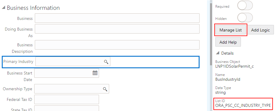
Some of the existing field groups contain fields associated with delivered lookup types. For example, the Primary Industry lookup is associated with the ORA_PSC_CC_INDUSTRY_TYPE lookup type.
This example illustrates a field on a field group associated with an existing lookup. Details are in the surrounding text.
To manage a lookup for a predefined field group:
Identify the lookup fields in a field group, which contain the magnifying glass icon, like the Primary Industry field on the Business Information field group.
Select the field.
Expand the Details section in the Field Attributes panel.
Make note of the List ID associated with the field. This is the lookup type that you will access and update on the Lookups page.
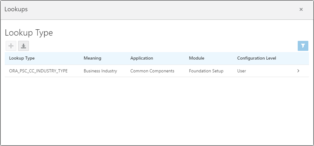
Click Manage List to open the Lookups page displaying the associated lookup type.
This example illustrates the Lookups page displaying the lookup type associated with a field on a field group. Details are in the surrounding text.
For more information on managing lookup types, see Setting Up Lookups.
Using Predefined Field Groups
This topic lists and describes the set of predefined field groups delivered to help you build forms quickly and consistently.
Predefined field groups are prebuilt user interface modules that you can use as building blocks for assembling forms. Field groups provide a set of fields and functionality to capture information for various sections of an application form.
Common Predefined Field Groups
| Field Group |
Description |
|---|---|
| Applicant |
Identification and contact information for the public user who is filling out the form (or on whose behalf an agent is completing the form). This group includes the applicant’s name, address, phone, and email. |
| Application |
Displays information about the form itself, such as status, relevant dates, and descriptions. |
| Attachments |
Enables you to attach and download files, such as documents or images. You determine document properties displayed in the list of attachments and during upload. Contains multiple instance options to create unique instances of the attachment field group. |
| Authorized Agent |
Enables applicants to self-identify as authorized agents acting on behalf of a contractor. This field group contains a switch for self-identifying as an authorized agent, a field for tracking authorized agent verification status, and read-only fields that are populated with the applicant’s name and contact information if the applicant is an authorized agent. This field group should be used in conjunction with the Contractor field group. Typically the Authorized Agent field group is placed immediately after the Contractor field group on a permit or planning application intake form page. |
| Comment |
Enables you to enter additional comments or descriptions pertaining to information on the form. Contains multiple instance options to create unique instances of the comments field group. |
| Contact Details |
Enables you to add information for individuals or organizations that are contacts for an application.
When users enter contact information in an application, they can create new contacts or choose existing profile contacts. When creating a new application contact, the user can indicate whether the new contact should also be added as a profile contact. When choosing an existing profile contact, the user can modify contact details and indicate whether the original profile contact record should be updated as well. |
| Contractor |
Enables applicants to provide information about a contractor who is performing the work for a permit or planning application. This field group includes an integration option that is configured as part of your agency-level contractor options. For more information, see Setting Up Contractor License Options. |
| Demolition |
If demolition is required as part of the job, this field group captures information related to the scope of the demolition and if hazardous materials or utilities need to be considered, such as electricity, gas, water, and so on. |
| Fee Summary |
Lists the items selected, the cost for each item, and the total amount to be paid when submitting the form.
Note: This does not include additional inspection or other fees which may be assessed at a later time.
|
| Property |
Describes the parcel as it is registered with the municipality, such as the parcel ID, parcel type, and so on. |
| Site and Zoning |
Describes features of the property related to acreage, flood preparedness, as well as zoning and land usage information. |
| Terms and Conditions |
Provides access to the terms and conditions regulating the usage of the online form, and provides a way for the user to accept the terms. This field group is hidden from agency staff who complete a form on behalf of a public user. This field group does not identify which Terms of Use definition to use, so if you add this field group to an application intake form, you need to also add a Terms of Use definition on the Permit Type or Planning Application Type page. The Display Mode property has these options:
If the display mode is Link, these two additional properties are available:
Note: This field group is not used to set up public user registration terms and conditions. The Public User Setup page includes all registration-related configuration.
|
Attachments Field Group
You can configure the attachments field group and add it into your form multiple times. Attachments provide supporting documentation needed by agency staff when processing a transaction.
| Configurable Features |
Description |
|---|---|
| Component Attributes |
You can name the attachments component title in the Label field. |
| Component Multi-Instance Options |
Use these multiple instance options to create unique instances of the attachment field group:
For more information about multiple instance options, see Working with Predefined Field Groups. |
| Attachment Columns: |
You can configure these attachment properties in the attachments list:
|
| Business Columns:
|
Agency-defined document categories and document subcategories enable you to organize the various types of attachments. You can configure these fields for document categories and document subcategories:
|
Predefined Business License Field Groups
| Field Group |
Description |
|---|---|
| Business Detail |
Describes the products and services to be sold, and captures additional information through a series of questions about the business. |
| Business Information |
Captures information to help describe the business, such as name, ownership type, mailing address, and so on.
Note: You must add this field group to all business license intake forms. It must come before the Business Locations and Business Owners field groups either in a previous tab, or above them in the same tab.
|
| Business Locations |
Captures information about the physical location of the business such as address, parcel number, and phone number.
Note: You must add this field group to all business license intake forms. It must come after the Business Information field group either in a subsequent tab, or below it on the same tab.
|
| Business Owners |
Captures information about the business owners or corporate officers.
Note: You must add this field group to all business license intake forms. It must come after the Business Information field group either in a subsequent tab, or below it on the same tab.
|
| Days and Hours of Operation |
Describes the days and hours of operations for the business. |
| Industry Classification |
Captures the North American Industry Classification System (NAICS) code for the business. |
| Restaurant |
Describes restaurant-related information such as seating, square footage, and food and alcohol service times. Additionally, captures information about activities that may require separate licenses or permits. |
| Retail Business Details |
Captures information related to retail business including products and services sold, retail space, fire and safety inspection details, and so on. |
| Tax Related Details |
Captures measurable attributes used to calculate taxes, such as number of employees, estimated or actual gross receipts, square footage, number of rental units, and so on. |
Predefined Permit Field Groups
| Field Group |
Description |
|---|---|
| Business Information |
Captures information to help describe the business, such as name, description, number of employees, industry, and so on. |
| Construction Information |
Captures information regarding the current construction site and the proposed construction project. |
| Electrical Equipment |
Describes a structure’s electrical features, such as outlet types, amps, voltage, and electric appliances. |
| Fence Information |
Describes the proposed fence attributes, such as type, material, dimensions, location, and so on. |
| Grading Information |
Describes the scope of grading work, such as the acreage affected, materials to be used and the amount of material. |
| Insurance |
Provides a contractor’s insurance type and policy information. |
| License Qualification |
Enables a contractor to add any state licences they have. |
| Mechanical Equipment |
Describes features of the job site related to ventilation, heating, cooling, fire safety, and so on. |
| Photovoltaic Information |
Describes attributes of a site’s solar energy configuration, such as roof area, coverage area, inverter information, and so on. |
| Plumbing Equipment |
Describes attributes of a site’s plumbing configuration. |
| Pool Information |
Describes attributes of a pool, such as type, depth, location, surrounding fencing, and so on. |
| Regulated Business Activity |
Enables you to specify any regulated activity or controlled substances allowed on the premises, such as alcohol, carnival rides, casino games, and so on. |
| Right of Way Use |
Enables you to provide any details related to the use of a right-of-way on the property or to gain access to the property, such as traffic, parking, or pedestrian impact. |
| Roof Information |
Describes features of a structure’s roof, such as existing roof type, proposed roof type, number of layers, and so on. |
| Signage |
Describes features of signage, such as the sign’s dimensions, use, whether permanent or temporary, and illumination. |
| Special Event |
Enables you to specify information about an event, including the safety plan, concessions, facilities, potential impacts, and traffic plans. |
| Water Heater |
Describes features of water heaters, such as quantity of new or replaced, type, fuel type, and tank capacity. |
| Yard Sale |
Enables you to specify yard sale information, such as the start time, end time, and the number of days. |
Predefined Planning and Zoning Field Groups
| Field Groups |
Description |
|---|---|
| Dwellings |
Describes features of housing such as number of units, floor area information, density bonus, rent-controlled units, and so on. |
| Impervious Surface |
Describes features of areas covered by impervious materials, such as concrete or asphalt, including exemptions from certain requirements, existing and proposed impervious surface areas, and the property lot area. |
| Planning |
Describes features included in planning and zoning, such as proposed number of units, change to the number of units, assessed value of the current building, development type, commercial building area, existing land use, lot areas, setbacks, and so on. |
Managing Lookup Types Associated with Fields in Predefined Field Groups
Some field groups have fields that are associated with existing lookup types delivered with your offering. To view or modify the lookup type, you can access the lookup from the Intake Form Designer using the Manage List button.
For more information on managing lookup lists for predefined field groups, see the section “Managing Lookups for Predefined Field Groups” in Working with Predefined Field Groups and refer to Setting Up Lookups.
Working with Group Boxes
This topic describes how to add group boxes to your form and discusses group box layout options and attributes.
Use group boxes as containers to indicate the items contained within a group box are grouped logically. Once you add a group box to a page, you can drag these items into the group box:
Predefined field groups
User-defined fields
Other group boxes (nested group boxes)
Adding Group Boxes
To add a group box:
Open the Add New list in the Elements panel.
Open the Layout list.
Click and hold on the Group box option.
Drag and drop the group box into the workspace.
Deleting Group Boxes
To delete a group box:
Select the group box.
Click the Remove button in the Attributes panel.
Setting Group Box Attributes
Select a group box to view the Group Box Attributes panel.
| Page Element |
Description |
|---|---|
| Remove |
Click to remove the group box from the page. |
| Label |
Add a name for the group box, describing the collection of items within it. |
| Collapsible |
Turn on to enable the group box to be collapsed when an end user clicks it, hiding items it contains. If not turned on, the group box is always expanded and its items are always visible. |
| Flexible Box Layout |
Use the Flexible Box Layout attribute to establish a group box container based on the CSS flexible box layout model. In the flexible box layout model, the items contained within the parent container assume a layout position automatically, based on space in the container. As the available unused space grows or shrinks, the items in the container grow to fill the unused space or shrink to avoid overflowing the parent. With Flexible Box Layout enabled, the system displays as many controls within the group box in one line until all of the space is utilized, then the system wraps the row, beginning a new line. When disabled, the controls within the group box display as stacked items, with each additional control displaying directly beneath the previous control. |
| Show Label |
Select to hide the group box label (specified in the Label field).
Note: You can add help only to group boxes with Show Label turned on. If Show Label is turned off, the
Add Help button does not appear on the attributes panel and any help icons associated with any previously added help no longer appear.
|
| Hide Border |
Hides the group box border. When turned on, the border is not visible. |
| Add Help |
Click to launch the Contextual Help page, which you can use to add help information to aid public users in completing the intake form. The Add Help button appears only if Show Label is turned on. Help text added for group boxes should apply to the overall group box content. Help can be added also at the page level, field group level, and field level depending on the scope of the help text. For more information on adding Contextual Help, see Adding Contextual Help to Forms. |
| License Activity |
Note: This attribute applies only to the Business Licenses offering.
Expand the Display section to view this feature. License activity filtering enables you to control the display of group boxes, depending on the current business license activity selected by the applicant. For more information on setting display filters, see Configuring Activity Filtering for Business Licenses. |
| Control Display |
Expand the Display section to the view this attribute. Click to select an element in the form that controls the display of the group box. For more information, see Displaying Form Elements Conditionally. |
| Hide from public user |
Expand the Security section to view this attribute. Hides the group box and all the elements in the group box container from the public user at runtime. Only agency staff can view and update information within a group box with Hide from public user turned on. In addition to hiding the UI element from the public user in the interface, the application also secures the back end for that specific UI element, such as preventing any unauthorized access to the fields contained within that UI element using a REST API, for example.
Note: The Hide from public user setting and the Confidential setting are mutually exclusive.
Note: You can't apply this setting to group boxes containing fields that have default values or fields that are set as required.
|
| Confidential |
Expand the Security section to view this attribute. Turn this attribute on to specify that the user-defined fields within the group box container hold confidential information. At run time, fields with confidential information will be hidden to all users except for users without the appropriate privilege. These users can see the confidential information:
Note: The field does appear in the JSON payload for the page, however the field value will be null.
Note: The Confidential attribute applies only to the Business Licenses offering.
Note: You can’t add a predefined field group to a group box with the Confidential attribute turned on. The Confidential attribute can be set only for pages and group boxes, and it applies only to user-defined fields within those containers. You can’t apply the Confidential attribute to field groups.
Note: The Hide from public user setting and the Confidential setting are mutually exclusive.
Note: Don’t apply this setting to group boxes containing fields that have default values or fields that are set as required.
|
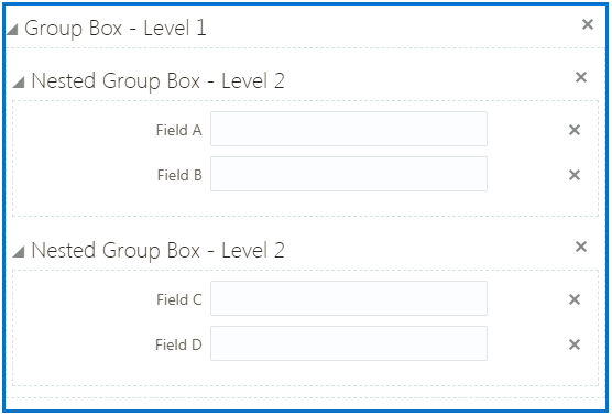
Example: Nesting Group Boxes
Nested group boxes can be used to represent subcategories of information and to enhance layout options, such as creating columns for form elements.
The following example illustrates nested group boxes, which you achieve by dropping group boxes within group boxes.
Example: Using Group Boxes to Combine Predefined Elements
In some cases you may want to give the appearance of multiple field groups being combined. You can do this using a group box to act as the outer container for the set of field groups. When using a group box to contain field groups, consider the following items:
The collapsible attribute of the group box container controls the visibility of the contained field groups. If the group box container is set to be collapsible, when the user collapses that group box, all of the elements within that group box will be hidden.
If you want the field groups within the group box to be categorized under just the label of the group box, turn off the Show Label attribute of the contained field groups.
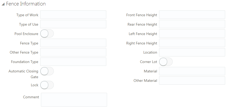
In the following example, assume you want to combine the Fence Information and Comment field groups, giving the appearance that Fence Information field group also contains a Comment field.
To combine field groups within a group box container:
Open the Add New list in the Elements panel.
Open the Layout list.
Drag and drop a Group box into the workspace.
Select the group box and make these changes on the Group Box Attributes panel:
Group Box Attribute
Sample Value
Label
Fence Information
Flexible Box Layout
Off
Open the Ready to Use list.
Open the Field Groups list.
Drag and drop the Fence field group into the group box
Select the Fence field group, and turn off Show Label on the Attributes panel.
Drag and drop the Comment field group into the group box.
Select the Comment field group, and turn off Show Label on the Attributes panel.
Save your changes.
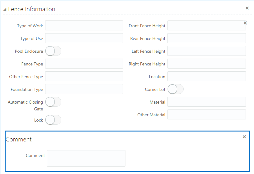
At runtime, the example steps above produce a single, collapsible section in the form that includes both the Fence Information and the Comment predefined elements.
This example illustrates the collapsed Fence Information group box.

This example illustrates the expanded Fence Information group box containing multiple field groups.
Example: Using Group Boxes to Combine Field Groups and User-Defined Fields
Similar to combining field groups within a single group box container, you can also combine field groups and user-defined fields within a single group box container creating the appearance of user-defined fields being part of a delivered field group.
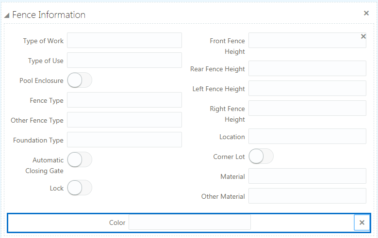
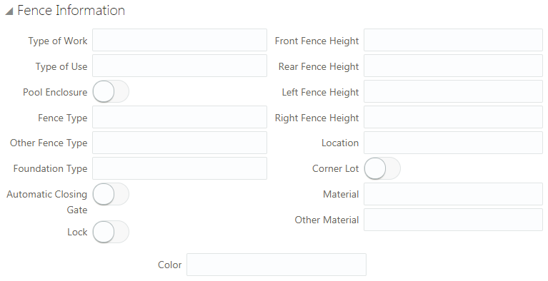
In the following example, assume you need to associate a field with the Fence Information element to capture the color of a proposed fence.
To combine predefined elements and user-defined elements with group boxes:
Open the Add New list in the Elements panel.
Open the Layout list.
Drag and drop a group box into the workspace.
Select the group box and make these changes on the Group Box Attributes panel:
Group Box Attribute
Sample Value
Label
Fence Information
Flexible Box Layout
Off
From the Ready to Use > Field Groups list, drag and drop the Fence field group into the group box.
Select the Fence field group, and turn off Show Label on the Attributes panel.
From the Add New > General list, drag and drop a text field into the Fence Information group box.
Select the text field, and enter Color for the Label in the Field Attributes panel.
Save your changes.
The following example illustrates how at runtime, the group box containing the field group and the user-defined field create the appearance of the manually created field being part of the delivered field group.
Working with Fields
This topic describes how to modify field attributes and add user-defined fields to your intake forms.
When end users are completing an application for a transaction, such as a permit, they enter the required information in fields. Fields can be added to intake forms by:
Adding predefined field groups to your form. Each field group is delivered with a set of fields.
Adding user-defined elements (fields) to your form.
Setting Field Attributes
Select a field to view the Field Attributes panel. Fields in predefined field groups and user-defined fields typically have the same set of attributes. Not all attributes apply to each field type.
The type of field you select determines the attributes appearing in the Field Attributes panel. For example, for a number field, you can set a default value and a placeholder value, but for a single-item check box, neither of these attributes apply and therefore don’t appear.
The following table describes the field attributes.
| Page Element |
Description |
|---|---|
| Remove |
Click to remove the selected field from the layout. The Remove button appears only for user-defined fields you added manually. You can’t remove fields from a delivered field group. |
| Label |
Add a custom label to the field.
Note: In the case of a user-defined field, the system forces the field ID value to match the Label value, but removes any spaces. The field ID represents how the field appears in the underlying data model. For example, a user-defined field with the label
Additional Requests, will have a field ID value of
AdditionalRequests_c.
|
| Placeholder |
Add descriptive text to provide hints for entering data. For example, the placeholder text could read: Enter date in this format” MM/DD/YY, or simply MM/DD/YY. The placeholder value does not get saved to the database when a form is submitted. |
| Default Value |
Enter a default value required for the field. The default value gets saved at runtime if the user does not change it. The control you use to set the default value is consistent with the field type you added to the intake form. For example, for the date field you use a date picker control, for a switch field you use a switch, and so on.
Note: In cases where both the Placeholder and Default Value attributes appear for a field type and you have provided values for both, the default value supersedes the placeholder value. That is, at runtime, users see the default value, not the placeholder value, but if they delete the default value, the placeholder value appears to help users enter a valid value.
|
| Decimal Places |
Applies to number fields only. Set the number of decimal places for number fields, depending on what you are measuring and the precision you require. The limit is 10 decimal places. When adding decimal places to a number field, keep in mind that the number of digits contained within a number field can’t exceed 16. The total number of digits is the sum of all integer digits and decimal digits. For example, if a field has 2 decimal places, that field has 14 integer digits that can be entered without exceeding any limits. If this limit is reached, this can cause unexpected rounding results. |
| Reusable |
Enable if you want to reuse a user-defined field on other intake forms. When you save the intake form, fields that are set to be reusable appear within the Ready to Use > Fields section in the Elements panel.
Note: A reusable field can’t be set to be required or hidden.
For more information, see the “Reusing Fields” section below. |
| Required |
Enable if this is a required field for which a user must enter a value.
Note: A required field can’t be hidden or reusable.
Note: You can’t delete a field that has been set to be required. You must first turn off the Required attribute, save the form layout, and then delete the field. Deleting a required field from an intake form that has already been published may affect forms submitted previously.
|
| Hidden |
Hides the field from the user. If a predefined element contains fields that you do not need, select this option so the user does not have access to the field.
Note: A hidden field can’t be required or reusable.
|
| Manage List |
Add values for fields containing a list of values, such as check boxes, lists, and so on.
Note: Depending on the lookup type, the location where you manage the lists differs. For existing lookups delivered on predefined field groups, you use the Lookups page. For lookups that you associate with a user-defined field, such as a drop-down list, you use the Custom Lookups page. The
Manage List button takes you to the appropriate page for the lookup type, with the correct list displayed.
For more information, see Defining Fields Displaying a List of Values. |
| Add Help |
Click to launch the Contextual Help page, which you can use to add help information to aid public users in completing the intake form. Help text added at the field level should apply specifically to that field. You can also add help to predefined elements, group boxes, and pages, depending on the scope of the help text. For more information on adding Contextual Help, see Adding Contextual Help to Forms. |
| Add Logic |
Click to add scripting logic using the Groovy programming language.
Note: For user-defined fields that you have added to your intake form manually, the
Add Logic button appears only after you have saved your form.
For more information on adding logic to your forms, see Adding Logic. |
| Edit |
Click to display the Rich Text Editor dialog box for entering formatted text to the application form. Appears only for rich text areas. For more information on rich text areas, see Adding Rich Text Areas. |
Using the Field Details Section
Under the main controls used to configure fields described above is the field details section. It provides additional information that you may need to know for various tasks such as reporting or writing business logic.
| Page Element |
Description |
|---|---|
| Business Object |
The business object to which this instance of a field belongs. |
| Name |
Also referred to as the field ID. This value is the internal name of the field as it appears in the database view object, the REST request JSON, or how you’d refer to it in a Groovy script for example. |
| Data Type |
The data type of the values the field stores, such as string or number. |
| List ID |
Applies to lookup fields, containing a list of values (LOVs). Knowing this value can make it easier to confirm the lookup list you need to access if values on the list need to be updated.
Note: Depending on the lookup type, the location where you manage the lists differs. For existing lookups delivered with the Fusion offering, you use the Lookups page. For lookups that you associate with a user-defined field, such as a drop-down list, you use the Custom Lookups page.
|
Adding User-Defined Fields
To add a user-defined field:
Expand the Add New section of the Elements panel.
Open the Layout list.
Add a group box to the current page.
Open the General list in the Add New section.
Select a field type, and drag and drop it in the desired group box.
Note: User-defined fields must be contained by a group box.Select the user-defined field you added, and use the Field Attributes panel to configure your field.
Note: User-defined fields and fields provided in predefined field groups use the same set of attributes.Save your changes.
Once saved, the system applies your user-defined field to the application data model so field data can be captured, stored, and retrieved.
Choosing User-Defined Field Types
Expand the Add New section in the Elements panel and open the General list to view the field types you can add to your forms.
| Field Type |
Description |
|---|---|
| Text field |
Adds a character field to hold text values. A text field is limited to a length of 200 characters. If you need to provide a field that enables users to enter more characters, consider a text area field. |
| Number field |
Stores numeric values. The value can be an integer or it can contain decimals depending on how you set the Decimal Places attribute.
Note: The total number of digits allowed is 16.
|
| Date field |
Stores date values, such as 09-26-2020. |
| Date time field |
Stores date and time values, such as 09-26-2020 11:25 AM. |
| Switch |
On-off field, such as an “active” field indicating whether an item is active or not, which would be either on or off (yes or no). |
| Text area |
A long character field enabling the user to enter longer descriptions. A text area field is limited to a length of 1500 characters. |
| Rich text area |
A long character field enabling the user to enter longer descriptions or instructional information that can be formatted using a rich text editor. For more information on rich text area fields, see Adding Rich Text Areas. |
| Single-item check box |
Displays a single option for the end user to select, such as, "I have read the terms and conditions, and I agree to the terms and conditions." This is different from a check box set, which displays a list of multiple items for an end user to select. In the case of a single-item check box, the label of the field acts as the text the end user reads and responds to on the application form. |
| Check box set |
A set of check boxes from which the end user can make multiple selections. For example, the label for the check box set might be Heating Source(s), with values such as Oil, Gas, Wood, Solar, and so on. This field needs to be associated with a list of lookup values. For more information, see Defining Fields Displaying a List of Values. |
| Radio button set |
A set of radio buttons from which the end user can make a single selection. For example, the label for the check box set might be Fence Type, with values such as Stone, Wood, Vinyl, and so on. This fields needs to be associated with a list of lookup values. For more information, see Defining Fields Displaying a List of Values. |
| Drop-down List |
A drop-down list allowing the user to select a single item. This field needs to be associated with a list of lookup values. For more information, see Defining Fields Displaying a List of Values. |
| Multi-select List |
A drop-down list allowing the user to select multiple items. This field needs to be associated with a list of lookup values. For more information, see Defining Fields Displaying a List of Values. |
Reusing Fields
You may want to include some user-defined fields on multiple intake forms. Rather than recreating the same field multiple times for each intake form, you can create the field on one intake form and set it to be reusable, which enables that field to be available to add to other intake forms for your agency.
Prior to setting a user-defined field to be reusable, consider these items:
| Consideration |
Description |
|---|---|
| Fees |
Reusable fields can’t be incorporated in the fee calculations executed by decision models defined in Oracle Integration Cloud.
|
| Deletion |
Currently, you can’t delete reusable fields from the Fields list in the Elements panel. You can remove unnecessary fields from the intake form. |
| Limited quantity |
You can define up to 625 fields as being reusable. |
| Required fields |
Required fields can’t be set to be reusable. |
| Hidden fields |
Hidden fields can’t be set to be reusable. |
| Groovy |
You can add logic to reusable fields, however, the logic should be specific to that field only. If the logic applies to the transaction type level, such as a specific permit type, then add the logic at the transaction type level using the Add Logic button in the toolbar. |
| Creation |
The reusable field is created, when you click Save.
Note: Once the field is saved with the Reusable switch turned on, the field is reusable,
and the Reusable switch becomes disabled. You can’t convert a reusable field to be a non-reusable field. Likewise, you can’t convert a non-reusable field to be a reusable field, once the intake form design including the field(s) has been saved.
|
| Updating |
Changing the label, placeholder, or default value on any reusable field will update those values for all transaction types using the field. |
| Cloning |
When you clone a transaction type, reusable fields are also cloned.
Note: During the cloning process, the new intake form design is saved. The save process, disables the Reusable switch for both reusable and non-reusable fields.
|
To make a user-defined field reusable:
Review the guidelines above and carefully determine if the field should be reusable.
Select the user-defined field.
Turn on the Reusable switch in the Field Attributes panel.
Click Save.
Confirm that the label for the reusable field appears in the Ready to Use > Fields section in the Elements panel.
Hiding Fields
In some cases, you may not want to display all of the fields associated with a delivered field group you've added to a form. You can hide unneeded fields so they do not appear to the user at runtime.
To hide fields:
Place your cursor in the field to select it.
Turn on the Hidden switch on the Field Attributes panel.
Once you have hidden a field, the design-time interface continues to display the field, but places a darkened background around the field to indicate it is a hidden field. The application does not display the field at runtime.
This example illustrates the shading around a field to indicate that is hidden during design time.
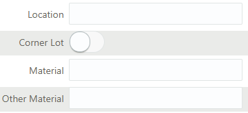
In this example of the design-time interface, Location and Material are not set to be hidden, but Corner Lot and Other Material are. Notice that the hidden fields display with the darkened background.
The following example of the runtime illustrates that the hidden fields do not display when an end user accesses the form. Only Location and Material render on the form at runtime, while Corner Lot and Other Material are not rendered.
This example illustrates the fields indicated as hidden in the previous example in design time do not appear on the form at runtime.
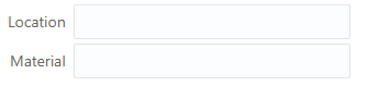
Adding Rich Text Areas
This topic describes how to add rich text areas to your intake forms so that you can display formatted text in application intake forms.
Rich Text Area Overview
In some cases, you may need to add rich text areas to your application forms so that you can display formatted text for users filling out the application. For example, if you needed to provide additional information, such as instructions or reference material, you can provide that within a rich text area.
When you add a rich text area element to your form, an Edit button appears in the Field Attributes panel when you select the rich text area element. The Edit button launches the Rich Text Editor dialog box.
This example illustrates the Rich Text Editor dialog box displaying bold, colored, and italicized text; normal text; and text within a numbered list.
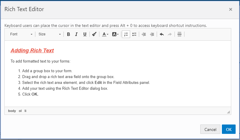
The Rich Text Editor dialog box provides these formatting options:
Font size
Bold, italic, underline
Copy formatting
Text color
Text background color
Numbered and bulleted lists
Undo and redo
Increase and decrease indentation
Horizontal line
Adding a Rich Text Area to a Form
To add a rich text area:
Insert a group box into your form where you want to place the rich text area.
From the Add New > General list, drag and drop a rich text element into the group box.
Select the rich text area element.
This example illustrates the rich text area element being selected prior to rich text being added.
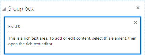
In the Field Attributes panel, click Edit to open the Rich Text Editor dialog box.
Note: If needed, you can use the Description field to enter a description of the contents of the rich text area for other implementation team members. The description you enter only appears in the designer; it is not be displayed at run time.Add text and use the desired formatting options.
Click OK.
Save your form layout.
Defining Fields Displaying a List of Values
This topic describes how to add a list-of-values (LOV) to user-defined fields.
Some of the user–defined fields that you can add to your form are considered “list-of-value” fields, or LOV fields. List-of-value fields enable end users to select field values from a predefined set of values (a lookup) to populate the field when entering data on the form. For example, radio sets and drop-down lists are list-of-value fields.
The list of values is a lookup type, and the individual items in the lookup type are lookup values.
When adding a list-of-value field type to your application form, you first add the field to the form, just as you would any other field. You then either select an existing lookup type to associate with the field, or you can create a new lookup type if needed. To manage lookup types you use the Custom Lookups page.
This example illustrates the Lookup Type page.
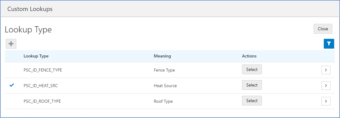
A list of values is a set of fixed field values defined for a specific purpose that is not expected to change over time. Removing items from the list, for example, could make previously saved data invalid.
An example of a field with a list of values could be the Property Zone Type field, where the values for a user to select are: Business, Residential, and Agricultural.
Once you have clicked the Select button, for a lookup type row, a check mark appears next to that lookup type to indicate it is the lookup type associated with the current LOV field.
This example illustrates the check mark that appears to the left of the lookup type to indicate lookup type selected for the current field.
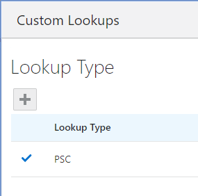
Identifying List of Value Type Fields
You associate a list of values with these field types:
Radio button set
Check box set
Drop-down list
Multi-select list
The following example illustrates a radio set, which is a set of radio buttons allowing a user to select a single value from the list of values.
Text surrounding the image describes it.
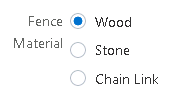
The following example illustrates a check box set, which is a list of multiple items allowing a user to select multiple values from the list of values.
Text surrounding the image describes it.
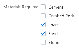
The following example illustrates a drop-down list, which is a list allowing a user to select a single value from the list of values.
Text surrounding the image describes it.
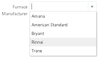
The following example illustrates a multi-select list, which is a drop-down list allowing a user to select multiple values from the list of values.
Text surrounding the image describes it.
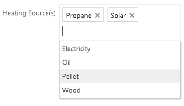
Selecting an Existing Lookup Type for a Field
To select an existing lookup type:
Add the list-of-value type field to your form layout.
Select the new field.
Click Manage List in the Field Attributes panel.
This opens the Lookup Type page.
On the Custom Lookups page, identify the lookup type to associate with the list-of-value field you added.
Use the Meaning column to identify the appropriate list, or you can click View More Details to view the description and the actual lookup values in the lookup type.
Click Select in the Actions column to associate the desired lookup type with your field.
Note: Once you select a lookup type, the Lookup Type page closes automatically. You can click Manage List to confirm your selection if needed.Save the form layout.
Adding a New Lookup Type for a Field
Add the list-of-value type field to your form layout.
Select the new field.
Click Manage List in the Field Attributes panel.
This opens the Lookup Type page.
On the Custom Lookups page, click Add.
On the Lookup Type Details page, enter these values.
Page Element
Description
Lookup Type
The system name, beginning with PSC, using uppercase letters, numbers, or underscores.
For example, PSC_ROOF_TYPE.
Note: All lookup types created and used within the Intake Form Designer must begin with PSC.Meaning
Add a short, user-friendly description. This value appears in the Meaning column of the list of lookup types, which can help to identify the contents of the list.
For example, Roof Type.
Description
Provide any additional information to help identify the purpose and intended usage of the lookup type.
Add lookup values to the lookup type.
In the Look Up Values grid, click Add.
Modify these values:
Page Element
Description
Lookup Code
A short code used to identify the lookup value to the system, like a key value.
Display Sequence
If required, you can set the sequence in which lookup values display in the lookup list, using a numeric sequence.
Enabled
By default, a new lookup value is enabled. To disable a lookup value, turn off this switch.
Start Date
Date on which a lookup value becomes valid.
End Date
Date on which a lookup value is no longer valid.
Meaning
The value that displays to the end user at runtime to select from the list.
Description
Any additional information to describe the content or purpose of a lookup value.
Click Save.
Repeat for additional lookup values in the lookup type.
Example:
This example illustrates the Lookup Type Details page, showing a completed lookup type with a set of lookup values.
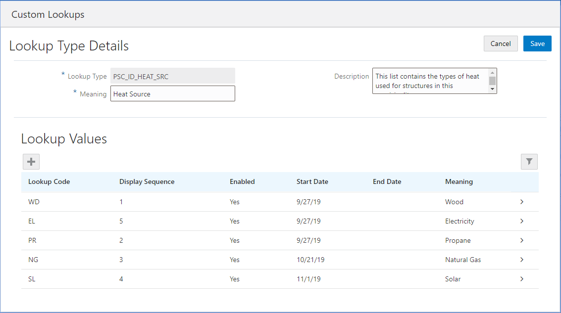
On the Lookup Types page click Select to associate the new lookup type with the field.
Or, click Close to associate the lookup type with another field later.
Save the form layout.
Understanding the Scope of Lookup Types Created in the Intake Form Designer
The items in the following table describe the scope of the list of value fields that you can create and use in the Intake Form Designer.
| Scope Item |
Description |
|---|---|
| User-defined fields |
You can create a list of values for user-defined fields only.
You can’t create a list of values for a field contained within a delivered field group. Some of the list of value fields in predefined field groups are associated with lookup lists that you can manage using the
Manage List button.
|
| Intake Form Designer-only |
The lookup types that you create within the Intake Form Designer can be used only within the Intake Form Designer. Only in specific circumstances can you associate a field in your form layout with lookup types created outside the Intake Form Designer.
The interface used to create and select lookup types for use in your intake forms looks identical to the Lookups page (Navigator > Common Setup > Lookups), which is the interface used to manage lookups for Public Sector Community Development offering pages, such as the permit offering or the planning and zoning offering. However, the lookup types created on the Lookup pages
can not be used for your intake forms nor visa versa. For example, you can’t use the UOM Type lookup type (ORA_PSC_CC_UOM_TYPE) from the Lookup Type page for your intake form fields.
|
| Other licensed offering(s) in the same database |
In select cases, if you are an existing Fusion Application Cloud customer, and you have other licensed offerings in the same database as the Public Sector Compliance and Regulation offerings, you can utilize lookup types not beginning with PSC for your intake form fields if required. For example, if you also license Fusion Application Cloud for Financials, which shares the same database as the Public Sector Compliance and Regulation offerings, you can select lookup types using the Intake Form Designer interface, assuming you are aware of the values it displays and how it is maintained. To access these lookup types, you need to modify the filtering on the Lookups page. By default, the Intake Form Designer filters on PSC or the exact name of the selected lookup. Refer to the following example for more information on modifying the filtering option. |
Example: This example illustrates modifying the default filtering for the Intake Form Designer lookups.
To modify the filtering on the Lookup Type page:
Click the Filter By button.
Select how you want to filter, as in by Lookup Type or by Meaning.
Select the operator to use for your filtering, such as Starts with, Contains, and so on.
Click Apply.
Displaying Form Elements Conditionally
This topic describes how you can show or hide elements on your forms depending on selections users make on other form elements.
You can configure some form elements to be either displayed or hidden, depending on the value of other fields in the form. Form elements that can control the display of other elements are controlling elements, and form elements that can be shown or hidden based on the value of controlling elements are controlled elements. The following table describes the elements involved in conditional display.
For example, assume you wanted to display the Photovoltaic field group only if the user has selected the Solar single-item check box in a “Building Options” section of a permit application form. In this case, you can set the Solar single-item check box as the controlling element for the Photovoltaic field group, having the Photovoltaic element (the controlled element) display only when the Solar single-item check box is selected.
| Display Type |
Element Types |
Description |
|---|---|---|
| Controlling Element |
|
Form elements that determine whether another form element is displayed, depending on the value selected by the user.
Note: Only single-item check boxes and switches can be controlling elements.
|
| Controlled Element |
|
Form elements that can be displayed conditionally, depending on the value of the associated controlling element. To control when these elements appear, click the Control Display button on the Attributes tab, which appears only for these element types. |
Procedure: Configuring Conditional Display
To configure conditional display for a form element:
Add the controlling element to a group box in your application form.
The controlling element can be a user-defined element of these types:
Single-item check box
Switch
Note: The controlling element must appear before the controlled element that references it.Add the form element that you want to display or hide conditionally (the controlled element).
The controlled element can be:
Field group
Group box
Page
Select the controlled element you just added so that it is the active element in the layout.
In the Attributes panel, click Control Display.
On the Control Element Display dialog box, click Add to add a row to the grid, then double-click in the newly added row, and make the appropriate selections.
Note: Once you add a row to the grid and activate it by double-clicking, you must enter value before clicking OK.This example illustrates the Control Element Display dialog box set to show a condition of a controlling element, such as hide this element if a switch element in the form is false.
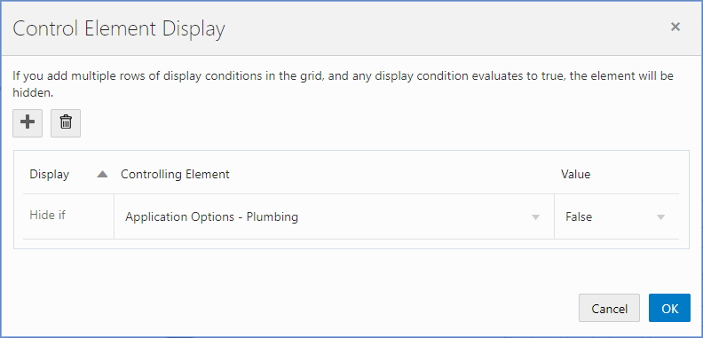
Element
Description
Add
Click to add a new row to the grid.
After adding a row, double-click the row to make it active.
Note: If you add multiple rows of conditions to the grid, the system assumes an “OR” operator exists between each row. If any of the conditions are confirmed, that display option will be enabled.Delete
Click to delete the selected row in the grid.
Display
Currently, Hide if is the only display option. You hide an element based on the value of the controlling switch or single-item check box, otherwise, the element is displayed.
Controlling Element
Select the form element that will control the display of the selected predefined form element or group box.
The drop-down list displays all user-defined switches and single-item check boxes that exist on or before the current page in the form.
Selecting the controlling element appearing before the controlled element adheres to the logical sequence a user would take when completing the application form.
Note: If the selected element is a group box, the drop-down list does not display any switches or single-item check boxes within that group box.Value
Select the value of the controlling element that determines when the display option will be rendered:
True: A condition is true if a single-item check box is selected or a switch is on.
False: A condition is false if a single-item check box is deselected or a switch is off.
Click OK.
Save your form.
The controlled element appears with an icon below the element label to indicate it is an item whose display is controlled by another element in the intake form.
This example illustrates the icon displayed for a controlled element.
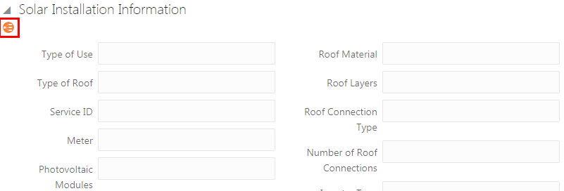
Working with the Conditional Display of Pages
This section describes items to consider when using the conditional display feature with pages, which includes:
Hiding a page based on a controlling element.
Hiding all elements on a page.
You can control the display of an entire page based on the value of a controlling element in the intake form. Doing so introduces dynamic display features to your intake form that can streamline the form significantly. Based on the user’s selection of a single-item check box or a switch can determine whether a page displays or is hidden, providing user’s an improved experience. Using this feature, only the pages relevant to the user’s transaction would be displayed. As selections are made, the pages appear or become hidden accordingly.
This example illustrates single-item check boxes controlling the display of the corresponding intake form pages.
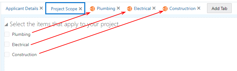
In cases where all of the elements on a particular page are controlled elements and each element’s controlling element’s display conditions cause all the elements on the page to be hidden, the system will hide the entire page.
In the following example, each element on the page is a controlled element. If each element becomes hidden as a result of the values selected for the controlling element, the entire page becomes hidden.
This is an example of all elements on a page being controlled elements. Details are in the surrounding text.
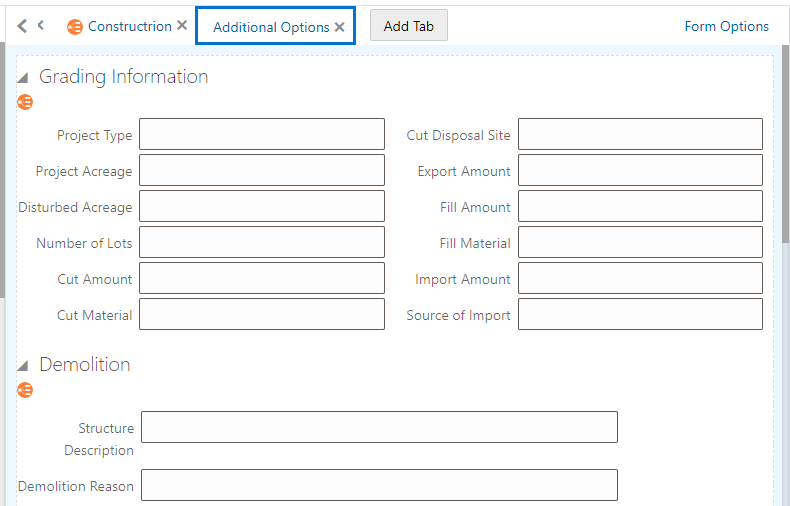
Adding Logic
This topic describes how to add business logic to intake forms using the Groovy programming language.
Groovy Overview
You can add business logic to your intake form using the Apache Groovy programming language.
Groovy is an:
Object oriented language that can be used for scripting or programming.
Extension of the Java programming language, using similar constructs and syntax.
For Java developers, Groovy can be compared to other programming languages, such as Python or Ruby, that don’t intend to replace Java, but act as a companion language, extending capabilities and providing additional flexibility.
When designing intake forms, you can add Groovy scripts to provide:
Validators
Triggers
Object functions
Global functions
The logic can be added at these levels:
Field: Field-level logic applies only to the currently selected field.
Object: Object-level logic can be used within a single intake form design.
Global: Global functions can be called from any intake form in your offering.
The types of scripts you can add depends on the level on which you are adding the logic (field or object).
| Script Type |
Level |
|---|---|
| Validator |
Field and Object |
| Trigger |
Object |
| Object Function |
Object |
| Global Function |
Object |
Before adding Groovy to your intake forms, you will need to become familiar with the Groovy language and how it is intended to be used within Oracle Fusion applications.
For more information on Groovy usage within Oracle, refer to Oracle Applications Cloud: Groovy Scripting Reference.
For general information on the Groovy language, see Apache Groovy documentation.
Working with the Groovy Script Editor
To access the Groovy Script Editor:
Save the intake form you are creating.
The field(s) you reference in your logic at the field level or the object level must exist in the underlying database object, which occurs when you save the form after adding any new elements.
Note: For the user-defined fields you added manually to your intake forms, the Add Logic button doesn’t display in the Field Attributes panel until you have saved your intake form.Click the Add Logic button in the Field Attributes panel or in the intake form header.
When clicking Add Logic in the Field Attributes panel, your code operates at the field level.
When you click Add Logic in the intake form header, your code operates at the object level.
This example illustrates the separate field-level and object-level Add Logic buttons.
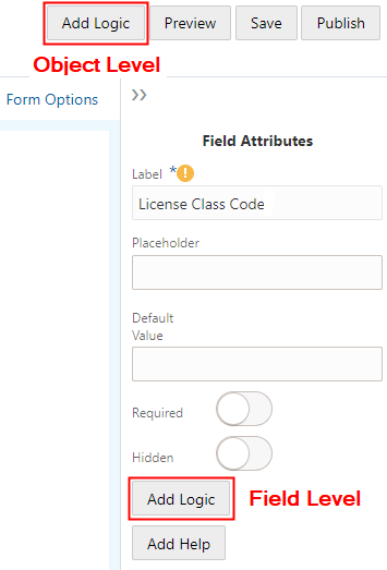
Use the Groovy Script Editor to add the logic, script name, error message, and additional options, depending on the type of script you are writing.
The following example illustrates adding validation logic to a field using the Groovy Script Editor.
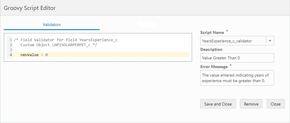
| Page Element |
Description |
|---|---|
| Work Area |
In the work area, add your logic. The first line in the comments (/* <text> */) is automatically generated, and it provides you the field name and object name as they are referenced internally. For a field contained in a delivered field group, the field name will be similar to the field label, such as DemOverallHeight. In the case of a user-defined field, the field name will match the field label you have entered, with a "_c" as a suffix to indicate it is a custom field. For example, if you have a user-defined field named Rooms, the field name appearing in the script will be Rooms_c. The custom object name is the type code as defined on the Transaction Type page, and it is preceded by the offering code, such as LNP1 or PZ1 and a “_c” suffix. LNP1 is the prefix for permits and PZ1 is the prefix for planning and zoning applications. For example, if for a permit the Transaction Type Code is Fence, the custom object name in the script will be LNP1Fence_c. |
| Script Name |
By default, the script name follows this structure: field_script type or object_script type For example, the user-defined field Years Experience would have the following default validator script name: YearsExperience_c_validator. You can change the script name if needed. To add multiple scripts of the current type, select New from the drop-down list. |
| Description |
Add text to describe the purpose of the script. |
| Type |
Used only for triggers. Defines when the trigger runs, such as during the Create event. See the "Add Triggers" section below for more information. |
| Parameters |
Used only for object functions and global functions. Enables you to define the parameters the function will accept. |
| Return Type |
Used only for object functions and global functions. Enables you to set the data type for the return value of the function. |
| Error Message |
Provide the message that the system displays the user to correct any issues. For example, in the case of a validator script, the message appears if the data entered for the field does not pass the validation logic.
|
| Save and Close |
Saves the current code and closes the editor. |
| Remove |
Removes the business logic from the associated field or object. This may be required in some cases prior to removing the field from the intake form. |
| Close |
Closes the editor without first saving any changes. |
Setting the Scope of a Groovy Script
The following table outlines the possible scope of a Groovy script.
| Scope |
Description |
Where Set |
|---|---|---|
| Field |
You can add Groovy logic to act on a single field. The code you add runs only against the selected field. You can add Groovy to fields in delivered predefined field groups or to user-defined fields you have added manually. |
Select the field to which you want to add validation logic, and click Add Logic in the Field Attributes panel for that field. |
| Object |
If your script involves more than one field, you need to add that code at the object level. The object refers to the current intake form you are creating. For example, if you are creating a fence permit, the logic you add for the current object applies to fields in that fence permit definition. |
When in the designer with the intake form open, click the Add Logic button at the top of the form, next to the Preview button. |
| Global |
You can create global functions that can be called by any field-level script or object-level script in your offering. |
When in the designer with a intake form open, click the Add Logic button in the header at the top of the form. You can access the Global Functions option only by opening the Groovy Script Editor at the object level. |
This example illustrates the Groovy Script Editor at the field level. Details are in the surrounding text.
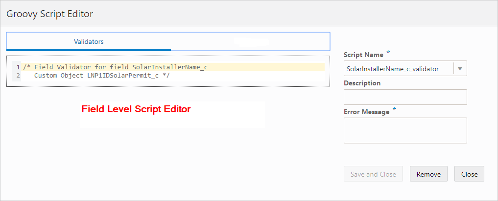
When you add logic at the field level, you can add Validator scripts only.
This example illustrates the Groovy Script Editor at the object level. Details are in the surrounding text.
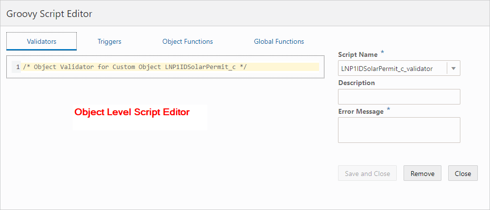
When you add logic at the object level, you can add these types of scripts:
Validators
Triggers
Object Functions
Global Functions
Work With the Transaction Type Data Structure
Accessing data stored within the transaction type business object requires and understanding of the underlying data structure. To understand the data structure, you need to become familiar with the JSON payload for a transaction intake form.
Use your REST client utility such as cURL or Postman to access the REST endpoint for an intake form.
You can use a “describe” request to view the data structure of the intake form, using a GET operation. For example:
https://servername.fa.us2.oraclecloud.com/fscmRestApi/resources/11.13.18.05/LNP1Id<transaction_type>_c/describe
This example illustrates the parent-child relationship of the data within a transaction type.
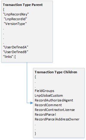
The describe results show you the metadata for the business object, such as the name, type, and so on, such as LnpRecordKey, integer, and so on.
You can also submit a request to access data for a specific transaction by including the LnpRecordKey value to the request. For example:
https://servername.fa.us2.oraclecloud.com/fscmRestApi/resources/11.13.18.05/LNP1Id<transaction_type>_c/<LnpRecordKey>
This example illustrates transaction type JSON returned in a REST client.
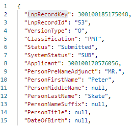
The top portion of the JSON reflects the parent object, and the sections within the “links” block are the child objects. The parent object contains attributes from the transaction type, some general field groups, such as Application and Applicant, and any user-defined fields you have added.
The majority of the fields in the field groups reside in a single object, the FieldGroups object (FieldGroupsVO). Reusable fields reside in LnpGlobalCustom object (LnpGlobalCustomVO).
Knowing the object on which you are writing your logic is essential for achieving the desired scope of your results. When you write logic at your transaction type level, as in Custom Object LNP1FencePermit_c, that logic applies locally, only for that transaction type. If you write logic at a child object level, as in Custom Object FieldGroupsVO, that logic is global and would apply to any instance of that field group or field group field in any transaction type where it appears.
When you open the Groovy Script Editor, comments at the top of the work area indicate where the logic you write will apply. For example:
/* Object Validator for Custom Object LNP1FencePermit_c */
What element you have selected in the workspace and where you click the Add Logic button (in the header or in the Field Attributes panel) determines where your logic applies, either locally to the current transaction type only, or globally. The following table provides selected scenarios to illustrate how the comments at the top of the work area indicate the scope of the logic for that script.
| Workspace Selection |
Comment |
Logic Scope |
|---|---|---|
|
|
The Logic applies to the Front Fence Height field in the selected field group. This field is stored in the child Field Groups view object, where all other fields appearing in field groups are stored. Logic written at this level for this field will apply globally to all instances where this field group is used. |
|
|
The Logic applies to the Field Groups view object, and logic applies globally to all instances where this field group is used. Because the logic is written at the object level it can apply to multiple fields in the Field Groups view object.
Note: Most field groups are considered child objects with the fields being stored in the Field Groups view object. Applicant and Application are considered parent objects, with their fields stored in the transaction type parent object.
|
|
|
The logic applies to the user-defined field Years Experience locally for that transaction type.
Note: If the field is set to be reusable, then the logic you add applies to all instances where that field is used.
|
|
|
The logic applies locally to multiple fields to the current transaction type. |
|
|
The logic applies globally to that reusable in any intake form where it is used. |
When you are writing logic on a field or object at the child level, such as FieldGroups, you can reference the fields that reside on that object directly. For example:
/* Object Validator for Custom Object FieldGroupsVO */

FenHeightFront < FenHeightRear
If you are writing logic that is local to your transaction type intake form, and you want to access values in a child object, such as FieldGroups, for validations and comparisons, you can’t directly reference the field names in your logic. The FieldGroups view object is a collection, so you need to parse the child record using the hasNext() method. For example:
/* Object Validator for Custom Object LNP1InfoDevResFence01_c */

// Identify and assign the object.
def vo = FieldGroups

while (vo.hasNext()) {
  // Access the next row in the row iterator.
  def currow = vo.next()
	// Run validation.
  currow.FenHeightFront < currow.FenHeightRear
  }
If you are writing logic that is local to your transaction type intake form, and you want to access values in a child object, such as LnpGlobalCustom, for validations and comparisons, you need to write code similar to accessing FieldGroups, but because LnpGlobalCustom isn’t a collection, you don’t need to use the hasNext() iteration method. For example:
First, instantiate the child object:
def vo = LnpGlobalCustom
Then use dot notation to access the desired field:
vo.EstimatedCost_c > 100
Preventing Logic Executing During a Save
Applicants have the option to save the intake form if they need to step away to gather more information, for example. If you don’t want your logic to run until the applicant is completely finished and submitting the form, you need to account for the Pending status in your logic. To enable applicants to save a form without being faced with a list of validation errors, it is recommended to add the following code to the top of each of your scripts.
      if (Status == "Pending") {
         return true
      }
Add Validation Logic
A validator script provides data integrity for end user input. A validator script is a logical construct that returns either true or false.
The essential components of a validator script include:
Groovy logic
Error message
For example, assume you have a form with the field Years Experience to indicate the number of years experience of a solar panel installer. To meet permit criteria for your agency policy, you can validate that the applicant doesn’t enter zero by adding the following validation script to the field.
newValue > 0
At runtime, if the field value entered does not meet your validation logic criteria during a save or submit request. The validator script returns either true or false. If the return is false, the system displays the error message so the user can resolve the issue.
This example illustrates the runtime message displayed by a Groovy validation script.
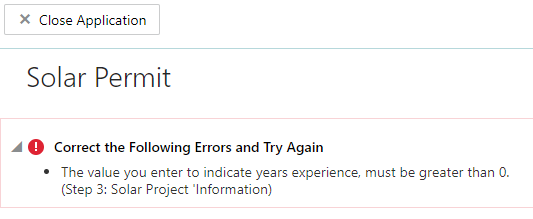
Validator scripts can be run at the field level and at the object level. Field-level validation is for single-field validation, and object-level validation involves validation of multiple fields. Use the object level when you reference multiple fields in the validation, and use the field name, not newValue. For example:
TotalCosts_c <= EstimatedCosts_c
Add Triggers
Triggers enable you to invoke processing logic based on an event.
In addition to the common attributes, including Script Name, Description, and Error Message, you also set the Type. Setting the type is how you define the event on which the trigger is based.
| Type |
Description |
|---|---|
| Create |
Fires when a new instance of an object is created. Use to assign programmatic default values to one or more fields in the object.
Note: Create events run only when the intake form is saved the first time. It does not run on subsequent saves or submits.
|
| Invalidate |
Fires on a valid parent object when a child row is created, removed, or modified, or also when the first persistent field is changed in an unmodified row. |
| Modify |
Fires when an attempt is made to modify an object. Returning false stops the row from being deleted and displays the optional trigger error message. |
| Remove |
Fires when an attempt is made to delete an object. Returning false stops the row from being deleted and displays the trigger error message. |
| Before Insert |
Fires before a new object is inserted into the database. |
| After Insert |
Fires after a new object is inserted into the database. |
| Before Update |
Fires before an existing object is modified in the database.
Note: If you want the trigger logic to run on each save and submit, not just on the initial Create event, use the Before Update event.
|
| After Update |
Fires after an existing object is modified in the database. |
| Before Delete |
Fires before an existing object is deleted from the database. |
| After Delete |
Fires after an existing object is deleted from the database. |
| Before Commit |
Not supported. |
| After Commit |
Not supported. |
| Before Rollback |
Not supported. |
| After Rollback |
Not supported. |
| After Transaction Posted |
Not supported. |
Add Functions
You can create functions at the object and the global level.
| Level |
Description |
|---|---|
| Object |
Object functions provide business logic to be used within the scope of the current business object, which is the current transaction type, such as an intake form for a permit. |
| Global |
Global functions can be called from any intake form design within the offering. |
The interface for creating functions is the same for creating object or global functions, and it contains the same general options in the editor, such as Script Name, Description, and Error Message, plus the additional items listed below.
This example illustrates defining a function, parameters, and return type. Details are in the surrounding text.
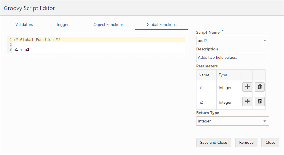
| Page Element |
Description |
|---|---|
| Parameters |
Define the parameters received by the function when it is called. Add the name of the parameter and its data type. Refer to the following table for data type descriptions. Click Add to include multiple parameters in the grid. Click Delete to remove a row from the grid. |
| Return Type |
Define the data type of the value returned by the function. Refer to the following table for data type descriptions. |
You can apply these data types.
| Data Type |
Description |
|---|---|
| Void |
Applies only to return values. Use in situations when the function does not provide a return value to the caller, such as when the functions performs a task, writes an output line, and so on. |
| String |
A text value. |
| Integer |
A whole number, either positive or negative. |
| Boolean |
A logical true or false value. |
| Long |
An integer value in the range of ±263-1. |
| BigInteger |
An integer of arbitrary precision. |
| Double |
A floating-point decimal value in the range of ±1.79769313486231570 x 10308 |
| Big Decimal |
A decimal number of arbitrary precision. |
| Date |
A date value with optional time component. |
| List |
An ordered collection of objects. |
| Map |
An unordered collection of name/value pairs. |
| Object |
An entire business object, which in this case refers to an instance of an intake form. |
Once you create the function, you can call it from other scripts.
This example illustrates defining variables and calling a function. Details are in the surrounding text.
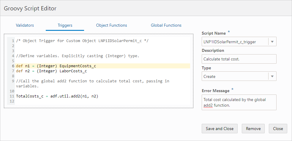
For a function defined at the object level, you can call the function using just the function name, such as add2.
For a function defined at the global level, you need to add as a prefix adf.util. For example, if the global function name is add2, you call the function using adf.util.add2(param1, param2).
In this example, there is global function named add2, which adds two parameters passed in. On the Triggers page, the trigger script is set to run on the Create event type, and the values for EquipmentCosts_c and LaborCosts_c are passed to the function to calculate the value of the TotalCosts_c field.
def n1 = (Integer) EquipmentCosts_c
Example: Basic Calculations
You can use functions to calculate, but you can also use basic expressions, such as A + B, A - B, and so on. For example:
TotalCost_c = EquipmentCosts_c + LaborCosts_c
Example: Accessing User Security Context
To access information regarding the current user, instantiate the getSecurityContext() object. In this example, the script checks if the user is assigned a particular role, and if not, displays the error message.
/*Get the security context.*/

def secCtx = adf.context.getSecurityContext()

/*Check if the user has the desired role.*/

if (secCtx.isUserInRole('PSC_ROLE_NAME')) {

/*If user has role, then check if field is not blank. If field is blank,
returns false, showing error message.*/

 return newValue != null
}

/*If the user doesn't have the role, returns true, bypassing the error message.*/

return true
Example: Validating a Phone Number
To validate the format of a phone number, you can use a regular expression, such as:
newValue ==~ /^(\d{3}\-\d{3}-\d{4})/
This example illustrates using a regular expression to validate number formatting.
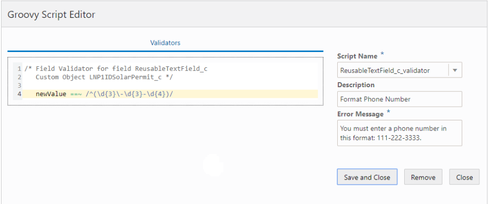
Copying a Field Value to Another Field
To make a field reflect the value of another field (to copy it), you can use a trigger. For example, you may have a field named Estimated Project Cost that will be reflected in the Final Cost field once the permit has been processed. To do this:
Use the Triggers tab.
Enter this code:
FinalCost_c = EstimateProjectCost_c
Select Before Update from the Type drop-down list.
Working with Dates
When working with dates, switches and so on, and you are checking for null values, it is recommended to use the following construct:
(!ExpirationDate_c)
Instead of using something like:
(ExpirationDate_c == null || ExpirationDate_c == "")
This can help to avoid script saving issues and unexpected validation results.
Adding Contextual Help to Forms
This topic describes how to add help text to various parts of your intake forms to aid public users when they are filling out an application form.
Working with Contextual Help
If you determine that the end user needs additional information to understand a user-interface element in your intake form, you can add contextual help text to that user-interface element. If you add contextual help to a user-interface element in your intake form design, the system displays a Help icon next to the label of that user-interface element.
You can see the Help icon in both the design and runtime mode. At runtime, end users click the Help icon to display your help text in a popup, without leaving the page.
You can add contextual help text to these intake form elements:
Page tabs
Field groups
Group boxes
Fields (applies to fields in field groups and to custom fields)
You can’t add contextual help text to these intake form elements:
Radio sets
Check box sets
If you need to add help for radio sets or check box sets, use a group box to contain the control and add the help text to the group box container.
Adding Contextual Help
To add contextual help:
Select the page element to which you want to add contextual help.
Note: You cannot add help text directly to radio sets and check box sets. Add help text to a group box surrounding the radio sets or check box sets.Click the Help button in the attributes panel.
On the Contextual Help Setup page, note the Type Code, Page Name, and Page Object values.
These values uniquely identify the page element to which you are associating the contextual help. You can’t change these values. They are read-only and maintained by the application.
Item
Value
Type Code
An automatically generated value consisting of the internal product code and the permit type code derived from the permit type definition.
Page Name
The name of the page tab on which you are adding help. Regardless of what the page label is on the tab, the application displays each tab using the default name in sequence, such as tabs1, tabs2, and so on.
For example, the second page tab in an intake form may have the name Fence Information, however in the Page Name field it will appear as tabs2.
Page Object
Identifies the page element for which you are adding help. Regardless of the page element’s label, the application displays the internal naming convention as the field value, which is the page element type code + sequence added.
For example, for the second field added to the form the field value is fields2, which indicates the element is a field and it is the second field added to the form.
The page element type codes are:
Field groups: ccas
Group boxes: widgets
Fields in field groups: <field group>_<internal field name> (such as ccas2_ReleaseDate)
Custom Fields: fields
In the Description field, add text to describe the purpose of the help text so other implementation team members can understand the content.
Click the Add New button in the Contextual Help Details grid to display the Add Context Help Details dialog box.
Select Agency Defined from the Type drop-down list.
Note: Help topics of type System Defined are provided by Oracle and should not be altered or removed. Use the Agency Defined help topic type to add help topics specific to your implementation. If you want your custom help text to display instead of delivered help text, disable the System Defined help topic, create your custom topic, and enable it.Activate the Help Content edit box by clicking to the right of the Help Content field label.
In the Help Content edit box, enter your help text.
The system provides rich-text editing features, which enables you to implement limited formatting options, as needed.
When you’ve added the content, and you are ready for it to be viewed by end users, turn on the Enabled switch.
Note: To prevent the help content from displaying at run time, turn off the Enabled switch.Click Save on the Contextual Help Details page.
Click Save on the Contextual Help page.
Confirm that the help icon appears on the page tab or next to the page control label in your intake form design.
For more information on contextual help, see Setting Up Contextual Help.
Reorder Intake Form Elements
This topic describes how you can move form elements, such as pages, field groups, group boxes, and user-defined fields to different locations within the form design.
As you build intake form designs, you may need to move form elements from one location to another for a variety of reasons, such as improved logical grouping, control display requirements, end-user feedback, and so on. You use the Reorder Intake Form modal page to move form elements and reorder the intake form design.
This example illustrates the Reorder Intake Form page. Details are in the surrounding text.
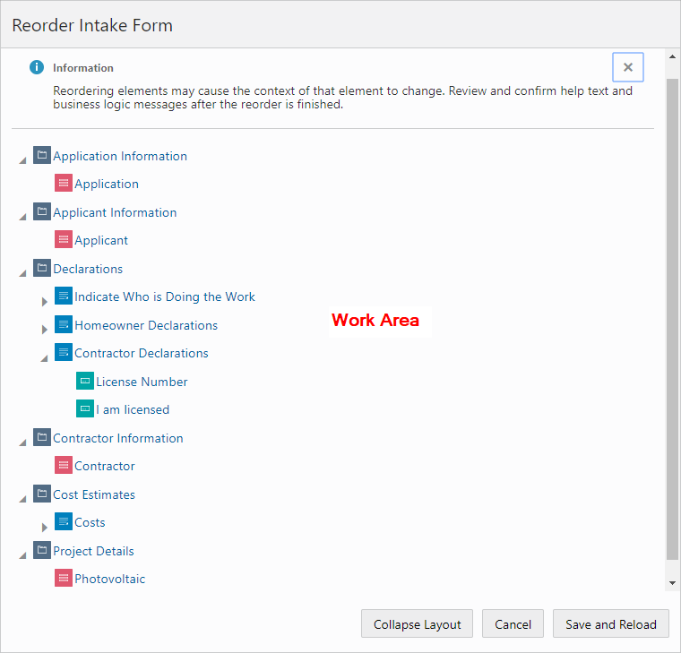
| Page Elements |
Description |
|---|---|
| Work Area |
The work area is where you view the current structure and order of your intake form in the element tree and perform any required reordering tasks. The work area displays each page tab, field group, group box, and user-defined field in the form design as a node within a hierarchical element tree. |
| Collapse Layout |
Collapses element tree view to display only the highest-level node in the hierarchy, the page tabs. |
| Expand Layout |
Expands the element tree to display more detail in the hierarchy, exposing field groups, group boxes, and user-defined fields (if the their group box container was previously expanded). The Expand Layout button appears only after the element tree has been collapsed.
Note: By default, user-defined fields are hidden to simplify the initial display. You need to manually expand the group box node that contains them.
|
| Cancel |
Closes the window and does not save any changes made. |
| Save and Reload |
Saves the changes you have made to the order and reloads the form design to display the new order. |
You can identify the element nodes in the hierarchical tree using this key.
| Page Element |
Description |
|---|---|
 |
Indicates a page tab. |
 |
Indicates a field group. |
 |
Indicates a group box. |
 |
Indicates a user-defined field.
Note: The individual fields contained in a field group are not displayed.
|
Moving Elements Using Drag and Drop
Left-click and hold to select the element you want move.
Drag the selected element to the desired location, using the drop indicator as a guide.
The drop indicator shows you whether you are dropping an element before, within, or after another element.
This example illustrates dragging and dropping form elements in the element tree. Details are in the surrounding text.
Release the left mouse button to drop the element in the indicated position.
Moving Elements Using Cut and Paste
Cut the element you want to move by selecting it and:
Pressing Ctrl + X.
Right-clicking and selecting Cut from the pop-up actions menu.
Paste the element to the desired location by selecting the new location and:
Pressing Ctrl + V and selecting the appropriate action from the pop-up menu.
Right-clicking and selecting the appropriate action from the pop-up menu.
| Menu Item |
Description |
|---|---|
| Cut |
Cuts the selected item to the clipboard. |
| Paste Before |
Pastes a cut item before the currently selected element. |
| Paste After |
Pastes a cut item after the currently selected element. |
| Paste Inside |
Pastes a cut item inside the currently selected element, such as a page tab or group box. |
| Paste First |
Pastes a cut item as the first item within the currently selected container, such as page tab or a group box. |
Moving Elements Using the Keyboard
You can use these keyboard shortcuts when reordering form elements.
| Shortcut |
Description |
|---|---|
| Tab |
Use to arrive at the first focusable element in the work area, which is the first page element node, and then to each button in the order they appear. |
| Shift + Tab |
Use to go the reverse direction of Tab. |
| Up and Down Arrows |
Use to move up and down the:
|
| Right Arrow |
Use to expand an element node to reveal the elements it contains. For example, use Right Arrow to show the user-defined fields contained within a group box. |
| Left Arrow |
Use to collapse an element node. |
| Shift + F10 |
Use to display the pop-up menu displaying available actions. |
| Esc |
Use to close the actions pop-up menu. |
| Enter |
Use to select an item on the actions pop-up menu. |
| Ctrl + X |
Cuts the selected element. |
| Ctrl + V |
Displays the actions pop-up menu after an element has been cut, enabling you to select a paste option. |
Reordering Page Element Considerations
The designer does not allow you to move form elements into invalid positions within the hierarchy, and the same rules applied when creating the initial form design apply also when reordering the form design. The following table outlines the rules governing each form element and any items you may need to consider when reordering elements in a form design.
| Form Element |
Reordering Rules and Considerations |
|---|---|
| Page tabs |
Page tabs can’t be dropped into another element. They can only be reordered within the element tree. |
| Field groups |
You can:
You can’t:
|
| Group boxes |
You can:
Note: By default, a dropped group box is added as the last element on the containing page or group box.
You can’t:
|
| User-defined fields |
You can:
|
The following table describes various conditions to consider when reordering form elements.
| Condition |
Description |
|---|---|
| Security |
You can’t drop an element into a page tab or group box that has security settings applied, such as the Hide from public user or the Confidential attribute enabled.
Note: The
Confidential attribute applies only to the Business License offering. Elements set to contain confidential information for the Business License offering can’t be reordered.
|
| Control Display |
A controlled element can’t appear before its controlling element in the form design order. For example, if a group box’s display is controlled by a single-item check box, you can’t move that group box to a position above that single-item check box. |
| Add Logic (Groovy) |
Groovy logic executes when the form is being submitted, so the order of the form design does not affect the logic. However, it is recommended that you review the error messages displayed by your Groovy scripts to make sure the context is still valid after reordering. |
| Add Help |
The display of help text does not depend on the order of the form design. However, it is recommended to review any help you have added to form elements to make sure the context is still valid after reordering. |
Configuring Activity Filtering for Business Licenses
This topic describes how to configure display filtering for business license intake forms so that only applicable form elements appear in the intake form for the current business license activity.
Activity Filtering Overview
A business license can be involved in different activities, including:
Origination: the initial application to be approved to establish and originate the business license.
Amendment: the license holder makes changes to a submitted application or an existing business license.
Renewal: the license holder renews the existing license for the next license period.
When creating a business license type, you have the options of enabling the license for renewal and amendment activity by turning on the Allow Amendment and Allow Renewal switches.
Depending on the activity, it may not be necessary to view and edit all of the information contained in the business license. However, it would be inefficient to design a separate form for each license activity. Use license activity filtering so that you can create a single intake form that can be used for all the business license activities.
For example, using license activity filtering you can set some form elements to display only for license origination, or only for amendments, while others can be set to display for all business license activity.
You can apply license activity filtering to:
Field groups
Group boxes
Setting Filtering Display Options
To view the license activity display options:
Select the form element.
Expand the Display section in the Attributes panel.
This example illustrates the license activity filtering options. Details are in the surrounding text.
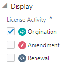
Page Element
Description
Origination
The element is available for origination activity.
Amendment
The element is available for amendment activity.
Renewal
The element is available for renewal activity.
Select at least one license activity for the element.
Note: You can select any combination of license activities, but at least one license activity filtering option must be selected for a field group or group box being added to a business license intake form design.Save your changes.
Viewing the Runtime Display
This table illustrates how the selected license activity filtering options behave at runtime.
| Origination |
Amendment |
Renewal |
Behavior |
|---|---|---|---|
| Selected |
Not Selected |
Not Selected |
Form element displays and is editable only for the origination activity.
Note: An element set to display for only origination will display in both amendment and renewal as read-only.
|
| Selected |
Selected |
Not Selected |
Form element displays for the origination and the amendment activities. |
| Selected |
Selected |
Selected |
Form element displays for the origination, amendment, and the renewal activities. |
Setting Form Options
This topic describes the options you can set for the entire form to control the ways public users interact with the form.
Enabling the Review Page
The review page presents all the fields of a multi-tab form on a single, scrollable page for efficient review of the entered data prior to submitting the form.
By default, the review page displays:
Form fields as read-only, but the end user can click the Edit button for each field group to modify the fields as needed.
All field groups expanded.
For multi-page view or single-page view.
For all forms, unless disabled.
To disable the review page:
In the Intake Form Designer, click the Form Options link.
On the Form Options dialog box, turn off Review Page.
Click OK.
Click Save.
Setting a Confirmation Step
You can enable one of the pages in a form as a confirmation page to display after the end user has filled in the information and submitted the form. You create the confirmation step in the designer and then set it to be the confirmation step in the Form Options.
When set as the Confirmation Step, the page displays:
At design time with the page tab filled in grey to indicate it is the confirmation step.
At runtime as the last page in the train stop drop-down list.
To enable the review page:
In the designer, click the Form Options link.
On the Form Options dialog box, select the desired page from the Confirmation Step drop-down list.
Click OK.
Click Save.
Mapping Form Fields to Decision Model Attributes
This topic describes how the fields added to an intake form in the designer are mapped to the fee model defined for the transaction type.
The Fee Mapping page in the designer is used to map attributes in the decision model to the fields added to the intake form. The Fee Mapping page is step 2 in the Intake Form Designer, where designing the layout is step 1.
This image illustrates Step 2 of 2: Fee Mapping in the design of a permit application.
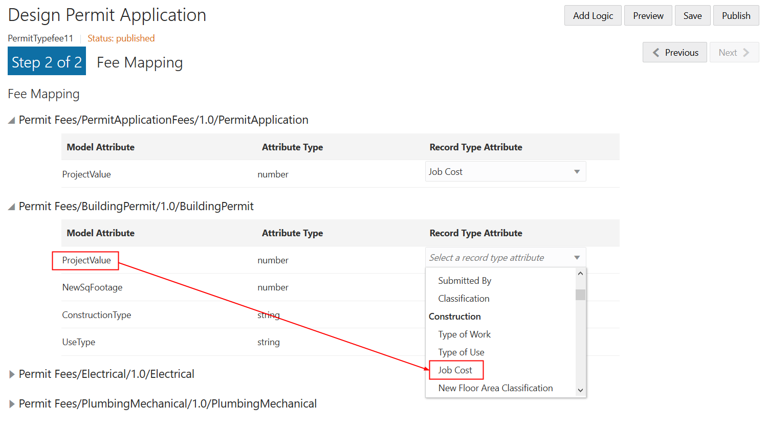
You assign a fee schedule to an application type on the Transaction Type page using the Fee Schedule field. You map attributes from the fee schedule’s underlying decision model created in Oracle Integration Cloud to the fields you have added to your intake form either through delivered field groups or by adding fields manually.
For more information on setting up fee schedules, see Setting Up Fee Schedules.
For more information on decision models, see Creating Decision Models for Fees.
Mapping Application Fields to the Fee Item in the Decision Model
To access the Fee Mapping page in the form designer:
Navigate to the Transaction Type page:
Select the transaction type that you want to view in the designer.
Click the Design Form button.
Click the Next button while in the application form setup step.
The fields on the Fee Mapping page are as follows:
Page Elements
Description
Model Attribute
The name of the attribute as it appears in the decision model in Oracle Autonomous Integration Cloud.
Not all model attributes must be mapped. Because fee schedules can be reused by multiple transaction types, only the model attributes required for fee calculations for the current transaction type need to be mapped. All other model attributes can be left blank.
Attribute Type
The data type of the model attribute, such as string, number, boolean, and so on.
Record Type Attribute
The field added to the intake form layout either contained in a predefined form element or a user-defined element you have added manually.
Select the record type attribute from the drop-down list that you want to map to the decision model attribute.
Click Save.
Considering User Experience
This topic describes concepts related to using forms that implementation teams need to consider when designing forms.
Required Fields
The system validates that required fields contain values prior to a submit request.
If a required field is empty the system displays the following error message on the page.
This example illustrates how the system displays messages to indicate what is required for a field.
The system displays an itemized list at the top of the form when clicking Submit so that in the case of multiple pages, the user can navigate quickly to the item and provide an acceptable value. The error message lists the error and the location to which the end user must navigate to correct the error. The list if errors can be expanded and collapsed as needed.
This example illustrates an error message appearing at the top of the form, displaying in the list the error, and the location of the offending field.
Runtime Application Form Save Behavior
You can save an intake form as a draft prior to submitting it. You may need to save an intake form as a draft for a variety of reasons, such as needing to gather additional information or the form requiring more time than anticipated. After saving the form, the user can return to it to provide more information and ultimately submit the form.
When saving a form as a draft, not all of the data validation occurs. However, the user will need to resolve any critical errors that the application can’t save, such as adding a value with an incompatible data type. For example, the system can’t save an alphabetic character entered into a field of a number data type.
The complete data validation process and logic runs for user-defined fields and field groups when the form is submitted.
When users take advantage of saving forms, consider these items:
| Consideration |
Description |
|---|---|
| Save |
|
| Submit |
|
| Groovy |
To compensate for the ability to bypass Groovy validation during a save, incorporate the "pending" status in your logic. An intake form is in "pending" status when it has been saved but not submitted. For example, add the following to the top of applicable Groovy scripts: if (Status == "Pending") {
return true
} |
| Upgrade |
Intake forms from previous releases with fields set as required need to be updated to include the validation adjustments associated with the ability to ignore required fields during a save.
|
Runtime Train Stop Drop-Down Behavior
The train stop drop-down list, appears in the center of the application form header to provide:
| Feature |
Description |
|---|---|
| Context |
The system automatically prepends the appropriate step number to the application form page name. The step numbers are assigned in the order the pages appear in the designer (from left-to-right). For example, assume you have three pages in your form: Application Details, Fence Details, Property Details. The train-stop drop-down list displays the pages as:
|
| Current Page |
To show the current page the user is viewing, the system displays a single, right-pointing, chevron character (>) to the left of page label in the drop-down list. |
| Navigation |
Select any page in the application form, including the review page, to access it immediately. |
| Switch to Single/Multi-page view |
Toggle between the multi-page view or the single-page view. |
Using the Single-Page View
When accessing the single-page view in review or advanced-edit mode, end users will notice these characteristics of the page elements.
| Page Element |
Behavior |
|---|---|
| Edit button |
Enables the end user to activate the form fields for editing. Initially, the system displays them in read-only mode. Once clicked, the system toggles the Edit button to the Done button. |
| Done button |
Once the end user completes any changes, clicking Done:
|
| Group boxes |
If a group box contains multiple group boxes, only the outer (parent) group box displays an Edit/Done button. |
| Field groups |
If there are multiple field groups in a group box, they will appear to be a single page section, with one Edit/Done button controlling all the field groups within the parent group box. Otherwise, if the field groups are on the page tab separately (not within the same parent group box container), then the system displays an Edit/Done button for each field group. |
| Expand All/Collapse All |
Expands or collapses all the elements on the page, including group boxes and field groups within parent group boxes. |
Advanced-Edit Mode
If needed, agency staff members can update a form after a public user has submitted the form. Agency staff members access the submitted form using the Permit Details page in the Permit List or by deep linking. Editing a form after a public user has submitted it is referred to as advanced-edit mode.
When in advanced-edit mode, the system:
Displays only the field groups enabled for advanced-edit mode.
Presents the form in the single-page view.
Agency staff members click the Edit button to activate fields and update data, and they click Done to save changes.
Testing Intake Forms
This topic describes the methods and considerations involved with testing your application intake forms.
You design, create, and test application forms on your development or test environment. Depending on what you have licensed, you may have a combined development and test environment, or you may have a separate development and test environment.
You can test forms in these modes:
Preview mode
Sandbox mode
Once your forms have been created and thoroughly tested, you then migrate the newly created forms to your production system for public user access.
Testing Forms in Preview Mode
You can perform initial testing using the Intake Form Designer preview mode.
To enter preview, click the Preview button. In preview mode, you can test the layout of the user interface and the tab flow in a simulated runtime scenario.
While the preview mode provides you an accurate view of how your intake form will appear in runtime mode, it does not enable you to enter data and save it. It can be used to get a quick, high-level view of the appearance of your form layout. To test the full functionality and data validation of your intake form, you need to access and test the form from the landing page in either sandbox mode or published mode.
Enabling Sandbox Mode Testing
You can test your intake form thoroughly in scenarios public users will encounter while the form design is still in the draft state within the sandbox. Testing in sandbox mode enables you to fully test and interact with the intake form without having to publish it. For example, you can:
Access the intake form from the landing page in the same way public users will.
Run any data validations or business logic while filling out the form.
Engage OIC definitions associated with the intake form, such as workflow and fee models.
Test the other processes involved in the entire lifecycle of the permit, such as approvals, inspections, and so on.
To enable sandbox mode testing:
Save your intake form.
Return to the Transaction Type page for your offering, such as the Permit Type page.
Open the transaction type associated with the intake form you want to test.
Set Status to Ready.
Set the Public User Enabled to either Enabled for all users or Enabled for registered users.
Specify any other required definitions related to the intake form, such as workflow process definitions, fee schedules, and so on.
Note: You need to update your workflow definitions to allow access from a transaction type within a sandbox. The workflow process definitions need an additional integration implemented called the Sandbox Connector. For more information on updating workflow definitions for sandbox testing, see Setting Up the Sandbox Connector.Click Save.
Configure security for user IDs you intend to use for sandbox testing.
When testing in sandbox mode, the user IDs you use to access the landing page and the intake forms require additional security roles.
Role
Access Description
PSC Custom Sandbox Access (CUSTOM_SANDBOX_ACCESS)
This role gets created automatically during implementation, and it enables access to definitions that exist within a sandbox. User IDs without this role can access published transaction types only.
This role should be used only in non-production environments, such as the development or the test environment.
To implement this role, add this role to any user you intend to use to test intake forms in sandbox mode.
To configure a sandbox test user, create an agency user and use the Agency Staff Access page to add:
All roles typically applied to the simulated user type.
PSC Custom Sandbox Access role.
Configuring Security for Sandbox Mode Testing
When testing in sandbox mode, the user IDs you use to access the landing page and the intake forms require additional security roles.
| Role |
Access Description |
|---|---|
| PSC Custom Sandbox Access (CUSTOM_SANDBOX_ACCESS) |
This role gets created during implementation. Enables access to definitions that exist within a sandbox only. This role should be used only in non-production environments, such as the development or the test environment. To implement this role, add this role to any user you intend to use to test intake forms in sandbox mode. To create a sandbox test user:
|
Migrating Application Forms Between Environments
After you have completed your testing of the application form on the development or the test environment, you can publish the intake form. To migrate an intake form from the current environment to another environment, the intake form must be published.
To migrate data from a source environment to a target environment, follow the procedure in Functional Setup Manager for migrating transaction type metadata and intake form layout metadata.
For more information on migrating definitions between environments, see Managing Transaction Type Configurations.
Publishing Intake Forms
This topic describes the steps to complete to publish intake forms.
You need to publish intake forms in order to:
Clone intake forms and transaction types.
Migrate intake forms from a source environment to a target environment, such as when migrating from the test environment to the production environment.
Before you publish an intake form, it is highly recommended that you ensure it is thoroughly tested in sandbox mode.
For more information on testing options, see Testing Intake Forms.
To publish a form:
Confirm that you have saved and tested all changes made to your form.
In the Intake Form Designer, click Publish.
Navigate to the Transaction Type page:
To navigate to the Transaction Type page for the offering, such as the Permit Type page for Permits.
On the Transaction Type page, open the appropriate transaction type, and set these values:
Transaction Type Status: Ready
Public User Enabled: Enabled for all users or Enabled for registered users.
Specify any related definitions required for your transaction type, such as workflow process definitions, fee schedules, and so on.
Click Save.
Cloning Transaction Type Definitions
This topic describes how to clone transaction type definitions and the associated form design. It also covers the attributes that will be shared between the source and clone definition and the attributes you will need to modify on the cloned definition.
You can clone a transaction type to:
Save time when creating a similar transaction type, rather than creating a new transaction type for each situation from scratch.
Create a new version of a currently published transaction type after making a significant correction or addition to the transaction definition.
In some cases, it may be more efficient to create a new transaction type and form, while in other cases, it may be more efficient to clone an existing transaction type and form.
When you clone a transaction type, you make a cloned copy of:
Most of the transaction type metadata, such as the specified Classification, Auto Number Rule, Department, Fee Schedule, and so on. Some of the metadata is not cloned, such as Transaction Type, Transaction Type Code, Transaction Type Status, Help Text and so on, as you’ll need to modify those values for the cloned copy.
All of the intake form layout in the Intake Form Designer, including pages, group boxes, field groups, and user-defined fields you have added to your application form.
When deciding to clone a transaction type, you may consider:
The number of fields and pages within the existing application form layout that you’d need to change.
Similarity between the existing transaction type and new transaction type.
Number of shared attributes.
When cloning to make a new transaction type, you will want to make sure you are aware of:
The attributes that will be shared between the source definition and the clone.
The attributes you need to modify to create unique values between the source definition and the clone.
Transaction Type Metadata Considerations
All of the field values on the Transaction Type page will appear in the cloned transaction type, except for selected field values listed in the following table.
Make sure to update any of the copied information on the Transaction Type page to reflect the requirements of the new transaction type. For example, if the Department, Fee Schedule, or Workflow information, should be different, make sure to update it for the new transaction type definition so it is associated with the correct items.
| Page Element |
Description |
|---|---|
| Type |
The type name doesn’t have to be unique. You can create a new transaction type by using a unique value or enter the same value as the source transaction type, if you are creating a new transaction definition with the same transaction type. |
| Type Code |
The type code must be unique. Enter a transaction type code that identifies this version of the transaction type definition. |
| Status |
Initially, for a newly created transaction type the status on the Transaction Type page is always set to Preliminary. |
| Valid From Date |
The application inserts the current date for the cloned transaction type. |
| Valid To Date |
Update to reflect your business requirements. |
| Public User Enabled |
Initially, for a newly created transaction type this is always set to Not enabled for public users. |
For more information on the fields on the Transaction Type page, see Setting Up Permit Types.
Intake Form Layout Attribute Considerations
The following table describes specific considerations for UI elements in your form layout with respect to cloning transaction types and what gets copied from the initial source intake form to the target clone.
| Element |
Description |
|---|---|
| Field groups |
The cloned copy of the transaction type contains the same layout as the source definition. If the intake form utilized any of the delivered field groups, the application copies the field groups into the cloned copy of the definition, using the same layout as the source definition. For example, if you added the Fence field group to the source permit definition to the second page tab, the Fence field group would appear in the cloned copy of the transaction type on the same page tab. |
| Labels |
The labels for fields and UI elements, such as pages, group boxes, field groups, and so on, are the same between the source and cloned definition. |
| User-defined fields |
Any fields you have added manually to the source will be copied, as is, to the cloned definition. For any fields that you have defined a list of values, make sure it applies to your new transaction type. |
| Security |
The cloned definition will have the same security configuration as the source definition for:
|
| Help |
If any help has been added to the form for a page, field group, group box, or field, for the source definition, the application does not copy help references into the cloned definition.
Note: You can remove the help references from the cloned form, but do not delete the help text from the Contextual Help page if other forms are still using that help text.
|
| Groovy scripts |
If any Groovy logic has been added to the source intake form, the cloning process does not copy the Groovy logic into the target clone definition. |
| Fees |
Any fee mapping, which is defined in the second step of the Intake Form Designer, is copied to the target clone definition. |
Cloning a Transaction Type to Create a New Transaction Type
When you clone a transaction type, you also clone the associated form design. You can clone just the transaction type definition without cloning the application form design; however, you can’t clone just the form design by itself.
This example illustrates the Clone Permit Type page, which is described in the steps for cloning a permit type.
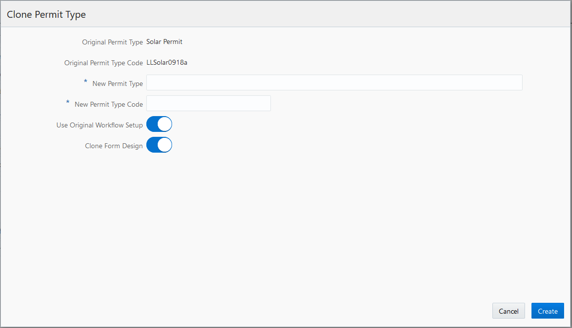
To clone a permit transaction type:
Select
Open the desired transaction type.
Note: Only transaction types with a status of Published can be cloned.Click the Clone button.
On the Clone Type page, enter the following values:
Page Element
Description
New Transaction Type
Enter a transaction type name.
The transaction type name can be the same as an existing transaction type name so that you can have different versions of the same transaction type. For example, if the original transaction type name is Fences, you can reuse the name for the new transaction type definition, but you must enter a unique type code to distinguish the two.
New Transaction Type Code
Enter a unique transaction type code.
Oracle recommends manually adding a version number to the source transaction type code if you want different versions of the same transaction type definition. For example, if the original type code is Solar-001, you can enter a new code, Solar-001-v2
Use Original Workflow Setup
Turn on the switch to use the original workflow setup as defined in the original transaction type. Turn off the switch to leave the workflow setup fields blank on the new transaction type. You must enter a workflow setup values.
Clone Form Design
Turn on the switch on to clone the application form design associated with the original transaction type. Turn off the switch to create a completely new application form using the Intake Form Designer.
Note: Providing a unique type code is required to make the transaction type definition unique.Click the Create button.
The cloning process opens the cloned copy of the transaction type.
Note: When saving the cloned definition, the application places the cloned definition within a sandbox.Make any other required changes to the cloned transaction type definition and form design.
See the previous sections for more information regarding what items to check.
Note: If there are numerous custom fields in the application form, when you have the layout open in Intake Form Designer, it can take several minutes to perform the initial save. While saving, the application is creating all of the custom fields, creating the other elements, and running validation.Publish the application form in the Intake Form Designer.
For more information on publishing a transaction type, see Publishing Intake Forms.
Return to the Transaction Type page to change the status to Ready for Use.
Considerations for Creating a New Version of a Transaction Type Using Cloning
In some cases, you may want create a new version of an existing, published transaction type to correct an error or make a change.
If the change made is insignificant, as in it does not change the meaning of a field or page element, then in most cases cloning is not required, and you can simply make the change directly to the transaction type definition. For example, assume you have a field for an email address on your form, and it had been requested to change the label from E-mail to Email (removing the hyphen). In this case, the change can be made directly to the form and republishing it.
However, in other situations, the change may be significant, in that it affects reporting associated with transaction type, alters historical data, makes future data out of sync with historical data, and so on.
Significant changes where cloning a transaction type is recommended include:
| Transaction Type Element |
Examples of Significant Changes |
|---|---|
| Field groups |
|
| User-defined form elements |
|
| HTML UI constructs |
|
Creating a New Version of a Transaction Type Using Cloning
Creating a new version of a transaction type using the cloning feature involves:
Deactivating the published version of the transaction type.
Cloning the published version of the transaction type.
Activating the cloned copy of the transaction type.
To deactivate a published transaction type:
Select
Open the definition for the published transaction type.
Set the Transaction Type Status field to Void.
Click Save.
To clone the published transaction type:
With the transaction still open from the previous steps, click Clone.
Enter the same Transaction Type value as used for the recently deactivated transaction type.
Enter a unique Transaction Type Code.
Note: Providing a unique transaction type code makes the transaction type definition unique. To keep track of versions, you can add v2, v3, v4 to the code, for example.Save the cloned definition.
Note: When saving the cloned definition, the application places the cloned definition within a sandbox.Make any other required changes to the cloned definition transaction type and form design.
See the previous sections for more information regarding what items to check.
Click Publish in the Intake Form Designer to publish the cloned definition.
For more information on publish a transaction type, see Publishing Intake Forms.
To activate the new transaction type:
Select or press Back from the Intake Form Designer interface.
Open the definition for the published transaction type.
On the Transaction Type page, set these values:
Transaction Type Status: Ready for Use.
Public User Enabled: Enabled for all users or Enabled for registered users.
Click Save.
Impact of Updating Existing Transaction Types and Republishing
This table describes the impact of various changes when you update and republish a transaction type.
| Modification |
Impact |
|---|---|
| Update a label for a user-defined field |
|
| Add a new user-defined field |
|
| Set a field as required |
|
| Add or edit Groovy script |
|
| Hide a field |
|
| Add a user-defined list of values (LOV) field |
|
| Add or edit a list of values (LOV) |
|
| Update list of values (LOV) display criteria (Enabled/Disabled) (Start Date/End Date) |
|
| Add or edit control display settings |
|
| Make changes to reusable field |
|
Impact of Cloning the Transaction Type and Retiring the Previous Version
This table describes the impact of various changes when you clone a transaction type to replace the previous version.
When cloning, you are creating a new transaction type, so in general, you should expect these impacts as the standard update:
Auditing: any new transaction that is created is available to audit framework, which requires you to enable the object to be audited and configure the report as needed.
Reporting: a new CSA needs to be created for each new transaction type.
| Modification |
Modification |
|---|---|
| Update a label for a user-defined field |
|
| Add a new user-defined field |
|
| Set a field group field or a user-defined field as required |
|
| Add or edit Groovy script |
|
| Hide a field |
|
| Add a user-defined list of values (LOV) field |
|
| Update a user-defined list of values (LOV) |
|
| Update list of values (LOV) display criteria (Enabled/Disabled) (Start Date/End Date) |
|
| Control display settings |
|
| Reusable custom fields |
|
Managing Transaction Type Configurations
This topic describes the considerations and steps related to migrating transaction type definitions, such as permits, planning and zoning applications, and code enforcement, from your test environment to your production environment.
Transaction Type Lifecycle Overview
Any implementation of Oracle Applications Cloud usually requires migrating setup data from one environment to another at various points in the subscription lifecycle.
For example, you set up your initial configuration of the Public Sector Compliance and Regulations offerings in the test environment, which is your source system. Then, after thorough testing and verification, you move the setup and configuration data from your test environment to the target environment, which is your production system.
You use the Fusion Applications Functional Setup Manager to perform these migration tasks.
This example illustrates that you use Functional Setup Manager to migrate data between your test and your production environment.
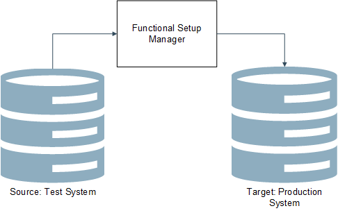
You access Functional Setup Manager by selecting or by clicking the Setup and Maintenance tile on the springboard. To access Functional Setup Manager, you need to have the System Administrator role associated with your user account.
The functional areas in Functional Setup Manager that apply to your transaction type definitions and application form definitions are:
| Offering |
Functional Area |
|---|---|
| Public Sector Permits |
Permit Types |
| Public Sector Planning and Zoning |
Planning Application Types |
| Public Sector Code Enforcement |
Incident and Case Types |
Like using Functional Setup Manager to setup your configuration, when migrating data, you use a top-down approach. That is, if you are not exporting the entire configured offering, and you are exporting by functional area, you need to export the functional areas in the order they appear.
For more information on using Functional Setup Manager, see Using Functional Setup Manager.
For additional information related to migrating configuration data from your test environment to your production environment for the Public Sector Compliance and Regulation offerings, see Oracle Public Sector Compliance and Regulation: Test to Production (Doc ID 2551940.1) on My Oracle Support.
Set the Target Instance URL
On the source system (your test environment), you need to define the URL target system (your production environment) so that setup data and configuration data can be sent to the target.
To set the target instance URL:
Sign on to the test environment.
Click the Setup and Maintenance tile on the springboard to access Functional Setup Manager.
On the right side of the Functional Manager Setup interface, click the Tasks tab to open the Tasks drawer.
Click Search, and search for Manage Configuration Set Migration Target Security Policy.
On the Manage Configuration Set Migration Target Security Policy page, enter the URL for your target environment, and the appropriate security credentials for the System Administrator role.
Note: It is recommended to include the port number when you specify the URL value. For example:https://server.example.com:443You can get the target port value by accessing the Manage Configuration Set Migration Target Security Policy page on your production system (your target).Save.
Managing Unified Sandboxes on the Source and Target System
Public Sector Compliance and Regulation requires the Unified Sandboxes feature to be enabled on your test environment, where you are actively designing and configuring your implementation. It is recommended that you disable the Unified Sandboxes feature on your production system.
For migrating transaction types from your test system to your production system, especially, make sure to disable the Unified Sandboxes feature on your target, production system. Because you should be completing all configuration tasks on your source test system, sandboxes shouldn’t be required on the production system. Having the Unified Sandboxes enabled on the production system can cause the Configuration Set Migration utility not to render or function properly.
To disable Unified Sandboxes:
Sign on to your target, production system.
Navigate to Functional Setup Manager.
Select your solution, such as Public Sector Permits, Public Sector Planning and Zoning, or Public Sector Code Enforcement.
Note: Disable Unified Sandboxes in all solutions you have licensed for Public Sector Compliance and Regulation.Click the Change Feature Opt In link.
Locate the Application Extensions feature, and click the pencil icon in the Features column.
Make sure the Unified Sandboxes feature is disabled.
Note: If there are any open sandboxes, they need to be deleted or published before you can disable this feature.Click Done.
Migrating Transaction Type Foundational Metadata
Before you use Functional Setup Manager to export transaction type configuration data, you need to create and migrate a configuration set, which includes the underlying metadata required to be in place as a prerequisite prior to migrating other transaction type setup data.
Because the Public Sector Compliance and Regulation solutions are metadata-driven, you need to migrate the metadata that is the foundation of the transaction definitions. This is the data stored in the Oracle Metadata Services (MDS) layer. You do this by creating a configuration migration set. Once that is complete, you can then begin using Functional Setup Manager export and import features to transfer the rest of required definitions between test and production systems.
To migrate transaction type metadata:
Sign on to the test system, which is the source system.
Click the Setup and Maintenance tile on the springboard to access Functional Setup Manager.
Select the appropriate offering (Permits, Planning and Zoning, or Code Enforcement).
Expand the Permit Types, Planning Application Types, or the Incident and Case Types functional area (depending on your offering).
Note: These steps for creating a migration set apply only to the Permit Types, the Planning Application Types, and the Incident and Case Types functional areas.Click the configuration you want (depending on your offering). For example for permits, click the Manage Permit Configuration link.
Note: This link takes you to the Manage Configuration Set Migration Target Security Policy. You can also access this page in Fusion Application by selecting .If you have not already specified your target instance URL, you must do that prior to the next step.
See the previous section for more information.
Select the Outgoing tile and create an outgoing migration set to export to your production environment.
When creating a configuration set, the utility compares differences between source and target, and determines the metadata that needs to be exported to the target system. When the process is complete, the resulting migration set is downloaded in the form of a downloadable jar file.
After finishing the creation and migration of the outgoing migration set, sign on to the production system (the target system), and complete the steps for applying the incoming migration set.
This example illustrates an incoming configuration set.
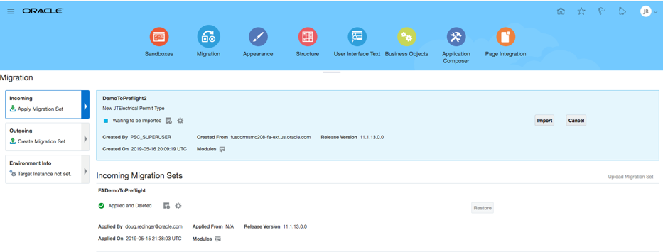
For more information on these steps, refer to Oracle Applications Cloud documentation: Configuring and Extending Applications.
Exporting and Importing Remaining Transaction Type Data
After you have completed migrating the configuration set on the source system, you then export the remaining transaction type data using the Functional Setup Manager options for the functional area or the entire offering.
This example illustrates using the functional area export options.
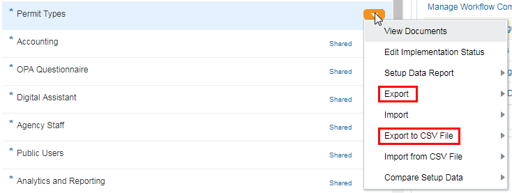
After exporting from the test system, you then sign on to the production system and import the corresponding business object data.
When you export business object data, you have the option to select only those business objects that you utilize. For example, if you are not using application groups, you could deselect Manage Application Groups from the Business Objects list.
The objects you export will be in the form of a downloadable jar file.
For more information on these Functional Setup Manager export and import features, see:
Using Functional Setup Manager: Managing Setup Using CSV File Packages
Using Functional Setup Manager: Exporting and Importing Setup Data