Redwood: Manage Stacked Visualizations Using a New User Experience
Stacked Visualizations lets you assemble multiple analytic layers, such as line, stacked bar, area, scatter, waterfall graphs, and pivot-table snapshots, into one composite view. You can drag and drop a visualization atop another to create a stack. The last added visualization is displayed on top with a list to switch layers. Each layer retains its own measures, data, hierarchies, and layouts. Common filters such as plan, organization, item, category, and time, synchronize across the stack. Stacks support drill down and drill-to actions, with links managed per visualization, and include multiple plan comparison. Stacked layers can show multiple plan versions with unified legends, distinct patterns, and aligned time buckets. You can resize the entire stack. A maximum of 10 visualizations per stack are supported.
You can now stack multiple visualizations into a single section or panel in the page. This enables you to assemble pages with a lot more visualizations and cycle through them. For example, you can have a high-level view along with a detailed analysis of related metrics without navigating across multiple screens or scrolling through a page.
Using drag-and-drop action, you can add visualizations on top of each other to create a stack. A dropdown list lets you easily switch between stacked visualizations, with the most recently added visualization displayed as the active view.
With this feature, you can:
- Reduce scrolling and page switching: By consolidating multiple visualizations into a single stack, you no longer need to toggle between different pages or tabs. This streamlined workflow minimizes context switching and helps maintain analytical focus.
- Enhance analytical flexibility with customizable, reusable layouts: You can create personalized stacks tailored to your specific analysis needs and save them for repeated use. This promotes consistency in analysis, improves productivity, and allows you to quickly access insights.
Enabling a Stacked Visualization
To enable a stacked visualization, in the Edit Page Layout mode, drag a visualization from the library and drop it onto another visualization to create a stack.
Enabling Edit Page Layout mode
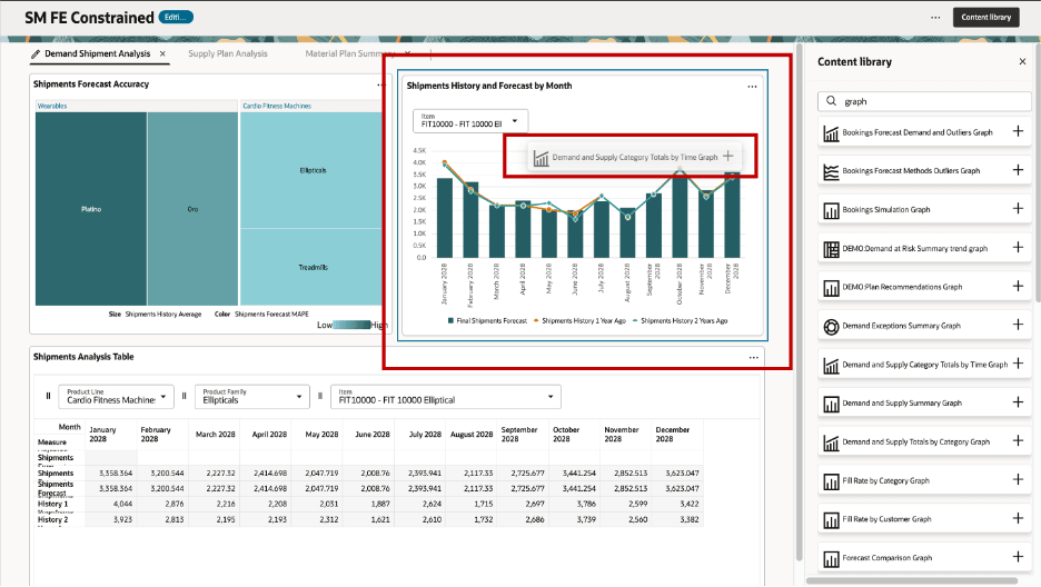
Dragging a Visualization from the Library Onto Another Visualization
Use the stack dropdown list to switch between visualizations.
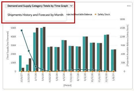
Switching Between Visualizations
You can add up to 10 visualizations per stack within a plan page.
Editing a stack
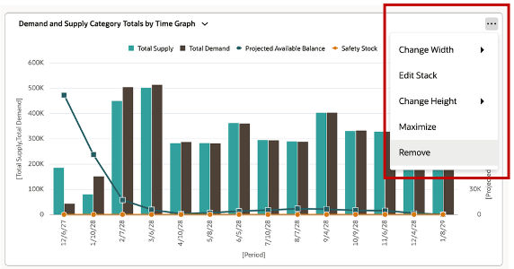
To edit a stack, select the Actions icon of the visualization and select the Edit Stack option.
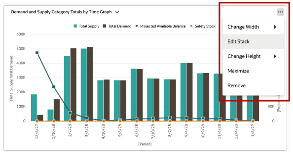
Editing a Stack
In the Stacked Layout drawer, you can review the visualizations in the stack, re-arrange the order of the visualizations, and remove (using the trash icon) visualizations. Select Apply and Close to save your changes.
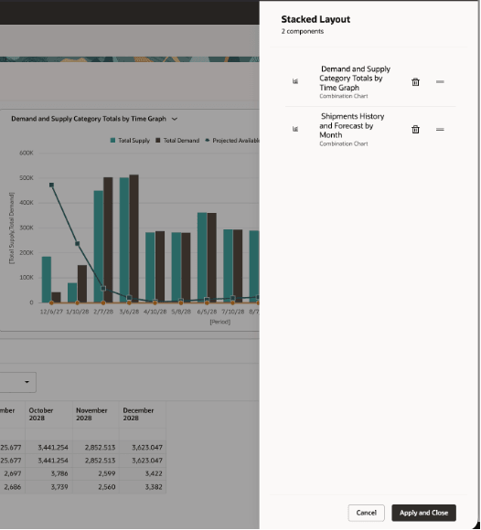
Stacked Layout Drawer
Removing a visualization from a Stack
You can also remove a visualization from the stack by selecting the Remove option from the visualization’s Actions menu.
Removing a Visualization
Comparing with other plans and archives
When the stacked visualizations feature is enabled, you can see a different layout when operating in Compare Plans mode.
Graph stacked visualizations
The screenshot displays a graph stacked visualization in compare plan mode.

Compare Plan Mode
When the graph stack visualizations of plans are compared:
- Graphs are displayed side by side in a single row.
- Up to 3 plans can be compared.
- All plans show the same list of visualizations.
- Changes to the visualization selection in the stack of the base plan are considered. All compared plans automatically update to match the selected visualization type in the base plan.
- Selecting a visualization in any compared plan updates the stacked view to display that same visualization across all plans.
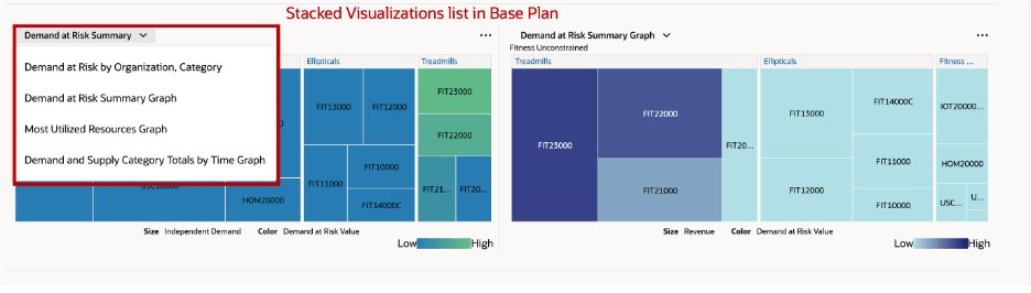
List of Visualizations in the Base Plan in Compare Mode
Pivot table stacked visualizations
The following screenshot shows the stacked visualization of a pivot table in plan compare mode:
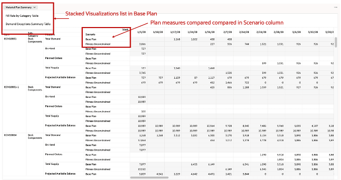
Pivot Tables in Stacked Visualizations in Compare Mode
When the pivot table stack visualizations of plans are compared:
- The base plan and compared plans are consolidated into a single table.
- A Scenario column distinguishes the different plans being compared.
- You can switch between visualizations, and the pivot table updates accordingly to reflect the new selection.
- Switching visualizations doesn’t introduce additional rows. The table structure remains consistent across selections.
Mixed pivot tables and graphs stacked visualizations
Mixed visualizations are displayed as two separate stacked sections:
- Graphs are displayed side by side in a single row, as in the graph-only stack scenario.
- Pivot tables are presented in a separate stacked section, as in the pivot table–only scenario.
If you exit the Compare Plans mode, it consolidates all visualizations (graphs and pivot tables) back into a single stacked view for the base plan.
Key Considerations for stacked visualizations
- Maximum number of visualizations in a stack - You can include a maximum of 10 visualizations in a stack. However, the overall limit of total number of visualizations in all pages is 40. Avoid creating stacks with many visualizations which have a large amount of data to avoid performance issues.
- Swapping Visualizations: Swapping a visualization with another visualization by simply dragging a new one from content library on top of an existing visualization isn’t supported any more. This is true for all visualizations on the pages, either in a stack or not.
- Applying Page Search Filters: Page search filters apply across all layers, but only relevant filters are considered per visualization
When you apply global filters such as plan, organization, item, or time, they are propagated across all visualizations in the stack to maintain consistency. However, each visualization only applies the filters that are relevant to its underlying data structure.
For example, if you apply an item filter while viewing a stack that includes both a Demand Plan graph (that contains item-level data) and a Resource Capacity graph (that may not include item attributes), the Demand Plan graph reflects the selected items. The Resource Capacity graph ignores the item filter and continues to display data based on applicable dimensions such as resource and time. This ensures that each visualization remains accurate and meaningful without causing errors or empty results.
- Editing a visualization’s properties: Use the Edit Properties option to configure currently active visualization's properties and links.
Active/Default visualization with Drill-To behavior: When you drill to either manually or using a dynamic link, a visualization within a stack that isn’t currently displayed, that visualization automatically becomes the active view in the stack. When you have dynamic drill to links to multiple visualizations in a stack, the first visualization in the stack order that has the drill to link becomes active.
Steps to enable and configure
You don't need to do anything to enable this feature.
Access requirements
Users who are assigned a configured job role that contains these privileges can access this feature:
- Manage Planning Pages (MSC_MANAGE_PLANNING_PAGES_PRIV)
- View Planning Objects (MSC_VIEW_PLANNING_OBJECTS_REST_SERVICE_PRIV)
These privileges were available prior to this update.