Enhanced Filtering for Dropdowns and Searches
This opt-in feature is only available in portal based user interfaces. It is not available in legacy pages. The following details highlight the system behavior when this feature is turned on.
Dropdown fields:
For input fields that are built as a dropdown, when you click the input field, you see the values and the input area.
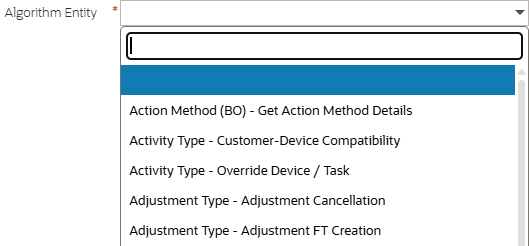
Algorithm Entity input Field
When you start typing, the system makes a match on your text with the values in the dropdown and narrows down your results list accordingly.
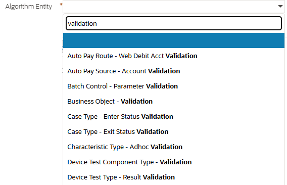
Validation Example
If you select a value and then subsequently click the dropdown again, the current value is highlighted and the text you previously entered is retained.
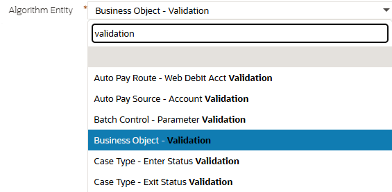
Original Value Retained
Search fields:
For input fields that have a search associated, the system now supports configuration to enable auto-filtering. Searches that are enabled to support this feature show a down arrow in the input field.

Example of Input Field with Down Arrow
Searches that do not support this feature do not include the down arrow.

Example of Input Field Without Down Arrow
The fields with a search associated with them continue to support previous capabilities including:
- Pasting a value or typing a value into the input field and tabbing out. If the value is an exact match, the information string is shown adjacent.

Example of Information String Shown Adjacent
- Typing a partial value and clicking 'enter'. This launches the search passing in the partial value and showing the results list that match that value.
New functionality was added so that if you click the down arrow, an input field is visible to show the label of the filter that has been configured to allow for auto-filtering. You can start typing to get records that match that result. For example:

Visible Input Field with Label
Typing 'business' displays all the maintenance objects whose description starts with that text. This search has been configured to display the description and the code in the results.
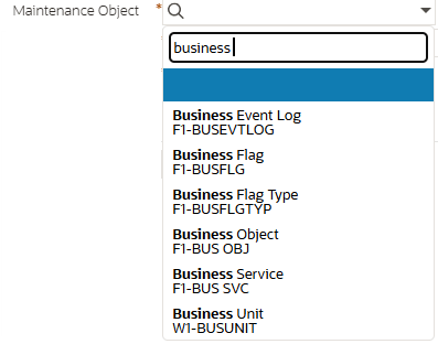
Business Example
When you start typing, the system uses one of the search's underlying filters that has been configured for this functionality. In contrast to the dropdown behavior, where the system looks for a match on the text anywhere in the string, for the search typeahead functionality, the system relies on the filter's definition as to whether it is 'likeable' and if so, whether it is 'likeable' on the suffix or the prefix or both.
Once a value is selected, the primary key of the chosen record is populated in the input field per existing functionality.

Primary Key Populated in Input Field
If after selecting a value you subsequently click the down arrow again, as with the dropdown behavior, the previous entered filter text is still visible. The selected value is highlighted and the text matching the filter value is bolded.
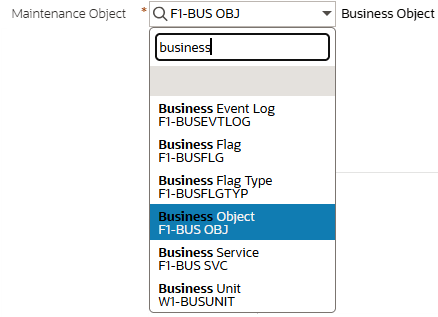
Selected Value is Highlighted and Value Bolded
Searches that enable this feature may also be configured to show up to three lines of supporting information for each record. In the example of Maintenance Object above, the search is configured to show both the maintenance object code and description in the results. In the base product, most searches for administrative tables which have a description have been configured to filter by the Description and to show the Description and the Code as shown in the Maintenance Object example.
For master and transaction fields, because only one filter field may be used for auto-filtering, searches are only enabled for this feature if a useful single filter was identified by the product team. For example, Person Name for the Account search.
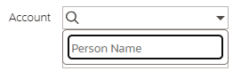
Example for Person Name
In this case, the search was configured to include the person name, account ID, and relationship type in the output.
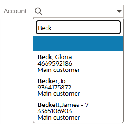
Example Including Person Name, Account ID, and Relationship Type
For dropdowns that have a lot of data, typing text to narrow down the list saves scrolling through a long list of values. For search metaphors where there is a reasonable filter value to enter, you save several clicks to get the data you are looking for.
Steps to enable and configure
To enable and configure this feature, complete these steps:
- Go to Feature Configuration and find (or create) the feature with the Custom Look and Feel feature configuration type.
- Edit the record and add an entry for the option "Enable Auto-Filtering" and set the value to "Yes".
- Click Save.
- Flush the server cache and restart the environment.
Tips and considerations
If you enable this capability and you have custom search zones, you may want to configure the search to support this functionality:
- Confirm if there is a single filter whose value would be useful for a user to type to get a short list of results. Update that filter's configuration to include the mnemonic 'oraSearchFilter'.
- If the search zone uses a filter map, confirm that the filter used by the search dropdown metaphor has a proper label for display to the user. If no label is defined, the user will see the generic word 'Filter' and not know what to type.
- Confirm if the search results for more than one column (up to 3) should be displayed to the user when showing the matching text. If you prefer different or additional text to be displayed, update the appropriate Display Columns parameter (or Initial Columns parameter, when applicable) with the text oraSearchDisplay='Cx,Cy'.