The Dual Functionality of the Sales Dashboard Ask Oracle Bar
The Sales Dashboard Ask Oracle bar serves two different and unrelated functions: keyword searches and the filtering of the reports in the sales dashboard itself.
Salespeople use the Ask Oracle bar to:
- Search by keyword through all the sales information they can access, including activities, emails, leads, opportunities, accounts, and other business objects.
- Filter the information in the active tab of the sales dashboard. For example, they can display data for a narrower time period or compare the performance of one manager to another.
Search Through All Sales Information by Keyword
Here's how to search by keyword:
- Enter the keyword in the Ask Oracle bar.
- If you don't see the item you're looking for in the list, click
Search to view all the results, filter them, and take
actions.
Keyword Search
Callout Description 1 Enter keyword. 2 View list of most often-accessed items matching the keyword. You can open individual items by clicking on links. 3 Click Search to view all results and take actions on them. 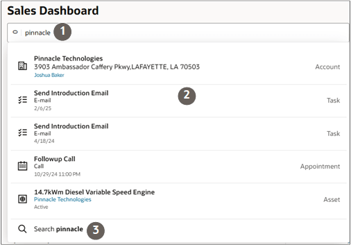
In the Search results page, you can add different search terms and filter by object.
Key Features of the Search Results Page
Callout Description 1 You can update the initial keyword. 2 Each search results indicates the object. 3 You can filter results by object 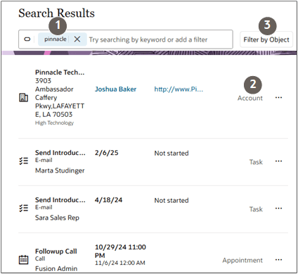
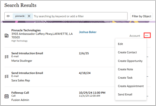
You can take actions directly on the search results by clicking the three dots Actions icon highlighted in the screenshot.
For example, you can edit an account record, and create contacts, opportunities, notes, tasks, appointment for the account. And you can and you can send an email.
Filter the Sales Dashboard Content
Salespeople can filter the contents of the dashboard to focus on a subset of the information.
Four filters are available: Time Period, Team, Territory, and Product Groups. The filters display as buttons and are also available for selection in the search box itself.

For example, you can filter the information in the KPI and in a visualization in the tab by clicking the Team filter button and selecting team members.
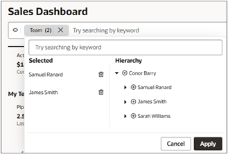
Both the metric and the visualization now display data for the selected team members.