Add a Chart to Your Report
You can add a chart to your report. You must add at least one group to slice the data by before adding the chart.
-
Open the Express Reports work area.
You can do so using a bookmarked URL, by clicking on the icon on the home page, or by making a selection in the Navigator.
- On the Express Reports page, click for the report you want to edit.
- Click Add Chart.
-
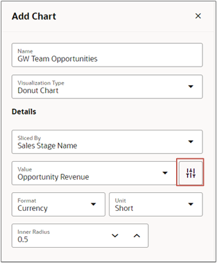
Make the following entries:
Field Description Name Optionally, enter a name that's different from the report name. Visualization Type Select the type of chart. Sliced By Select one of the groups you added to the report. Value Select the column that you want to chart. Preferences (arrows icon highlighted in the screenshot) Lets you specify the format and unit for the column you selected as the Value. 
- From the Visualization Type list, select the type of chart you want to display. Options include bar chart, doughnut chart, and funnel chart, and so on.
- In the Sliced By field, select how you want the data to be categorized. How you can slice data depends on the groups you added to the report. For example, if you grouped your data by sales stage and opportunity owner, then you can select either of these for your chart.
- Enter any other details required by the visualization you selected.
- Click Save.