Configure Sales Pages Using Page Composer
Use Oracle Page Composer to configure Sales pages in a sandbox while you're working in the application. You can make your UI configurations available to all users or only to a subset, such as only to partners or only to users with a specific job role.
Oracle Page Composer is a page editor, developed as part of Oracle WebCenter, for revising the layout and content of application pages. Its full capabilities are described in the Oracle Fusion Middleware User's Guide for Oracle WebCenter and in the Oracle Fusion Applications Extensibility Guide.
You can use Page Composer, also known as Oracle Composer, for performing the following types of configurations in your sales application pages:
-
Simple UI editing functions, such as showing and hiding fields, changing field labels, and making fields read-only or required
-
Changing page layout and adding Oracle BI Publisher reports and other content to dashboard pages
-
Creating new infolets
-
Creating saved searches (also called saved lists) for others in the organization
-
Configuring the display of search results in tables
If you're planning to configure the UI for a specific job role, then you must have that job role assigned to you so that you can test the configuration in the sandbox.
How to Open Page Composer
To open Page composer, create and enter a sandbox with Page Composer as one of the tools and select Page Composer from the Tools menu. If you're planning to use Page Composer to make changes for specific job roles, then you must create a separate sandbox just for Page Composer. The other tools don't support making changes by job role.
-
Activate a sandbox.
The active sandbox name appears at the top of the page.
-
Click the user image or name and select Edit Pages from the Settings and Actions menu.
Page Composer Modes
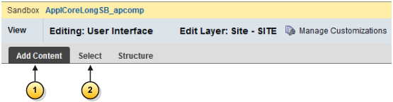
When configuring sales pages, you can use Page Composer in one of two modes: the Add Content mode and the Select mode. The following figure shows a partial screen capture of the Page Composer toolbar with the two modes highlighted by callouts.
-
Use the Add Content mode (highlighted by callout 1 in the following figure) to move, add, and edit regions on dashboards and external-facing partner pagers. You also use this mode to create saved searches, specify search result content, and to navigate in the UI when you're in Page Composer.
You're in the Add Content mode when you first open Page Composer. You can also select this mode by clicking Add Content on the top left corner of a page.
-
Use the Select mode (callout 2), which you can activate by clicking Select, to configure the properties of different UI elements such as fields and table columns.
Add Content Mode
Use the Add Content mode to do the following:
-
Configure the content on dashboard pages, including the Welcome page in the desktop UI.
Dashboards pages are the pages that users land on when they navigate to work areas using the Navigator. Dashboard pages display analytics, notifications and other information.
-
Configure all of the external-facing landing and transactional partner management pages.
-
Configure the table display of search results.
-
Create saved searches (saved lists).
-
Navigate to other pages while working in Page Composer.
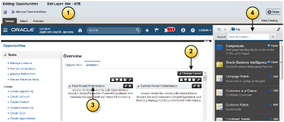
When you open Page Composer, the application opens in the Add Content mode automatically. On pages that support configuration in this mode, such as the sales dashboard in the following image, different regions are highlighted with borders and display configuration controls.
The following screenshot shows a partial screen capture of an application page with the different Add Content features highlighted by callouts.
-
A bar appears at the top of the page indicating that you're in editing the page in Page Composer (callout 1).
-
You can change the column layout of the page by clicking Change Layout (callout 2).
-
You can move a region, by grabbing its toolbar (callout 3) and dragging it to a different position.
-
You can add a new tab (callout 4).
You can also make changes in each region:
-
You can remove a region by clicking Close, the icon at the top right-hand corner of the region.
-
You can add content by clicking Add Content.
-
You can add a new region by clicking one of the icons to the right of the Add Content button. These icons specify where in the page the new region is created.
Select Mode
In the Select mode, a border appears around individual fields and other UI elements as you move your cursor over them.
Clicking within a border for a UI element that supports configuration displays a menu with one or both of the following options: Edit Component and Edit Parent Component.
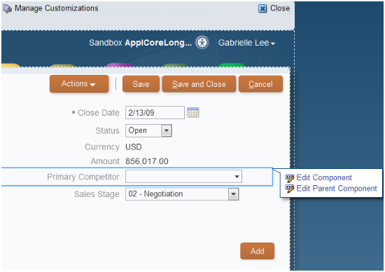
Not all UI elements support configuration, so these editing options aren't always enabled.
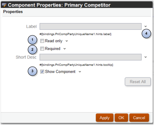
You use the Component Properties window to make your configurations. Not all the configurations are available on all the UI elements, so the content of this window varies. The following screenshot highlights the different components with callouts.
-
To make a field read-only, you select the Read Only option (callout 1).
-
To make a field required, you select the Required option (callout 2).
Note:Before making a field required, the field must display a value. If it doesn't, then cancel out of this window and enter the value first.
-
To hide the field, you deselect the Show Component option (callout 3).
Some UI components are protected from updates to preserve the product business logic. For example, if a field is read-only because of a security privilege defined in the application, you can't make it editable in Page Composer.
How to Edit the Partner Portal UI Shell Using the Page Composer Source View
Channel partner portal administrators can use Page Composer's Source View to configure the header and footer areas of the pages partners use to register themselves and sign in after they're registered. This is the only sales page which supports this mode. You can use this mode to add a company logo, copyright information or links, for example.
To configure the partner portal UI shell, you must activate a sandbox and select the Update Partner Portal UI Shell task in the Channel dashboard.
To learn more about working in the Source view, see the Oracle Fusion Middleware User's Guide for Oracle WebCenter.
How to Make Configurations Available to Different User Groups
You can make your configurations available to different subsets of users.
When you launch Page Composer, you must select one of the following configuration layers:
-
Site: Your configurations are visible to all users.
-
External or Internal: Depending on your selection, your configurations are visible to either internal users (your employees) or to external users (your partners or anonymous users).
-
Job Role: Your configurations are visible to users with the job role you select. The list of available job roles includes all the job roles assigned to you directly and any job roles that are inherited by those job roles.
Note:If you created your own job roles, then you must run the Retrieve Latest LDAP Changes process from the Scheduled Processes work area before the job roles are available for selection.
By default, configurations you made at a higher level are propagated to lower-level layers, unless you deselect these layers in the Include column.
The Welcome page in the desktop UI doesn't support different configuration layers. You must configure this page at the site level.