About the Waterfall Chart Type
Waterfall charts display a running total of positive and negative values, which is helpful in showing how you arrived at a net value from an initial value.
Waterfall charts are used to portray how an initial value is affected by a series of intermediate positive or negative values. Usually the initial and the final values (end points) are represented by whole columns, while the intermediate values are shown as floating columns that begin based on the value of the previous column. The columns can be color-coded to distinguish between positive and negative values.
Example Waterfall Chart - Inventory Analysis
This example visualizes changes in a single account over time.

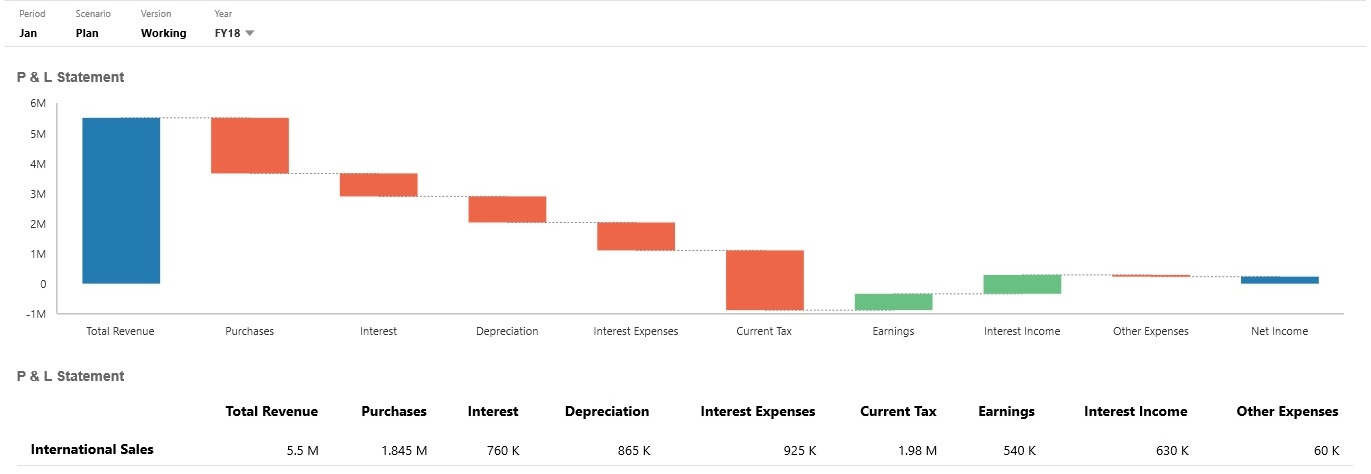
Example Waterfall Chart - P & L Statement
This example has expense accounts that are shown as a negative change to Total Revenue, and income accounts that are shown as a positive change, for a final Net Income value.

Dashboard designers can set these waterfall chart properties:
Table 11-8 Waterfall Chart Properties
| Setting | Description |
|---|---|
|
Value Scale |
Especially useful for large numbers, you can scale how a value is displayed. For example, if the value is 1,689,000 and you select K - Thousand as the scaling option, the chart displays the value as 1,689K. Your scaling options:
|
|
Grid Lines |
Select Hide or Show to display the x-axis lines of the grid. |
|
Connecting Lines |
Select Hide or Show to display the lines connecting the end of each column to the beginning of the next column. This helps visualize the flow of the data in the chart. |
|
Plot Deltas |
Select Yes to automatically calculate and plot the common start and end points from one bar to the next based on the values provided. This is useful for showing the trend for balance type of accounts. Otherwise, select No to manually set increase and decrease points. When No is selected, you can manually set these increase/decrease options on a bar-by-bar basis:
The manual options you can set for each bar are Auto, Reverse, and Total. Auto will consider the positive/negative values from the data source and plot accordingly. Reverse will change the sign, and Total will make the chart restart at the corresponding bar. |
|
Increase Decrease Total |
Select a color for each property. |
|
End Bar |
Select whether to Hide or Show the end bar on the chart. In the preceding example, the end bar is shown. If the end bar is shown, you can specify a label. |
|
Axes |
Select a Custom Range for the X-Axis and the Y-Axis, or select Off. |
Videos
| Your Goal | Watch This Video |
|---|---|
|
Learn how to create waterfall charts to track the changes in a single account over time and to track how multiple accounts interact to produce a final total. |