Customizing Dashboard Colors
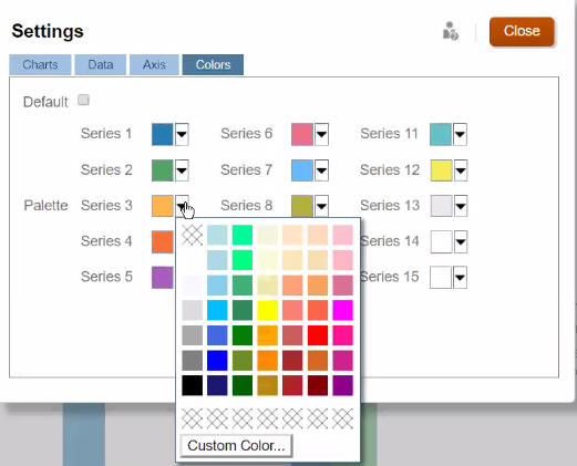
Maybe your company uses a standard set of colors in charts to denote different types of data. For example, dark blue might represent actual data versus light blue for budget data. When you customize dashboard colors, you select colors in the order of rows on the form. Series 1 represents the first row of data, and so on. You can assign each row in the form a color that represents its data in the chart.
You can customize dashboard colors in Bar, Line, Area, Bubble, Column, Combination, Doughnut, Pie, Radar, and Scatter chart types.
-
With the chart on the dashboard's design palette, click Settings
 .
.
-
Click Colors.
-
Clear the Default check box, and then click the down arrow
 for the Series you want to change.
Check the chart in the background to see the data type that each series represents.

-
Click the colors you want for the selected Series, and then click Close.
Note:
To select more shades of colors than the ones initially displayed, click Custom Color....
Your selections apply only to the current chart. Follow these steps to change the colors of other charts in the dashboard.