Format Rule Scenarios
These scenarios provide examples of how format/validation rules and Groovy rules that are defined at design time affect the display in runtime forms when cell styles and custom styles are applied.
Scenario 1: Apply Cell Styles
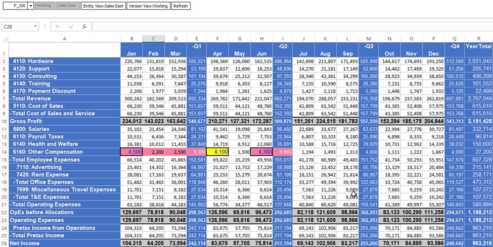
Smart View runtime data grid with Smart View cell styles applied:
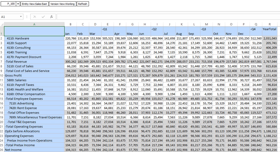
Web runtime data grid with Web cell styles applied:

Scenario 2: Apply Custom Style
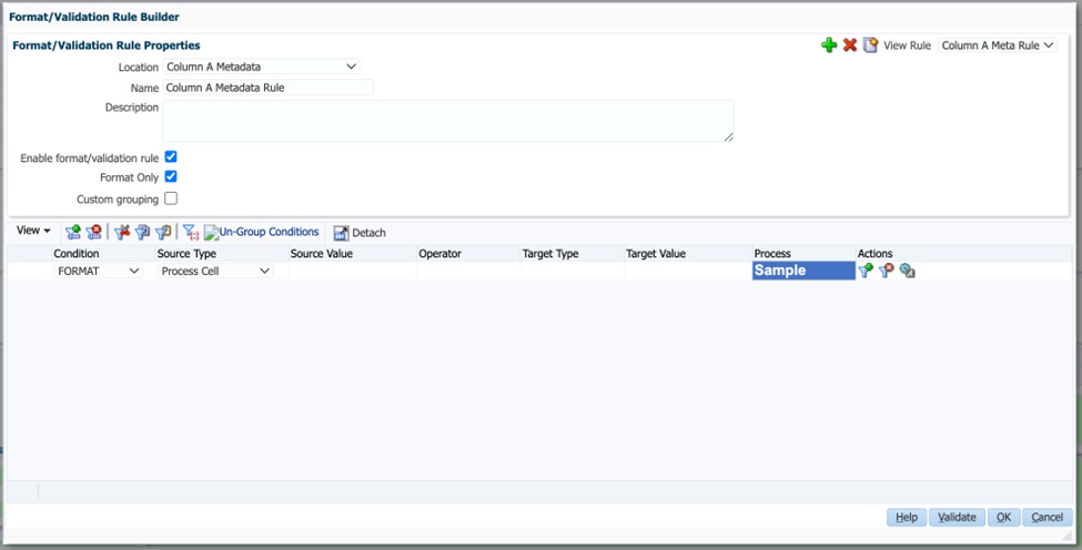
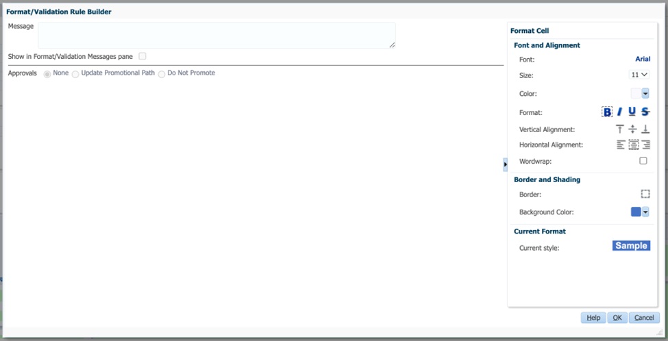
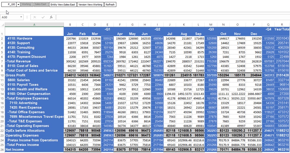
In the Format/Validation Rule Builder, a format-only rule is created on each of the row and column header cells and on Column A and Column B as shown in the screen shots below.
Format/Validation Rule Builder Properties:
Format/Validation Rule Builder Format Cell Options:
Smart View runtime data grid with custom styles applied so only design-time format rules display:
Web runtime data grid with custom styles applied so only design-time format rules display:

Scenario 3: Apply Custom and Cell Styles
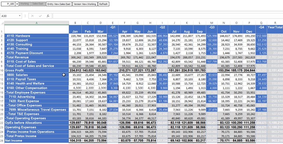
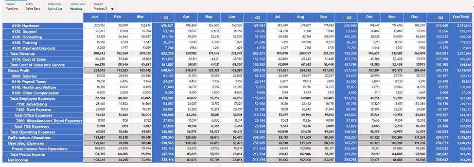
In the screen shots below, the Oracle Smart View for Office cell styles take precedence over design-time format rules.
Smart View runtime data grid with custom and cell styles applied:
Web runtime data grid with custom and cell styles applied:
Scenario 4: Apply Cell Style with One Data Validation Rule
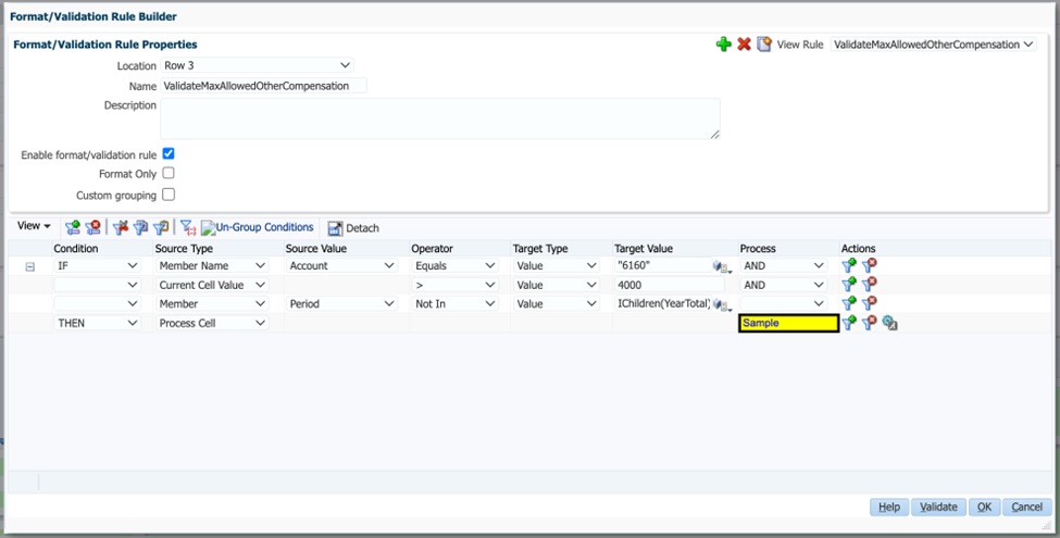
In the Format/Validation Rule Builder screen shots below, a data validation rule is added that sets the background color and tooltip for level 0 Other Compensation cells if the value exceeds $4000.
Format/Validation Rule Builder Properties:
Format/Validation Rule Builder Format Cell Options:
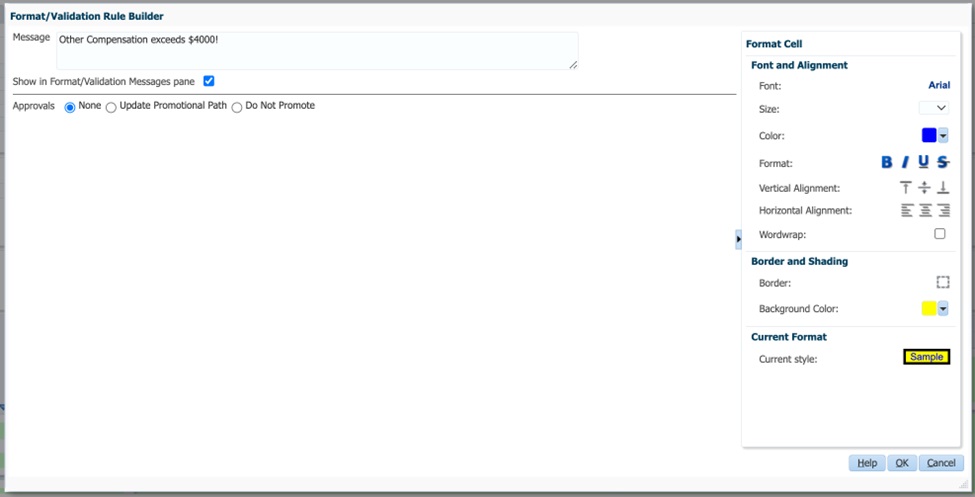
Smart View runtime data grid with cell styles applied and one data validation rule:
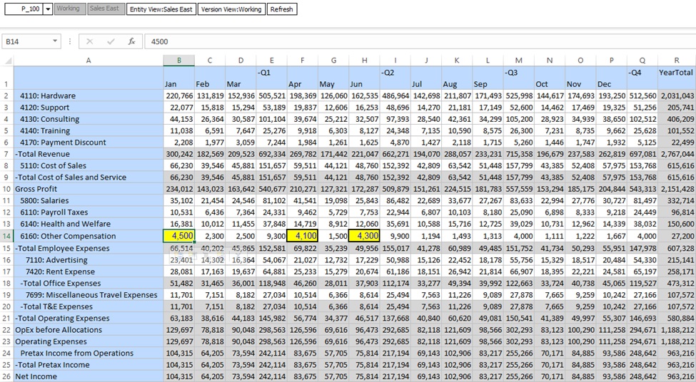
In the screen shot above, the data validation rule that was defined in the rule builder is applied to cells [B,14], [F,14], and [H,14]. There's a black border on all four sides, yellow background color, and blue font.
Web runtime data grid with cell styles applied and one data validation rule:

Note the following about the screen shot above:
-
Formatting: Black border on all four sides, yellow background color, and blue font.
-
Tooltip Message: Other Compensation exceeds $4000!
Scenario 5: Apply Cell Style with One Data Validation Rule and One Groovy Rule
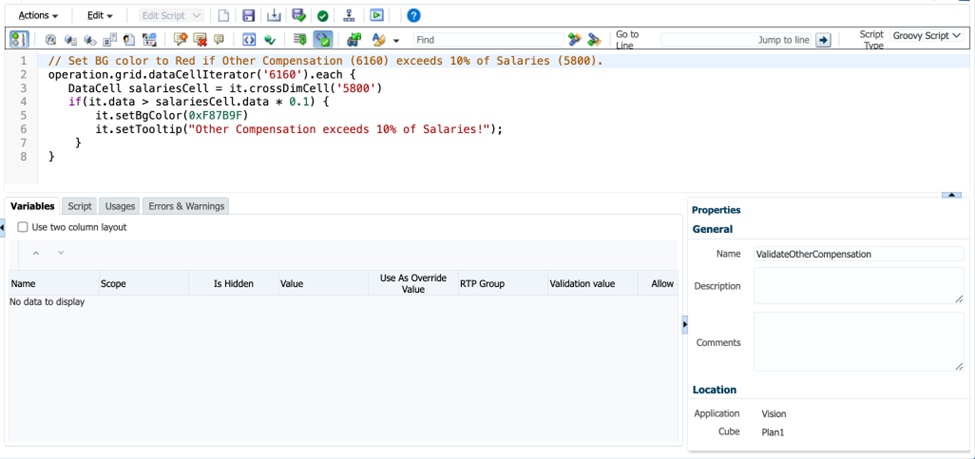
The Groovy rule definition sets the background color and a tooltip for the Other Compensation cells if the cell value exceeds 10% of Salaries.
Groovy Rule definition:
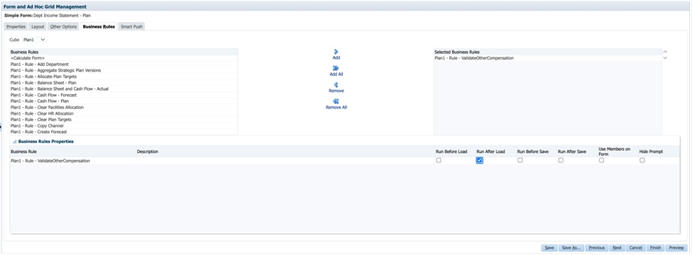
Adding the Groovy rule to the form on the Business Rules tab of the Form Designer:
Smart View runtime data grid with Groovy rules and data validation rules applied:
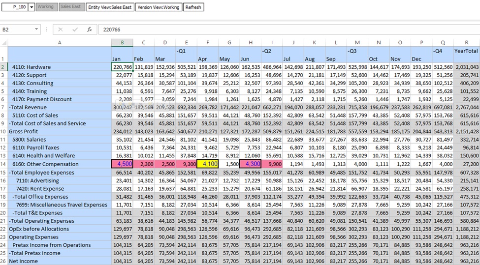
The data validation rule and the Groovy rule are applied to cells [B,14] and [H,14].
Note the following in the above Smart View runtime data grid:
-
The background color is applied from the Groovy rule as it has higher precedence than the data validation rule. The formatting (border and blue font) is merged from the data validation rule since the Groovy rule does not apply any formatting.
-
In cells [C,14], [D,14], [E,14], and [I,14], only the Groovy rule definition is displayed.
-
Only cell [F,14] applies the data validation rule
Web runtime data grid with Groovy rules and data validation rules applied:

Note the following in the above Web runtime data grid:
-
The background color is applied from the Groovy rule as it has higher precedence than the data validation rule. The formatting (border and blue font) is merged from the data validation rule since the Groovy rule does not apply any formatting.
-
In some cells, only the Groovy rule definition is displayed.
-
Only one cell applies the data validation rule
Scenario 6: Apply Custom and Cell Styles with One Data Validation Rule and One Groovy Rule
In the screen shots below, the order of precedence is applied with P1 being the highest precedence:
- (P1) Groovy rule
- (P2) Data Validation rule in the Format/Data Validation Rule Builder
- (P3) Smart View cell styles
- (P4) Format rule in the Format/Data Validation Rule Builder
- (P5) Smart View Custom formatting
Smart View runtime data grid with custom and cell styles applied and one data validation rule and one groovy rule:

Smart View runtime data grid with read-only disabled:
