Employee Travel Metrics
The Travel metrics tab on redwood employee dashboard provides deeper insights into employee travel behavior within the warehouse. This tab show cases three charts with time-based trend analysis to help you in making more informed operational decisions. A toggle button on each chart helps compare trends by current day, past week, or month.
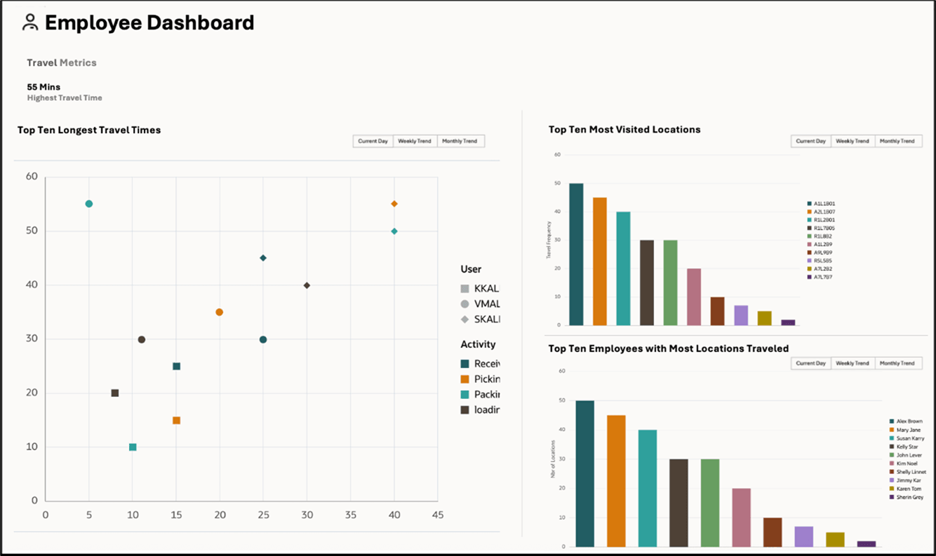
Scatter Chart – Top Ten Longest Travel Times
The scatter chart highlights the top 10 longest employee travel times. This visual allows you to quickly identify travel-intensive activities and can assist in correlatinglong travel timeswith number of locations traveled during a WMS activity. You can hover over any datapoint to view details such as the name of the employee, activityperformed, travel time, the corresponding date and the number of visited locations.
Bar Chart – Top Ten Most Visited Locations
The bar chart in the top right panel displays the most visited locations while performing WMS activities. This chart helps identify high-traffic zones within the facility. You can hover over the bars for additional information such as the location, travel frequency and the corresponding dates.
Bar Chart – Top Ten Employees with Most Locations Traveled
To monitor employee travel activity further, a second bar chart in the bottom right panel showcases the top 10 employees who have visited the most number of locations. This enables quick identification of highly mobile employees and supports workforce planning. Like the other charts, you can hover over the bars for additional information such as the number of locations and the corresponding dates.